The network for creativity
Join 1.25M professional creatives like you
Connect with clients, get discovered, and run your business 100% commission-free
Creatives on Contra have earned over $150M and we are just getting started
Back to feedPost

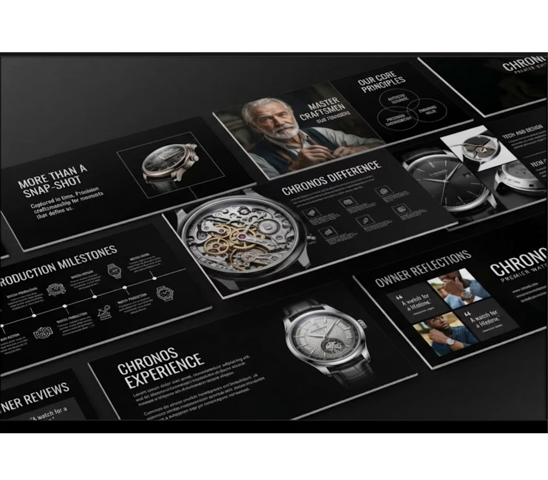
Chronos Luxury Horology Presentation Redesign
Project Description
Chronos is a complete brand presentation transformation that shifts a modern luxury aesthetic into the high-end horology sector. Taking a multi-slide presentation layout originally designed for a beauty brand, this project involved adapting every structural element typography hierarchy, graphic modules, visual accents, and photography into a cohesive, sophisticated deck tailored for a heritage watchmaking brand.
Project Goal
To rebrand a high-contrast presentation template into a luxury watch deck while maintaining 100% layout fidelity, precise structural alignment, and premium visual appeal across all slides.
Objectives
Rebrand all text content, typography styling, and messaging to align with high-end watchmaking and fine craft.
Replace generic imagery with sharp, curated imagery featuring luxury timepieces, intricate mechanical movements, and master watchmakers.
Preserve exact original design attributes, including color balance, grid alignment, geometric shapes, data visualization graphics, and slide-by-slide structure.
Key Challenges
Maintaining Grid Precision: Adapting completely different copy lengths and subject matter without disrupting the tight, original slide layout or visual balance.
Preserving Visual Identity: Ensuring the dark, dramatic aesthetic translated seamlessly from beauty to luxury watchmaking without feeling misplaced or generic.
Image Framing & Scale: Fitting detailed watch mechanics into pre-existing photo containers without losing focus on fine craftsmanship.
What I Focused On
Editorial Copywriting: Crafting compelling, luxury-focused headlines (e.g., "More Than A Snap-Shot," "Chronos Difference," "Master Craftsmen") that match the tone of premier horology brands.
Layout Integrity: Strictly mirroring the original slide-by-slide composition, including Venn diagrams, timeline milestones, image collages, and testimonial quotes.
Visual Cohesion: Harmonizing dark-mode backgrounds, stark typography contrast, and high-resolution product imagery for an elevated brand experience.
The Solution
By systematically swapping brand copy and imagery while keeping every line, shape, and grid coordinate intact, I delivered a sleek, fully realized corporate presentation deck. The final outcome demonstrates how an existing visual framework can be transformed across industries while preserving original design standards.


The network for creativity
Join 1.25M professional creatives like you
Connect with clients, get discovered, and run your business 100% commission-free
Creatives on Contra have earned over $150M and we are just getting started
Related posts

AI Mental Wellness Platform UI/UX Design
Designed a modern and intuitive AI-powered mental wellness website focused on emotional well-being and personalized digital experiences.
The platform features an AI therapist, mood tracking, meditation, sleep improvement, wellness plans, and data-driven insights. A calming blue color palette, immersive visuals, clean layouts, and thoughtful UI elements create a seamless and engaging user experience.
mentalhealthwebsitedesignartificialintelligenceAI VIsual DesignerResponsive DesignWeb DesignClaudeFigma


love how calm the mood tracking and meditation screens feel in this wellness design

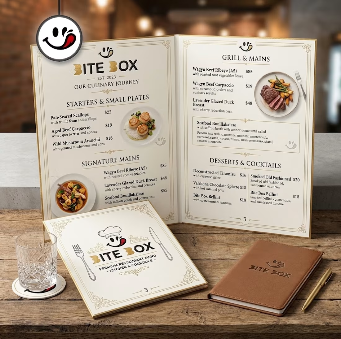
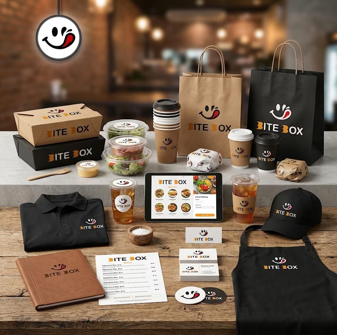
🍔 BITE BOX — Where Every Bite Brings a Smile! 🧡
A fun, fresh, and memorable logo concept designed for a modern fast-food brand. The smile icon represents happiness, while the bold typography creates a friendly and recognizable identity. 🍟✨
#LogoDesign #FoodBranding #GraphicDesign #BrandIdentity #LogoDesigner


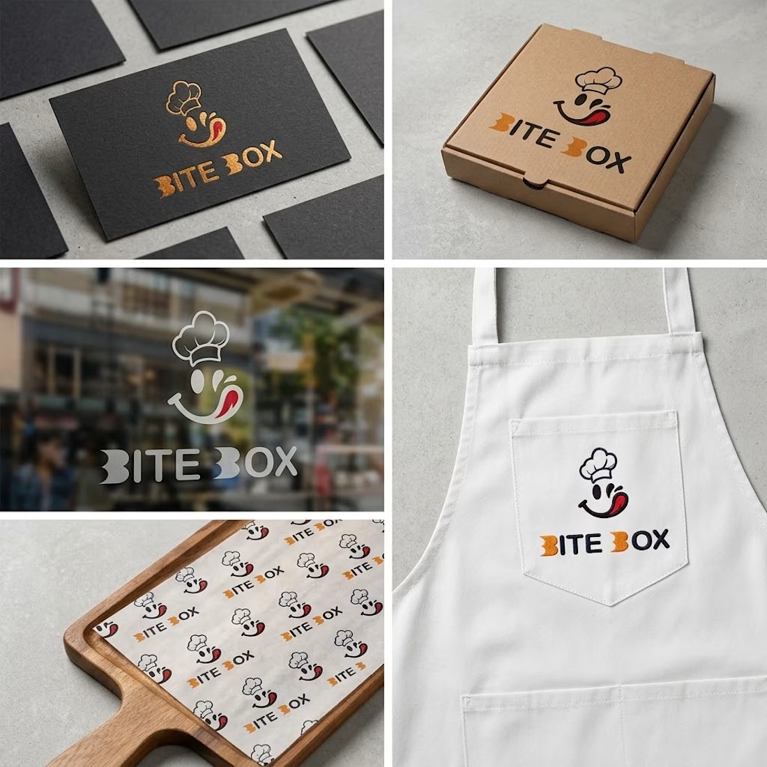


the little chef smile on the box is doing a lot of the work here

Exploring a modern fintech mobile app concept designed to make managing money feel effortless.
Designed to simplify everyday money management, the experience brings together thoughtful layouts, clear financial insights, and seamless interactions to make managing finances feel more intuitive and effortless.
A balance of deep forest green, soft mint accents, thoughtful typography, and clean data visualization brings a fresh visual identity to everyday finance.