
Fadare Caleb Timileyin
Canva & Digital Product, Brand, Website & UI/UX Designer
- 5.00
- Rating
- 3
- Followers


1. The Goal of the Project
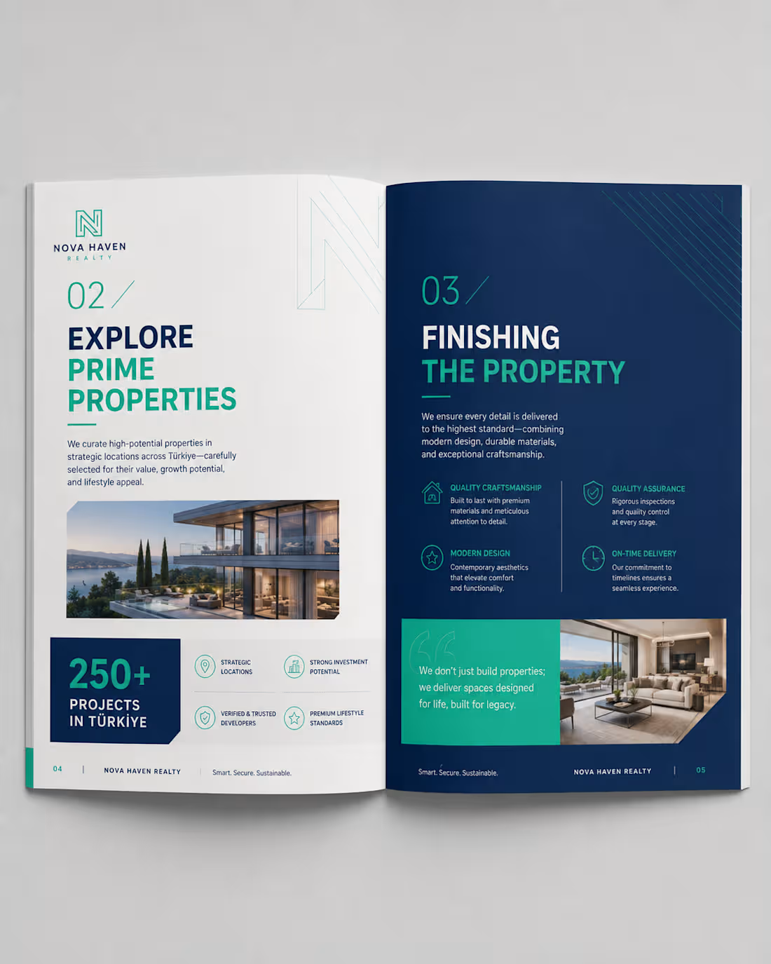
The goal of this project was to transform a basic real-estate brochure concept into a premium, professional, and highly engaging property investment publication.
The client needed a brochure that could communicate property opportunities, investment benefits, development quality, and brand credibility in a way that felt trustworthy and visually sophisticated.
The objective was not only to make the brochure attractive, but to create a strong visual identity that could position the company as a modern, reliable, and premium real-estate brand capable of appealing to investors, property buyers, and potential partners.
For this reason, I developed the new brand concept NOVA HAVEN REALTY, with the tagline:
Smart. Secure. Sustainable.
2. The Challenges Faced
The major challenge was presenting a large amount of real-estate information without making the brochure look overcrowded or difficult to read.
The content included property information, investment benefits, statistics, company strengths, project details, photographs, and supporting explanations. All of these needed to work together within one consistent design system.
Another challenge was creating a professional balance between corporate credibility and luxury presentation. The brochure needed to look premium enough to attract serious property investors while remaining clean, informative, and easy to understand.
It was also important to maintain consistency across the cover and different interior layouts while allowing each page to have its own visual character.
3. Project Overview
Nova Haven Realty – Property Investment & Development Guide 2026 is a modern real-estate corporate brochure created to present investment opportunities, property developments, company strengths, and investor benefits.
I developed a complete visual direction using a sophisticated combination of:
Deep navy blue for trust, professionalism, and authority
Teal and mint green for freshness, growth, and investment opportunities
White and light grey for clarity and visual balance
Premium architectural and property photography
Clean geometric graphics and architectural line elements
Modern typography with bold headings and clear information hierarchy
The brochure includes a professionally designed front cover and multiple interior spread concepts, allowing different types of information to be presented while maintaining one consistent brand identity.
The overall design direction communicates trust, investment confidence, modern living, quality development, and long-term value.
4. The Solution I Brought to the Client's Problem
I approached the project by creating a complete editorial and visual design system instead of simply decorating individual pages.
I established a consistent brand language using navy blue, teal, white, typography hierarchy, geometric elements, iconography, page numbering, photography, and structured layouts.
Important information such as investment returns, number of projects, years of experience, and property advantages was presented using large numerical highlights and dedicated statistic blocks, making important information easier for readers to notice immediately.
I also used modular grid layouts to separate complex information into smaller, easy-to-understand sections. High-quality property images were strategically positioned to create visual impact and help potential buyers imagine the lifestyle and quality associated with the developments.
The final result is a premium, organised, and visually persuasive real-estate brochure that improves readability, strengthens brand credibility, and gives the client a professional marketing tool capable of presenting their property opportunities with greater confidence and authority.
0
101
1. The Goal of the Project
The goal was to transform an ordinary corporate book into a premium, modern, and visually engaging brand publication. I wanted the final design to communicate professionalism and sustainability while creating a strong visual identity that could remain consistent across the cover and interior pages.
The project was rebranded as SOLARA ATLAS – Impact by Design, with a visual direction centred on sustainability, innovation, and positive environmental impact.
2. The Challenges Faced
The original design had useful information but lacked a distinctive brand personality and stronger visual hierarchy. The main challenge was finding a way to present large amounts of text, statistics, images, and corporate information without making the pages feel crowded or repetitive.
Another challenge was maintaining consistency across different types of pages while still making every spread visually interesting. The design needed to work equally well for storytelling pages, statistics, corporate information, photographs, and infographic-style content.
3. Project Overview
SOLARA ATLAS is a premium sustainability-focused brand book designed to communicate a company's purpose, environmental initiatives, achievements, and impact.
I developed a complete visual direction using a sophisticated combination of terracotta orange, warm cream, charcoal, and natural photography. Elegant serif typography was paired with clean supporting fonts, minimalist line icons, strong numerical highlights, modular grids, and carefully selected renewable-energy imagery.
The final concept includes a distinctive book cover and multiple editorial page layouts, creating a cohesive publication that feels professional, contemporary, and premium.
4. The Solution I Brought to the Client's Problem
I redesigned the publication around a clear editorial system rather than treating every page as an individual design. I established a consistent colour palette, typography hierarchy, grid structure, icon style, photography direction, and visual language that could be applied throughout the entire book.
I used bold section introductions to improve navigation, large statistics to make important information immediately noticeable, modular layouts to simplify complex information, and high-quality imagery to create emotional and visual impact.
The result was a publication that transformed the client's information into a strong branded experience that is easier to read, more memorable, and visually capable of positioning the organisation as modern, credible, and premium.
0
116
Project Overview
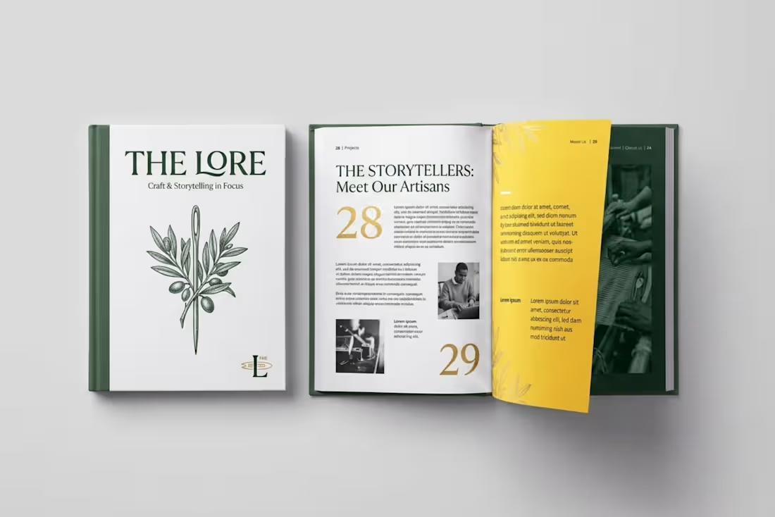
THE LORE is a complete brand elevation and layout overhaul, transforming a stark corporate brochure into a premium, narrative-driven editorial book.
Goal: Elevate a generic agency brochure into a high-end, artisanal publication that highlights heritage, craft, and brand storytelling.
Challenges: The original design suffered from harsh contrast, rigid corporate formatting.
Solution: Rebranded the title to "THE LORE," introduced an earthy color system (forest green, parchment, and gold), integrated custom botanical illustrations with high-contrast imagery.
0
112
GREEN EARTH
Overview
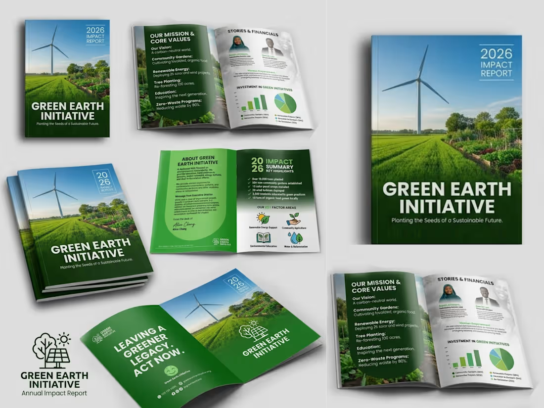
I made a professional company profile design for GREEN EARTH INITIATIVE that showcases their brand's identity, values, services, and strengths through a clean, engaging, and visually compelling layout.
Goal
Create a company profile that builds credibility, communicates the brand's value, and leaves a lasting impression on clients, partners, and investors.
Challenges
Presenting detailed business information in a clear, organized, and visually appealing format while maintaining a strong brand identity.
Solutions
Developed a modern, well-structured design with strategic layouts, compelling visuals, and consistent branding to enhance readability, professionalism, and business impact.
0
231