
Destiny Chukwuma Emmanuel
Graphic designer & AI Image/Video Producer
New to Contra
Destiny Chukwuma is ready for their next project!
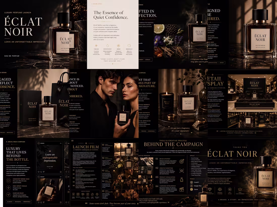
ÉCLAT NOIR Luxury Perfume Launch Campaign
OVERVIEW
ÉCLAT NOIR is a conceptual luxury fragrance brand created to explore how AI can accelerate premium brand campaigns without compromising creative direction.
Rather than designing a single logo or product mockup, I developed a complete launch experience, from brand positioning and product visualization to social media assets, retail displays, packaging concepts, and a cinematic commercial.
The objective was to prove that AI is most powerful when guided by strong creative thinking, art direction, and a clear brand narrative.
THE CHALLENGE
Luxury brands don’t sell products, they sell emotion.
The challenge was to create a fragrance launch that felt sophisticated, timeless, and aspirational while maintaining visual consistency across every customer touchpoint.
Every asset needed to communicate the same feeling:
Quiet confidence. Mystery. Lasting presence.
MY APPROACH
Instead of treating AI as the designer, I approached it as a creative production pipeline.
I first defined the brand strategy, audience, visual language, storytelling direction, and campaign structure before producing any visuals.
From there, I directed every scene, product render, environment, and cinematic sequence to ensure the entire campaign felt like work from a premium luxury brand.
The result is a cohesive launch campaign that spans multiple marketing channels while maintaining one consistent identity.
DELIVERABLES
Brand Identity Direction
Luxury Product Visualization
Packaging Design Concepts
Editorial Campaign
Lifestyle Campaign
Retail Display Concepts
Social Media Campaign
AI Commercial Storyboard
AI Launch Film
Campaign Presentation
Creative Process
The project was built using an AI-assisted creative workflow where strategy remained the foundation of every decision.
Defined the brand positioning and campaign narrative
Developed the creative direction and visual language
Designed the product and packaging concepts
Produced luxury campaign imagery
Created storyboard frames for the commercial
Generated cinematic video sequences
Edited the launch film
Designed the final presentation
Results
ÉCLAT NOIR demonstrates how modern creative tools can be combined with strategic design thinking to build premium brand experiences in a fraction of the traditional production timeline.
Rather than replacing creativity, AI became a production partner that allowed ideas to move from concept to execution with greater speed while preserving a high level of craftsmanship and consistency.
The final outcome is a complete luxury launch campaign that showcases branding, visual storytelling, campaign design, and AI-assisted creative direction working together as one cohesive system.
TOOLS
ChatGPT: Brand strategy, creative direction, copywriting, art direction, prompt development, and campaign planning.
Google Flow: AI commercial generation.
Canva: Presentation and campaign layout.
InShot: Commercial video editing and final post-production.
SKILS
Creative Direction
Brand Strategy
Brand Identity
Campaign Design
Art Direction
Product Visualization
Visual Storytelling
AI-Assisted Design
AI Video Production
Presentation Design
Prompt Engineering
https://canva.link/u931zqdxj2xrd2w
1
99
JOLLY JUICE is a self-initiated AI commercial campaign created to explore how compelling brand storytelling can bring a fictional product to life. The project combines realistic product visualization, cinematic advertising, lifestyle imagery, branded merchandise, and AI-generated video to present a cohesive marketing campaign from concept to execution.
The goal was to create visuals that feel authentic, commercially viable, and ready for real-world use while maintaining a consistent brand identity across every touchpoint. From premium product shots and lifestyle scenes to branded merchandise and motion content, every asset was crafted to demonstrate how AI can support modern advertising without compromising creative quality.
This project showcases my approach to AI-powered creative direction, commercial product visualization, and visual storytelling for brands looking to make a lasting impression.
2
2
175
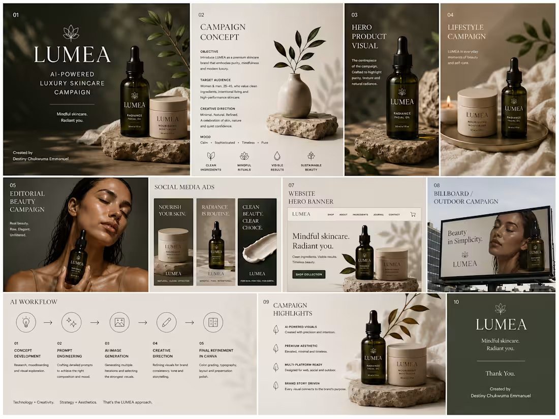
LUMEA AI-Powered Luxury Skincare Campaign
Overview
LUMEA is a fictional luxury skincare brand created to showcase the power of AI in commercial advertising and visual storytelling. This concept explores how AI can be leveraged to produce premium campaign visuals that capture a brand’s identity and connect with a modern, design-conscious audience.
The Challenge
The objective was to create a cohesive campaign that communicates elegance, trust, and sophistication while demonstrating how AI generated imagery can be used for high-end marketing and brand communication.
My Approach
I developed the creative direction, established the visual language, and used AI to produce a series of cinematic campaign visuals. Every image was crafted with a focus on premium aesthetics, consistent lighting, refined composition, and a luxurious brand feel to ensure a cohesive campaign across multiple marketing touchpoints.
Deliverables
Creative Direction
Brand Campaign Concept
AI-Generated Commercial Visuals
Hero Product Imagery
Lifestyle Campaign Assets
Editorial Beauty Visuals
Website Hero Concept
Billboard Advertisement
Tools
ChatGPT (Creative Direction & Prompt Development)
AI Image Generation
Outcome
This project demonstrates how AI can be used as a creative partner to develop visually compelling, brand focused campaigns. It reflects my ability to combine strategic thinking, art direction, and AI powered visual creation to produce marketing assets that feel polished, premium, and commercially relevant.
2
2
125
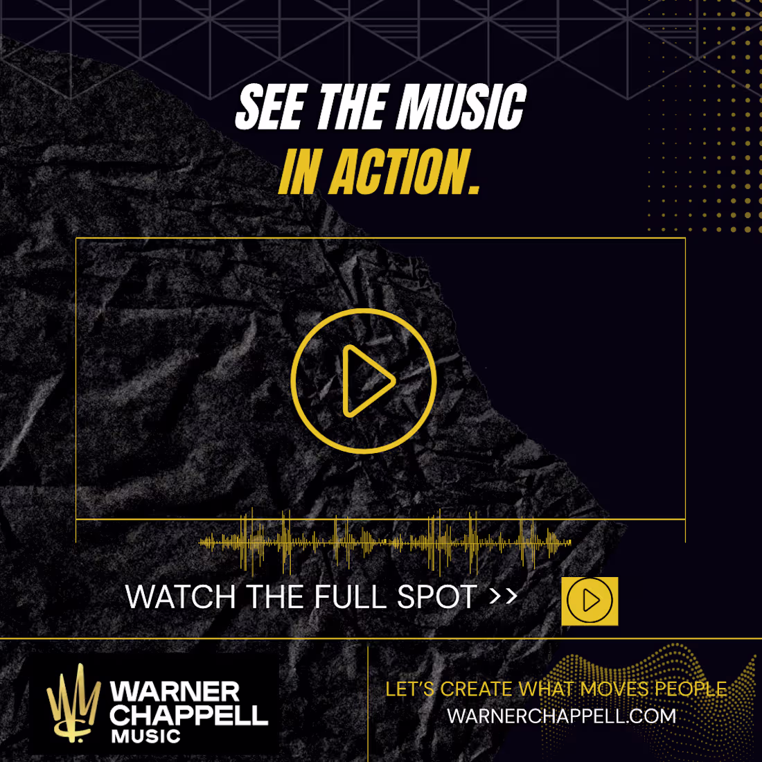
Warner Chappell Music “In The Mix” Social Media Series
A self-initiated concept created in response to Warner Chappell Music’s freelance design brief on Contra. The project explores a bold, premium visual identity for their recurring “In The Mix” social media series, designed to showcase custom music case studies across Instagram and LinkedIn.
The deliverable includes a fully editable 5-slide Canva carousel template featuring dynamic typography, structured Q&A layouts, and a reusable design system that enables the marketing team to quickly adapt the template for future campaigns while maintaining a consistent brand experience.
Tell me what you think.
View the full project here:
https://canva.link/ap0qpr640otqscx
3
5
292
Overview
This is a self-initiated concept created in response to a real design brief for Activist Skincare. The objective was to explore how the brand’s visual identity could evolve into a more vibrant, natural luxury experience across social media and email marketing.
Rather than creating isolated assets, I designed a cohesive marketing system that maintains consistency across customer touchpoints while highlighting the brand’s premium skincare products.
Scope
• Social Media Product Spotlight Template
• Email Marketing Template
• Design System
• Visual Direction
Design Approach
The goal was to create a cohesive visual system that reflects Activist Skincare’s vibrant, natural luxury aesthetic across both social media and email marketing.
The design draws inspiration from editorial layouts, botanical imagery, refined typography, generous whitespace, and a clear visual hierarchy to keep the product at the center of the experience. Every element was chosen to create a premium, modern, and approachable brand presence while ensuring consistency across multiple customer touchpoints.
Outcome
The final concept demonstrates how a unified design system can strengthen brand recognition and create a consistent customer experience across multiple digital channels.
1
141
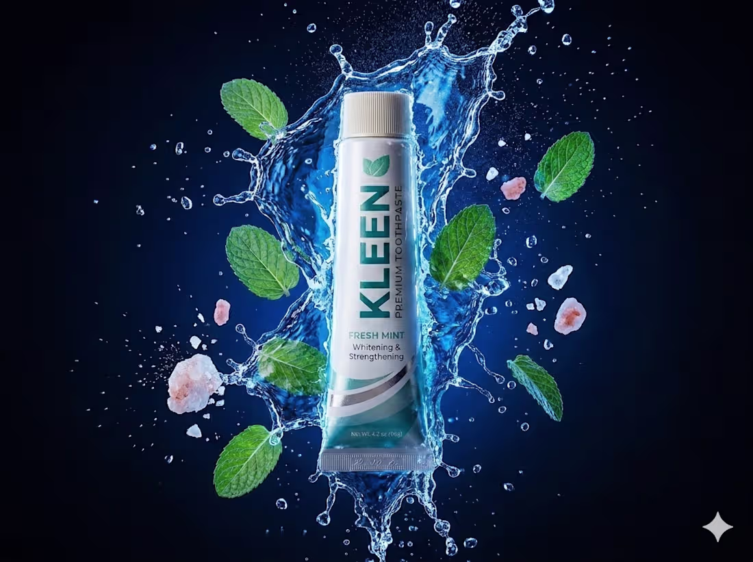
AI Product Photography with Google Gemini: KLEEN Toothpaste Concept Project
Note: This is a spec/concept project created to demonstrate AI product photography skills for DTC brands. KLEEN is a fictional brand used for portfolio purposes.
The Challenge
KLEEN needed premium product images for online sales and marketing.
A traditional photoshoot costs $2,000+, takes 2 weeks to schedule, and delivers maybe 2-3 angles. Need a bundle shot or lifestyle scene later? Pay again.
Most small brands either look cheap online or skip visual marketing entirely. Neither is an option if you want to compete.
My Solution
Using Google Gemini and iterative prompt engineering, I created 4 hyper-realistic product images from a single base photo.
The approach relies on what I call Consistency Locking: a prompting methodology I developed to keep the exact product design, logo, typography, colors, and details identical across every scene. Only the background, lighting, and props change.
The result: studio-quality imagery. Zero studio.
Deliverables
Hero Splash Shot: Dark background, water splash, mint and salt accents. Built for ads and website heroes. Stops the scroll instantly.
Lifestyle with Toothbrush: Product paired with a bamboo brush in a clean, natural setting. Builds trust on product pages by showing real context.
Action Squeeze Shot: Hand squeezing paste onto a brush with water droplets mid-air. Demonstrates texture and real use. Reduces buyer hesitation.
3-Pack Bundle: Three tubes in a kraft box with a splash effect. Designed for Amazon multi-pack listings and bulk purchase promotions.
All 4 images maintain 100% brand consistency across every shot.
Tools
Google Gemini Image Generation + Iterative Prompt Engineering
Results:
Traditional: Time 2 weeks
Cost $2,000+ 90% less
Output 2-3 angles
AI Approach: Time: 1 day
Cost: 90% less
Output: 4 Campaign ready images
Why This Matters
Your product photos are your sales team. For DTC brands, visuals are the difference between a scroll and a sale.
AI is easy. Anyone can type a prompt. But 7 years of design experience + prompt engineering = Gemini executes like a pro photographer. That’s the difference.
AI with Google Gemini lets DTC brands compete visually with category leaders, without the category leader budget.
Use Cases
Amazon listings · Shopify product pages · Instagram and Facebook ads · Pitch decks · Packaging mockups
0
126
Title: Denis Studio – Brand Logo Design
Description:
Denis Studio, a photo studio brand, needed a refined visual identity to reflect a premium yet approachable aesthetic. The challenge was to create a timeless mark that works seamlessly across digital platforms, print collateral, and photo watermarks.
I designed an elegant DS monogram system that balances sophistication with versatility. The interlocking letterforms use custom serif details to convey artistry and craftsmanship, while balanced proportions ensure legibility at any scale.
Role: Logo Design, Brand Identity
Deliverables:
+ Primary DS monogram logo
+ Full "Denis Studio" wordmark lockup
+ Color and black/white variations for light and dark backgrounds
+ Scalable vector files for web, print, and watermark use
2
2
214
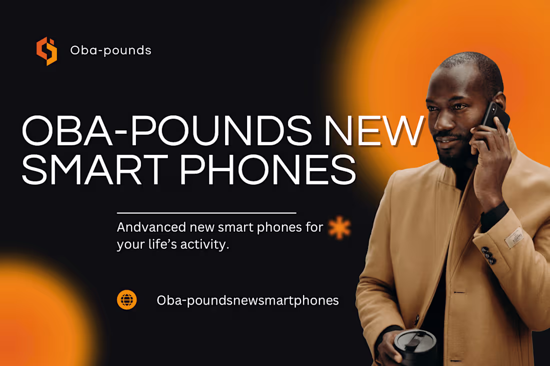
Product ads don’t sell specs. They sell a better version of you.
Oba-pounds New Smartphones campaign.
The brief wasn’t “list the features.” It was “make ambition feel attainable.”
So we put the phone in the background. The man in the foreground.
Camel coat. Coffee. Call. That’s the life this phone enables. Not the other way around.
Black + orange because tech should feel powerful, not sterile. The glow says “energy” without saying “battery life.”
Headline is massive because confidence is massive. Subhead says “Advanced new smartphones for your daily life” — no jargon, no gigahertz. Just outcome.
The asterisk? That’s your life. The phone fits into it.
Art direction + ad design for Oba-pounds smartphone launch.
I create tech brands that feel human. From UI to billboard, I make complex products feel obvious.
Building hardware, SaaS, or fintech that needs to connect? Let’s talk.
2
1
152
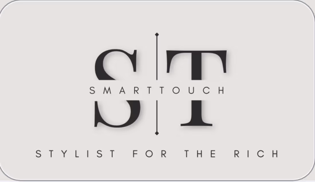
Luxury doesn’t shout. It spaces things out.
SmartTouch rebrand.
The brief: Make it feel like the stylist you call when money isn’t the question.
So we killed the noise.
ST monogram split by a single line — that’s the boundary between personal and public. Between who you are at home and who you are on the red carpet.
SMARTTOUCH knocked out of the center. If you know, you know.
“STYLIST FOR THE RICH” set wide, confident, no apologies. Not “affordable luxury.” Not “accessible.” Just rich.
Because when you serve that market, pretending otherwise is the fastest way to lose trust.
Off-white background. Soft shadow. Rounded container. Everything says “custom” and “considered”.
Brand identity for SmartTouch. This is the final mark.
I design for luxury, fashion, and personal brands that need to feel established on day one.
If your client list is confidential, we should talk.
2
1
141
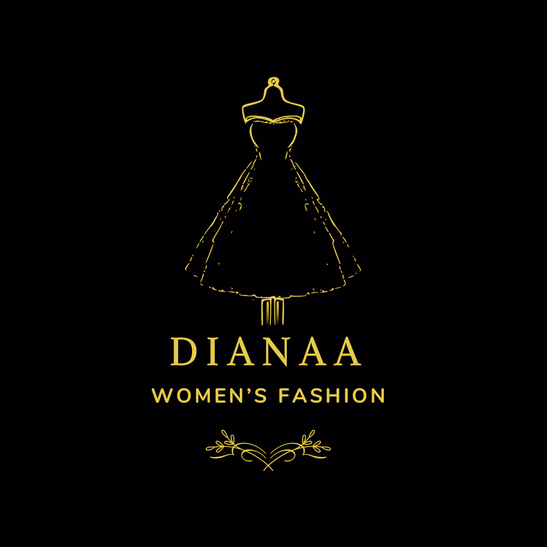
Fashion brands have 2 seconds to prove they understand women.
DIANAA does it in one glance.
Sketch-style dress form because fashion starts with a drawing, not a factory.
Gold on black because elegance doesn’t need color to be loud.
Spaced serif because luxury needs room to breathe.
The brief was simple: “Make it feel like a Paris atelier, not fast fashion.”
So we skipped the sans-serif, skipped the influencers, skipped the trend.
We went back to craft. The mannequin. The pencil line. The flourish underneath like a signature on a custom gown.
This is brand identity for a label that values the process as much as the product.
Logo + wordmark system for DIANAA. Full brand world coming.
I design for fashion, beauty, and luxury brands that want to feel established, not seasonal.
Building something timeless? Let’s talk.
1
100
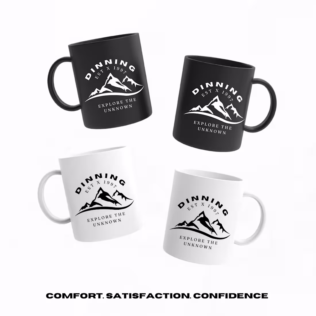
A logo isn’t a brand. A mug is.
DINNING EST X 1997.
The brief wasn’t “make a cool mountain logo.” It was “make something people want to hold at 6am before they go climb something.”
So we built the badge first. Arching type for movement. Mountains because the goal is always up. “Explore the unknown” because comfort is the enemy.
Then we put it on black and white mugs because the best gear looks good beat up.
This isn’t just merchandise. It’s the brand in someone’s hands. Every morning.
That’s where loyalty actually happens. Not in a brand deck.
DINNING brand identity + merch system. More pieces coming.
I design brands that people wear, use, and keep. If you’re building outdoor, lifestyle, or coffee, let’s talk.
1
101