
Fadare Caleb Timileyin
Canva & Digital Product, Brand, Website & UI/UX Designer
- 5.0
- Rating
- 3
- Followers


Novais IT - Corporate IT Infrastructure Presentation Redesign
Project Description
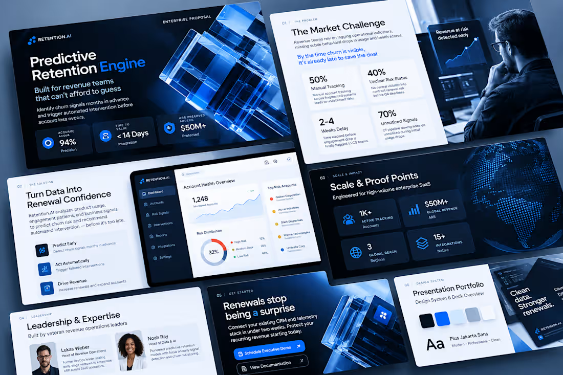
A comprehensive corporate presentation redesign for Novais IT, a specialized information technology integration company. This project transformed a standard IT services pitch deck into a modern, visually striking professional presentation that highlights infrastructure solutions, data center management, and advanced security systems.
Project Goal
To modernize and elevate Novais IT's corporate presentation deck, creating an engaging, high-end visual layout that clearly communicates technical IT services and corporate expertise to enterprise clients.
Objectives
Restructure Slide Flow: Organize 9 distinct presentation slides covering company history, sector reach, structured cabling, data center tech, security systems, and client portfolios.
Visual Modernization: Apply a sleek dark-mode aesthetic with deep navy gradients, crisp typography hierarchy, and professional corporate color accents.
Curated Asset Integration: Integrate high-resolution imagery and clear technical icons representing network engineering, server rooms, fiber optics, and biometric access control.
Key Challenges
Translating Technical Data: Structuring complex IT concepts (such as electromechanical infrastructure, active directory setups, and firewall integrations) into clean, digestible slide blocks.
Maintaining Visual Balance: Ensuring heavy technical service lists and step-by-step bullet points fit harmoniously into structured layout grids without looking cluttered.
What I Focused On
Information Architecture: Grouping technical services logically across dedicated slides—such as splitting structured cabling, data center solutions, and surveillance systems into distinct thematic sections.
Brand Professionalism: Highlighting core company metrics (such as 10+ years of experience) and prominent enterprise partnerships (Bridgestone, Chevrolet, Latam, Klabin, etc.) to build immediate authority.
The Solution
By rebuilding the slide architecture with a sophisticated dark-navy theme, clear service breakdown panels, and professional tech imagery, I delivered a cohesive and polished corporate deck. The final presentation successfully establishes Novais IT as an industry leader in IT infrastructure and connectivity solutions.
0
21
Chronos Luxury Horology Presentation Redesign
Project Description
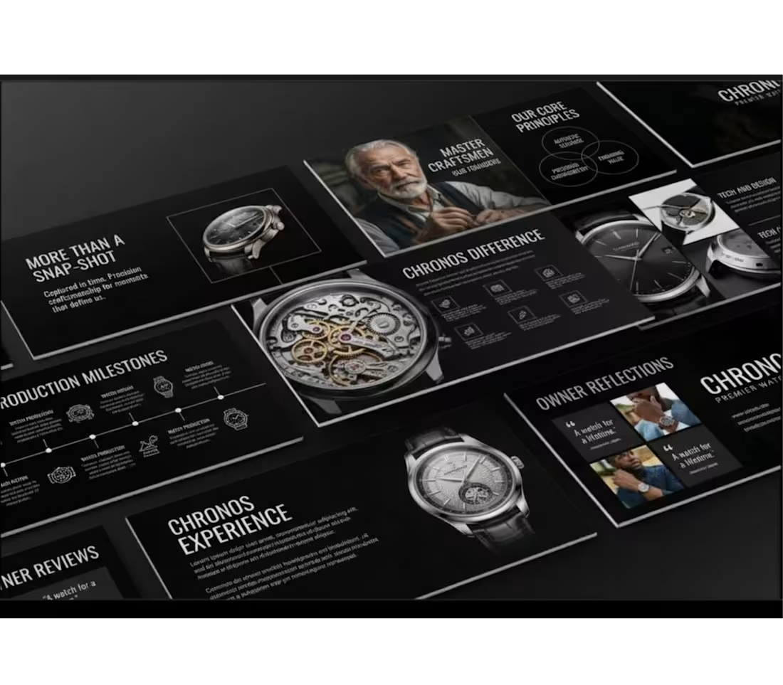
Chronos is a complete brand presentation transformation that shifts a modern luxury aesthetic into the high-end horology sector. Taking a multi-slide presentation layout originally designed for a beauty brand, this project involved adapting every structural element typography hierarchy, graphic modules, visual accents, and photography into a cohesive, sophisticated deck tailored for a heritage watchmaking brand.
Project Goal
To rebrand a high-contrast presentation template into a luxury watch deck while maintaining 100% layout fidelity, precise structural alignment, and premium visual appeal across all slides.
Objectives
Rebrand all text content, typography styling, and messaging to align with high-end watchmaking and fine craft.
Replace generic imagery with sharp, curated imagery featuring luxury timepieces, intricate mechanical movements, and master watchmakers.
Preserve exact original design attributes, including color balance, grid alignment, geometric shapes, data visualization graphics, and slide-by-slide structure.
Key Challenges
Maintaining Grid Precision: Adapting completely different copy lengths and subject matter without disrupting the tight, original slide layout or visual balance.
Preserving Visual Identity: Ensuring the dark, dramatic aesthetic translated seamlessly from beauty to luxury watchmaking without feeling misplaced or generic.
Image Framing & Scale: Fitting detailed watch mechanics into pre-existing photo containers without losing focus on fine craftsmanship.
What I Focused On
Editorial Copywriting: Crafting compelling, luxury-focused headlines (e.g., "More Than A Snap-Shot," "Chronos Difference," "Master Craftsmen") that match the tone of premier horology brands.
Layout Integrity: Strictly mirroring the original slide-by-slide composition, including Venn diagrams, timeline milestones, image collages, and testimonial quotes.
Visual Cohesion: Harmonizing dark-mode backgrounds, stark typography contrast, and high-resolution product imagery for an elevated brand experience.
The Solution
By systematically swapping brand copy and imagery while keeping every line, shape, and grid coordinate intact, I delivered a sleek, fully realized corporate presentation deck. The final outcome demonstrates how an existing visual framework can be transformed across industries while preserving original design standards.
0
31
1. The Goal of the Project
The goal of this project was to transform a basic real-estate brochure concept into a premium, professional, and highly engaging property investment publication.
The client needed a brochure that could communicate property opportunities, investment benefits, development quality, and brand credibility in a way that felt trustworthy and visually sophisticated.
The objective was not only to make the brochure attractive, but to create a strong visual identity that could position the company as a modern, reliable, and premium real-estate brand capable of appealing to investors, property buyers, and potential partners.
For this reason, I developed the new brand concept NOVA HAVEN REALTY, with the tagline:
Smart. Secure. Sustainable.
2. The Challenges Faced
The major challenge was presenting a large amount of real-estate information without making the brochure look overcrowded or difficult to read.
The content included property information, investment benefits, statistics, company strengths, project details, photographs, and supporting explanations. All of these needed to work together within one consistent design system.
Another challenge was creating a professional balance between corporate credibility and luxury presentation. The brochure needed to look premium enough to attract serious property investors while remaining clean, informative, and easy to understand.
It was also important to maintain consistency across the cover and different interior layouts while allowing each page to have its own visual character.
3. Project Overview
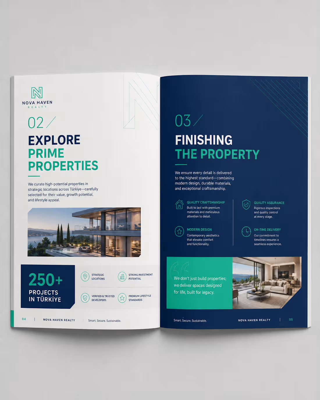
Nova Haven Realty – Property Investment & Development Guide 2026 is a modern real-estate corporate brochure created to present investment opportunities, property developments, company strengths, and investor benefits.
I developed a complete visual direction using a sophisticated combination of:
Deep navy blue for trust, professionalism, and authority
Teal and mint green for freshness, growth, and investment opportunities
White and light grey for clarity and visual balance
Premium architectural and property photography
Clean geometric graphics and architectural line elements
Modern typography with bold headings and clear information hierarchy
The brochure includes a professionally designed front cover and multiple interior spread concepts, allowing different types of information to be presented while maintaining one consistent brand identity.
The overall design direction communicates trust, investment confidence, modern living, quality development, and long-term value.
4. The Solution I Brought to the Client's Problem
I approached the project by creating a complete editorial and visual design system instead of simply decorating individual pages.
I established a consistent brand language using navy blue, teal, white, typography hierarchy, geometric elements, iconography, page numbering, photography, and structured layouts.
Important information such as investment returns, number of projects, years of experience, and property advantages was presented using large numerical highlights and dedicated statistic blocks, making important information easier for readers to notice immediately.
I also used modular grid layouts to separate complex information into smaller, easy-to-understand sections. High-quality property images were strategically positioned to create visual impact and help potential buyers imagine the lifestyle and quality associated with the developments.
The final result is a premium, organised, and visually persuasive real-estate brochure that improves readability, strengthens brand credibility, and gives the client a professional marketing tool capable of presenting their property opportunities with greater confidence and authority.
0
135
1. The Goal of the Project
The goal was to transform an ordinary corporate book into a premium, modern, and visually engaging brand publication. I wanted the final design to communicate professionalism and sustainability while creating a strong visual identity that could remain consistent across the cover and interior pages.
The project was rebranded as SOLARA ATLAS – Impact by Design, with a visual direction centred on sustainability, innovation, and positive environmental impact.
2. The Challenges Faced
The original design had useful information but lacked a distinctive brand personality and stronger visual hierarchy. The main challenge was finding a way to present large amounts of text, statistics, images, and corporate information without making the pages feel crowded or repetitive.
Another challenge was maintaining consistency across different types of pages while still making every spread visually interesting. The design needed to work equally well for storytelling pages, statistics, corporate information, photographs, and infographic-style content.
3. Project Overview
SOLARA ATLAS is a premium sustainability-focused brand book designed to communicate a company's purpose, environmental initiatives, achievements, and impact.
I developed a complete visual direction using a sophisticated combination of terracotta orange, warm cream, charcoal, and natural photography. Elegant serif typography was paired with clean supporting fonts, minimalist line icons, strong numerical highlights, modular grids, and carefully selected renewable-energy imagery.
The final concept includes a distinctive book cover and multiple editorial page layouts, creating a cohesive publication that feels professional, contemporary, and premium.
4. The Solution I Brought to the Client's Problem
I redesigned the publication around a clear editorial system rather than treating every page as an individual design. I established a consistent colour palette, typography hierarchy, grid structure, icon style, photography direction, and visual language that could be applied throughout the entire book.
I used bold section introductions to improve navigation, large statistics to make important information immediately noticeable, modular layouts to simplify complex information, and high-quality imagery to create emotional and visual impact.
The result was a publication that transformed the client's information into a strong branded experience that is easier to read, more memorable, and visually capable of positioning the organisation as modern, credible, and premium.
0
164