Freelancers using Figma Make in GurugramFreelancers using Figma Make in Gurugram
Figma UI/UX & Product Designer | SaaS, AI, Fintech & Web App
New to Contra
Figma UI/UX & Product Designer | SaaS, AI, Fintech & Web App
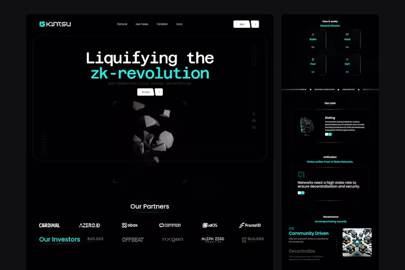
Cover image for Kintsu — DeFi Website &
Kintsu — DeFi Website & Staking Dashboard UX/UI Design Kintsu was a project focused on making decentralized finance more accessible, intuitive, and trustworthy. A modern Web3 platform connecting liquid staking, lending, digital assets, and DeFi opportunities through one seamless experience. As the UX/UI Designer, I designed both the website and dashboard, transforming complex blockchain functionality into clear, engaging, and user-friendly interfaces. What I designed: Web3 Website & Homepage: Crafted a premium website with bold typography, modern visuals, and compelling storytelling. Simplified complex DeFi concepts while communicating the platform's value and building user confidence. DeFi Dashboard Experience: Designed a financial dashboard with intuitive navigation, organized data, and clear visual hierarchy, making it easier for users to explore assets, staking opportunities, and platform activity. Liquid Staking UX: Created streamlined staking and unstaking journeys with clear transaction steps, reward information, and confirmation states to simplify blockchain interactions. Portfolio & Asset Management: Designed structured interfaces for displaying asset balances, staking positions, rewards, and financial activity, making complex data easier to understand. DeFi Product Discovery: Organized staking, lending, and vault-related information into intuitive layouts, helping users explore financial opportunities without unnecessary complexity. Scalable Web3 Design System: Developed a consistent visual language with modern typography, reusable Figma components, responsive layouts, and polished interactions across the website and dashboard. The Result: A cohesive Web3 website and dashboard experience bringing decentralized finance, staking, and asset management into one unified design system. The design simplifies complex financial interactions, strengthens platform credibility, and creates an intuitive experience for users exploring DeFi.
0
3
Cover image for YOTT — AI & Industrial
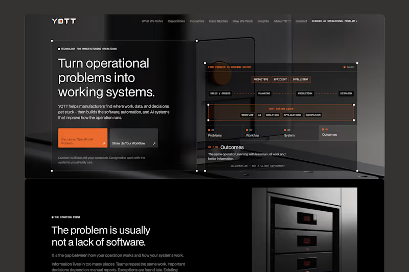
YOTT — AI & Industrial Technology Website UX/UI Design YOTT was a project focused on making complex industrial technology simple, accessible, and business-driven. A modern B2B website connecting AI, automation, software, and manufacturing solutions with real operational challenges. As the UX/UI Designer, I transformed complex technical services into a clear, professional, and conversion-focused digital experience. What I designed: Strategic Homepage & Storytelling: Designed a problem-first homepage highlighting manufacturing challenges such as manual workflows, disconnected systems, slow reporting, and operational inefficiencies. Focused on real business problems before introducing solutions. B2B Website Experience: Crafted eight core pages covering solutions, capabilities, industries, case studies, processes, insights, company information, and contact. Simplified navigation and improved information hierarchy. Interactive Discovery Tool: Designed a five-step journey helping visitors identify operational challenges and discover relevant technology opportunities without technical expertise. AI & Technology Solutions UX: Organized AI, automation, analytics, custom software, and system integration services into structured, intuitive product experiences. Premium Industrial UI Design: Developed a sophisticated dark visual identity with industrial imagery, modern typography, refined spacing, responsive layouts, and reusable Figma components. Conversion-Focused UX: Designed strategic calls to action, interactive problem-solution sections, and a six-step process guiding visitors from discovery to meaningful business inquiries. The Result: A complete, responsive B2B website that brings industrial technology and business-focused storytelling into one cohesive digital experience. The design simplifies complex solutions, strengthens brand credibility, and helps manufacturers confidently explore technology opportunities.
0
11
Cover image for FacilPay — Web3 Fintech Website
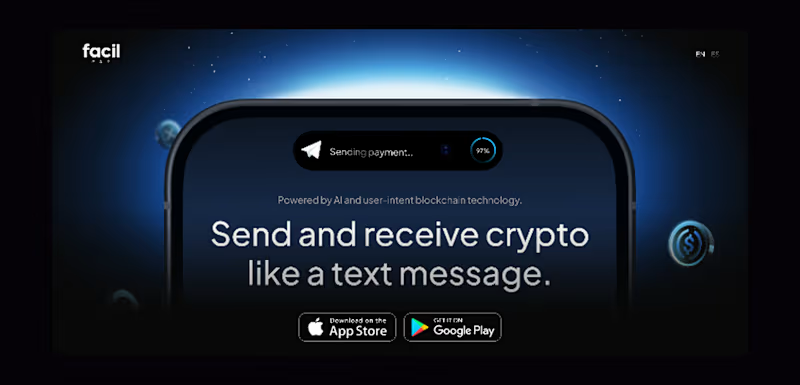
FacilPay — Web3 Fintech Website & Mobile App UX/UI Design FacilPay was a project focused on redefining how people interact with cryptocurrency. An AI-powered Web3 payment platform combining secure messaging, multi-chain wallets, and digital payments into one seamless experience. As the UX/UI Designer, I designed both the website and mobile app, transforming complex blockchain functionality into intuitive, secure, and user-friendly experiences. What I designed: Fintech Website & Homepage: Created a modern, conversion-focused website with compelling visuals, bold typography, and clear storytelling. Simplified Web3 concepts while highlighting the platform's unique payment capabilities. Mobile App UX/UI: Designed an intuitive crypto payment app with seamless navigation, wallet management, messaging, and transaction flows. Focused on making everyday crypto interactions feel as simple as traditional banking. Crypto Wallet & Dashboard: Crafted a clean wallet interface displaying balances, digital assets, NFTs, and transaction activity. Organized complex financial information into easy-to-understand layouts. Payments & Transaction UX: Designed streamlined send, receive, and payment request journeys with clear confirmation states and intuitive interactions to build user confidence. Multi-Chain & Swap Experience: Created user-friendly interfaces for managing assets across blockchains, swapping tokens, and bridging crypto without unnecessary complexity. AI & Messaging Experience: Designed conversational payment interactions combining secure messaging with AI-powered assistance, making crypto transactions feel as natural as sending a text. Scalable Fintech Design System: Developed consistent typography, reusable Figma components, responsive layouts, and polished UI patterns across the website and mobile app. The Result: A cohesive Web3 website and mobile app experience bringing AI, crypto payments, messaging, and multi-chain asset management into one unified design.
0
22
Cover image for 21SPADES — Web3 Marketplace &
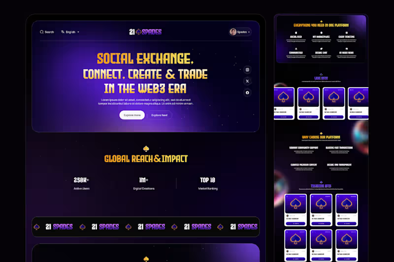
21SPADES — Web3 Marketplace & Community Platform UX/UI Design 21Spades was a Web3 project focused on making blockchain technology, digital ownership, and decentralized communities more accessible, engaging, and user-friendly. A modern digital ecosystem connecting creators, collectors, and communities through tokenized assets, social interactions, NFT marketplaces, and blockchain-powered experiences. As the UX/UI Designer, I transformed complex Web3 concepts into a visually engaging, intuitive, and user-centered digital experience, combining premium design aesthetics with seamless navigation and clear product storytelling. What I designed: Strategic Homepage & Visual Storytelling: Designed an immersive homepage built around the concept of "Participate, Connect, Own." Established a strong visual hierarchy through bold typography, dynamic imagery, modern layouts, and engaging content sections highlighting the platform's core value. Web3 Marketplace Experience: Crafted an intuitive digital marketplace experience for discovering tokenized assets, exploring trending collections, and connecting with creators. Simplified asset discovery through organized content sections, clear navigation, and visually engaging collection presentations. Community & Social Experience: Designed feature presentations for social feeds, Web3 communities, secure messaging, and creator engagement. Focused on making decentralized interactions feel familiar, accessible, and connected. NFT & Digital Asset Tokenization UX: Structured a clear four-step tokenization journey covering wallet setup, blockchain selection, collection creation, and asset minting. Simplified technical blockchain processes into easy-to-understand user journeys. Web3 Ecosystem & Feature Discovery: Organized marketplace, event ticketing, AI-powered Web3 news, community engagement, and secure communication features into a cohesive digital experience. Used structured information architecture to make the ecosystem easier to explore. Premium Web3 UI Design: Created a distinctive, modern visual experience featuring bold typography, immersive digital artwork, refined spacing, engaging content layouts, and consistent UI components. Focused on a premium aesthetic while maintaining usability and clarity across the website. Trust & User-Centered Experience: Designed sections communicating blockchain transparency, digital ownership, secure interactions, and platform benefits. Simplified complex technical messaging to help users understand the value of decentralized technology. Conversion-Focused UX: Designed strategic calls to action, marketplace discovery sections, educational content, and clear onboarding pathways guiding visitors from initial exploration to meaningful platform participation. The Result: A cohesive, modern Web3 website experience that brings digital ownership, NFT marketplaces, community engagement, and blockchain-powered services together into one connected ecosystem. The design simplifies complex Web3 concepts, strengthens brand identity, improves product discoverability, and creates an engaging journey for creators, collectors, and new users exploring decentralized digital experiences. Designed in Figma | UX/UI Design | Web3 | Blockchain | NFT Marketplace | Community Platform | Website Design
0
19
UI/UX Designer • No-code Builder • AI Architect
    $1k+
    Earned
    86
    Followers
UI/UX Designer • No-code Builder • AI Architect
Cover image for Northbound🚀: Studio Autopilot 

An AI-powered
Northbound🚀: Studio Autopilot An AI-powered client pipeline for creative studios, wrapped in a hand-built 3D world. A brief comes in, gets scored and routed, becomes a priced proposal, is accepted online and turns into a running project, with no one chasing emails. Every studio knows the feeling: a new brief lands and the clock starts. Then come hours of reading, qualifying, writing proposals, chasing replies and setting up the project. Northbound turns that whole journey into one automated flow, so a small studio can respond like a big one. The problem: Creative studios lose their best hours to admin. Strong leads wait days for a proposal, weak ones eat the same time as good ones, and follow-ups slip through the cracks. The work that wins clients is the work nobody has time for. The solution: - AI brief scoring and routing. Every brief is read for budget, timeline, goals and fit, then routed one of three ways: fast track, a quick human review, or an honest, helpful decline with pointers. - Tailored proposals in about a minute. Strong fits get a scoped proposal with workstreams, a realistic timeline and three priced packages. - Online acceptance and kickoff booking. Clients pick a package, accept online and book their kickoff call on the spot. - A project that runs itself. Milestones are planned on acceptance, and follow-ups and reminders go out automatically. - A morning digest. Every day at 08:00 the studio owner gets a summary of new briefs, proposals awaiting review, clients who haven’t replied, and what’s due. - An owner dashboard showing pipeline, win rate and hours saved, plus a review queue to approve held proposals in one click. - A live demo console where anyone can send a sample brief through the real pipeline and watch each step happen.
18
18
2.2K
Product designer. High-conversion, high-craft. Startup speed
    8
    Followers
Product designer. High-conversion, high-craft. Startup speed
Web Designer & Framer Expert
    1x
    Hired
    3
    Followers
Web Designer & Framer Expert