Freelance Animators in Greater London
Sign Up
Post a job
Sign Up
Log In
Filters
2
Projects
People
George Weatherhead
max
London, UK
I animate interactive, gamified worlds 🚀
$25k+
Earned
11x
Hired
5.0
Rating
246
Followers
expert
Club
Follow
Message
I animate interactive, gamified worlds 🚀
6
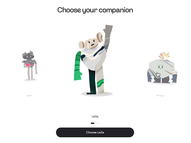
Learning Companions - Pebble
6
172
9
AI Companion - Rive
9
457
4
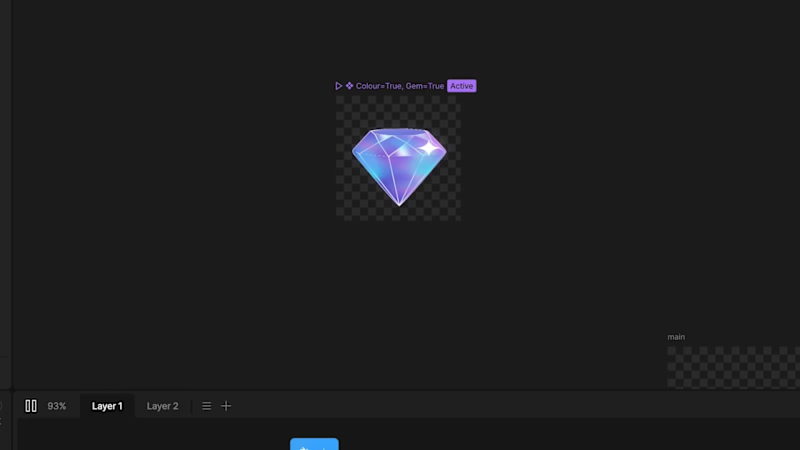
Gems & Stars - Immutable 💎
4
126
26
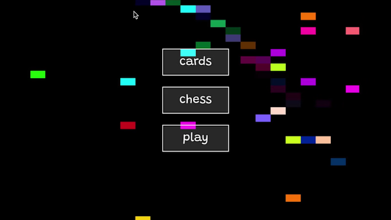
I’ve always loved the idea of having my own little games company. For the @Rive challenge, I decided to create my imaginary game studio - and then gamify it On the site, I showcase a custom deck of playing cards I designed last year. Pick a suit, choose a card, and see what’s inside the box 👀✨ Gamification has become a big niche for me this year. Maintain streaks and play with the digital cards earns you rewards Data-binding images, inputs, strings, and lists… lots of lists... ✌️
13
26
2.4K
Animator
(11)
Follow
Message
Luis Viana
London, UK
Senior Motion Designer & Animator
$1k+
Earned
4x
Hired
4.8
Rating
27
Followers
Top
Follow
Message
Senior Motion Designer & Animator
7
Oreo of the Day
7
53
2
Animated Content for Social Media - Samsung Summer Recycle
2
33
1
Best of Luis Viana
1
123
1
Animated Content for IG Reels/Stories+TikTok+YouTube - bunq
1
22
Animator
(10)
Follow
Message
Tamara Hardy
London, UK
2D Motion Designer & Illustrator

5.0
Rating
4
Followers
Follow
Message
2D Motion Designer & Illustrator
1
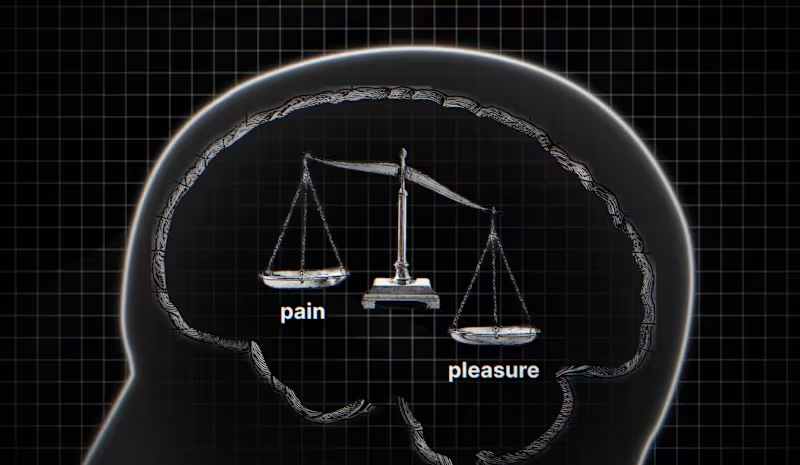
Flight Studio / Diary Of A CEO - Dopamine Expert
1
38
2
Unmind: Brand Toolkitting
2
12
1
2D Explainer Video - PodPoint
1
7
1
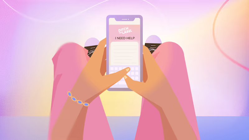
Ditch The Label: Role of The Phone
1
20
Animator
(5)
Follow
Message
Sam Allen
pro
London, UK
Moving, zappy motion and video 💥
$10k+
Earned
11x
Hired
5.0
Rating
244
Followers
Top
Follow
Message
Moving, zappy motion and video 💥
15
E.ON Next // TV Idents, Character Animation
15
129
46
Motion Design Showreel 2025
46
784
2
Character Showreel 2024
2
38
2
Tiktok // Ad Campaign Case studies
2
94
Animator
(4)
Follow
Message
Cameron Almeida
London, UK
I help brands make better video.
$1k+
Earned
1x
Hired
5.0
Rating
3
Followers
Follow
Message
I help brands make better video.

0
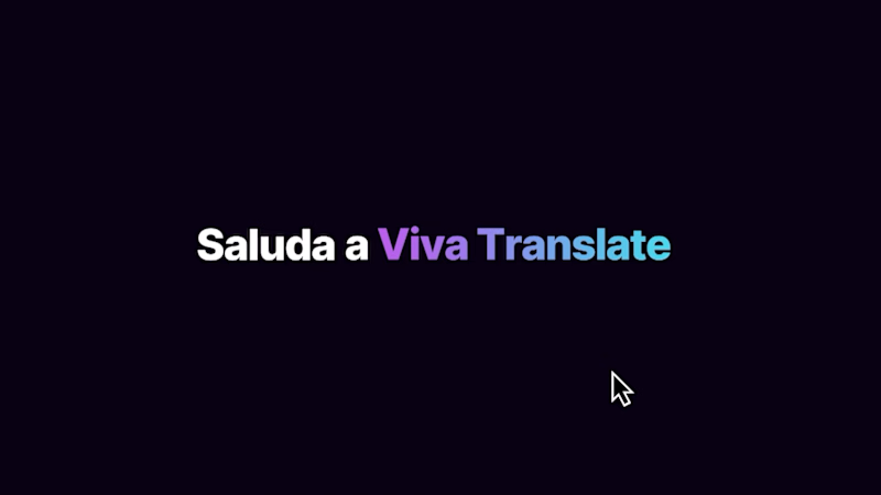
Viva Translate App Promo
0
34
0
Royal Bank of Canada x Ownr
0
21
0
Bite-Sized Industry Entertainment
0
44
0
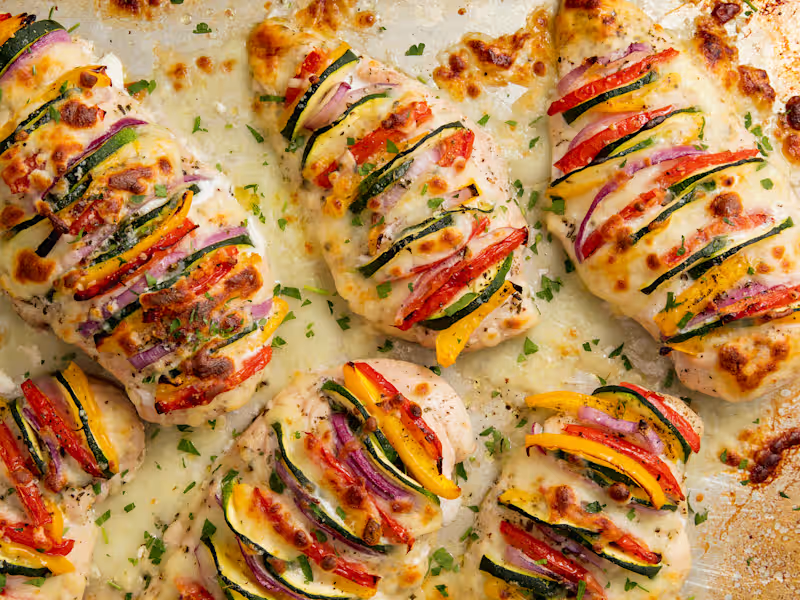
Hearst Branded Recipe Content
0
30
Animator
(3)
Follow
Message
Dc Turner
London, UK
Award-winning creative technologist
9
Followers
expert
Follow
Message
Award-winning creative technologist
35
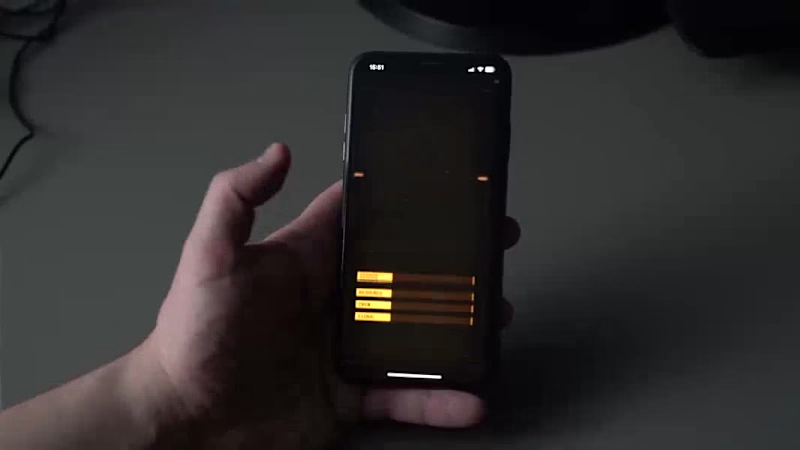
-- INFO "Phantasm_Console_001" Ultra Low-Rez Ambience. Six colours, 128x128 pixels. Animated by hand. -- TAGS ( #PICO8 (https://bsky.app/hashtag/PICO8) | #Animation (https://bsky.app/hashtag/Animation) | #PixelArt (https://bsky.app/hashtag/PixelArt) | #Aseprite (https://bsky.app/hashtag/Aseprite) | #MotionGraphics (https://bsky.app/hashtag/MotionGraphics) ) -- AUDIO Tigram Hamasyan | He Saw Her Reflection In The Water
35
195
1
Tim Minchin: STORM
1
8
0
Interactive Screen Graphics for Film and TV
0
23
0
WHY? (Animated Music Video)
0
13
Animator
(5)
Follow
Message
Monodeep Samanta
pro
London, UK
Web and Mobile App UX/UI Designer 🇬🇧
Follow
Message
Web and Mobile App UX/UI Designer 🇬🇧
1
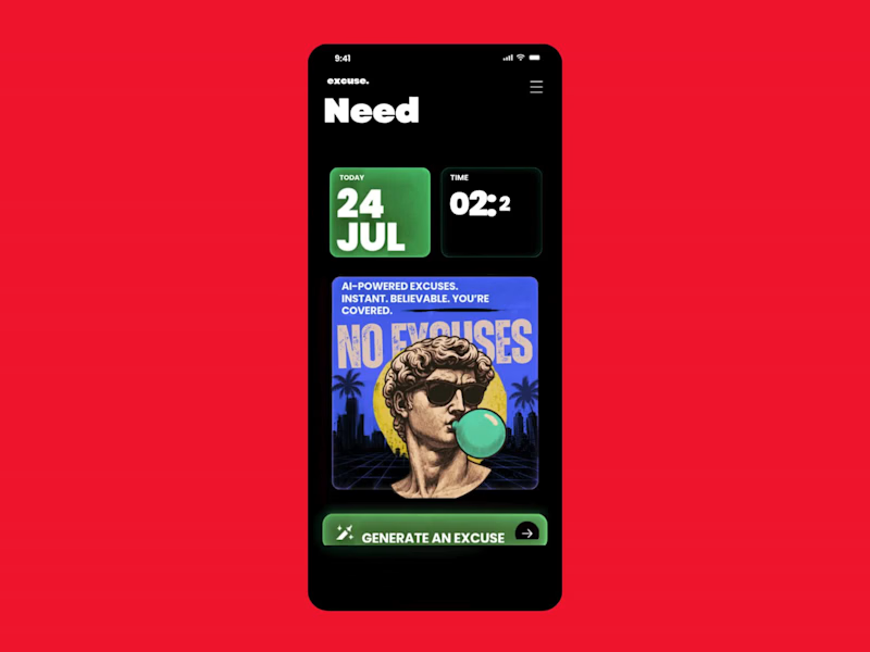
Monday Survival Kit: AI Excuse Generator We've all had that Monday morning where getting out of bed feels like the hardest task of the week. This is a fun UI concept for an AI-powered Excuse Generator that creates believable, dramatic, or completely ridiculous excuses in seconds. It's designed as a parody app that doesn't take itself too seriously, while exploring bold typography, playful illustrations, and a retro-inspired visual style. Sometimes the best product ideas aren't built to solve a huge business problem. They're built to make people laugh, start conversations, and remind us that great UX can also entertain. A few favourites: "My motivation is currently buffering." "My alarm resigned this morning." "I'm attending an emergency meeting with my pillow." "My coffee requested a delayed start." Would you download it for Monday mornings?
1
79
4
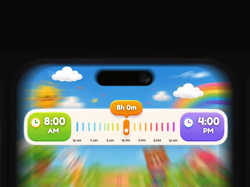
Turning a Boring Time Picker into a Playful Learning Experience for Kids Most time picker widgets are designed for adults. They’re functional, but they don’t encourage exploration or make learning enjoyable. For this concept, I redesigned a standard time selection component into a child-friendly experience using playful illustrations, bright colours, and soft rounded shapes while keeping the interaction clear and intuitive. Every visual element has a purpose, from the colour-coded timeline to the oversized time cards and friendly characters that make scheduling feel less intimidating. The interaction is fully grounded in real-world logic. The timeline accurately represents the selected duration, the labels remain consistent, and the visual hierarchy ensures children can understand the relationship between start time, end time, and total duration at a glance. The accompanying animation focuses on subtle motion rather than decoration. Characters gently bounce, the slider glides smoothly across the timeline, colours transition naturally, and micro-interactions provide feedback without overwhelming young users. This concept demonstrates that educational interfaces don’t have to sacrifice usability for personality. A well-designed UI can be both delightful and functionally accurate. Tools Figma After Effects UI Animation Motion Design
4
125
3
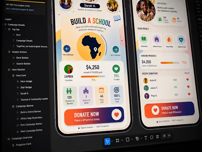
Turning a complex donation journey into a simple, emotional experience. From early wireframes to polished UI, the challenge was balancing storytelling, impact data, trust, and a clear donation action without overwhelming the user. Less noise. Clearer hierarchy. Stronger purpose
3
61
4
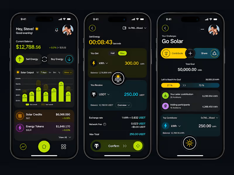
Designing Solar Energy for Every Screen Solar energy data is often complex, technical, and difficult to understand quickly. This concept explores how that information can become simple, visual, and useful across both mobile and Apple Watch. The iPhone experience gives users the complete picture. They can track solar output, monitor energy value, sell or buy energy, manage contributions, and follow sustainability goals. The Apple Watch version focuses only on what matters in the moment. Users can check their balance, view goal progress, monitor performance, and take quick actions without opening the full app. The visual system uses a dark interface with lime, yellow, cyan, purple, and orange accents. Each colour has a purpose, helping users separate energy production, transactions, progress, and community activity without making the interface feel overwhelming. The main UX principle was simple: The phone is for understanding and management. The watch is for awareness and quick action. This creates a connected experience where renewable energy feels less technical, more personal, and easier to engage with every day. #UIDesign #UXDesign #ProductDesign #AppleWatch #WatchOS #MobileAppDesign #SolarEnergy #Sustainability #CleanEnergy #Figma #InteractionDesign
2
4
98
Animator
(2)
Follow
Message
Elisabetta Tuan
Greater London, UK
Creative designer: branding, print, UX/UI, motion & more
Follow
Message
Creative designer: branding, print, UX/UI, motion & more
1
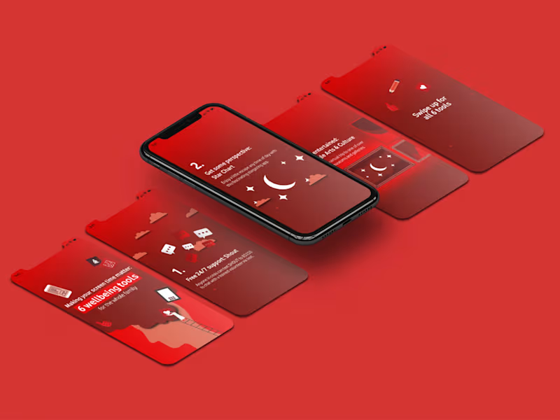
Vodafone Social Media Animation for Mental Health Tools
1
33
0
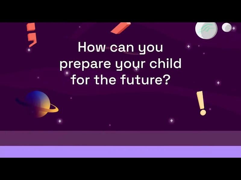
CodeBrave Tutors Explainer Video
0
8
0
Leave Behind - Bill & Melinda Gates Foundation Publiction
0
7
0
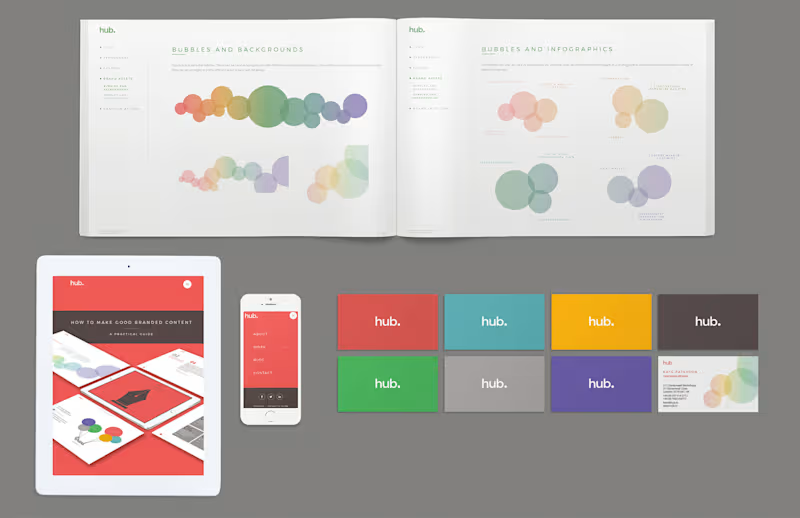
Hub Branding and Web Design Revamp
0
7
Animator
(2)
Follow
Message
Explore people