
Brand Identity & Logo Designer





Product Designer & Framer Developer


UiUX Designer & Motion Graphics Expert for startup
- $1k+
- Earned
- 1x
- Hired
- 5.0
- Rating
- 91
- Followers
UiUX Designer & Motion Graphics Expert for startup

I made a $3 million change to a product website.
I didn't write new copy. I didn't change the colors. I didn't redesign the whole thing.
I just made the product visible.
I was working on a website for a company selling high ticket solar panel fences. The product was impressive. The problem was simple.
Homeowners and contractors were being asked to spend thousands on something they couldn't fully see or understand.
So I used AI to generate an exploded 3D diagram of the fence panel — pulled apart layer by layer. Every component. Every layer. Right there on the page.
Because here's what I've learned about expensive products:
People don't buy what they can't understand.
A contractor needs to see what he's installing before he commits.
2
2
132


A recent project reminded me that high-end design isn't just about "vibes", it’s about mathematical certainty.
I was tasked with translating a complex AI utility into a visual language that a shopper can understand in less than a second. Most brands lean into "mystery" and "hype." I chose precision.
The Challenge:
How do you explain an "AI fitting engine" without using a wall of text?
The Execution:
Reframing the Hook: Swapping "AI recommendations" for "Deterministic Fit." It moves the needle from a guess to a calculation.
The Narrative Hierarchy: Leading with the technical promise (Precision) and following immediately with the human result (Confidence).
Native Identity: Instead of using clinical wireframes, I built a "Styled Checkout" aesthetic. The fit experience should live natively inside the brand’s luxury DNA, not feel like a third-party plugin.
The Takeaway: Design "standards" are often a moving target. But when you ground your work in system logic and clear visual hierarchy, the story tells itself.
#ProductDesign #AIAutomation #UIdesign #VibeCoding #SystemDesign
1
126

Imagine your homepage reacting to your hand movements…That’s exactly what I built
Just wrapped an interactive hero section animation for a client using Three.js
A client wanted a hero section that didn’t just look good but actually responded to the user something futuristic, dynamic, and unforgettable.
So I built a particle based animation that reacts in real time to hand movements using the user’s camera. As you move your hand, the particles shift and flow instantly, creating a smooth, immersive experience from the very first second on the site.
This kind of interaction is perfect for brands that want their landing page to feel alive and truly pull users in especially AI products, Web3 platforms, and creative tech companies.
I’ve attached a video showing how it works.
0
222

Figma UI/UX designer and Web Developer
- $•••••
- Earned
- 2x
- Hired
- 5.0
- Rating
- 9
- Followers
Figma UI/UX designer and Web Developer


Building result-driven websites for Founders & Businesses
- $1k+
- Earned
- 4x
- Hired
- 4.8
- Rating
- 14
- Followers
Building result-driven websites for Founders & Businesses


AI Video Creator for Product Ads, UGC & Brands | Designer
- 5.0
- Rating
- 6
- Followers
AI Video Creator for Product Ads, UGC & Brands | Designer

Spa Website Redesign | WordPress & Elementor
Palm Cove Retreat Day Spa needed a homepage that better reflected the quality of its services and created a stronger first impression for visitors. This project focused on redesigning the homepage to improve clarity, simplify the user journey, and make it easier for potential customers to explore treatments and book appointments.
The original homepage contained multiple competing elements that distracted visitors from the spa's core services. Important information was difficult to scan, the messaging lacked a clear focus, and there was no obvious path for users to book an appointment or explore the spa's treatment packages. The spa also wanted a branded banner with a QR code that customers could scan to access the digital spa menu while visiting the location.
Instead of simply updating the design, I restructured the homepage around the customer journey. The new homepage immediately communicates the spa's value, supported by calming visuals, concise messaging, and clear calls to action for booking appointments and viewing spa packages. To improve the in-store experience, I also designed a branded promotional banner featuring a QR code that links directly to the spa's online menu, allowing customers to browse treatments from their phones.
Key Features
- WordPress Website Redesign
- Elementor Development
- Responsive Website Design
- Homepage UX Redesign
- Clear Calls to Action
- Spa Packages Section
- Appointment Booking Buttons
- QR Code Banner Design
Mobile-Friendly Layout Applied on-page SEO best practices, including optimized page titles, meta descriptions, heading hierarchy, image alt text, and internal linking. The homepage was also structured to improve content readability for both users and search engines. Optimized images, improved page structure, and ensured the redesigned homepage delivers a fast and responsive experience across desktop, tablet, and mobile devices.
Tools Used: WordPress, Elementor, Canva, Rank Math SEO, Google Analytics 4, Microsoft Clarity, LiteSpeed Cache.
The redesigned homepage gives Palm Cove Retreat Day Spa a cleaner and more professional online presence that better reflects its brand. Visitors can quickly understand the spa's services, navigate to treatment packages, and book appointments with confidence. The addition of the QR code banner also connects the spa's physical location with its digital experience, making it easier for customers to access the online menu from anywhere.
0
126

Website Redesign for a Professional Cleaning Company
This project focused on redesigning a cleaning company's WordPress website to better reflect its brand and make it easier for visitors to understand its services. The redesign improved the website's structure, user experience, and overall presentation while creating a clearer path for customer enquiries.
The existing website didn't accurately represent the company's professionalism or the full range of services it offers. Core services such as residential cleaning, deep cleaning, commercial cleaning, and fumigation were scattered across the website, making it difficult for visitors to quickly understand what the business specializes in. Other services, including real estate and agro solutions, also needed to be presented in a more organized way.
Rather than simply refreshing the design, I restructured the website around the company's primary services and improved the content hierarchy. Dedicated sections were created for each core service, navigation was simplified, and clear calls to action were added throughout the website to encourage visitors to request a quote or make an enquiry. I implemented on-page SEO best practices, including optimized page titles, meta descriptions, heading hierarchy, image alt text, and internal linking. The new site structure also makes it easier for search engines to understand the company's services.
Key Features:
WordPress Website Redesign
Responsive Website Design
Improved Service Structure
Dedicated Service Pages
Clear Calls to Action
Contact & Quote Request Forms
Mobile-Friendly Design
Improved Navigation
Tools Used: WordPress, Elementor, Rank Math SEO, Google Analytics 4, Microsoft Clarity, LiteSpeed Cache.
The redesigned website now presents the company's cleaning services in a clear and professional way while giving supporting services their own place within the site. Visitors can quickly understand what the business offers, navigate the website with ease, and take action through strategically placed enquiry forms and calls to action.
0
202

Figma to WordPress Website for a Dental Clinic
A dental clinic's website is often a patient's first impression of the practice. This project involved converting a custom Figma design into a fully responsive WordPress website that presents the clinic professionally, makes information easy to find, and encourages visitors to book an appointment.
The objective wasn't simply to recreate a design. The website needed to maintain the visual consistency of the original Figma mockup while delivering a smooth experience across all devices. Patients should be able to learn about treatments, find contact information, and navigate the website without confusion.
I transformed the approved Figma design into a fully functional WordPress website using Elementor, paying close attention to layout, spacing, typography, and responsiveness. The pages were structured to highlight the clinic's services, create a clear user journey, and make appointment booking more accessible. The website was built with on-page SEO best practices, including optimized page titles, meta descriptions, heading structure, image alt text, and internal linking to support better search engine visibility. Images were optimized for faster loading, unnecessary assets were minimized, and the website was tested to provide a consistent experience across desktop, tablet, and mobile devices.
Key Features:
Figma to WordPress Development
Responsive Website Design
Dental Service Pages
Appointment Call-to-Action
Contact Form
Mobile-Friendly Layout
Clean Navigation
Custom Elementor Build
Tools Used: WordPress, Elementor, Figma, Rank Math SEO, Google Analytics 4, LiteSpeed Cache.
The completed website accurately reflects the original Figma design while giving the dental clinic a professional online presence that builds trust with prospective patients. The responsive layout, intuitive navigation, and optimized structure create a better experience for visitors and provide a solid foundation for future online growth.
0
176

SEO-Focused WordPress Website for Cleaning Company
Sabi Cleaners wanted to move beyond relying only on social media and establish a professional online presence that customers could easily find through Google. I designed and developed a WordPress website, optimized it for search engines, created the company's Google Business Profile, and connected the website to Google Search Console and Google Analytics 4 to support long-term growth.
Sabi Cleaners had an online presence through social media, potential customers had no central place to learn about the company's services or request a quote. The business also lacked visibility in local search results, making it harder for people searching for cleaning services to discover the company.
I created a responsive WordPress website that clearly presents the company's residential, commercial, post-construction, and facility maintenance services. Alongside the website, I set up and optimized the company's Google Business Profile to improve its visibility in Google Search and Google Maps. I also connected the website to Google Search Console and Google Analytics 4, giving the business valuable insights into website performance and visitor activity.
Key Features:
WordPress Website Design
Responsive Website Design
Dedicated Service Pages
Quote Request Form
Contact Page
FAQ Section
Google Business Profile Setup & Optimization
Google Search Console Integration
Google Analytics 4 Integration
Mobile-Friendly Design
I implemented on-page SEO best practices using Rank Math SEO, including keyword optimization, meta titles and descriptions, heading hierarchy, image alt text, internal linking, and XML sitemap submission through Google Search Console. The Google Business Profile was optimized to strengthen the company's Local SEO and improve its visibility in local search results. Optimized images, enabled caching with LiteSpeed Cache, improved page loading speed, and ensured the website performs smoothly across desktop, tablet, and mobile devices.
Tools Used: WordPress, Elementor, Rank Math SEO, Google Business Profile, Google Search Console, Google Analytics 4, Microsoft Clarity, LiteSpeed Cache.
Sabi Cleaners now has a professional website that complements its social media presence and gives potential customers a trusted place to explore services, request quotes, and contact the business. With Local SEO, a Google Business Profile, and analytics in place, the business has a stronger foundation for improving its visibility on Google and growing its online presence.
0
165


Graphic Designer and Video Editor building modern visuals

Luxury Concierge Website.
To make a digital interface that shows how great the service is at a high-end concierge. The goal was to make it feel like a "digital private club" that would appeal to wealthy people.
The Approach
Minimalist Elegance: A "less is more" UI that makes things feel more exclusive.
Lifestyle-First Imagery: Put high-quality images that sell the experience, not just the service, at the top of the list.
Seamless UX: Made it easy for clients who value their time above all else to get around.
1
125
Project Summary
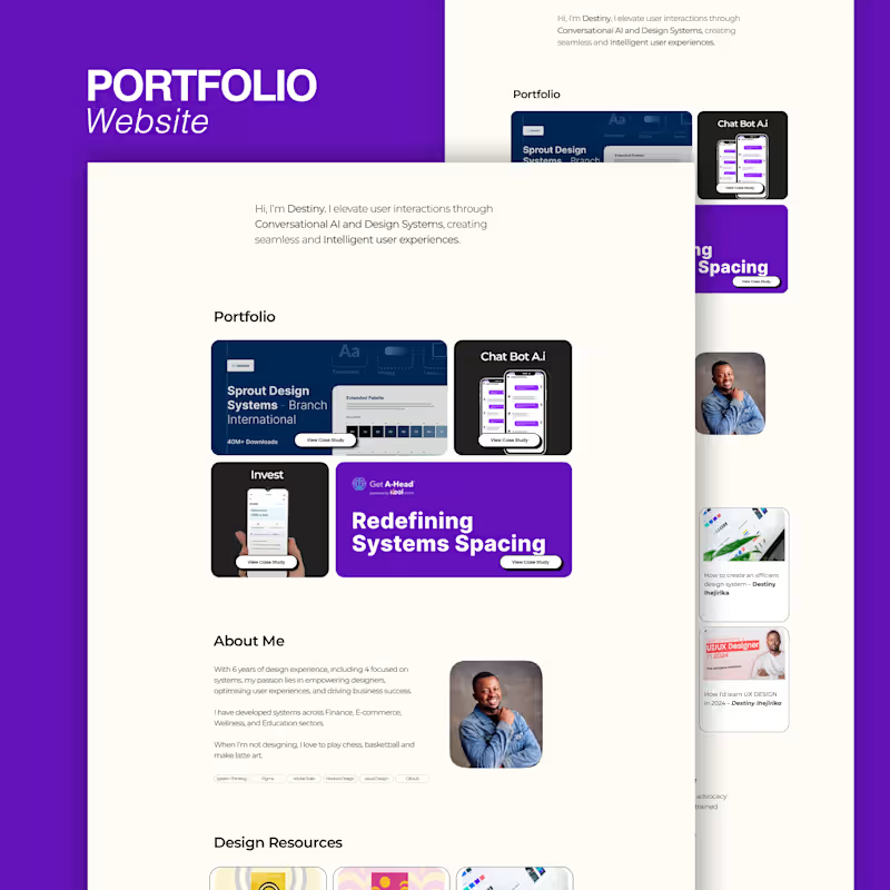
A Senior Product Designer hired me to make and build a digital portfolio for them. The goal was to make a "digital gallery" that looked and felt high-end and invisible. This way, the client's complicated UX case studies and UI prototypes could be the main focus without any visual distractions.
Key Features
Interactive Case Study Templates: Modular sections for "Problem," "Process," and "Solution."
Light Mode Strategy: A refined color palette that supports high-contrast accessibility.
High-Speed Performance: Optimized all image assets and prototypes for near-instant load times.
0
130
Project Title: Hospitality Platform: Goldplates Feast house
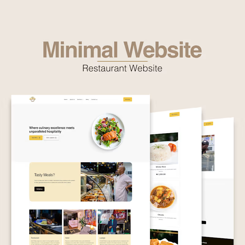
The Goal: To create a unified digital home that balanced their culinary excellence with their luxury accommodations. The challenge was to create a seamless user journey where guests could browse the menu, explore different locations, and learn about the hotel offerings without feeling overwhelmed.
The Approach
Unified Brand Identity: Developed a design system that works for both high-energy dining and calm, luxury lodging.
Interactive Menu Catalog: Built a visually-driven food catalog designed to drive "appetite appeal" through high-resolution imagery and intuitive categorisation.
2
190

For a sustainable energy company, I filmed and edited this piece.
The advertisement's vision board showcased a portable power station and its ease of use, suggesting that even the youngest consumers could use it in the event of a power loss with the push of a button.
The goal of this campaign was to demystify sustainable energy. Portable power stations can often feel like complex "tech gear," but the objective here was to show that this product is a seamless addition to any home. We centered the narrative around extreme user-friendliness—proving that the interface is so intuitive, even a child can navigate it safely and effectively.
0
85


Framer Sites + AI Automations for Small Businesses


