Fintech website (Firefly)
Project overview
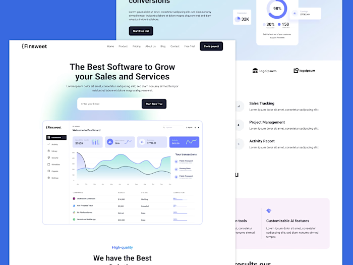
Firefly is a groundbreaking fintech company that helps users set financial goals, track expenses, and earn more, all in one easy-to-use app. My goal was to create a modern, user-friendly platform that simplifies financial management while offering a visually stunning experience.
Approach
I focused on keeping things simple, elegant, and functional, aligning with the core values of the Fintech industry. My aim was to design a landing page that not only reflects Firefly's vision but also provides a seamless journey for users.
Design Process (Figma)
Inspiration: I drew inspiration from modern finance and design trends, crafting a visual identity that resonates with Firefly's innovative spirit.
Sketches & Concepts: I sketched various layouts and ideas, refining them to ensure they capture Firefly's brand identity and appeal to its target audience.
Digital Prototyping: Using Figma, I turned my sketches into digital prototypes, refining every detail to optimize the user experience.
Feedback & Refinement: I collaborated closely with the Firefly team, incorporating their feedback to ensure the design aligns perfectly with their vision and goals.
Development Process (Webflow)
Development: With the design finalized, I brought it to life using Webflow's powerful development tools, ensuring seamless functionality and responsiveness across all devices.
Crafting Interactions: I added animations and navigation elements to enhance user engagement and create a memorable browsing experience.
Easy Content Management: Leveraging Webflow's Content Management System (CMS), I provided Firefly with a simple and intuitive platform to manage and update content effortlessly.
Testing & Tweaking: Before launch, I conducted rigorous testing to identify and resolve any potential issues, optimizing the landing page for performance and user satisfaction.
Design

Live website
Results
The redesigned landing page attracted a 30% surge in traffic, showcasing its enhanced appeal and effectiveness in drawing in users.
With improved navigation and engaging content, I achieved a 20% reduction in bounce rate, indicating higher user retention and engagement.
The revamped landing page generated a 25% increase in new business inquiries, demonstrating its effectiveness in converting visitors into potential clients.
Like this project
Posted Apr 19, 2024
My goal was to create a modern, user-friendly platform that simplifies financial management while offering a visually stunning experience.


