SaaS website(Finsweet)
Project overview
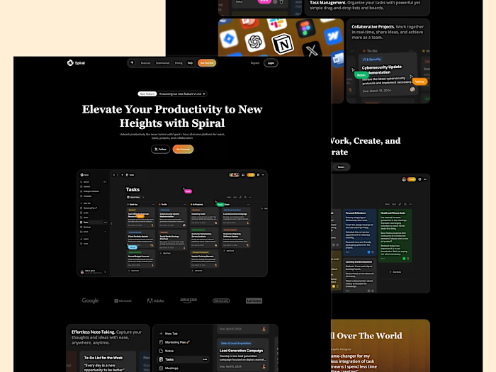
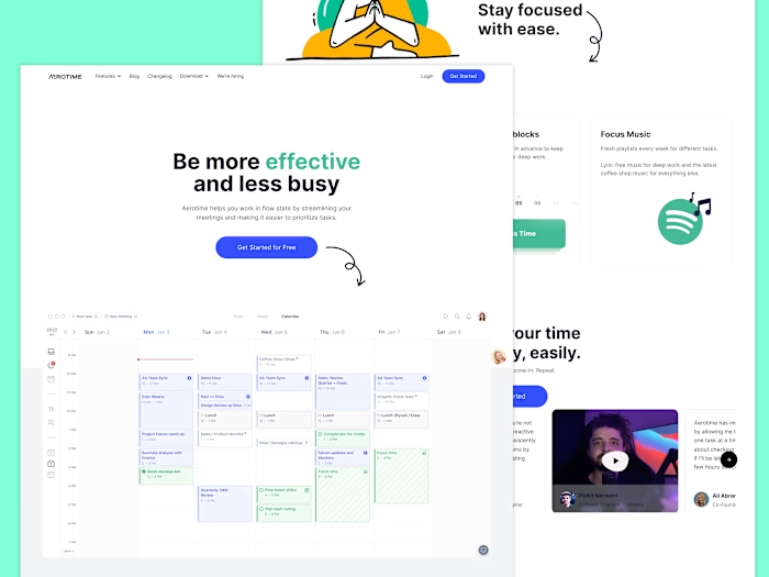
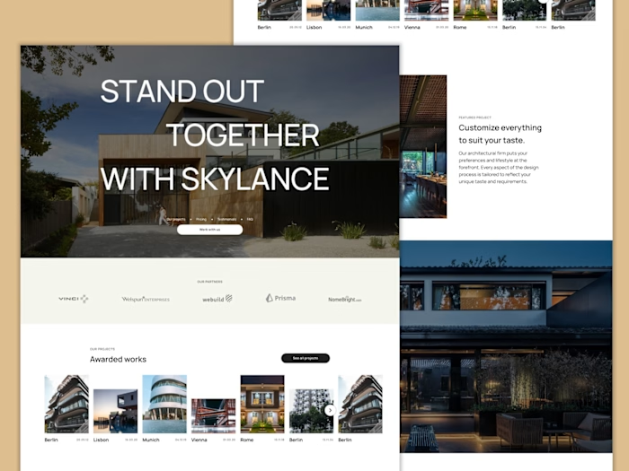
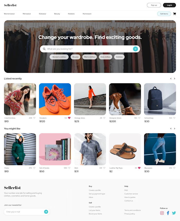
Finsweet is a SaaS company designed to empower companies to enhance their sales and services through innovative software solutions. Our aim was to develop a compelling landing page that not only showcases the capabilities of Finsweet's software but also provides a seamless user experience to visitors, ultimately driving growth for our clients.
Approach
I approached the project with a focus on simplicity, elegance, and functionality, aligning with Finsweet's values and objectives. Our goal was to create a modern and visually captivating landing page that effectively communicates Finsweet's brand identity and value proposition.
Design Process (Figma)
Inspiration: I drew inspiration from industry trends and design philosophies, incorporating elements from the software and technology sectors to shape the visual aesthetics of the landing page.
Sketches & Concepts: Through iterative sketching and conceptualization, I developed various layouts and styles, refining them to resonate with Finsweet's brand identity.
Digital Prototyping: Leveraging Figma, I transformed my sketches into digital prototypes, meticulously refining details to ensure a seamless user experience and alignment with Finsweet's objectives.
Feedback & Refinement: Collaborating closely with the Finsweet team, I incorporated their feedback iteratively, refining the design to perfection and ensuring it accurately represents Finsweet's vision.
Development Process (Webflow)
Development: With the finalized design as the blueprint, the development phase commenced using Webflow's powerful tools to bring the vision to life.
Crafting Interactions: I implemented animations and navigation elements strategically to enhance user engagement and interaction, enriching the overall browsing experience.
Easy Content Management: Leveraging Webflow's CMS capabilities, I ensured that Finsweet has seamless control over updating content, projects, and blogs, empowering them to keep the landing page dynamic and up-to-date.
Testing & Tweaking: Prior to launch, I conducted rigorous testing to identify and address any potential issues, optimizing the landing page for performance and ensuring a flawless user experience.
Design

Live website
Results
A 30% increase in website visits, indicating improved traction and visibility.
A 20% decrease in bounce rate, demonstrating enhanced user engagement and retention.
A 25% rise in new business inquiries compared to industry averages, highlighting the effectiveness of the landing page in driving conversions and generating leads.
Like this project
Posted Apr 19, 2024
My aim was to develop a compelling landing page that not only showcases the capabilities of Finsweet's software but also provides a seamless user experience.


