Freelancers using Adobe Illustrator in Dhaka Division
Sign Up
Post a job
Sign Up
Log In
Filters
2
Projects
People
Zerin Zaker
pro
Dhaka, Bangladesh
Brand & Motion Designer | AI Video, Visual Identity, UI/UX
$5k+
Earned
14x
Hired
4.7
Rating
335
Followers
expert
Expert
+1
Follow
Message
Brand & Motion Designer | AI Video, Visual Identity, UI/UX
1
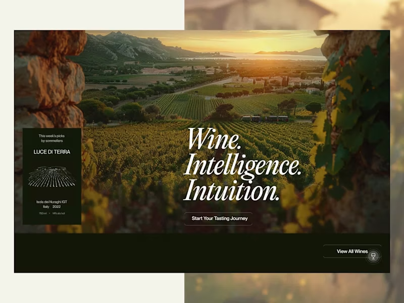
AI-Powered Wine Website Design - VineWinner
1
8
0
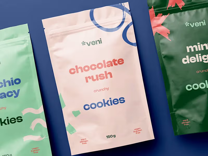
Veni Brand Design for Food Delivery
0
5
3
Maré Viva - Visual Identity
3
60
2
Harvest Hands Collective Brand Identity
2
16
Adobe Illustrator
(9)
Follow
Message
Jerin Nusrat
pro
Dhaka, Bangladesh
Brand Identity & Framer Designer for Brands & Businesses
$1k+
Earned
5x
Hired
5.0
Rating
256
Followers
expert
expert
+1
Follow
Message
Brand Identity & Framer Designer for Brands & Businesses
2
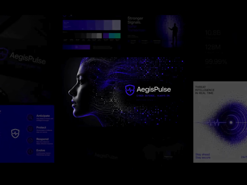
AegisPulse Brand Identity Development
2
2
2
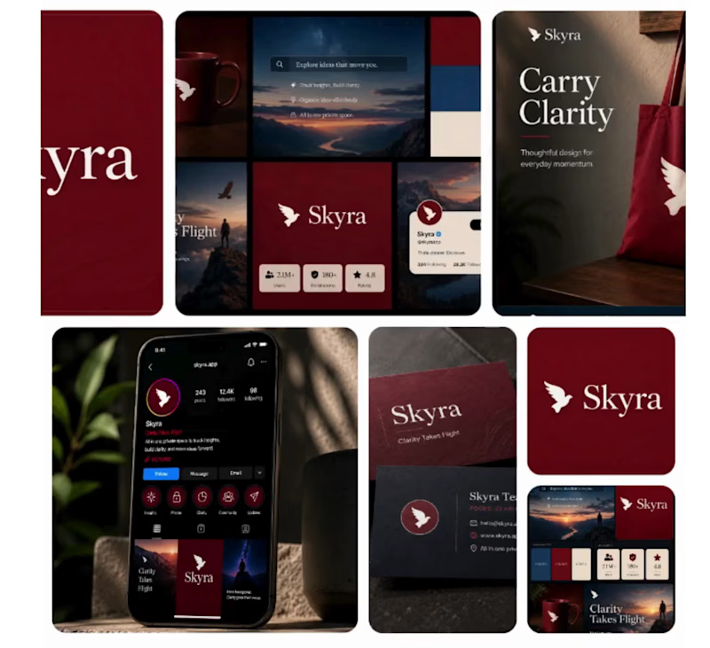
Brand Identity & Visual Direction for Skyra
2
9
5
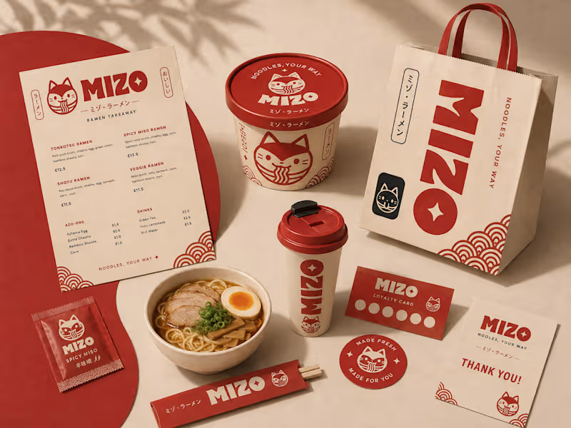
MIZO Ramen Takeaway Brand Identity & Packaging Design
5
12
3
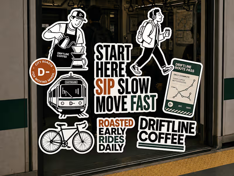
Driftline Coffee Branding and Packaging Project
3
13
Adobe Illustrator
(20)
Follow
Message
Orbix Studio
max
Dhaka, Bangladesh
UX-led product design & dev agency for b2b saas and AI
$25k+
Earned
169
Followers
expert
Follow
Message
UX-led product design & dev agency for b2b saas and AI
0
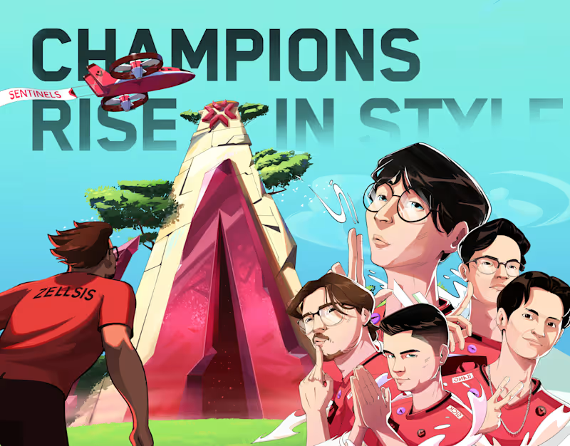
Valorant ChampionsCup | Orbix Studio | Illustration
0
11
4
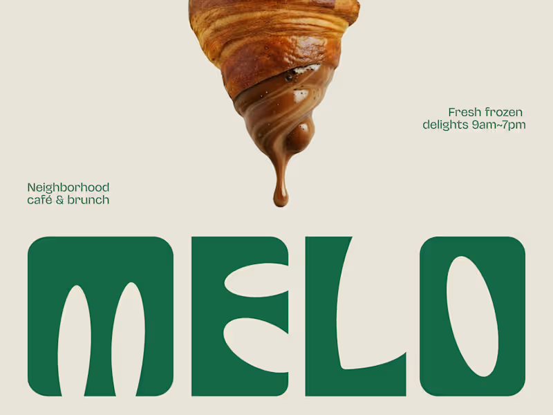
The best café brands don't introduce themselves. They just feel familiar from day one. Most neighborhood café brands hide behind generic coffee cup icons, overused script fonts, and a color palette that could belong to a yoga studio or a juice bar or literally anything else. The logo promises character. The brand delivers nothing you'd remember by the time you reach the door. Melo made familiarity the whole brief. A custom palm tree emblem encircled in a clean oval, organic, architectural, impossible to mistake for anything else. Deep forest green across three environments: cream, burnt green, and dark olive, each one feeling as considered as the last. A rounded wordmark so confident it can fill an entire poster at display scale and still feel warm rather than loud. And right there on the campaign visual, a caramel-dripping croissant melted into the letterforms, like the food and the brand were always the same thing. That's not just a logo system. That's a place people recognize before they even read the name. Because a neighborhood spot that earns a place in someone's morning deserves a brand that feels just as inevitable. What makes a café logo feel like it actually belongs to a place? 👇
2
4
403
0
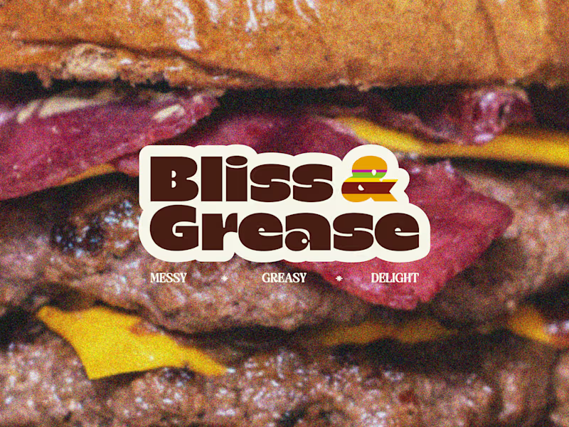
Some brands try to look appetizing. Bliss & Grease decided to look exactly like what it is. Most burger joints hide behind polished food photography, clean white packaging, and a brand voice that pretends eating a double cheeseburger is somehow a refined experience. The menu promises indulgence. The brand delivers corporately. Bliss & Grease built the honesty into the name itself. Chunky retro wordmark with enough swagger to fill a wall. Deep chocolate brown, warm cream, and a rainbow-striped burger icon that nods to the 70s without getting lost in nostalgia. Grainy film-textured photography that makes the meat look exactly as messy and magnificent as it actually is. And right there under the logo, in three words: Messy. Greasy. Delight. That's not just a brand line. That's a permission slip for everyone who stopped apologizing for what they actually want to eat. The sticker-style logotype treatment, grain overlay, and macro burger photography turn a brand identity into something that feels like it belongs on a late-night food truck and a vintage concert poster at the same time. Because a burger that owns every greasy, glorious bite deserves a brand with exactly the same energy. What's the most honest thing a food brand has ever said about its own product? 👇
0
378
0
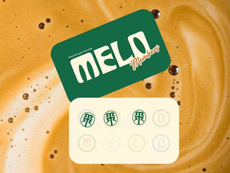
Every cafe looks the same these days. Melo decided that was everyone else's problem. Most neighborhood cafes hide behind kraft paper textures, overused coffee bean icons, and a logo that could belong to any shop on any street in any city. The vibe promises warmth. The brand delivers nothing memorable. Melo built the personality into every single touchpoint. Bold rounded wordmark with enough character to own a takeaway cup at arm's length. Deep forest green paired with warm cream is grounded, inviting, and unmistakably its own. A hand-drawn palm tree emblem that feels like a neighborhood landmark rather than a corporate asset. And right there on the loyalty card, in plain sight, is "Finish all to get a free meal." That's not just a punch card. That's a reason to come back eight times. The scallop-edged stamp system, script members' lettering, and floating cup mockup turn everyday cafe collateral into something people actually want to hold onto, photograph, collect, and show their friends. Because a neighborhood cafe that feels like a second home deserves a brand that feels just as warm. What's the cafe branding detail that makes you choose one spot over another? 👇
0
367
Adobe Illustrator
(20)
Follow
Message
Mehedi Islam
pro
Dhaka, Bangladesh
Branding & Logo Designer | Visual Identity Specialist

$1k+
Earned
1x
Hired
5.0
Rating
31
Followers
Follow
Message
Branding & Logo Designer | Visual Identity Specialist
1
Golden Touch ABA | Brand Identity & Visual System
1
16
0
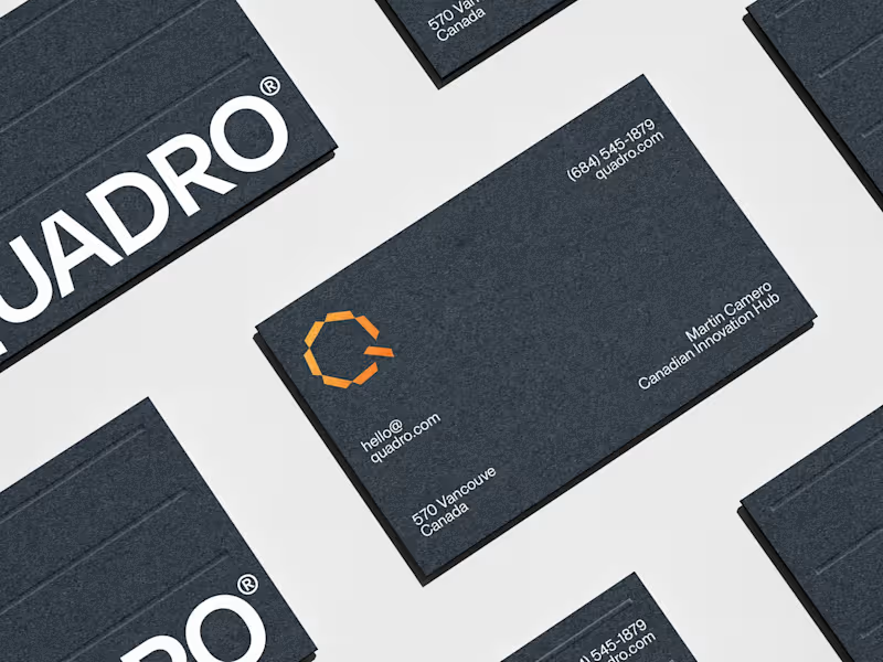
Quadro Solar Solutions
0
8
0
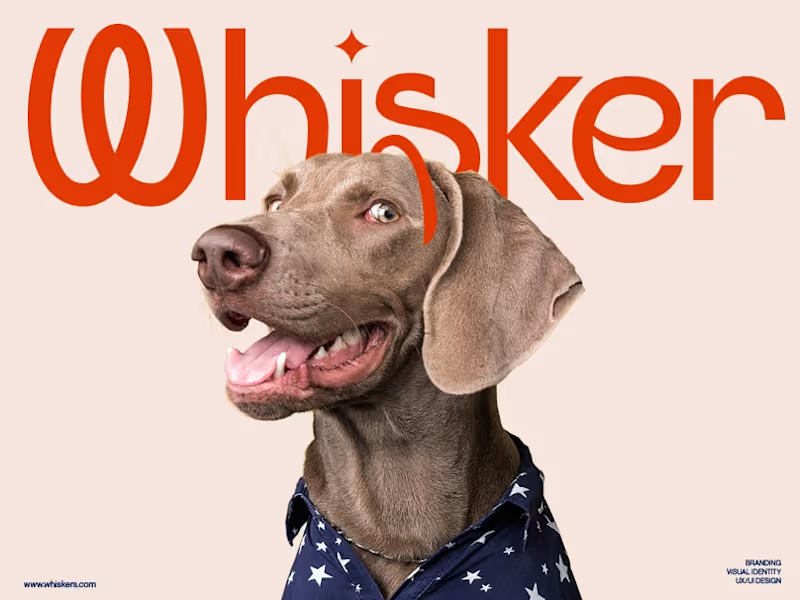
Whisker® | Petcare & Food Branding
0
15
0
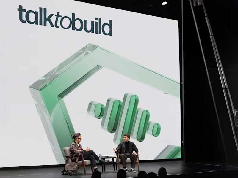
Brand Identity & Website UI Design for Talk to Build
0
16
Adobe Illustrator
(11)
Follow
Message
Mh Thithas
Dhaka, Bangladesh
Delivering Memorable User Experiences for Apps and Websites.
$5k+
Earned
2x
Hired
5.0
Rating
126
Followers
Follow
Message
Delivering Memorable User Experiences for Apps and Websites.
1
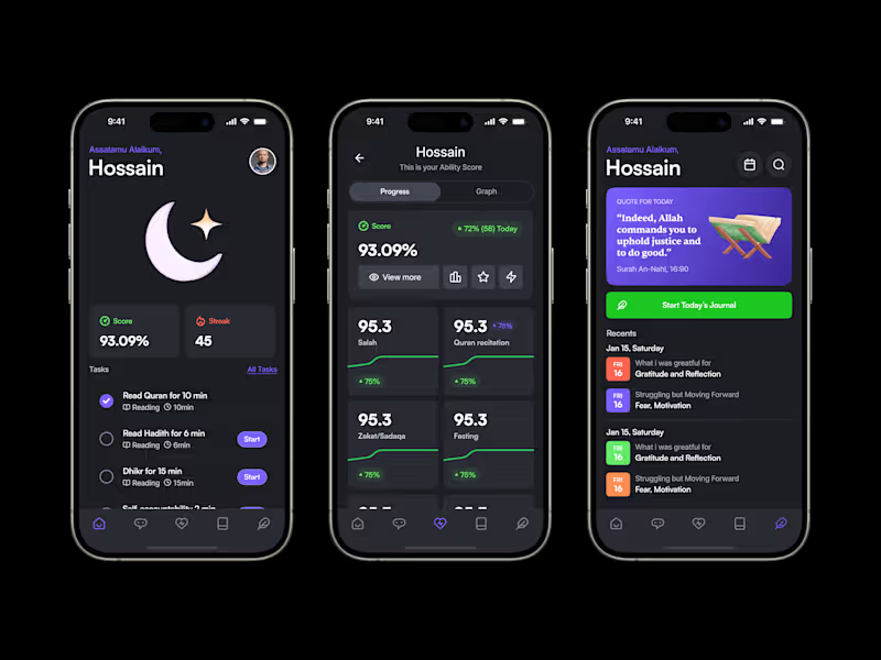
Quran AI – Your Path to Becoming a Better Muslim
1
28
0
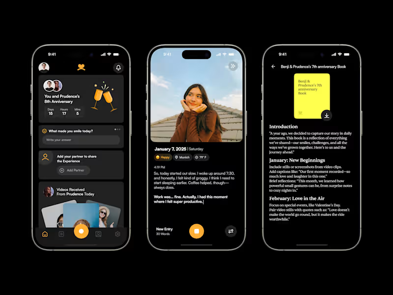
Wrapped togather, relationship-focused digital diary
0
11
0
Supernova Landing Page Design
0
6
0
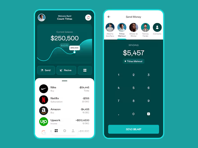
Mobile Banking Application
0
6
Adobe Illustrator
(25)
Follow
Message
MD Rafee Alam
Dhaka, Bangladesh
Product Design | Website Design | Branding | App Design
5.0
Rating
128
Followers
Follow
Message
Product Design | Website Design | Branding | App Design
1
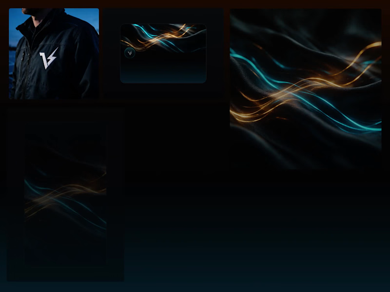
VOLTA — Home Energy OS | Brand Identity A bold visual identity and digital product experience for VOLTA, a home energy platform that brings solar, battery, grid, and energy usage into one simple view. I designed a futuristic brand system and product experience focused on making complex energy data feel clear, intuitive, and visually engaging. The visual direction combines deep blacks, luminous gradients, glass-like UI surfaces, and energetic accent colors to create a premium technology aesthetic. The identity was extended across the mobile app, digital touch points, product visuals, and brand applications for a consistent experience. Explore Full Project Here: https://contra.com/p/qrrrXMFl-volta-home-energy-os-ui-ux-design-or-mobile-app-design?referralExperimentNid=DEFAULT_REFERRAL_PROGRAM&referrerUsername=rafee_alam_coruscatingart
1
60
2
Kurogane Gaming Landing Page | Brand Identity
2
6
3
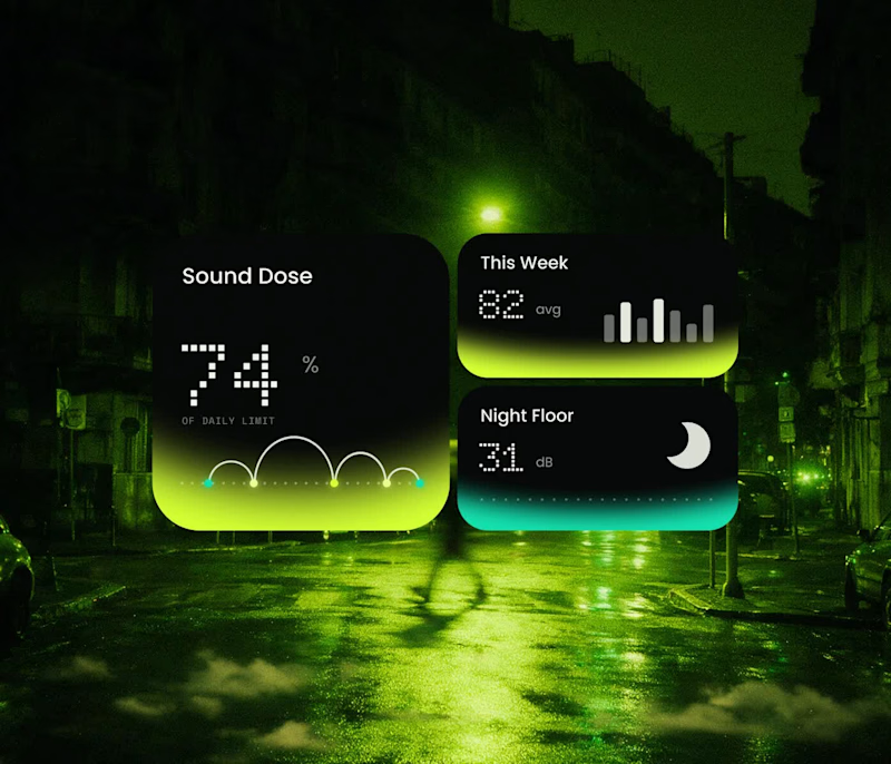
Hearing Health Mobile App UI UX Design | Brand Identity
3
6
1
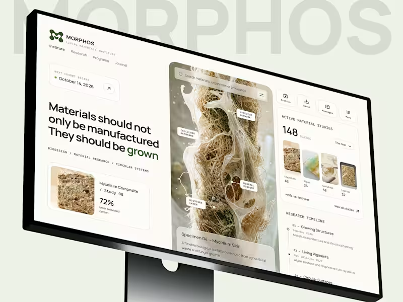
Biomaterials Research Platform UI UX Design | Landing Page
1
3
Adobe Illustrator
(15)
Follow
Message
Mir Ashfaque
pro
Dhaka, Bangladesh
UI/UX Designer | SaaS Dashboards, Web & Mobile Apps

5.0
Rating
149
Followers
Follow
Message
UI/UX Designer | SaaS Dashboards, Web & Mobile Apps
0
Educare- E- Learning Platform UIUX Design
0
6
0
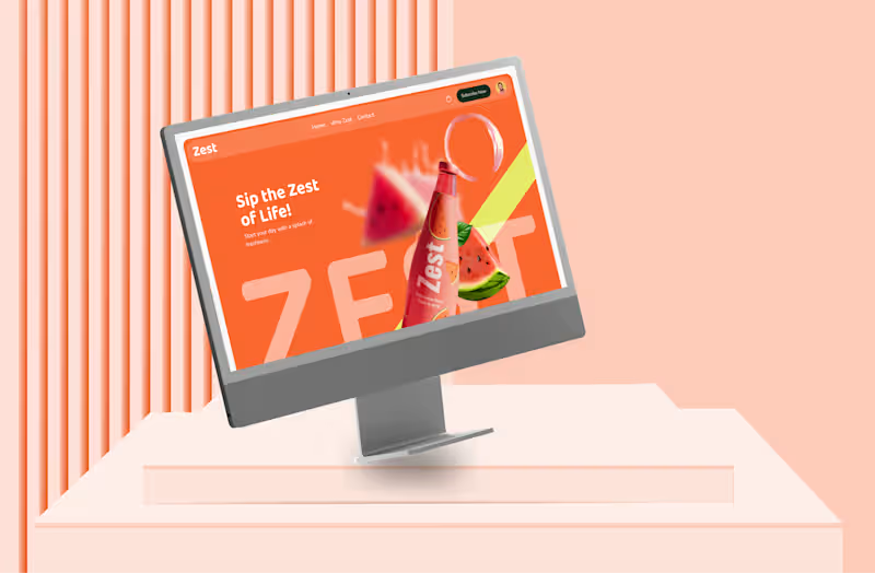
Zest | A D2C Juice Subscription Experience
0
10
2
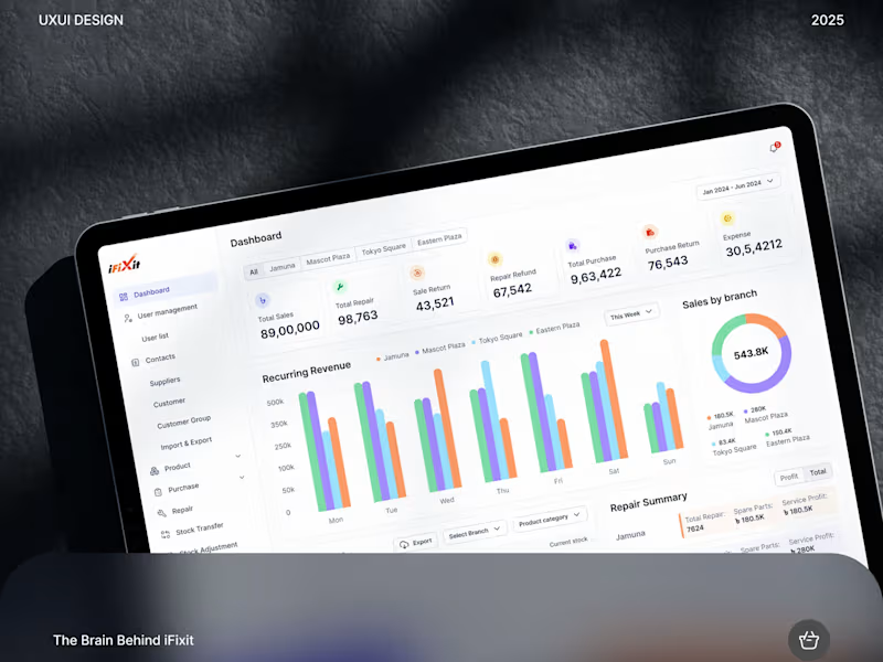
iFixit Centralized Admin Panel Design | SaaS Dashboard
2
13
0
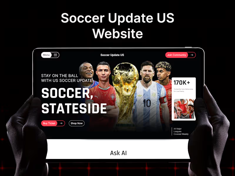
Soccer Update US - UIUX Design
0
5
Adobe Illustrator
(3)
Follow
Message
Taqwah - SaaS Product Design
pro
Dhaka, Bangladesh
Only 3 Slots Left - Get 30% Off Your First SaaS Project.
61
Followers
Follow
Message
Only 3 Slots Left - Get 30% Off Your First SaaS Project.
4
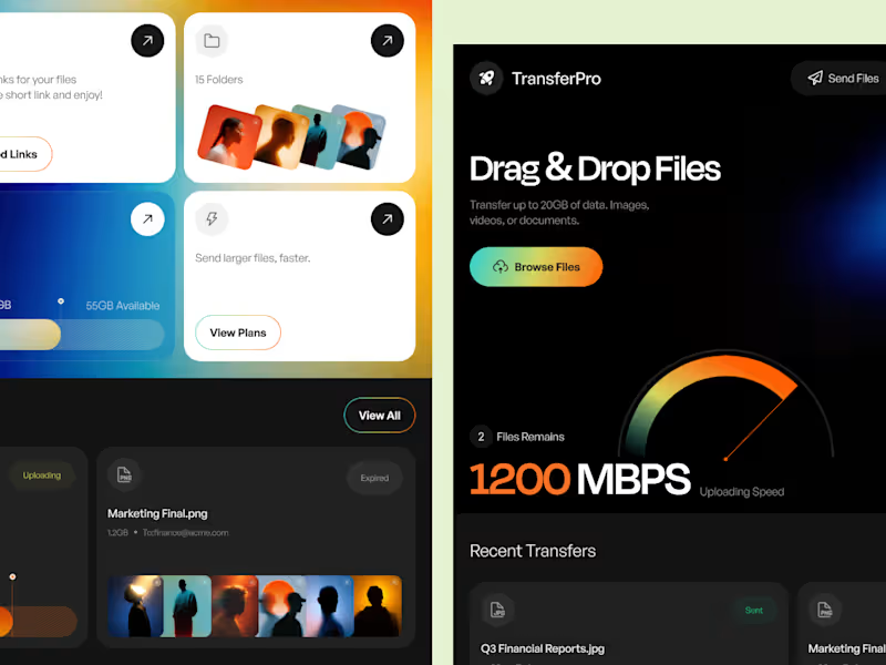
TransferPro - A High-Speed File Transfer SaaS Experience TransferPro explores how a complex file-management product can feel fast, focused, and visually refined. The concept combines large-file transfers, cloud storage, shared links, folder organization, and recent activity inside one centralized SaaS workspace. From the 1200 Mbps performance visualization to the bento-style feature cards, every section was designed to reinforce the product's core promise: speed without unnecessary complexity. The visual language uses a dark foundation with energetic gradients to create a futuristic cloud-tech aesthetic while maintaining a clear information hierarchy. For SaaS products, good UI isn't just about making the interface look modern. It's about making complex workflows easier to understand, faster to navigate, and easier to scale. Building a SaaS product that needs a stronger UX or a complete UI redesign? Let's collaborate. Taqwah specializes in SaaS UI/UX, dashboard design, design systems, and product interfaces built around real user and business needs. 🌐 taqwah.agency (http://taqwah.agency) | 📩 hello@taqwah.agency (mailto:hello@taqwah.agency)
2
4
110
15
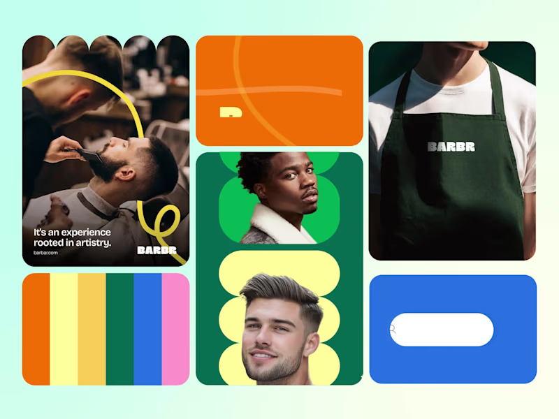
Your Brand Is Speaking Before You Do Customers form an opinion about your business before they ever experience your product or service. That opinion is shaped by your brand. Not just the logo. Not just the colours. The entire identity. Barbr Bento Motion was created to explore how a complete branding system can shape that perception through consistency, structure, and purposeful motion. Instead of presenting individual assets, we focused on revealing how every piece of the identity - from typography and colour to brand applications and supporting graphics - works together to communicate one clear message: Professional businesses build professional brands. Because the strongest brands don't simply look premium. They make customers feel confident enough to choose them. If your visual identity isn't communicating your business's value, it may already be costing you opportunities before the first conversation begins. Looking for a brand identity that helps your business earn trust, attract better customers, and stand out in a crowded market? Let's build a brand that works as hard as you do. 🌐 taqwah.agency (http://taqwah.agency) | 📩 hello@taqwah.agency (mailto:hello@taqwah.agency)
13
15
568
7
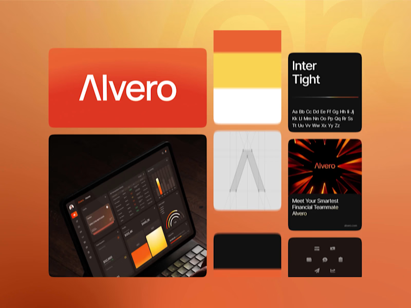
Most SaaS products invest in interfaces. The strongest ones invest in identity. Alvero Bento Motion explores how branding, motion, typography, and modular layouts can work together to create a memorable finance SaaS experience. Rather than relying on flashy animation, every movement is designed to reinforce recognition, communicate trust, and express the brand's personality. Because motion isn't just decoration. It's part of the brand. If you're building a SaaS product and want a visual identity that users remember - not just another interface - we'd love to collaborate. Let's create branding and motion systems that move your product forward. 🌐 taqwah.agency (http://taqwah.agency) | 📩 hello@taqwah.agency (mailto:hello@taqwah.agency)
1
7
305
5
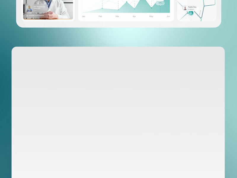
Purposeful motion turns healthcare workflows into experiences users instantly understand. Nurein Dashboard Motion transforms a complex telemedicine workflow into an experience that's calm, intuitive, and easy to understand. Highlights include: • Appointment scheduling • Treatment plan tracking • Health monitoring • Pharmacy access • Medical reports • Purposeful UI animation Every transition is designed to communicate, not decorate. If you're building a healthcare platform, SaaS dashboard, or digital product, we help transform complex workflows into experiences users actually enjoy. Let's create a product that moves with purpose. 🌐 taqwah.agency (http://taqwah.agency) | 📩 hello@taqwah.agency (mailto:hello@taqwah.agency)
2
5
220
Adobe Illustrator
(25)
Follow
Message
Explore people