Freelance Visual Designers in Dhaka Division
Sign Up
Post a job
Sign Up
Log In
Filters
2
Projects
People
Zerin Zaker
pro
Dhaka, Bangladesh
Brand & Motion Designer | AI Video, Visual Identity, UI/UX
$5k+
Earned
13x
Hired
4.6
Rating
329
Followers
expert
Expert
+1
Follow
Message
Brand & Motion Designer | AI Video, Visual Identity, UI/UX
3
Maré Viva - Visual Identity
3
20
1
Kukie Brand Identity Design
1
17
1
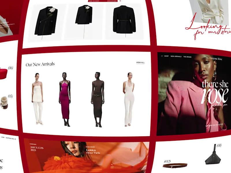
Vivienne Rosé E-commerce Website Design
1
6
1
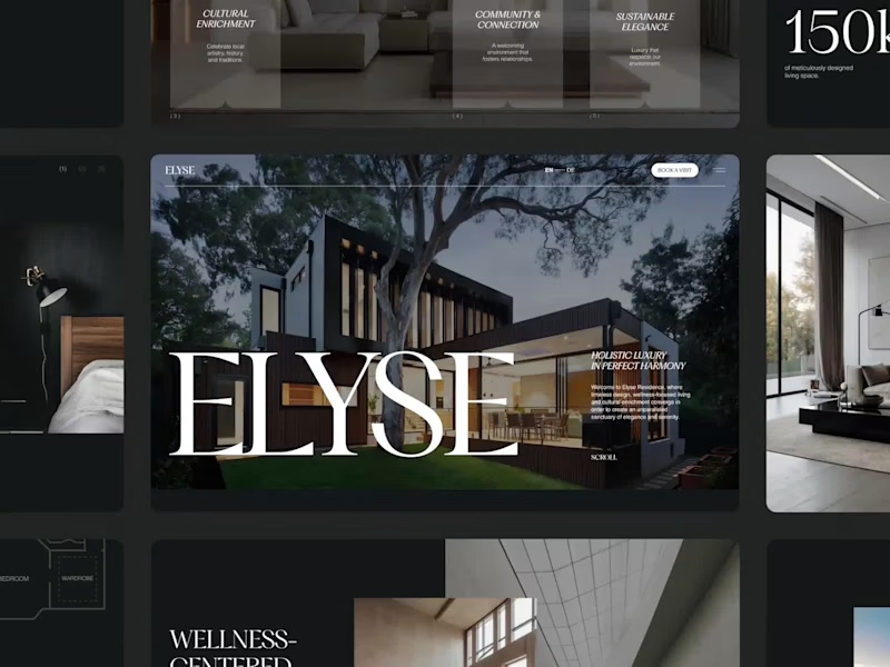
Elyse Residence Luxury Real Estate Website Design
1
8
Visual Designer
(2)
Follow
Message
Omayer Zishan
pro
Dhaka, Bangladesh
Providing Solutions, Not Just Skills| Award-Winning Designer
4x
Hired
5.0
Rating
415
Followers
Expert
Expert
+2
Follow
Message
Providing Solutions, Not Just Skills| Award-Winning Designer
11
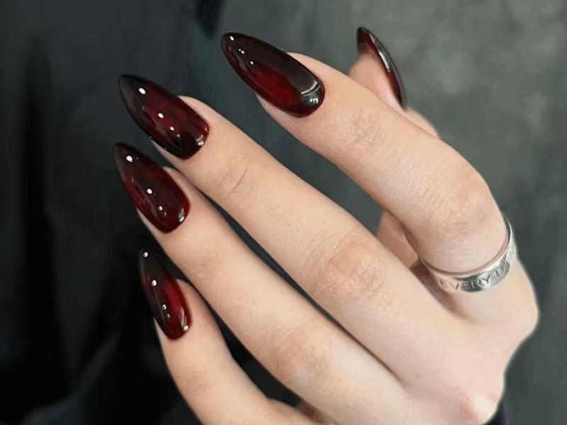
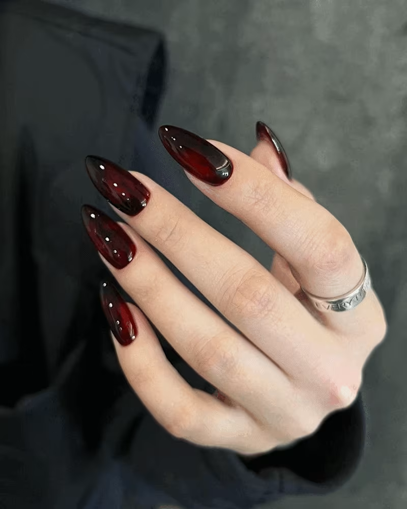
I just wrapped up an exciting conceptual project – 'Nailed It' – and it’s now live! 😊 It’s a nail studio with a goth twist, blending dark vibes with luxury nail art. I’m absolutely in love with how it turned out! Make sure to check out the project and share your thoughts in the comments! 🖤 Check it out here! (https://contra.com/p/7MbLZk3U-nailed-it-goth-inspired-brand-identity-for-a-nail-studio?r=omayer_zishan_ec59qqw0)
9
11
812
4
Nailed It: Goth Inspired Brand Identity for a Nail Studio
4
30
4
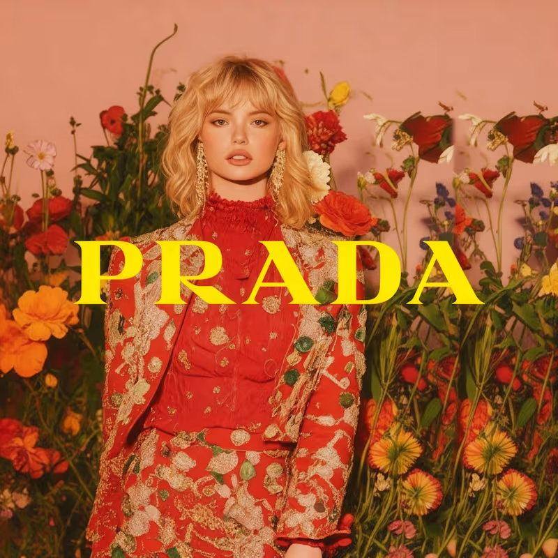
Prada x AI: Spring 2026 Campaign Concept
4
323
7
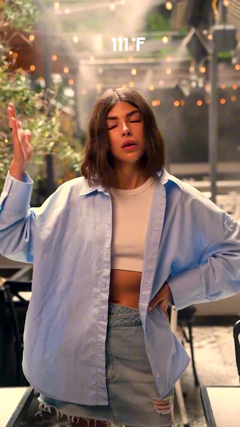
Recently worked on two video ads for clients – one for PLEZI and another for Konscious Foods. Unfortunately, neither of them quite hit the mark with the clients. But I’d still love to hear what YOU think! Your feedback would be super helpful as I continue refining my work. Check them out below and let me know your thoughts!
6
7
896
Visual Designer
(3)
Follow
Message
Orbix Studio
max
Dhaka, Bangladesh
UX-led product design & dev agency for b2b saas and AI
$25k+
Earned
160
Followers
expert
Follow
Message
UX-led product design & dev agency for b2b saas and AI
4
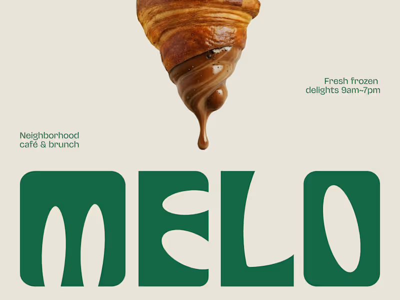
The best café brands don't introduce themselves. They just feel familiar from day one. Most neighborhood café brands hide behind generic coffee cup icons, overused script fonts, and a color palette that could belong to a yoga studio or a juice bar or literally anything else. The logo promises character. The brand delivers nothing you'd remember by the time you reach the door. Melo made familiarity the whole brief. A custom palm tree emblem encircled in a clean oval, organic, architectural, impossible to mistake for anything else. Deep forest green across three environments: cream, burnt green, and dark olive, each one feeling as considered as the last. A rounded wordmark so confident it can fill an entire poster at display scale and still feel warm rather than loud. And right there on the campaign visual, a caramel-dripping croissant melted into the letterforms, like the food and the brand were always the same thing. That's not just a logo system. That's a place people recognize before they even read the name. Because a neighborhood spot that earns a place in someone's morning deserves a brand that feels just as inevitable. What makes a café logo feel like it actually belongs to a place? 👇
2
4
388
0
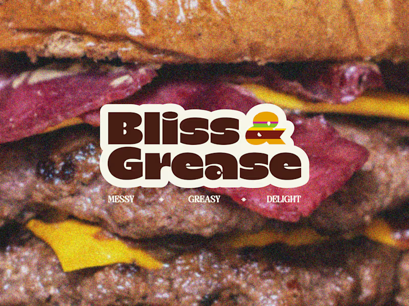
Some brands try to look appetizing. Bliss & Grease decided to look exactly like what it is. Most burger joints hide behind polished food photography, clean white packaging, and a brand voice that pretends eating a double cheeseburger is somehow a refined experience. The menu promises indulgence. The brand delivers corporately. Bliss & Grease built the honesty into the name itself. Chunky retro wordmark with enough swagger to fill a wall. Deep chocolate brown, warm cream, and a rainbow-striped burger icon that nods to the 70s without getting lost in nostalgia. Grainy film-textured photography that makes the meat look exactly as messy and magnificent as it actually is. And right there under the logo, in three words: Messy. Greasy. Delight. That's not just a brand line. That's a permission slip for everyone who stopped apologizing for what they actually want to eat. The sticker-style logotype treatment, grain overlay, and macro burger photography turn a brand identity into something that feels like it belongs on a late-night food truck and a vintage concert poster at the same time. Because a burger that owns every greasy, glorious bite deserves a brand with exactly the same energy. What's the most honest thing a food brand has ever said about its own product? 👇
0
363
0
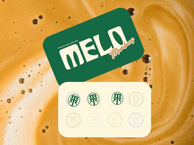
Every cafe looks the same these days. Melo decided that was everyone else's problem. Most neighborhood cafes hide behind kraft paper textures, overused coffee bean icons, and a logo that could belong to any shop on any street in any city. The vibe promises warmth. The brand delivers nothing memorable. Melo built the personality into every single touchpoint. Bold rounded wordmark with enough character to own a takeaway cup at arm's length. Deep forest green paired with warm cream is grounded, inviting, and unmistakably its own. A hand-drawn palm tree emblem that feels like a neighborhood landmark rather than a corporate asset. And right there on the loyalty card, in plain sight, is "Finish all to get a free meal." That's not just a punch card. That's a reason to come back eight times. The scallop-edged stamp system, script members' lettering, and floating cup mockup turn everyday cafe collateral into something people actually want to hold onto, photograph, collect, and show their friends. Because a neighborhood cafe that feels like a second home deserves a brand that feels just as warm. What's the cafe branding detail that makes you choose one spot over another? 👇
0
352
0
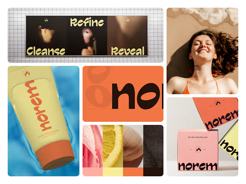
Skincare branding has a confidence problem. Nobody fixed it until Norem did. Most beauty brands hide behind clinical whites, sterile packaging, and ingredient lists that read like a lab report. The bottle promises transformation. The shelf presence delivers nothing. Norem built the confidence into the brand itself. Bold rounded wordmark. A palette that feels sun-kissed rather than synthetic warm terracotta orange, pale butter yellow, or deep espresso brown. Real skin. Real texture. Real ingredients visible in every campaign frame. And right there on every package, in plain sight, is "let skin look like skin." That's not just a tagline. That's the entire brand philosophy in five words. The oversized typography, unapologetic color blocking, and three-word campaign Cleanse. Refine. Reveal. Turn a cleanser tube into a shelf presence that stops people mid-aisle before they even read the label. Because skincare that's actually honest about what it does deserves a brand that's just as honest about who it's for. What's the boldest brand decision you've seen on a beauty product? 👇
0
339
Visual Designer
(22)
Follow
Message
Mehedi Islam
pro
Dhaka, Bangladesh
Branding & Logo Designer | Visual Identity Specialist
$1k+
Earned
1x
Hired
5.0
Rating
30
Followers
Follow
Message
Branding & Logo Designer | Visual Identity Specialist
0
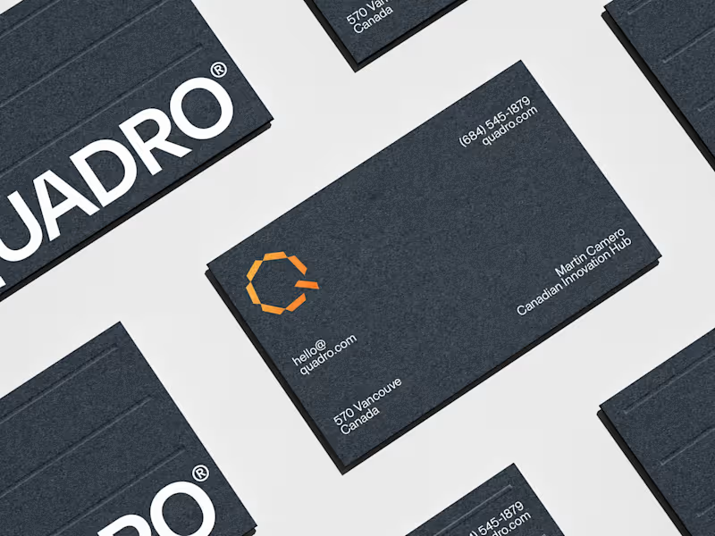
Quadro Solar Solutions
0
5
0
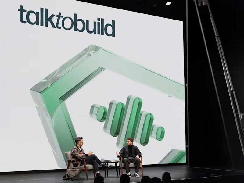
Brand Identity & Website UI Design for Talk to Build
0
16
0
ROODY | Wooden Furniture Branding
0
6
0
NOARÉ | Luxury Fashion Branding & Website Design
0
11
Visual Designer
(6)
Follow
Message
Milon Ahmed
pro
Dhaka, Bangladesh
Brand Strategist, Founder and Creative Head @graytive.com
12
Followers
Follow
Message
Brand Strategist, Founder and Creative Head @graytive.com
2
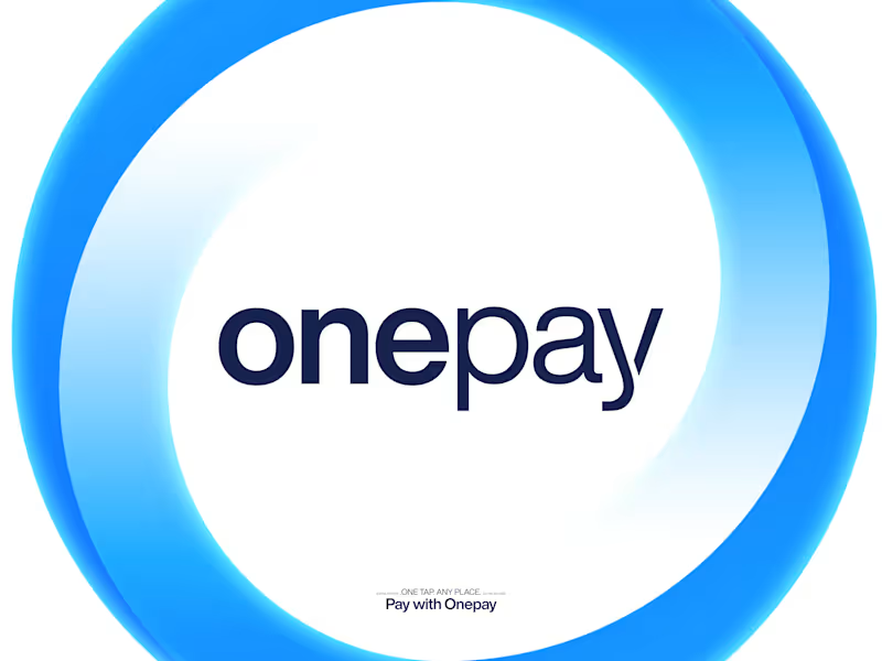
OnePay — Branding
2
62
3
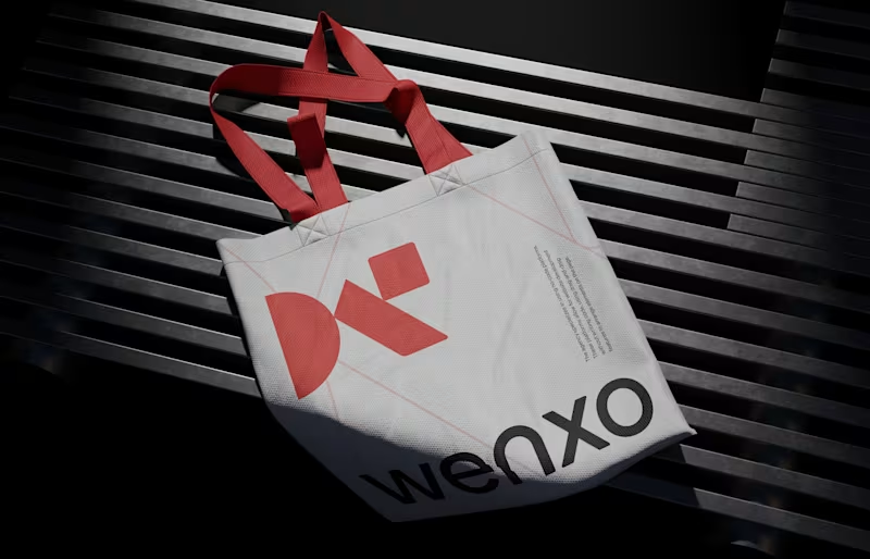
Wenxo — Logo and Visual Identity
3
11
9
Web3 Finance and DeFi Platform Logo https://dribbble.com/shots/27506659-Web3-Finance-Logo-DeFi-Logo-Economics-logo-N-logo-Fintech
4
9
266
2
Convera AI Logo Design Convera AI is a modern AI-powered platform that transforms ideas, data, and workflows into intelligent solutions. The brand represents innovation, efficiency, and continuous growth through advanced artificial intelligence and automation. https://www.behance.net/gallery/251814383/Convera-AI-logo Let’s collaborate to build your brand together. 👋 Available for new projects. Email: milon45666@gmail.com
2
102
Visual Designer
(2)
Follow
Message
Hamida Jannat
Dhaka, Bangladesh
Landing Page UI Designer, Figma Expert
5.0
Rating
14
Followers
Follow
Message
Landing Page UI Designer, Figma Expert
1
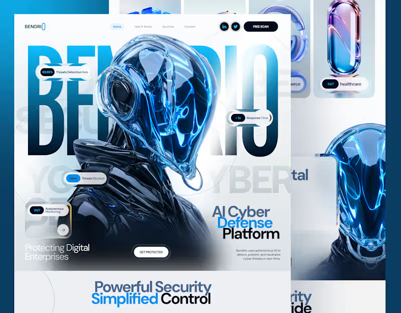
Bendrio - Cyber Security website design, landing page
1
9
0
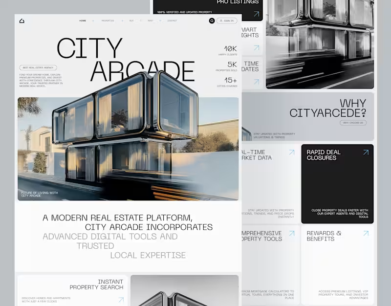
Real Estate Website Design UI/UX City Arcade
0
2
0
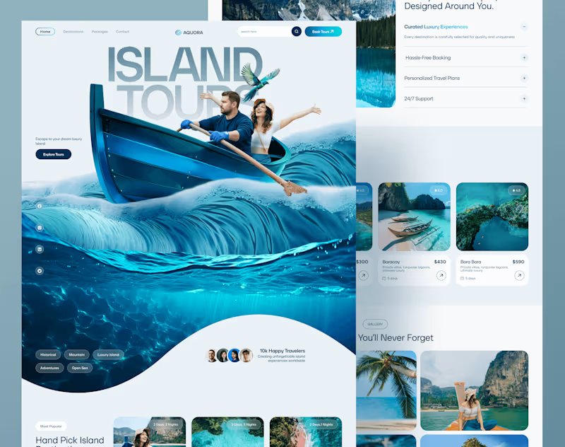
Aquora Travel website design, Landing page, web design
0
8
0
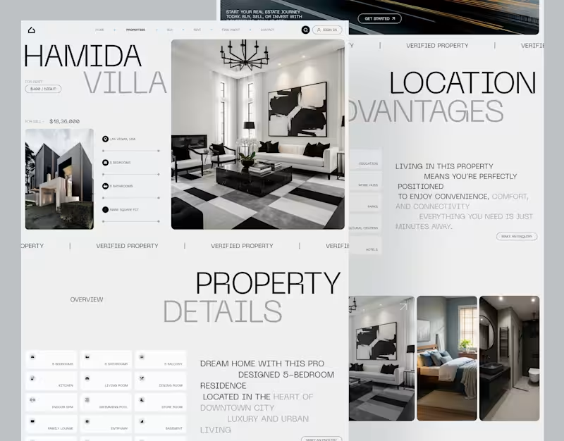
Real Estate Property detail page City Arcade
0
2
Visual Designer
(12)
Follow
Message
Anik Poddar
Dhaka, Bangladesh
VFX, Motion Designer & 3D Animation
5.0
Rating
13
Followers
Follow
Message
VFX, Motion Designer & 3D Animation
0
SaaS Explainer Video | Motion Design & Storytelling
0
16
1
Backlit Communication Showreel Case Study
1
7
0
Studio X Men’s Shampoo TVC — VFX, 3D Tracking & Compositing
0
11
0
CarryBee Brand Commercial — Motion Graphics & VFX Design
0
5
Visual Designer
(4)
Follow
Message
Jakaria Mahmud
Dhaka, Bangladesh
Your Creative Growth Partner
5.0
Rating
37
Followers
Follow
Message
Your Creative Growth Partner
11
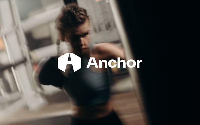
Introducing Anchor - a bold fitness brand identity built for people who train with purpose. From performance apparel and lifting accessories to powerful campaign visuals, every detail is designed to move with strength, focus, and confidence. A complete branding concept for a modern fitness lifestyle brand. #BrandIdentity #FitnessBranding #SportswearDesign #LogoDesign #BrandDesign #CreativeDirection #GraphicDesign
2
11
100
8
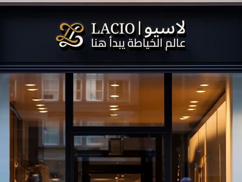
Lacio - a refined brand identity crafted for a modern sewing and tailoring brand. From the signature monogram and Arabic-English typography to social media templates, storefront signage, and digital touchpoints, every detail was designed to make the brand feel elegant, trustworthy, and memorable. A visual identity where craftsmanship meets contemporary luxury. #BrandIdentity #BrandDesign #LogoDesign #VisualIdentity #FashionBranding #LuxuryBranding #ArabicBranding #BilingualBranding #TailoringBrand #SewingBrand #SocialMediaDesign #GraphicDesign #BrandingDesigner
4
8
177
16
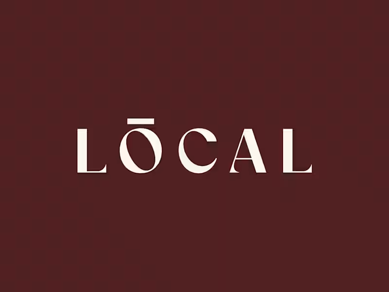
Built a coffee brand around the feeling of being local. ☕️ LOCAL is a modern café identity designed to feel warm, calm, premium, and familiar - without falling into the usual coffee-brand clichés. From the wordmark and earthy color palette to typography, packaging, uniforms, and real-world applications, every detail was created to make the brand feel like a natural part of everyday life. Brand Identity • Art Direction • Packaging • Visual System What do you think - would you stop by LOCAL for a coffee? 👀 #BrandIdentity #Branding #CoffeeBrand #CafeBranding #PackagingDesign #VisualIdentity #GraphicDesign #BrandDesigner #CreativeDirection #ContraDesigner
5
16
317
12
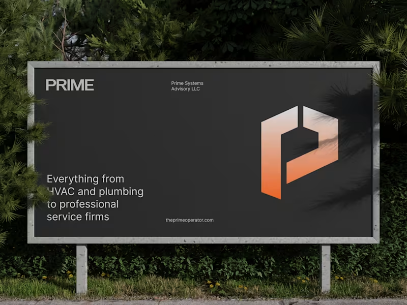
A logo can look good and still fail to position a business. For Prime Systems Advisory, the challenge wasn’t simply creating a new visual identity. The goal was to build a brand that could communicate scale, reliability, and operational expertise, while standing apart in a crowded professional services market. The solution was a focused brand system built around a distinctive geometric “P” symbol, strong typography, a confident visual language, and applications designed to work across both digital and physical touchpoints. The identity was designed to make Prime feel like more than another service provider, it positions the business as a strategic infrastructure partner for scalable companies. Good branding doesn’t just make a business look better. It makes the business easier to understand, remember, and trust. Brand Identity → Positioning → Visual System → Real-world Applications #BrandIdentity #Branding #BrandStrategy #LogoDesign #VisualIdentity #GraphicDesign #CreativeStrategy #BusinessBranding #DesignProcess #Contra
10
12
421
Visual Designer
(10)
Follow
Message
Explore people