The network for creativity
Join 1.25M professional creatives like you
Connect with clients, get discovered, and run your business 100% commission-free
Creatives on Contra have earned over $150M and we are just getting started
Back to feedPost
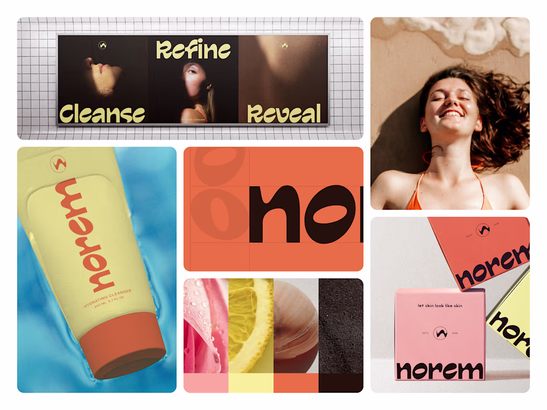
Skincare branding has a confidence problem. Nobody fixed it until Norem did.
Most beauty brands hide behind clinical whites, sterile packaging, and ingredient lists that read like a lab report. The bottle promises transformation. The shelf presence delivers nothing.
Norem built the confidence into the brand itself.
Bold rounded wordmark. A palette that feels sun-kissed rather than synthetic warm terracotta orange, pale butter yellow, or deep espresso brown. Real skin. Real texture. Real ingredients visible in every campaign frame. And right there on every package, in plain sight, is "let skin look like skin."
That's not just a tagline. That's the entire brand philosophy in five words.
The oversized typography, unapologetic color blocking, and three-word campaign Cleanse. Refine. Reveal. Turn a cleanser tube into a shelf presence that stops people mid-aisle before they even read the label.
Because skincare that's actually honest about what it does deserves a brand that's just as honest about who it's for.
What's the boldest brand decision you've seen on a beauty product? 👇
The network for creativity
Join 1.25M professional creatives like you
Connect with clients, get discovered, and run your business 100% commission-free
Creatives on Contra have earned over $150M and we are just getting started
Related posts
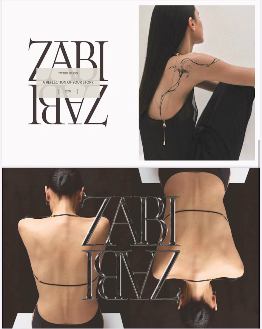
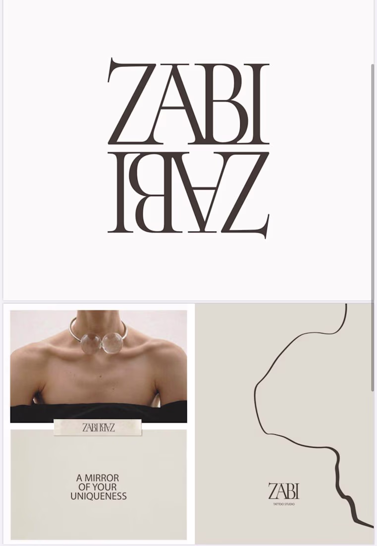
I’m currently working on a visual identity for a tattoo studio. I’ll show you a small part of this project.
It was important to convey femininity and character. The studio creates fine-line tattoos that look clean and reflect each client’s personal story. The mirror effect in the logo represents exactly this idea of reflecting stories through tattoos. The lines in the typography reference fine-line tattoo work, and their interconnection represents the close bond between the tattoo artist and the client. This reflects the core philosophy of the brand.
I’d be curious to hear your thoughts on the result. 😊
As a woman, I really appreciate how femininity is expressed here — not as decoration, but as character. Beautiful work.😍
👋 Hey, we’re Lynksen.
We build digital products and websites that don’t just work - they win hearts.
For 5+ years, we’ve been the go-to team for startups and brands chasing big ideas - turning raw sparks into products that fuel millions of daily clicks, swipes, and sign-ups.
We move fast, combining product thinking, clear UX, and real business needs to create smooth, high-converting products for brands ready to make an impact.
👉 Have a project idea? We are available for new projects hello@lynksen.com or DM us!
post is awesome love the person who edited it lol
The wellness app space is soft.
Pastel gradients. Motivational push notifications. Streak badges.
I built the opposite. MUSCL treats your body as a specimen. And the data as the only truth.
Amazing!
Trending
Claude
Claude has entered the design space. How are you using Claude Design?
Contra University
Learn from expert creatives how to earn more using next-gen AI tools.
MagicPath
The canvas is infinite, and exploration is becoming the workflow. How are you using MagicPath?
creativeaiflow
Creative AI workflows are evolving. What tools do you use, and what are their strengths and weaknesses?
freelancerlife
Freelancer life is wins, pivots, and everything in between. What’s yours right now?
