The network for creativity
Join 1.25M professional creatives like you
Connect with clients, get discovered, and run your business 100% commission-free
Creatives on Contra have earned over $150M and we are just getting started
Back to feedPost

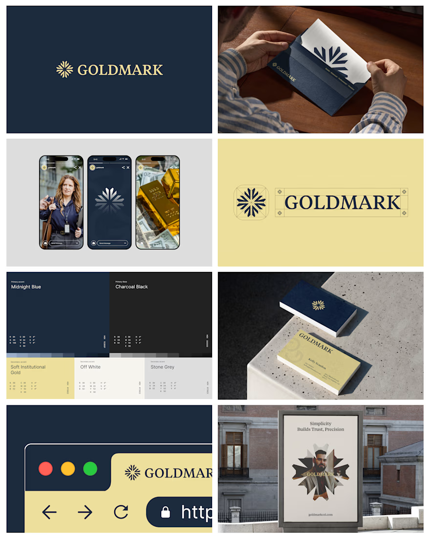
Luxury branding isn't about looking expensive. Its about making people feel confident in what they are trusting. That was the thinking behind GOLDMARK.
The challenge was to build an identity that connects the timeless value of gold with the evolving world of digital ownership without feeling like a traditional gold company or another generic fintech brand.
We approached it with three principles:
→ Confidence through colour. Midnight blue establishes stability, while soft institutional gold communicates value without feeling excessive.
→ Recognition through geometry. A structured symbol creates a distinctive visual anchor that works across digital and physical applications.
→ Consistency across every touchpoint. From business cards and stationery to social media and outdoor advertising, every element follows the same visual language.
The goal wasn't simply to create a beautiful logo. It was to build an identity that feels credible, considered and recognisable wherever people encounter the brand. Because when a business operates in a high trust industry design has a bigger job than looking good.


The network for creativity
Join 1.25M professional creatives like you
Connect with clients, get discovered, and run your business 100% commission-free
Creatives on Contra have earned over $150M and we are just getting started








Related posts

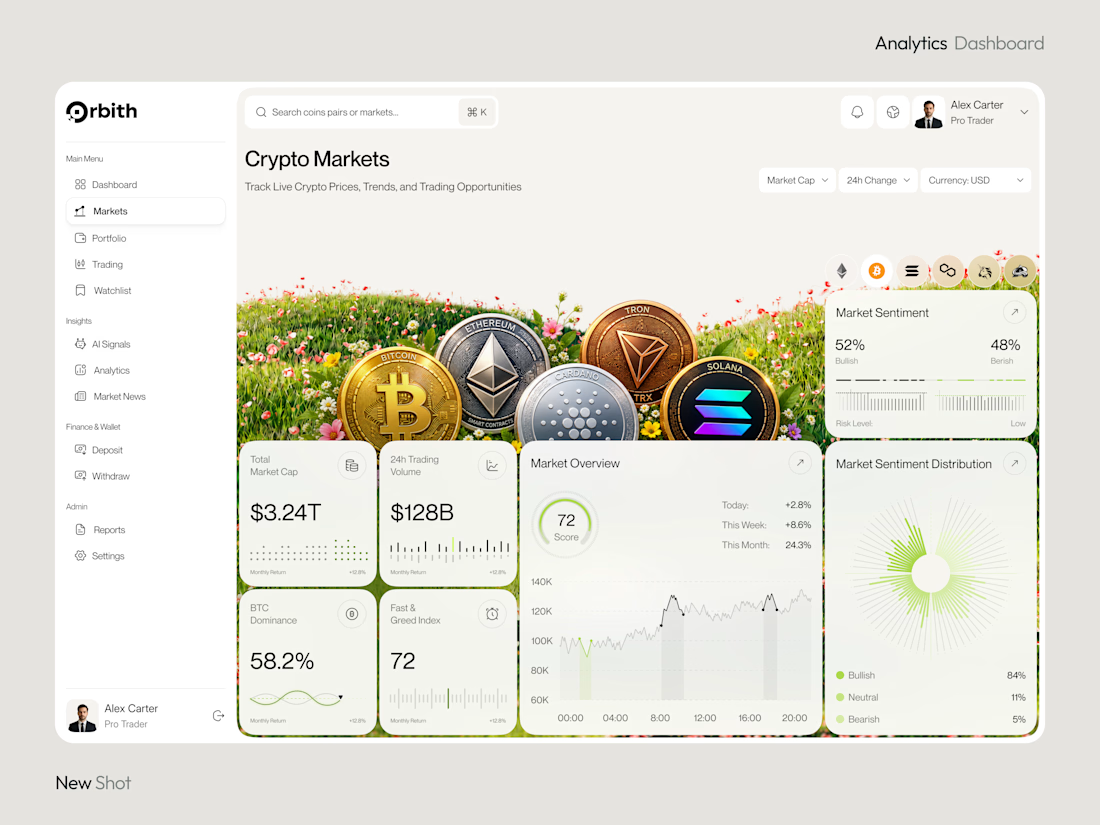
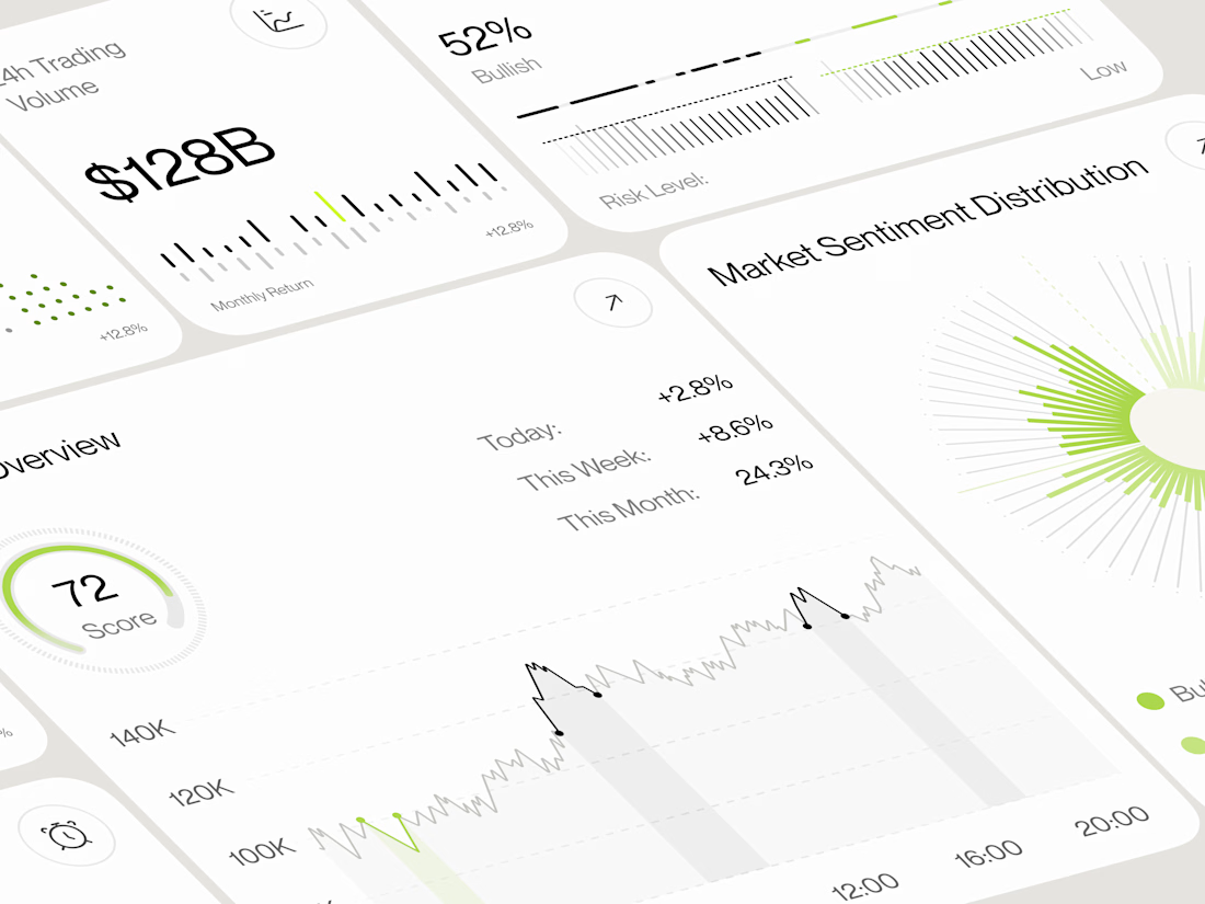
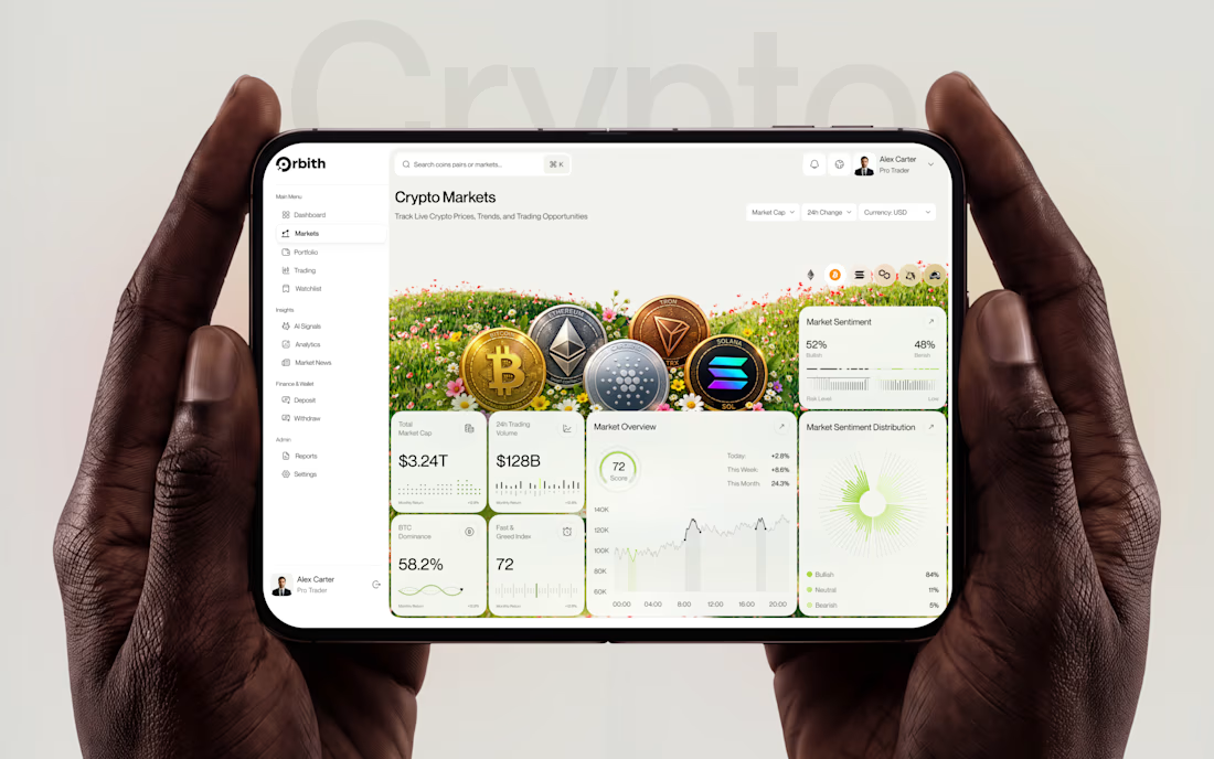
Most crypto dashboards show numbers. Great design turns those numbers into decisions.
Meet Orbit — a crypto analytics dashboard where real time insights meet a premium, data-driven experience.
Would you trust this interface with your next trading decision?
#UIDesign #DashboardDesign #CryptoTrading #FintechDesign #ProductDesign

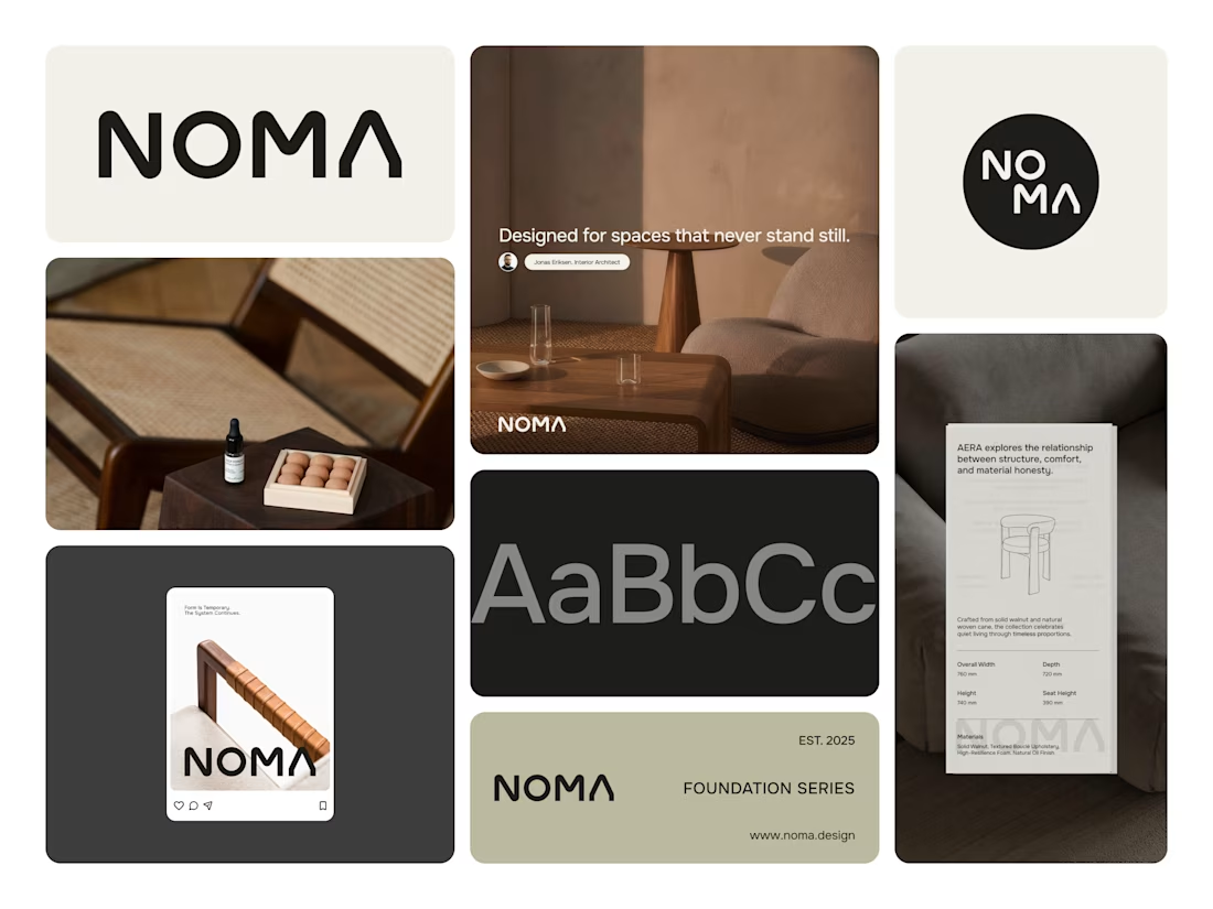
Clean work

Noma is furniture brand from indonesia, they have clean visual identity.

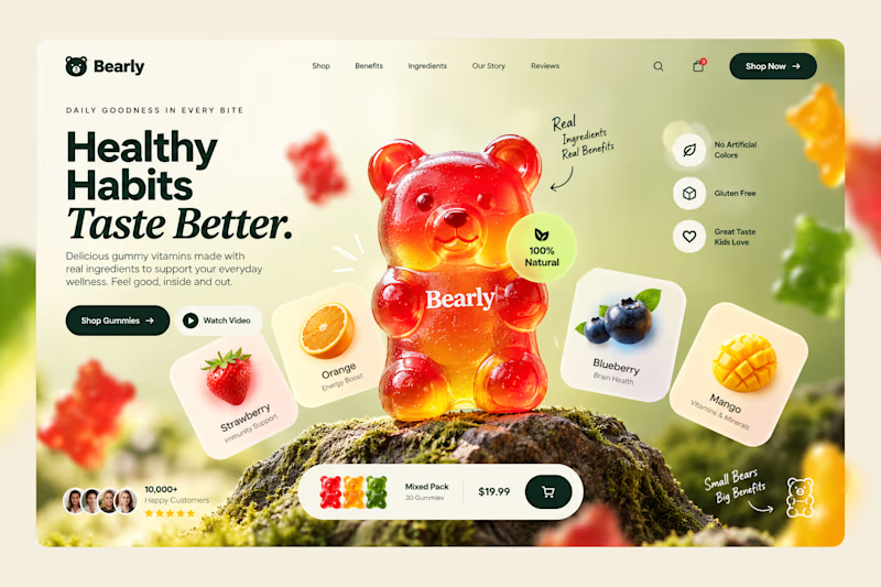
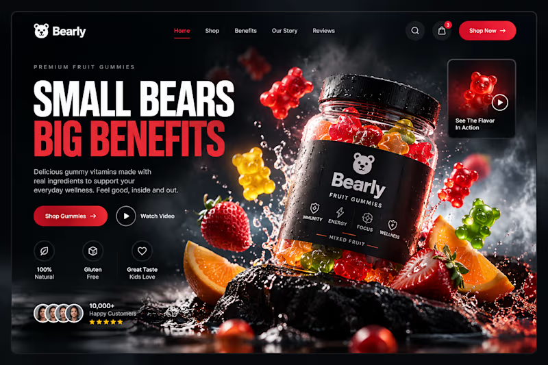
Which gummy brand would make you stop scrolling?
Two different directions for Bearly, a gummy candy brand concept.
One is bright, playful, and fruit-inspired. The other is bold, dark, and premium.
Same product, two completely different visual experiences.
Which one would you choose? Vote below! 👇
#BrandIdentity #WebDesign #UIUX #EcommerceDesign #Figma #DesignInspiration #ABTesting
9 voted
75%
3 voted
25%
12 votes
Closed

Playful.. n full stop😍