Brand & Motion Designer | AI Video, Visual Identity, UI/UX
Brand & Motion Designer | AI Video, Visual Identity, UI/UX
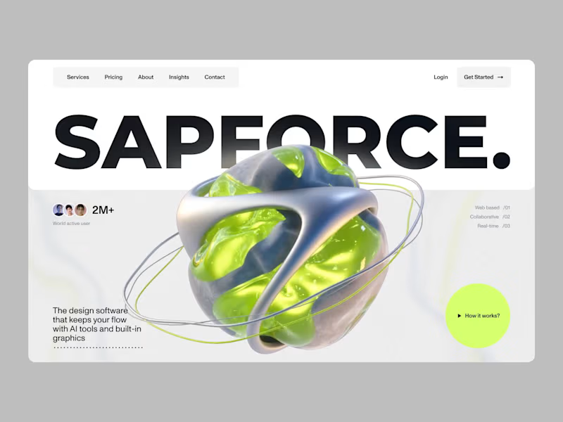
UX-led product design & dev agency for b2b saas and AI
UX-led product design & dev agency for b2b saas and AI
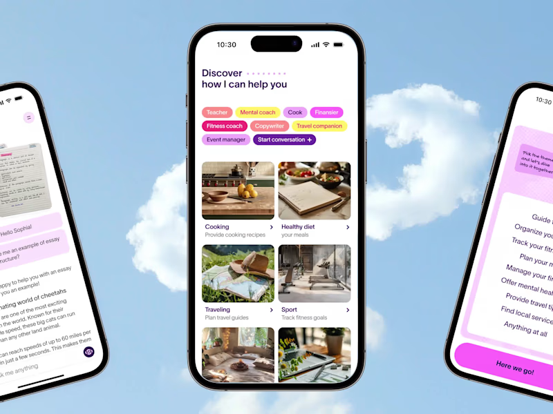
Product Designer & No-code Developer
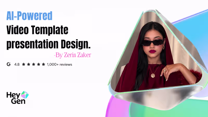
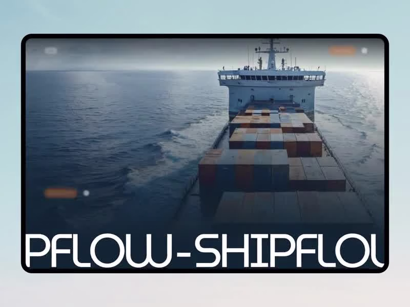
AI & SaaS Explainer Video Editor | Demo & Product Launch
- 10
- Followers
AI & SaaS Explainer Video Editor | Demo & Product Launch
Only 3 Slots Left - Get 30% Off Your First SaaS Project.
- 53
- Followers
Only 3 Slots Left - Get 30% Off Your First SaaS Project.
VFX, Motion Designer & 3D Animation
Product Designer: Motion, Editing, Framer expert.
- 2x
- Hired
- 5.0
- Rating
- 72
- Followers
Product Designer: Motion, Editing, Framer expert.

Motion and Brand Designer - www.ahmedintisher.com
- $1k+
- Earned
- 1x
- Hired
- 5
- Followers
Motion and Brand Designer - www.ahmedintisher.com