UX-led product design & dev agency for b2b saas and AI
UX-led product design & dev agency for b2b saas and AI
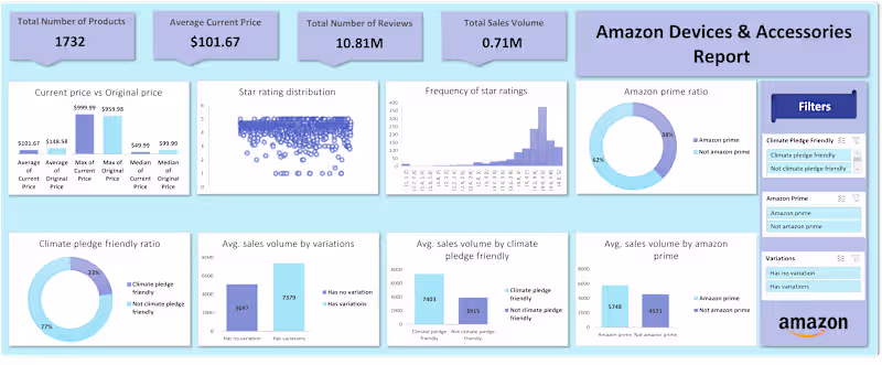
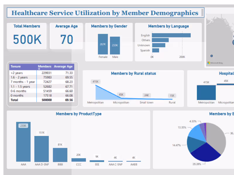
Power BI Data Analyst + ML AI Automation Expert
- 5.0
- Rating
- 100
- Followers
Power BI Data Analyst + ML AI Automation Expert
Global Product Sourcing, Conversion Optimization, BI Report

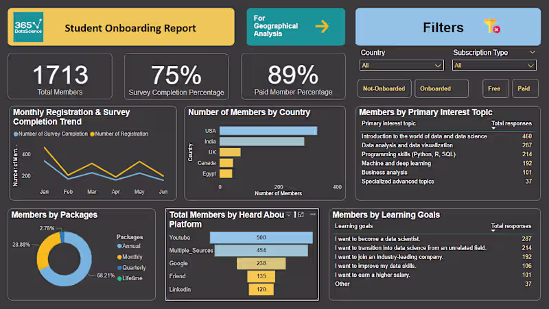
Data Analyst transforming raw data into actionable dashboard
Data Analyst transforming raw data into actionable dashboard

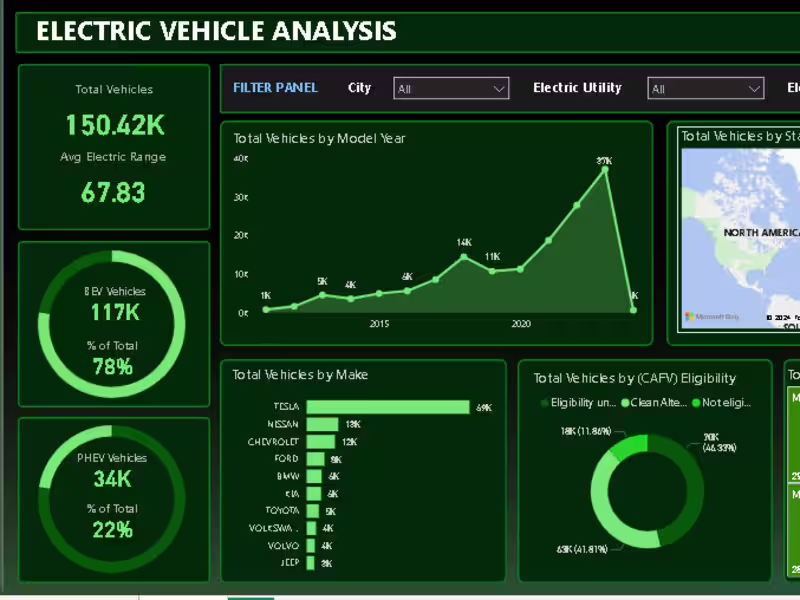
Data analyst | Python | SQL | Tableau | Excel | Power BI
Data analyst | Python | SQL | Tableau | Excel | Power BI
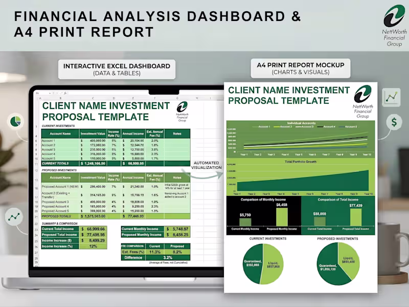
Data Analyst | Excel Expert | Google Sheets
Data Analyst | Excel Expert | Google Sheets

View more →
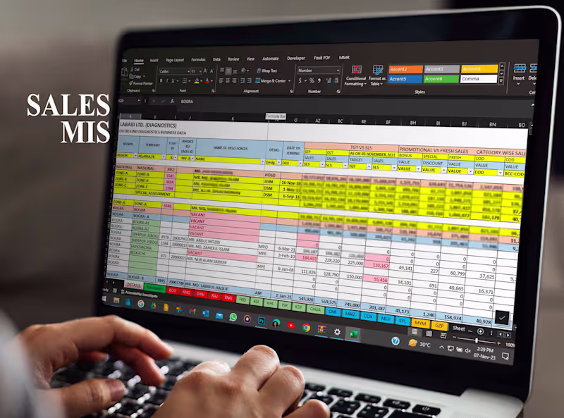
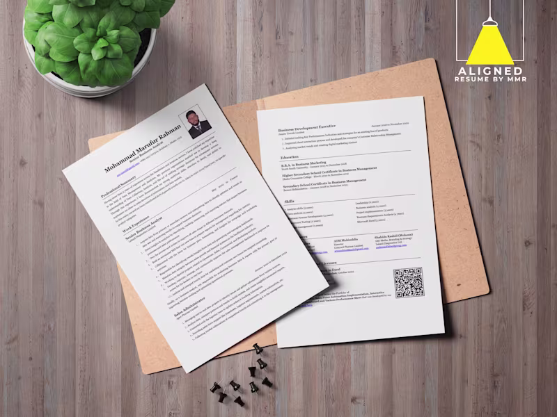
Automated Sales MIS Expert | ATS Resume Builder
Automated Sales MIS Expert | ATS Resume Builder
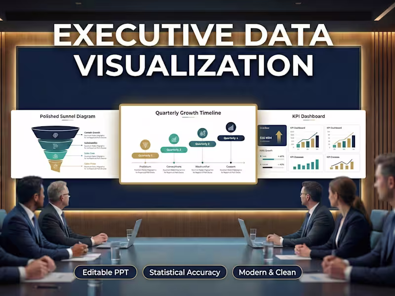
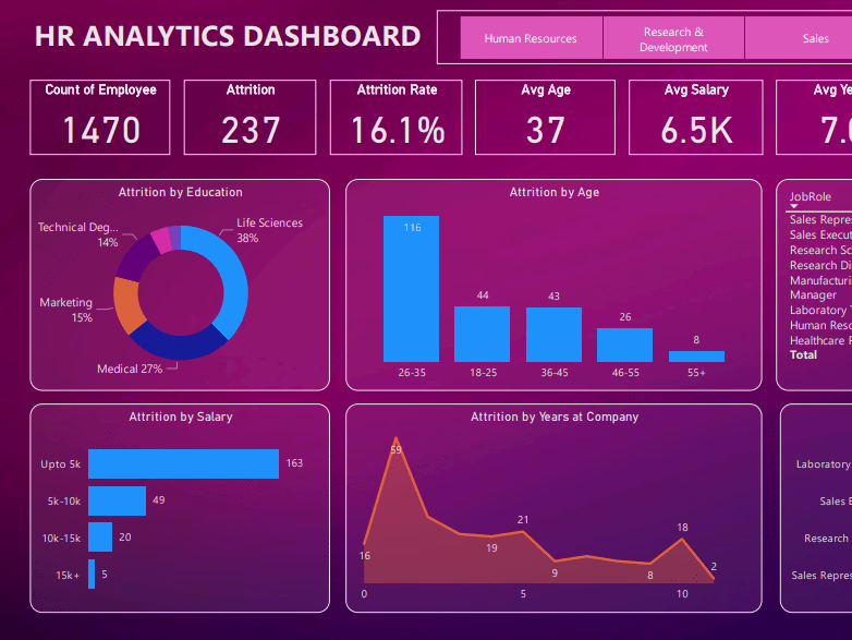
🔍 Insightful Data Analysis & Visualization Expert
🔍 Insightful Data Analysis & Visualization Expert

View more →