The network for creativity
Join 1.25M professional creatives like you
Connect with clients, get discovered, and run your business 100% commission-free
Creatives on Contra have earned over $150M and we are just getting started
Back to feedPost
Most health dashboards show you numbers. This one tells you what to do with them right down to "Take A Breath Now."
A modern health records dashboard designed to make medical analytics, fitness metrics, and wellness insights feel clear and genuinely personal. Built for clinicians, coaches, and individuals managing their complete health picture in one workspace.
Designed in Figma with a clean white and neon green interface that keeps complex health data easy to act on. Tracker analytics, oxygen levels, heart rate, calories, workouts, breath coaching, and blockchain-verified wellness metrics all in one calm, readable layout.
The same structure adapts easily for medical SaaS, personal wellness apps, fitness tracking, or AI healthcare products. Every section designed to balance clinical precision with human warmth.
Really happy with how the crisp white canvas, neon green accents, and human anatomy visuals turned complex medical data into something that actually feels good to open every morning.
Would love to hear your thoughts on the UI direction. 👀
UX Design | Health Tech | Dashboard UI | SaaS Platform
Tools: Figma, Jitter
The network for creativity
Join 1.25M professional creatives like you
Connect with clients, get discovered, and run your business 100% commission-free
Creatives on Contra have earned over $150M and we are just getting started
Related posts
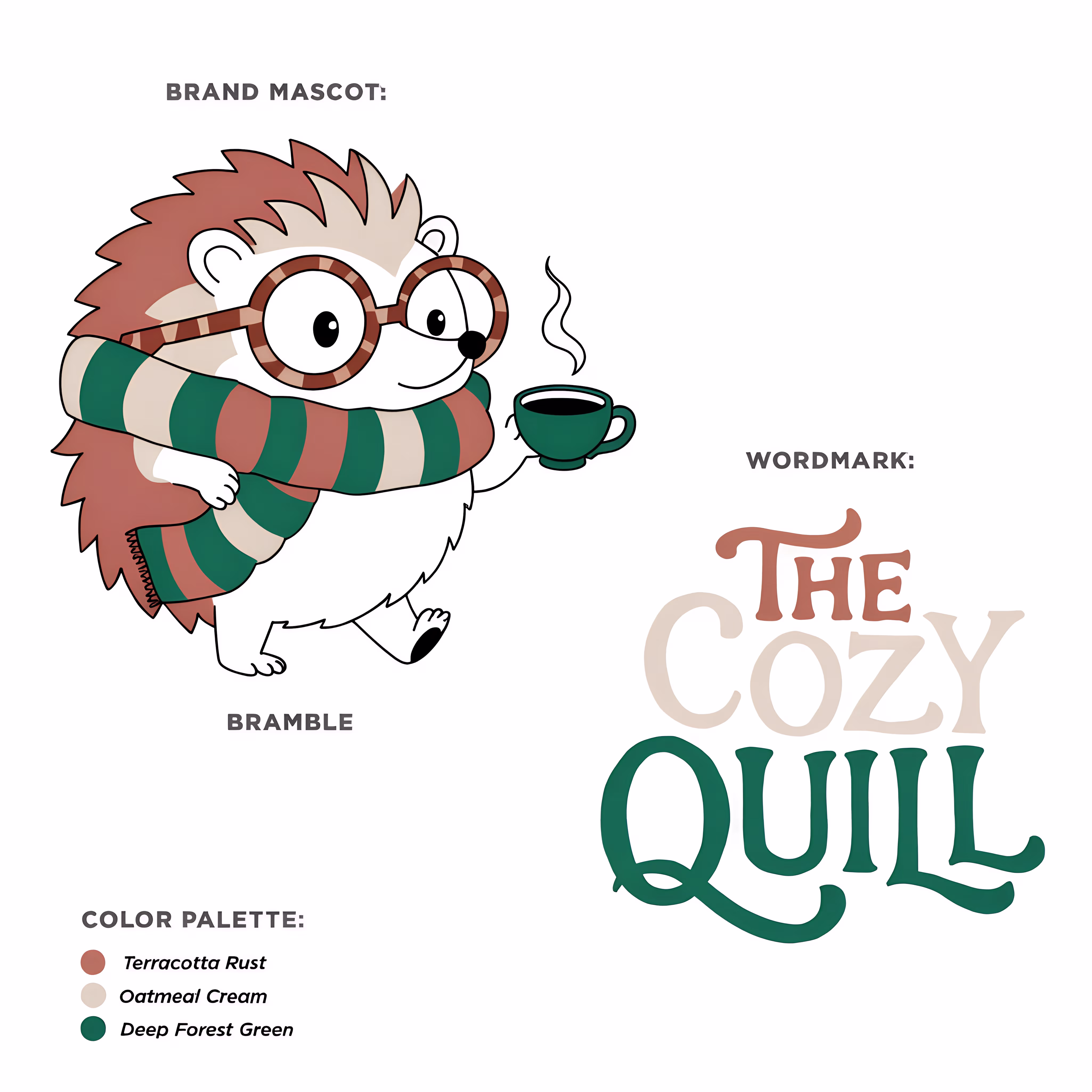
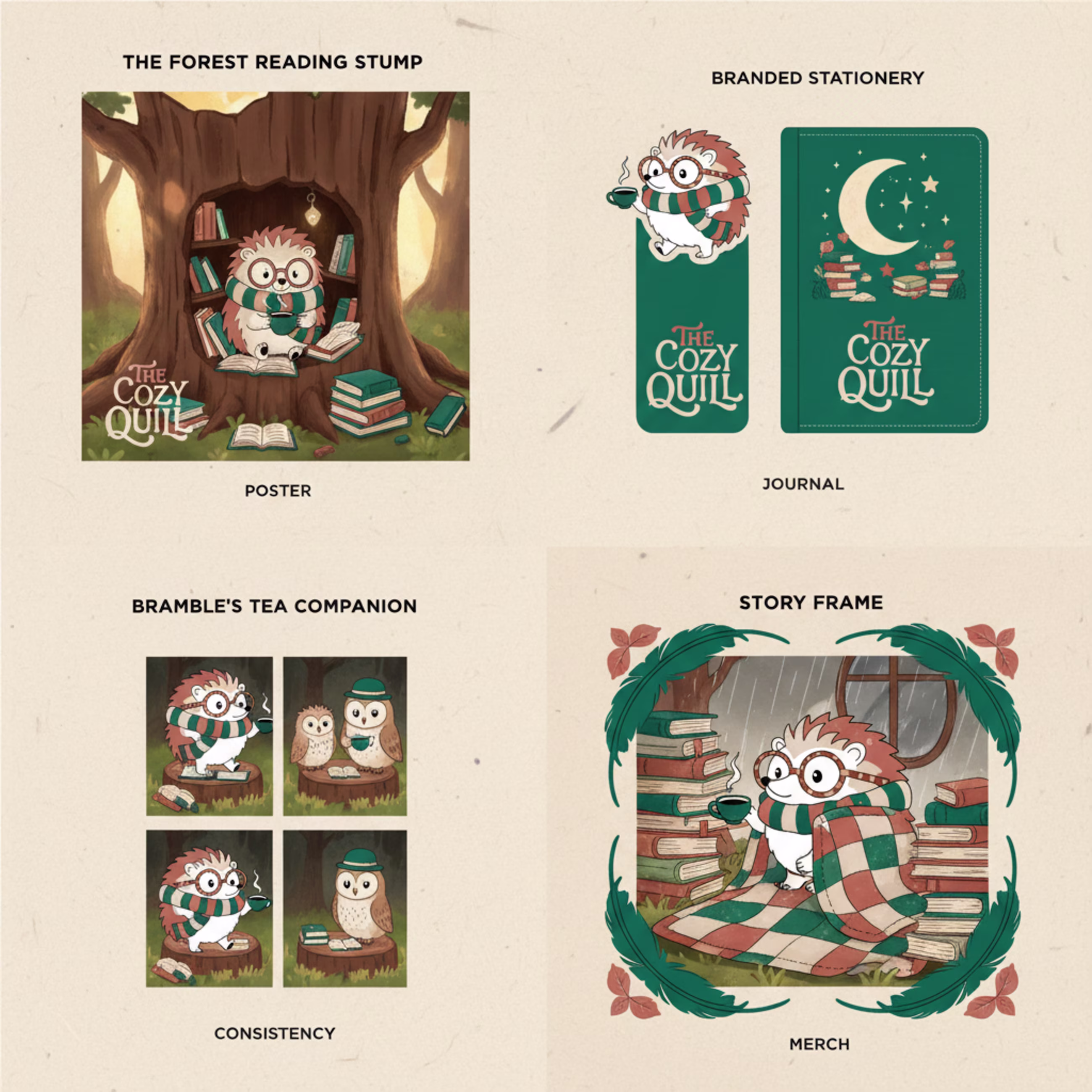
Here is a fun graphic design project I just finished for a brand called The Cozy Quill. It is a warm, friendly neighborhood bookstore and cafe meant to feel like a cozy, rainy afternoon.
The main character of the brand is Bramble, a cute little hedgehog who loves reading books and drinking hot tea. He is super easy to recognize because he always wears large round reading glasses and a striped scarf.
The main goal of this project was to prove that one character can be used for all parts of a business without changing his look. I designed him using just three simple colors: dark green, rust brown, and cream.
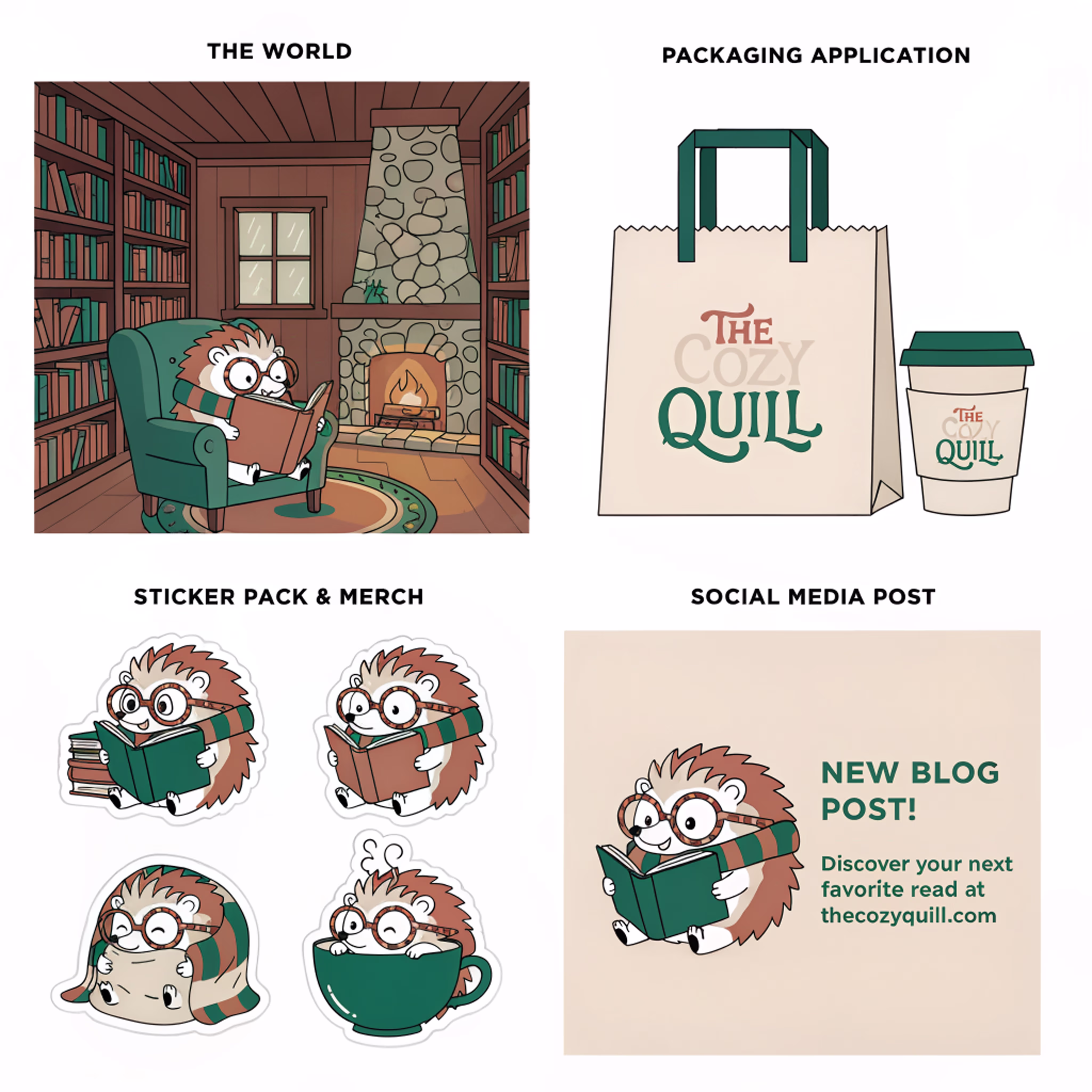
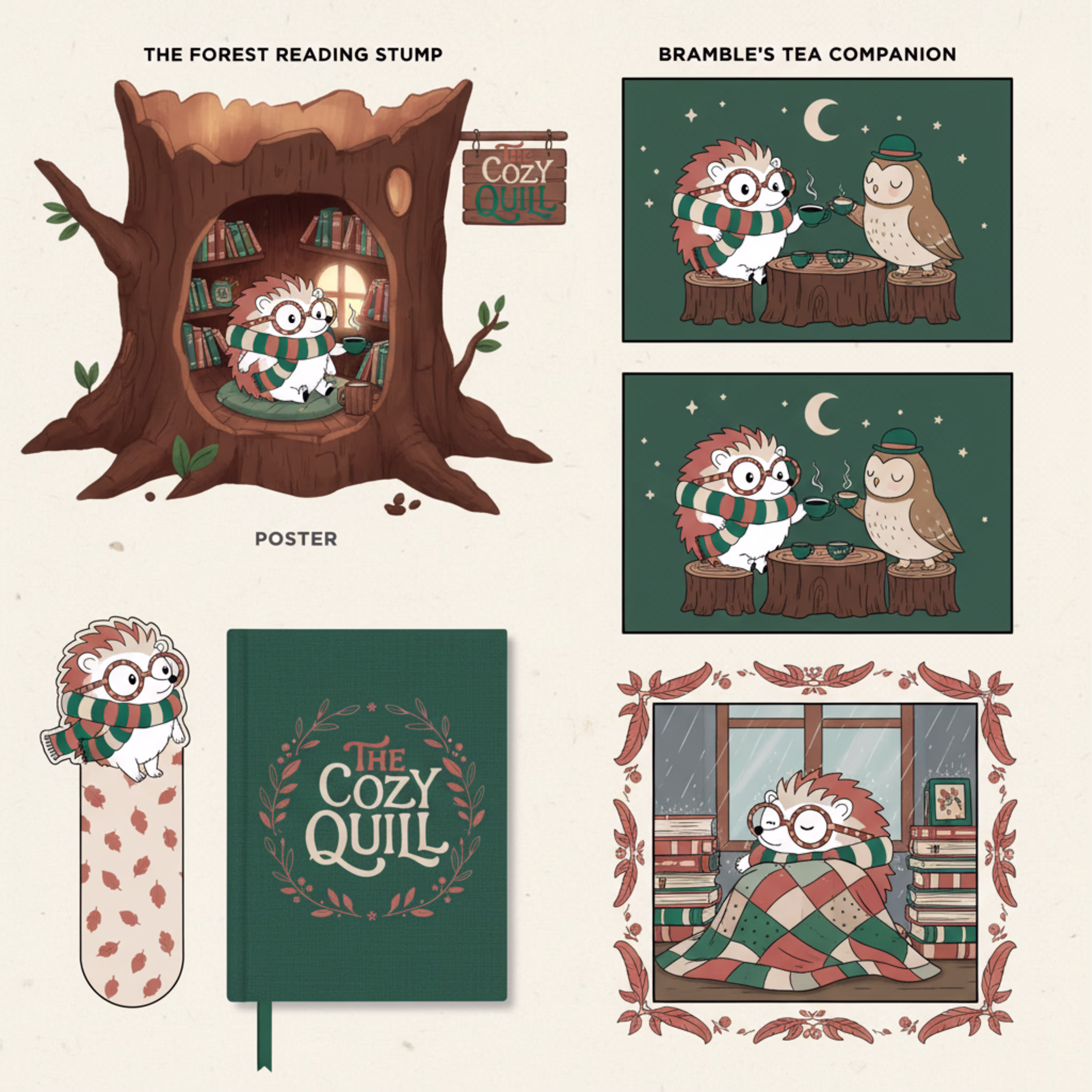
Here is everything I created to bring his world to life:
Logo & Colors: A friendly, hand-written text logo that matches Bramble's colors.
Packaging: Branded coffee cups and paper bags for the cafe.
Fun Merchandise: Cute die-cut stickers, a canvas tote bag, custom bookmarks, and journals.
Posters & Comics: Art prints of Bramble's treehouse library, event posters, and short comic strips showing him wrapping up books for customers.
No matter where Bramble pops up, he looks exactly like himself every single time!😍 🙌
Cool graphics!!
looks clean and modern design
Looks Good
Trending
Claude
Claude has entered the design space. How are you using Claude Design?
Contra University
Learn from expert creatives how to earn more using next-gen AI tools.
MagicPath
The canvas is infinite, and exploration is becoming the workflow. How are you using MagicPath?
creativeaiflow
Creative AI workflows are evolving. What tools do you use, and what are their strengths and weaknesses?
freelancerlife
Freelancer life is wins, pivots, and everything in between. What’s yours right now?