The network for creativity
Join 1.25M professional creatives like you
Connect with clients, get discovered, and run your business 100% commission-free
Creatives on Contra have earned over $150M and we are just getting started
Back to feedPost

F1 Data Analysis: Vettel vs Verstappen — SQL & Power BI
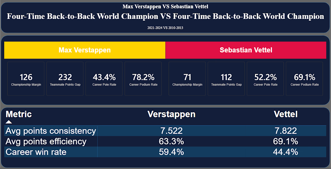
A SQL + Power BI comparison of Sebastian Vettel's (2010–2013) and Max Verstappen's (2021–2024) four-title runs at Red Bull Racing — same team, different eras, very different paths to the top.
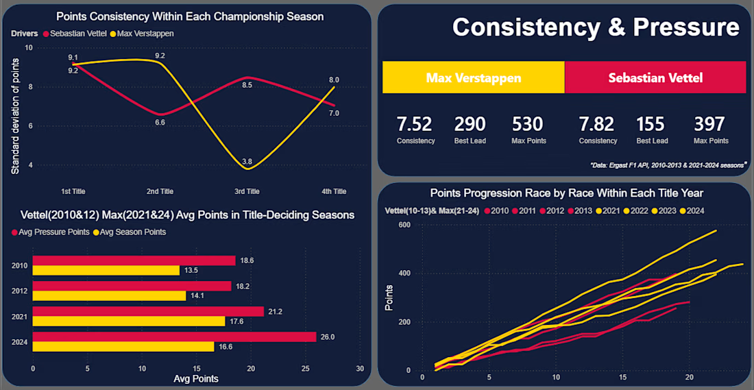
Built on the Ergast F1 database: 14 SQL queries across 5 categories (dominance, race execution, consistency, teammate benchmarking), visualized in a 5-page Power BI dashboard.
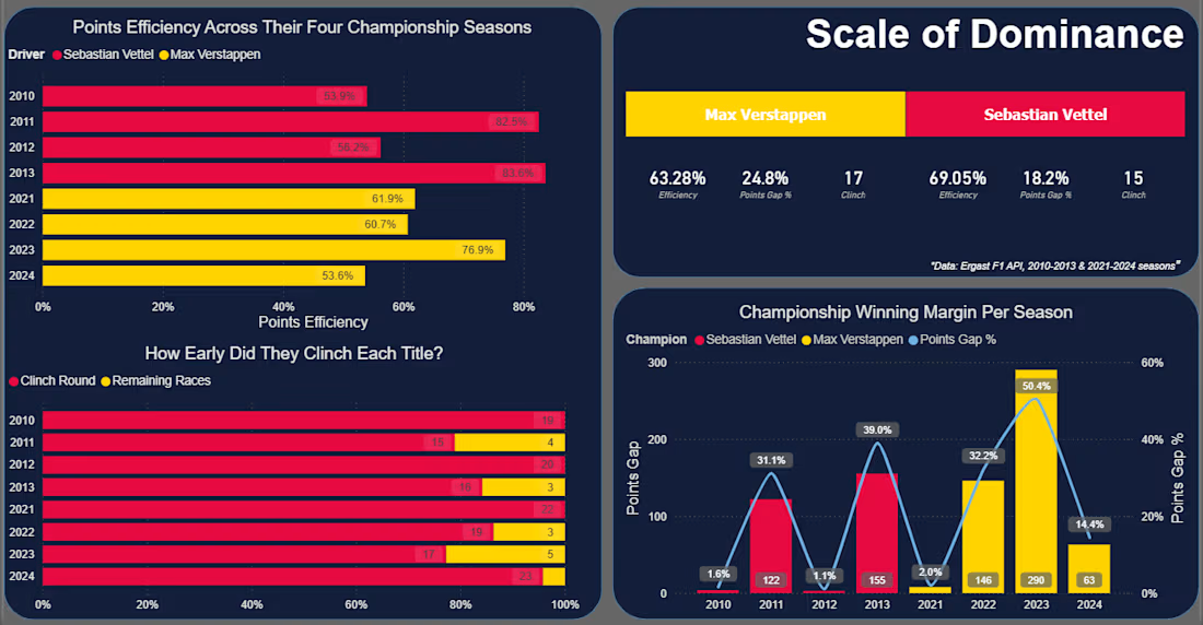
Key finding: Vettel converted a higher share of available points on average (69.05% vs Verstappen's 63.28%), despite winning fewer races overall.
Tech Stack
SQL Server · DBeaver · Power BI · Excel
Full project: github.com/MZT49/four-time-champions-vettel-vs-verstappen

The network for creativity
Join 1.25M professional creatives like you
Connect with clients, get discovered, and run your business 100% commission-free
Creatives on Contra have earned over $150M and we are just getting started

Challenges
View all


Related posts

Same headline, two layouts fighting for attention.
Which one wins the first 3 seconds?

3 voted
75%

1 voted
25%

4 votes
Closed

I’m picking B. The visual details make it feel more distinctive.

Animated Fintech UI for pie showing portfolio performance, Investment income, Investment advisory, and smart advisory features through interactive financial visualization
A motion exploration for Pie, bringing key wealth-management features to life through animated UI components.
The concept explores how portfolio performance, investment income, investment advisory, and smart advisory can be presented in a clear and engaging way while keeping the overall experience simple and premium.
A look at how motion can make financial products feel more intuitive, modern, and easier to understand.


The motion-led charts make a dense wealth-management story feel approachable; the distinct panels give each metric room to breathe while still reading as one system.


