


Brand Designer & Strategist




B2B Product Designer & Digital Systems Partner


B2B Product Designer & Digital Systems Partner


Building standout Brands & Products • Top 1% on Contra
Building standout Brands & Products • Top 1% on Contra
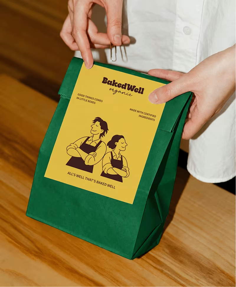
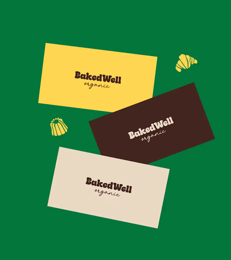
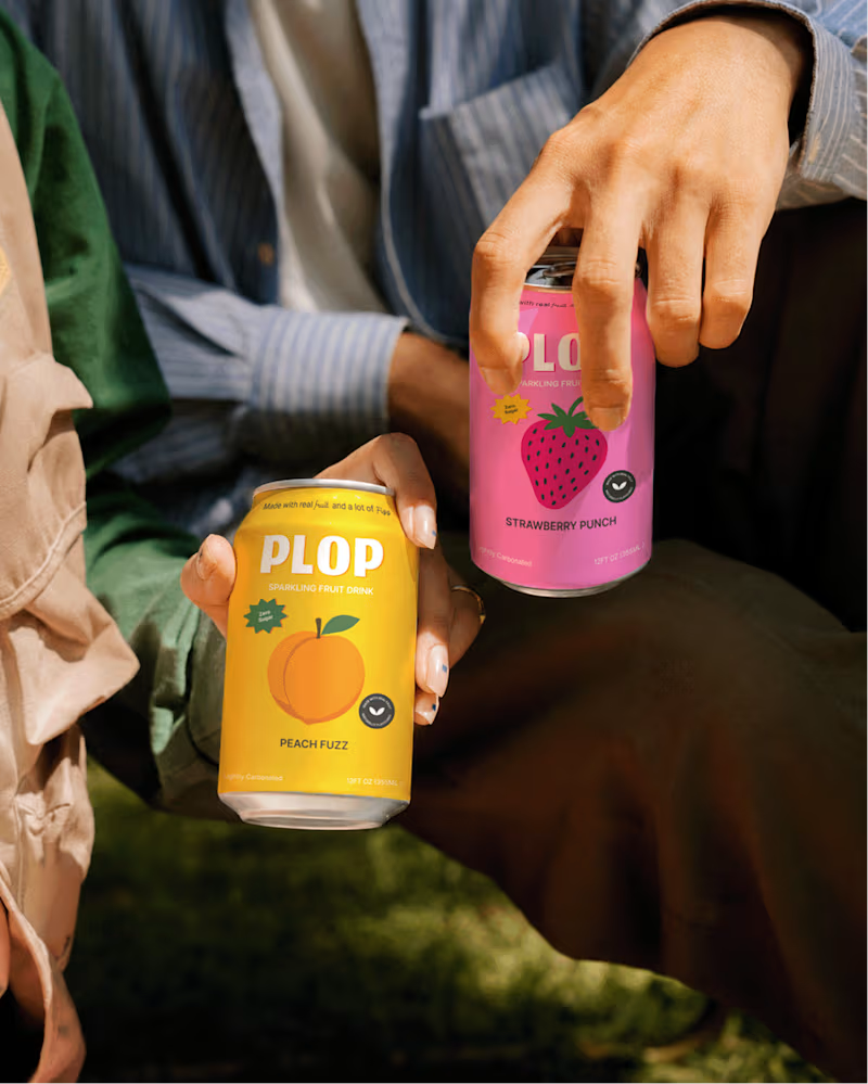
The idea was to create an identity that feels as warm and honest as the people behind the brand, while still standing out on the shelf.
The visual direction brings together bold colours, playful founder illustrations, and a touch of nostalgia to make organic baking feel approachable rather than overly serious.
Every element is designed to reflect brand’s philosophy: real ingredients, no shortcuts, and desserts worth coming back for.
3
4
286

Senior Brand Designer for Product Brands & Startups
- $10k+
- Earned
- 7x
- Hired
- 5.0
- Rating
- 113
- Followers
Senior Brand Designer for Product Brands & Startups



Vibrant Life Chiropractic - bringing wellness to life through design.
Created a calming yet confident brand identity for a chiropractic and wellness clinic that wanted to move away from the typical “clinical” look and feel.
Soft, modern tones and clean typography were used to communicate trust, care, and holistic healing, all while keeping the visuals fresh and approachable.
A brand that feels as rejuvenating as the service it represents. 🌿
2
6
164

Empowering businesses with bespoke solutions
- $•••••
- Earned
- 18x
- Hired
- 5.0
- Rating
- 32
- Followers
Empowering businesses with bespoke solutions
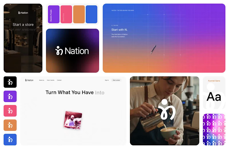
From a logo to a brand - an Aurelza exploration
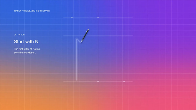
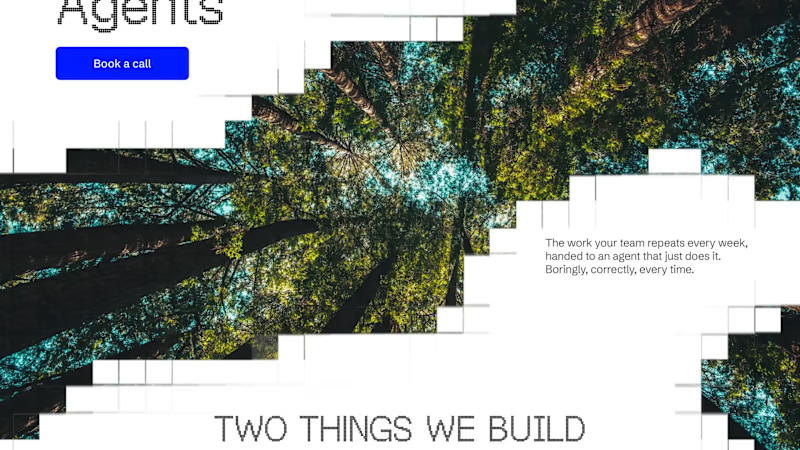
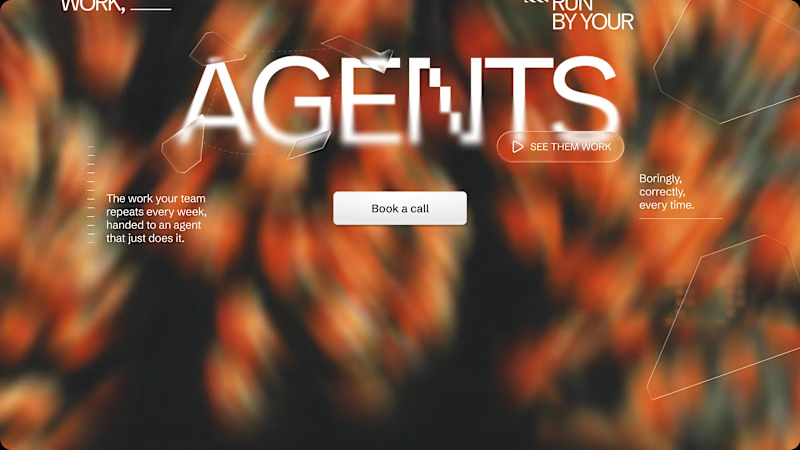
We took our Nation trial further, exploring color, typography, motion, and a website direction for a store that runs and markets itself.
What do you think of this direction? Rate it out of 10.
2
5
176


Expert Multidisciplinary Product Designer
- $1k+
- Earned
- 2x
- Hired
- 5.0
- Rating
- 21
- Followers
Expert Multidisciplinary Product Designer


A Global Product Design and Development Studio
- $5k+
- Earned
- 3x
- Hired
- 4.6
- Rating
- 8
- Followers
A Global Product Design and Development Studio




Brand Designer


