Rock - Gym and Fitness Brand
Harshit Sharma

Client Overview:
ROCK Fitness, a staple in Astoria, New York, has been a driving force in the local fitness community for over 20 years. Known for its dedication to helping New Yorkers push their limits and achieve personal fitness goals, the brand has cultivated a strong, tight-knit community. As the business grew, the time had come to evolve. ROCK Fitness sought a fresh visual identity to reflect its evolution while honoring its roots. To accomplish this, they turned to me, Harshit, a multi-disciplinary designer with a passion for blending the old with the new in creative and meaningful ways.
The Challenge:
After two decades of success, ROCK Fitness had built a strong identity and an incredibly loyal following. The challenge was to refresh this established brand, creating a modern and forward-thinking visual identity while still preserving the essence and heritage that had made ROCK Fitness a household name in the community. The rebrand needed to resonate with both the long-time members and attract new clientele who aligned with the brand’s core values of strength, resilience, and community.
The Solution:
Visual Identity & Branding:
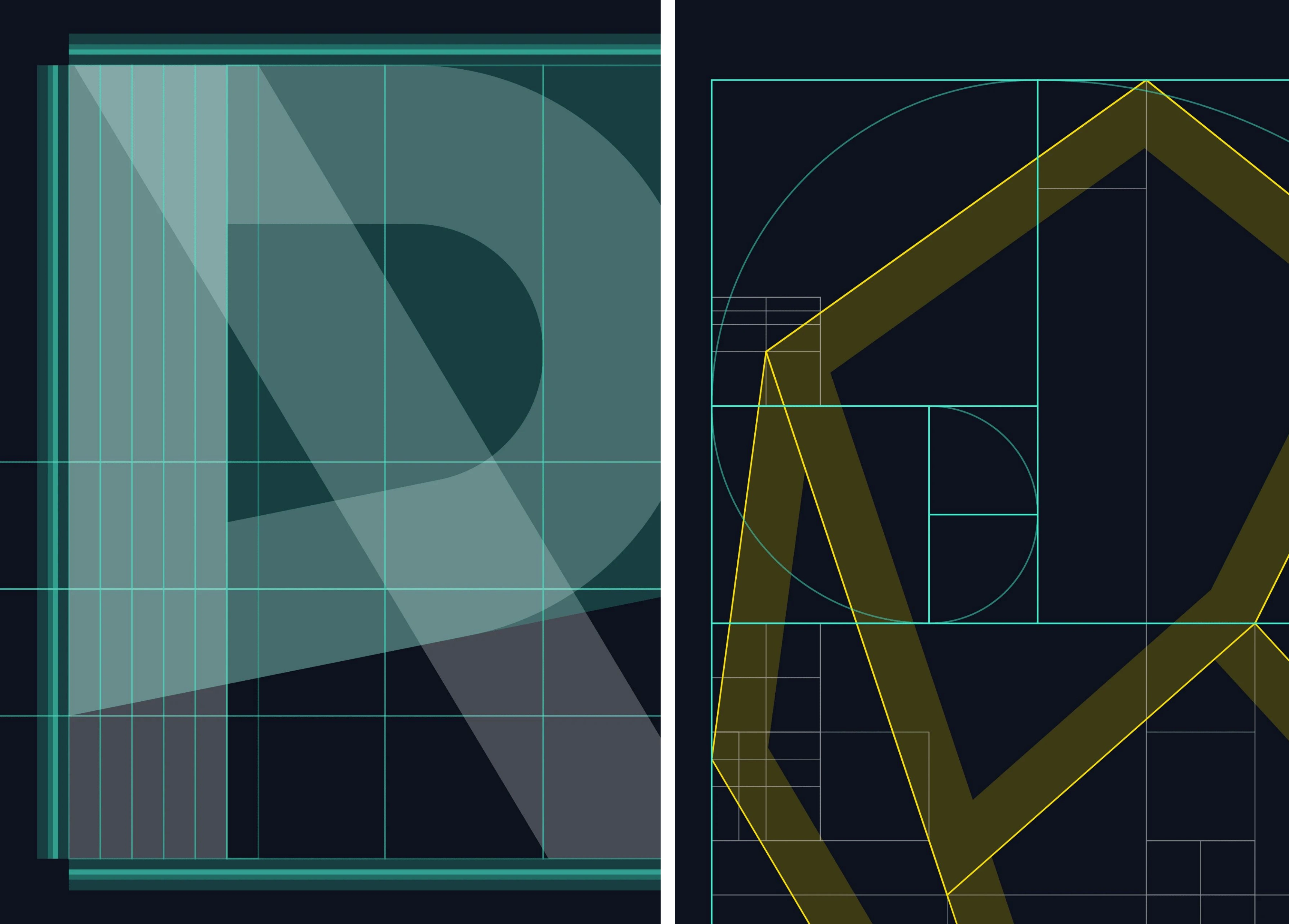
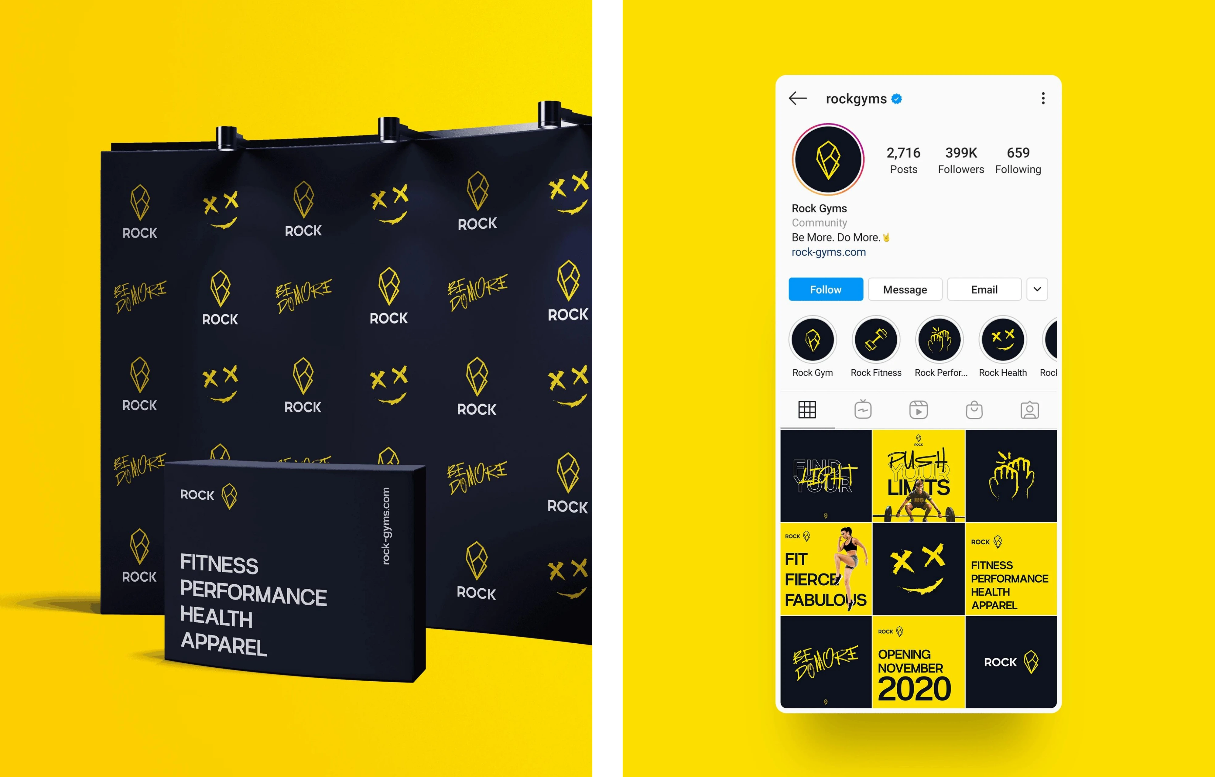
The rebranding project began with a deep dive into the brand’s legacy. The ROCK diamond logo became a central theme of the redesign. I skillfully integrated the letters R, O, C, and K within the diamond shape, paying homage to the original logo. Additionally, I ensured that the mountain peak from the previous branding was subtly incorporated into the design, creating a sense of continuity while also signaling a fresh perspective.
This new logo was designed to embody the brand’s core values of strength, perseverance, and growth while maintaining a modern, clean aesthetic that would appeal to today’s audience. The mountain peak not only connects the past but also symbolises the highs that the members of ROCK Fitness reach through their fitness journeys.
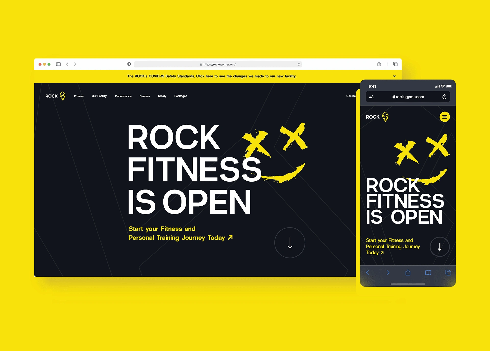
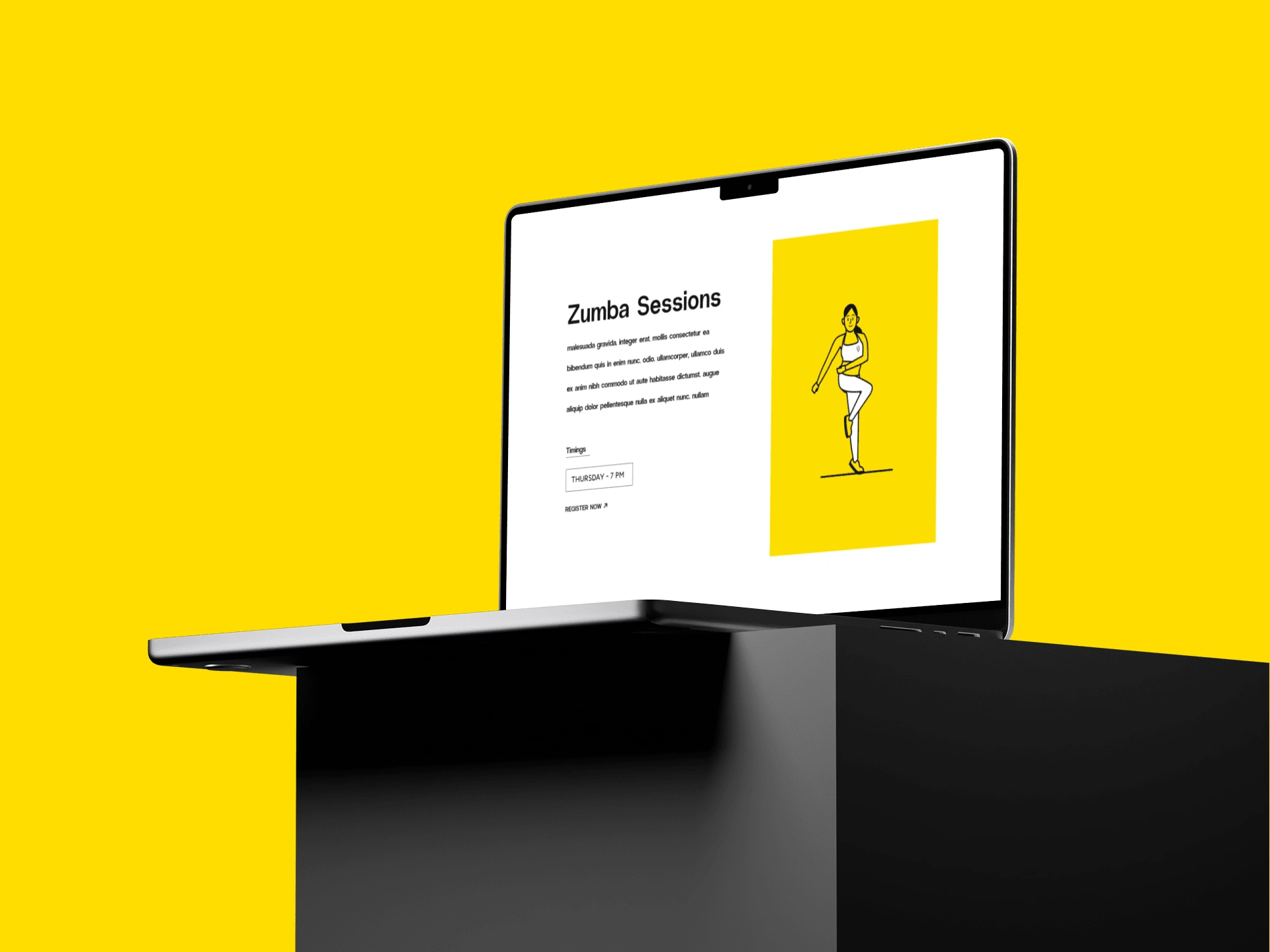
Website Preview
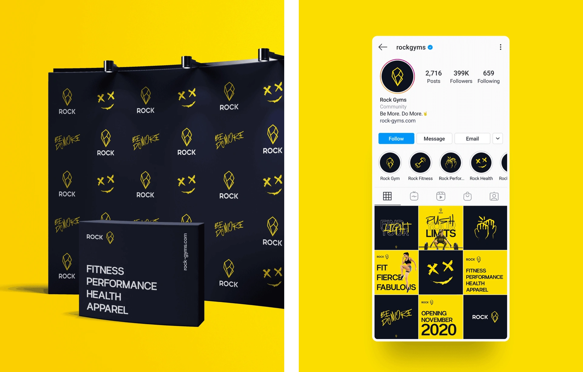
Social Presence of the brand
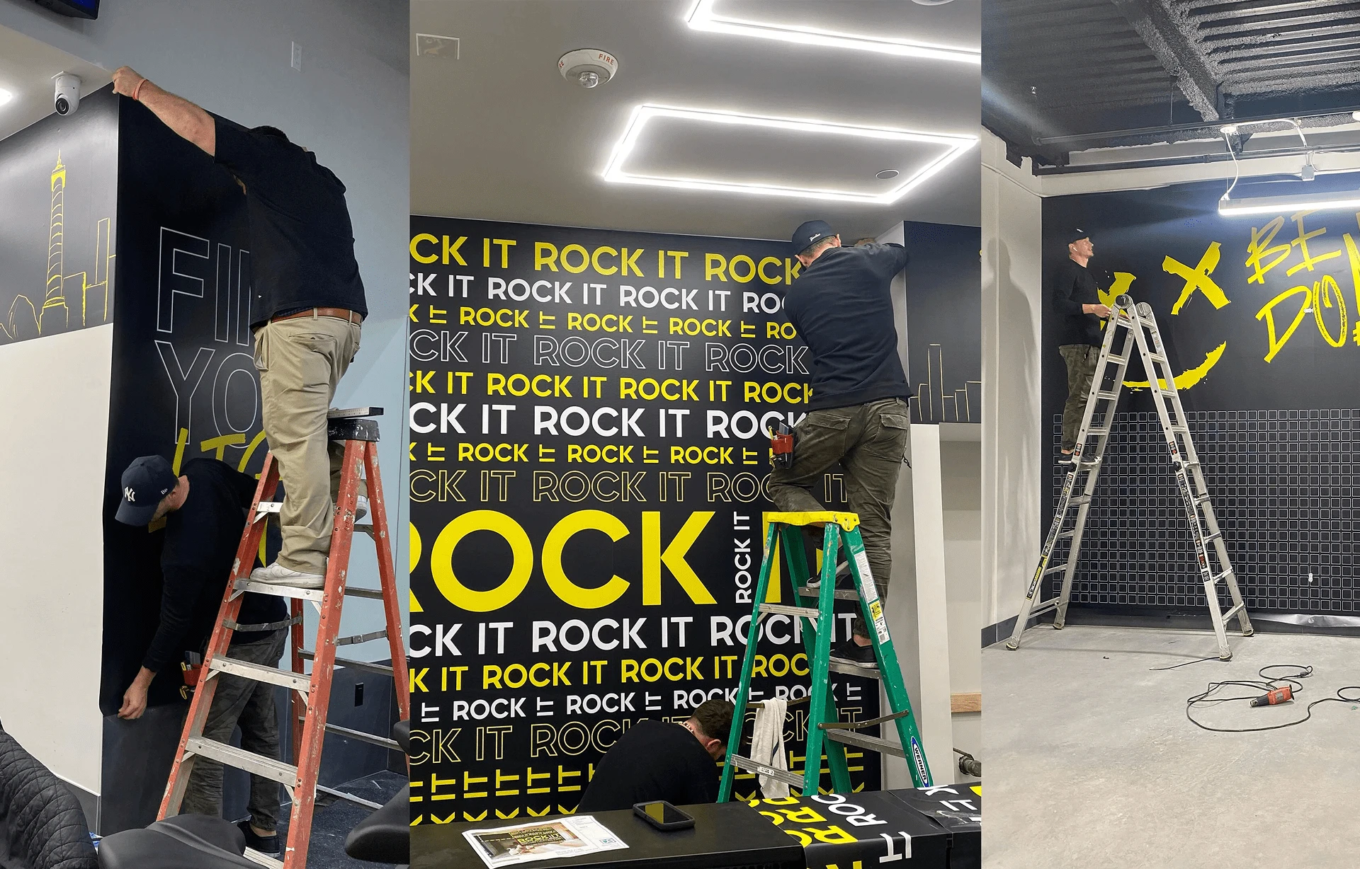
Creative Content Development:
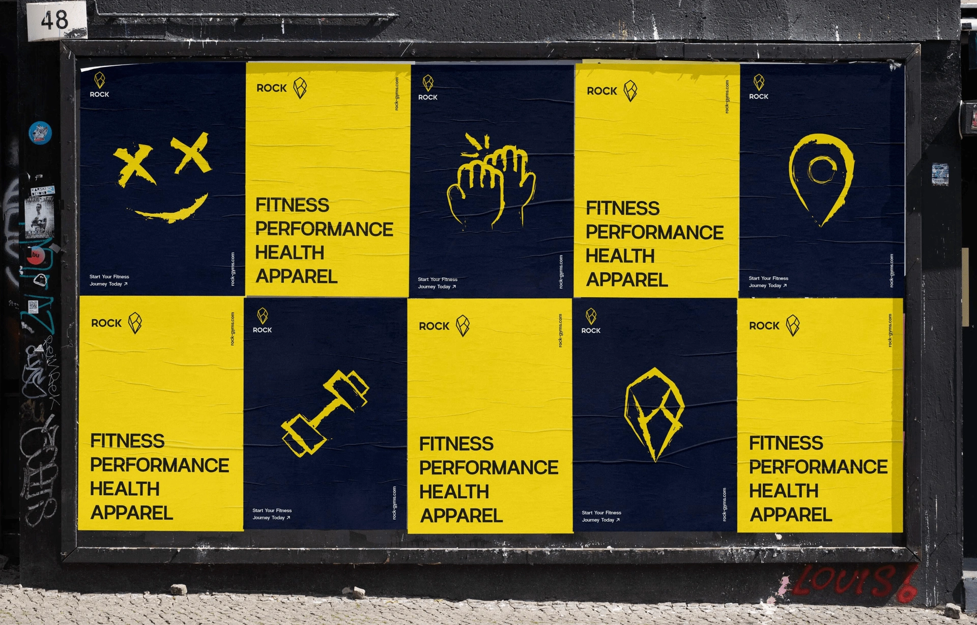
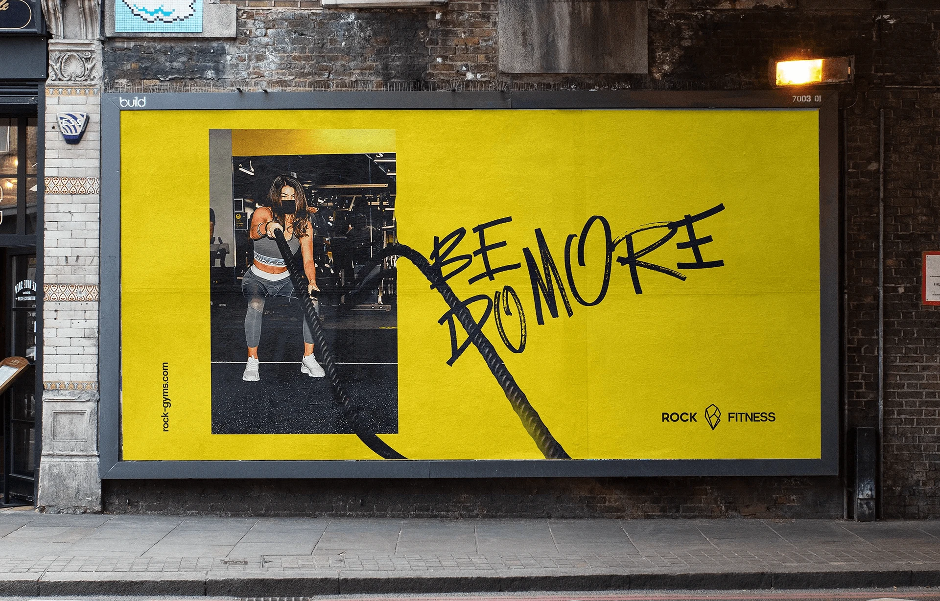
I developed a comprehensive creative content strategy to complement the rebrand, including advertisements, photoshoots, and commercial videos. Working with an in-house team of photographers, cinematographers, and directors, I ensured that every piece of content reflected the power and determination inherent in the ROCK Fitness community. From dynamic action shots to behind-the-scenes moments, we created engaging visuals that embodied the spirit of the brand’s new identity.
Through these assets, I could tell the story of ROCK Fitness's ongoing journey: a place where people come together, challenge themselves and push boundaries. The content not only highlighted the physical transformation but also emphasized the personal growth each experiences.
The Result:
The rebrand successfully merged ROCK Fitness’s heritage with a bold, modern design. The new ROCK diamond logo, incorporating both the letters and the mountain peak, symbolized the fitness center's journey from its past to a bright future. The clean, dynamic design resonated with both long-time members and attracted new clients who appreciated the fresh yet familiar feel of the rebrand.
The accompanying creative content, including advertisements and commercials, effectively communicated the renewed vision of ROCK Fitness. It helped the brand to stand out in a crowded market while reinforcing its identity as a trusted fitness community. The combination of strong visuals and compelling content energized both existing and new members, creating a sense of pride and excitement about being part of the ROCK Fitness family.

Final Thoughts:
The ROCK Fitness rebrand is a perfect example of how to honor a brand’s legacy while embracing innovation. By integrating key elements from the old identity into a modern, forward-thinking design, I helped ROCK Fitness redefine its visual presence and reinforce its core values. The end result was not just a refreshed logo but a revitalized brand that energized its community and set the stage for future growth.
Like this project
Posted Feb 19, 2025
A rebrand for ROCK Fitness, blending legacy and modernity through a refreshed logo and dynamic content, capturing the brand’s strength, resilience & community.
Likes
4
Views
13
Timeline
Jan 4, 2022 - Feb 25, 2022