Freelance Brand Designers in Community of Madrid
Sign Up
Post a job
Sign Up
Log In
Filters
2
Projects
People
Jorge Rico
Madrid, Spain
A solo brand designer with the power of a small collective
$25k+
Earned
2x
Hired
5.0
Rating
93
Followers
expert
Hired
Follow
Message
A solo brand designer with the power of a small collective
27
🔥 Working on a promotional post for Rico® Supply featuring the LIQUID Glass Effect, created in Jitter 🔥 Since the beginning, I’ve loved pushing the boundaries of what’s possible with Jitter — doing things that weren’t meant to be done. Today is one of those moments when you realize you’ve achieved something HUGE — something no one, not even the app’s creators, has ever done with this tool. I’m beyond excited to share LIQUID Glass, created entirely and exclusively in Jitter — pure creativity and native tools only.
8
27
834
4
ComPsych
4
64
5
Jitter Highlights
5
141
1
Virtz
1
44
Brand Designer
(8)
Follow
Message
Jorge Gutiérrez Marco
pro
Madrid, Spain
Brand & Web Designer | Gold Laus Award | Ex-FutureBrand
$5k+
Earned
5x
Hired
5.0
Rating
102
Followers
expert
Follow
Message
Brand & Web Designer | Gold Laus Award | Ex-FutureBrand
4
CasalTV: A Brand for Belonging at Home
4
59
1
Nuuk Cruise Agency: The Force of Seven
1
25
3
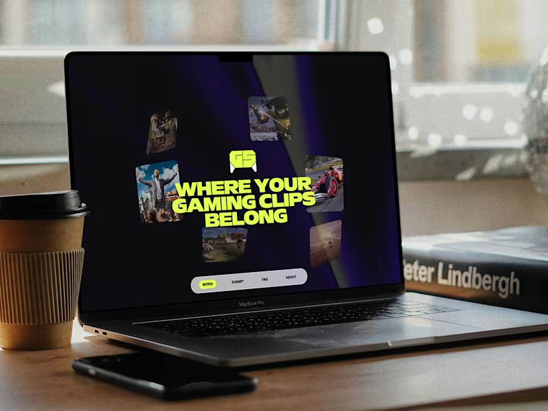
GameSprout Website Redesign
3
39
6
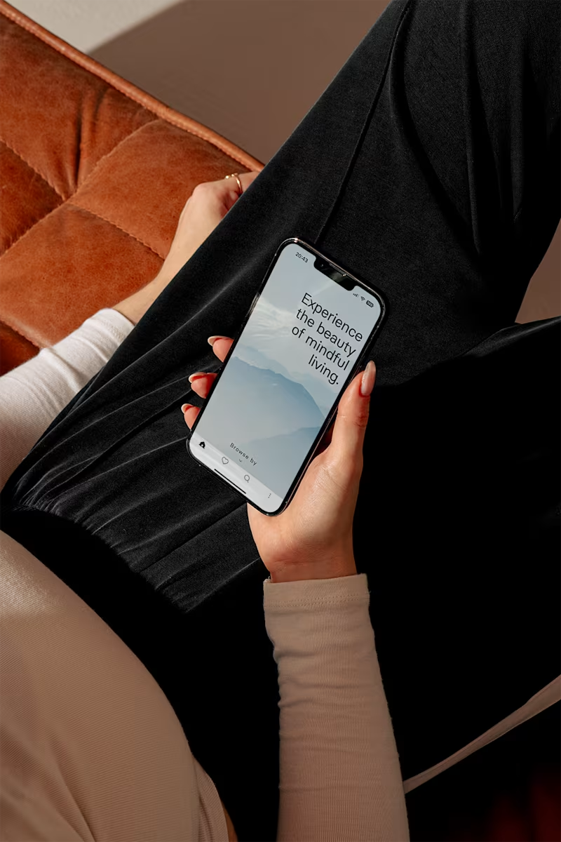
MuslimQuest: A Mindful Digital Experience
6
47
Brand Designer
(6)
Follow
Message
Virginia Roson
pro
Madrid, Spain
Creative designer blending strategy, style & AI tools.
$1k+
Earned
5x
Hired
5.0
Rating
136
Followers
Expert
Follow
Message
Creative designer blending strategy, style & AI tools.
108
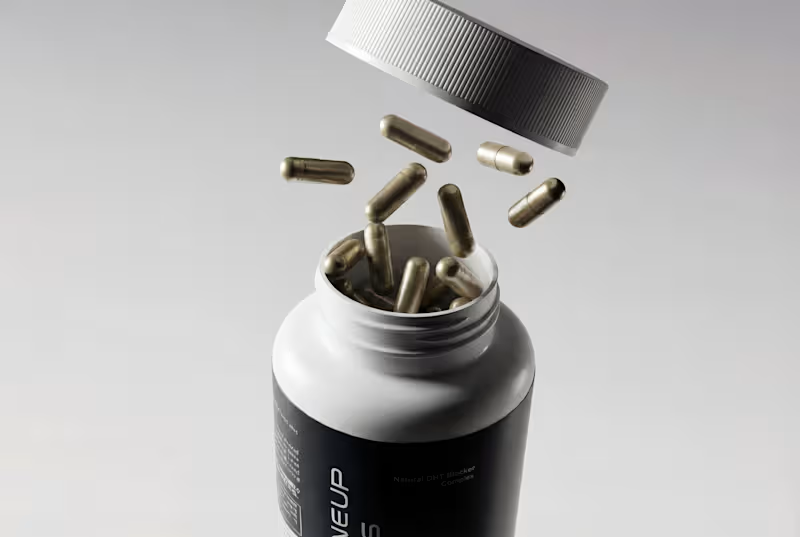
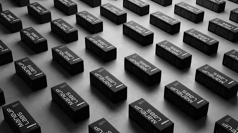
Hot take: hair growth products don't have to look like medicine to work like it. Most brands in this category go clinical white and blue, it reads safe, but it also reads like something you'd hide in a drawer, not something you'd want visible on your sink. For Maneup Labs, I went almost fully black instead. That was a real risk. In a category this saturated with sterile, pharmacy-white packaging, going dark could just as easily read cold, or get lost next to competitors leaning into "clean = trustworthy." But it did the opposite: next to every clinical-looking bottle on the shelf, black reads premium, not medicinal, closer to what you'd expect from a grooming or fragrance brand than a hair-loss aisle. That's the audience shift the whole rebrand was built around, not the guy who wants to feel like he's medicating something, but the guy who wants a product that looks like it belongs on his counter. Would a bottle like this make it out of your bathroom cabinet and onto your sink? Check it out (https://contra.com/p/oN7mPNlL-maneup-labs-brand-identity-and-packaging-design)
63
108
3.9K
10
Brand Identity and Packaging Design for Maneup Labs
10
213
46
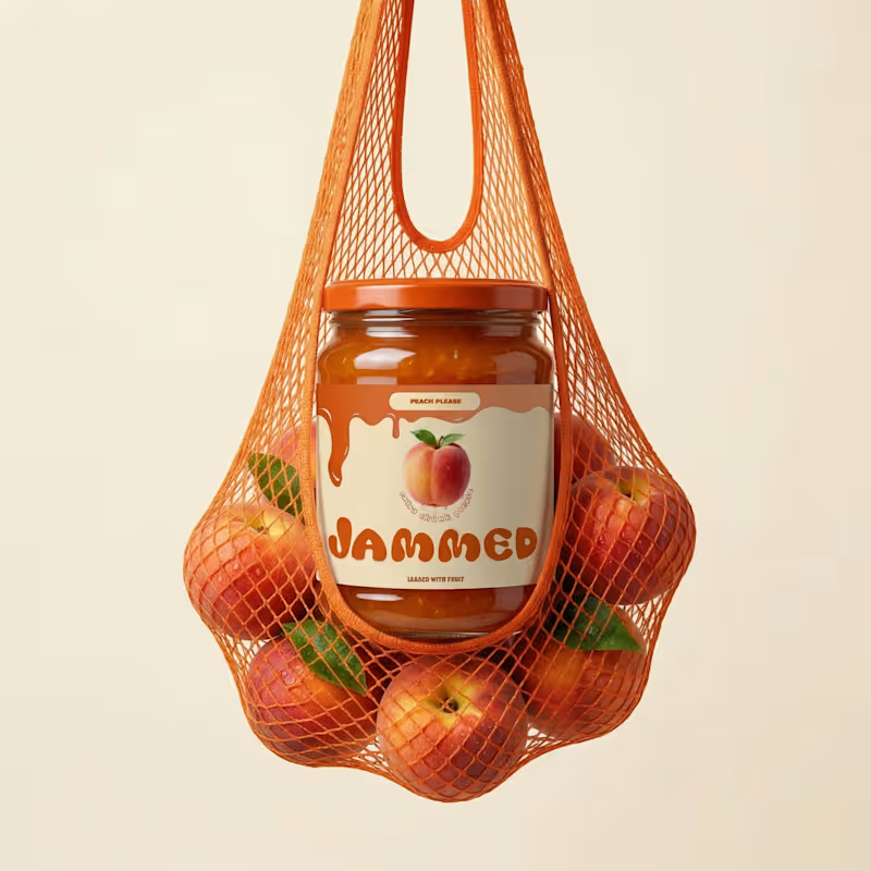
JAMMED- Branding & Packaging Design A contemporary jam brand exploring the intersection of food, fashion, and visual culture. Built through a bold identity system and expressive imagery. See more → @ThinkOnTheEdge (https://www.instagram.com/thinkontheedge/) What flavor are you choosing? :)
20
46
1.4K
7
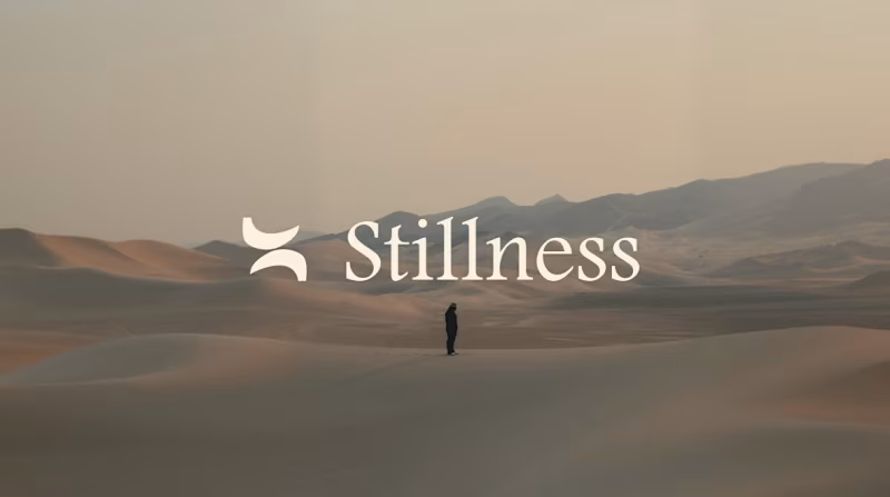
Logo, Branding & Web Design This is such an exciting project I've been working on!! Stillness is a luxury wellness retreats company based in Spain. Can't wait to share more!
7
655
Brand Designer
(14)
Follow
Message
Carlos Huertas
Madrid, Spain
Web designer helping brands to stand out | Strategic design
118
Followers
expert
Follow
Message
Web designer helping brands to stand out | Strategic design
3
Landing page for FolderV12 → folderv12.com (https://folderv12.com/) 🚀 We launched FolderV12 two days ago and it's already getting some traction. 📂 FolderV12 is an e-commerce brand of premium organizational products built for Creative & Ambitious minds. Our mission is to help this niche to get more mental clarity with their projects and help them focus on what matters. Nowadays, every organizational product/system is ugly, boring and useless, because they try to solve a generic problem, when in reality, each proffesional has specific needs, and therefore, need specific solutions. That's why we are focusing only on helping Creative and Ambitious minds. If you are interested, fill out the form from the website and enter our newsletter to discover more. We also have a Free gift for you in case you fill out the large Form. Really cool products and things about to come. FolderV12 will be the coolest brand in the industry.
4
3
221
21
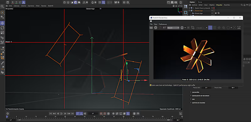
✱ Day 3 building my own digital brand - Documenting my journey as a designer in my 20s. Logo done and also a 3D version on C4D in order to stand out visually in the market, specially in the niche that will be this brand. ✅Research of the market and competitors done. ✅Naming defined. ✅Mission, vision & values of the brand defined. ✅Art direction of the project defined. ✅Logo done ✦ Currently building the website in Framer. A website that really stand out in the market, that builds authority, trust and maintains the brand consistency which helps a lot to increase brand awareness over time. I'm building a high-quality type of MVP that maybe it will evolve during the next years. That's why I'm building just the basics of branding and not an entire brand guidelines yet. This is a really high-quality and premium digital brand.
21
337
0
Branding + Landing page for my own newsletter.
2
0
132
23
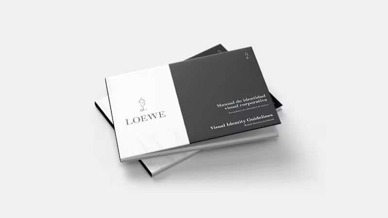
Maybe it's not very common to see projects about the luxury industry here but I wanted to share this branding project that I did. Hope you like it! Rebranding for Loewe + brand guidelines. Loewe is a Spanish luxury brand that focuses primarily on craftsmanship and sustainability. This rebranding was carried out with the aim of highlighting and emphasizing these brand values that set it apart in a sector as consumerist as luxury fashion. The goal was to approach this rebranding from a transparent perspective, directly connected to nature but taking into account the luxury, exclusivity, and elegance of the brand. Create a visual identity manual with brand guidelines in order to maintain a clear and consistent visual identity over time.
2
23
306
Brand Designer
(4)
Follow
Message
Isabella De Cuppis
Madrid, Spain
Designer & Creative Director
2x
Hired
14
Followers
Follow
Message
Designer & Creative Director
0
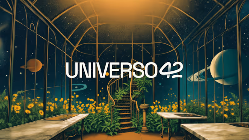
Visual Brand Identity for Universo 42
0
13
52
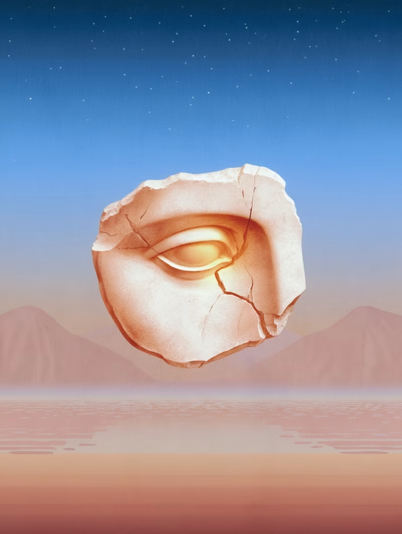
A brand system built around ideas needed images that could hold abstract thinking without turning literal. So I went looking for dreamlike spaces: small worlds a concept could live inside, recognisable as a family but never quite repeating. Reve made the exploring genuinely fun, and most of the work was in the nipping and tucking, chasing the small details until everything clicked.
18
52
1K
4
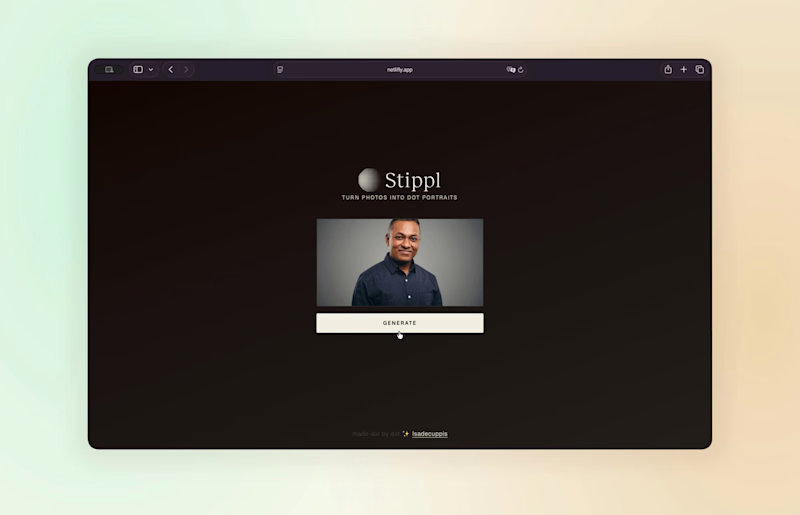
Ten years ago, generative brand tools required a developer and a real budget. Most designers could think these systems but hardly build them. Turns out, that changed. I recently designed a brand identity system that needed a way to unify speaker portraits from completely different sources. So with Claude (https://www.linkedin.com/company/claude/) as my partner in crime, I built Stippl, a browser-based tool that converts any portrait into a stippled illustration. It removes the background automatically and renders everything in dots, producing a consistent treatment every time. Brand assets, ready to use for everyone.
3
4
482
2
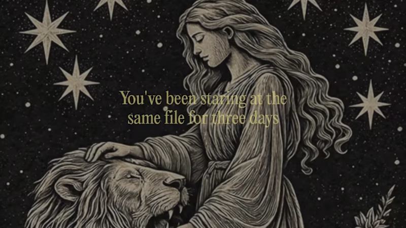
There's a moment every designer knows. You've been staring at the same file for three days and you can't see it anymore. You need someone to tell you the truth, but everyone around you is either too polite or too busy. The signs were always there. Ask the universe. ✨ Tarot critique is the Major Arcana, reread for designers. You paste your portfolio URL, turn the cards, and somewhere between a few centuries of borrowed wisdom and the thing you already knew but wouldn't admit, the reading finds you. Not your love life. Your work. The hierarchy that isn't working, the story you're not telling, the thing that has to go. Draw your cards. The deck has been waiting. 🌙 https://tarot-critique.figma.site/ Made in Figma Make ✺ cards in Reve ✺ assets in Figma Weave Figma community: https://www.figma.com/community/file/1649526102616790249 Twitter post: https://x.com/isadc_/status/2067697682773102721?s=20
2
2
282
Brand Designer
(3)
Follow
Message
Fernando Montezuma
Madrid, Spain
Senior Product Designer + Front-end for SaaS, Fintech & B2B.
1x
Hired
21
Followers
Follow
Message
Senior Product Designer + Front-end for SaaS, Fintech & B2B.
0
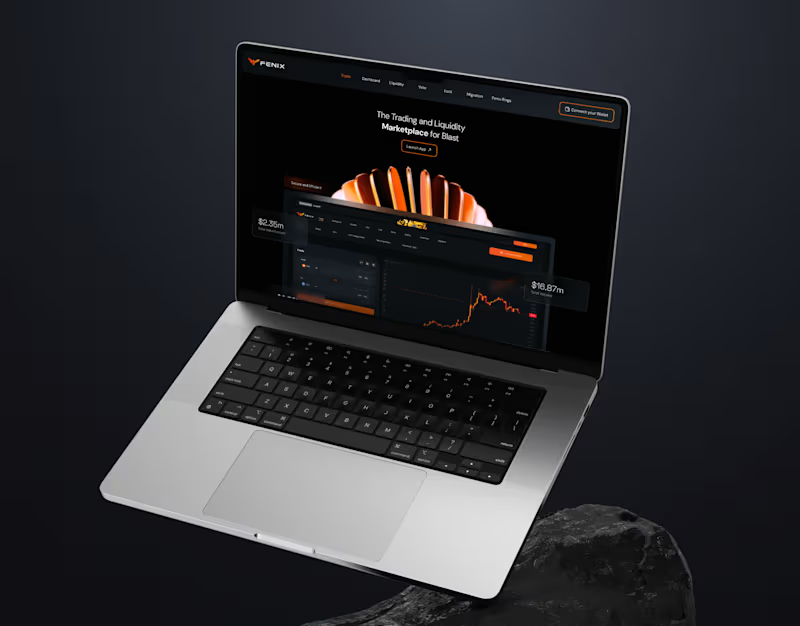
Fenix Finance - Branding, Website and Product
0
11
0
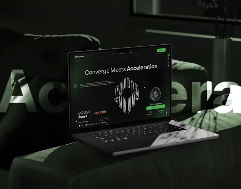
Accelera - Branding, UX/UI, Motion / 3D
0
15
0
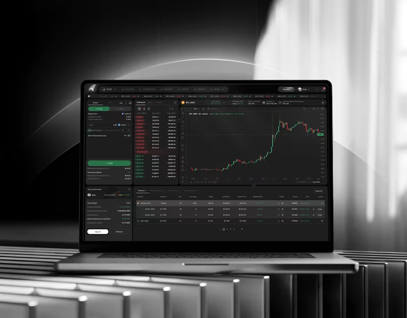
Carbon Terminal - Branding, UX/UI, Motion, 3D and Front-end
0
12
0
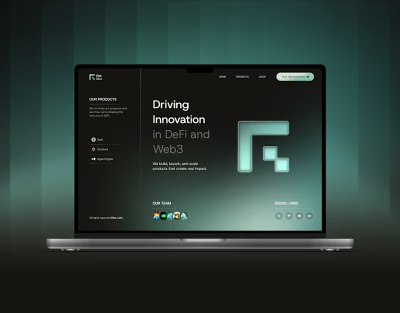
RiseLabs - Branding, UX/UI, Motion, 3D and Front-end
0
11
Brand Designer
(9)
Follow
Message
Joy Z
Madrid, Spain
E-comm branding. Clients include Specsavers, Bonobos, iHeart
1x
Hired
5.0
Rating
13
Followers
Follow
Message
E-comm branding. Clients include Specsavers, Bonobos, iHeart
0
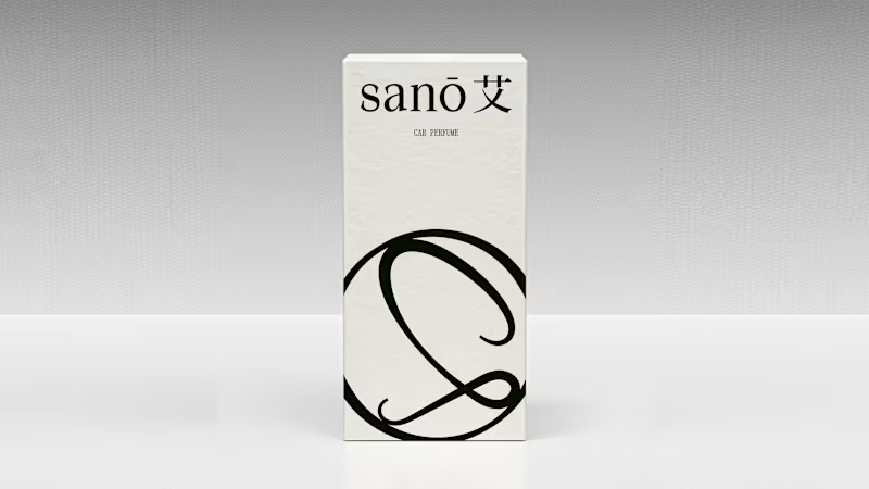
Brand Strategy and Creative Direction for sanō 艾
0
37
0
Raïa beverage brand identity
0
21
0
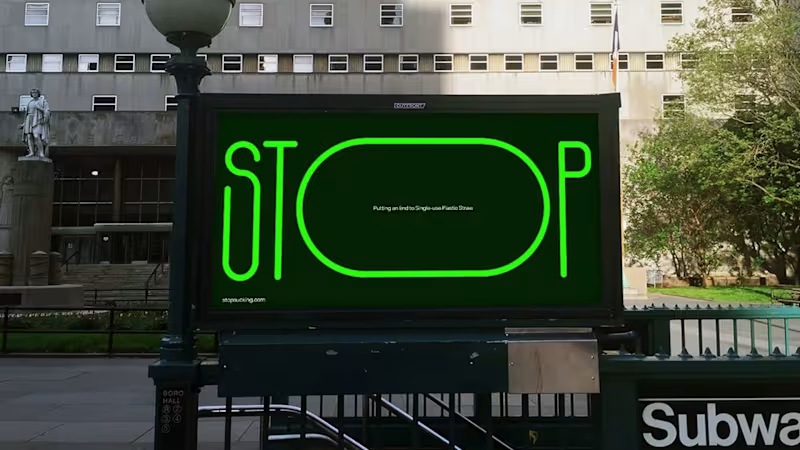
Stop sucking social campaign web
0
15
0
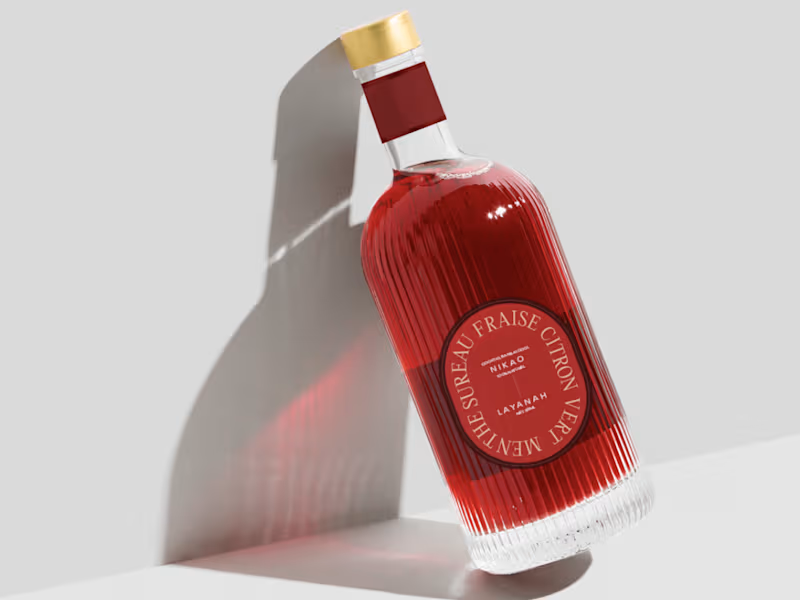
Nikao beverage mocktail branding
0
11
Brand Designer
(5)
Follow
Message
Andreu Martínez
pro
Madrid, Spain
VIDRIO| Creative Atelier & Art Direction by Andreu Martínez
26
Followers
Follow
Message
VIDRIO| Creative Atelier & Art Direction by Andreu Martínez
21
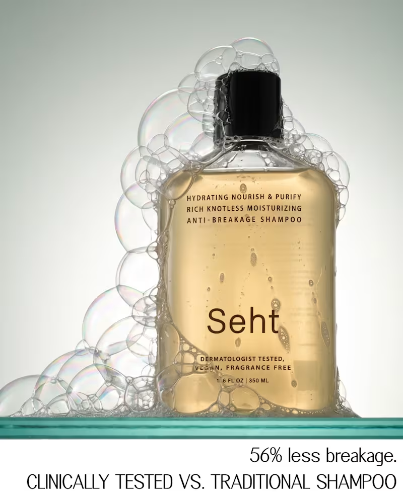
Seht — Haircare Product Photography Seht is a dermatologist-tested, fragrance-free haircare brand. The client came to me with a clear vision: a moodboard of minimal, editorial product photography for their shampoo and conditioner, and a request to create images in that spirit without copying any of them. The brief was clear, but it pulled in several directions: liquid in motion, foam, motion blur, dark still lifes, bright editorial rows. So before shooting anything, I built a short visual guide to hold the series together. It sets a three-tone palette, typography, camera and lighting rules, and one core restriction: only the product, its own formula, water and light in frame. From that system I produced a set of 10 campaign images, plus extra frames for social. Each one was built from the client's references, then refined through retouching so the bottles, labels and formula textures stay true to the real product. The result is a set that feels like a single campaign rather than ten separate photos, and a visual language the brand can keep building on.
14
21
479
27
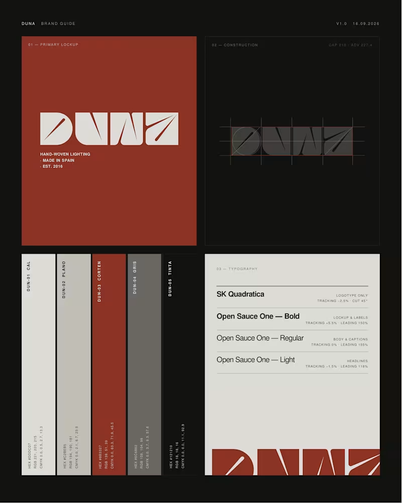
DUNA — Lighting brand identity (self-initiated) A full rebrand of Lab des Sens Atelier, a Spanish workshop that hand-weaves lighting in natural fibre. Every piece in their catalogue is named after a Spanish beach — Portlligat, Riazor, Zarautz. The brand itself was named in French. That gap was the whole project: new name, logotype, colour and type system, two collections, bilingual copy and a full set of campaign imagery, all built on one territory — the light of the Spanish coast. Every image was art-directed before it was made, then generated and finished by hand. Claude · Higgsfield · Photoshop · art direction throughout. Unsolicited concept, not affiliated with the brand. Does the direction land for you? Curious to hear what you'd have pushed further.
18
27
1.3K
7
Nórd — Brand identity & campaign for a fictional alpine optics brand Nórd isn't a real product. It's a self-initiated portfolio piece — a fictional high-performance ski goggle brand I built end to end: naming, logo, brand system and full campaign. The goal was to take technical winter gear and give it the restraint and desirability of a luxury fashion label. Process As always, analysis before execution. I studied the codes of technical eyewear and alpine editorial — cold light, mirrored lenses, balaclava styling — and anchored everything to one idea: clarity in the whiteout. The name Nórd (north) drove the system, and the accent over the Ó became a "north tick" — a diacritic that doubles as a compass mark, the single spark of colour in an otherwise monochrome identity. I built a mini brand manual (logo, colour, typography and an "N-System" of model and temperature codes like N-09 / −09°), then art-directed a full editorial campaign across registers — heroic low-angle portraits, cold atmospheric product shots and clean packshots — tied together by one visual system. Direction & craft Imagery was produced through my Augmented Art Direction approach: AI used as a precision instrument under tight creative direction, then refined by hand so the set reads as one campaign, not a folder of generations. Deliverables: naming & verbal identity · logo & brand manual · art direction · full campaign · retouching · copywriting. Design & direction: Vidrio.
9
7
667
34
Caelum — Concept project (fictional brand) Caelum isn't a real product. It's a self-initiated portfolio piece — a fictional daily collagen gummy I built end to end to practise taking a clinical category and giving it clean-beauty desirability. The name (Latin for "sky") set the direction: clarity. Skin, clear as sky. Form came before colour — I skipped the generic supplement jar for a sculptural asymmetric bottle, with a wide mouth for the gummies and matte soft-touch plastic instead of glass (glass would've been dishonest for something you open every day — the luxury is in the touch, not the shine). The campaign was directed through my Augmented Art Direction approach: AI as a precision instrument under tight direction, then unified by hand in Affinity so the set reads as one campaign. Real question for you: does the matte plastic feel more premium than glass here, or less? Curious where people land. 👇 Design & direction: Vidrio.
12
34
1.4K
Brand Designer
(9)
Follow
Message
Explore people