The network for creativity
Join 1.25M professional creatives like you
Connect with clients, get discovered, and run your business 100% commission-free
Creatives on Contra have earned over $150M and we are just getting started
Back to feedPost
Nórd — Brand identity & campaign for a fictional alpine optics brand
Nórd isn't a real product. It's a self-initiated portfolio piece — a fictional high-performance ski goggle brand I built end to end: naming, logo, brand system and full campaign. The goal was to take technical winter gear and give it the restraint and desirability of a luxury fashion label.
Process
As always, analysis before execution. I studied the codes of technical eyewear and alpine editorial — cold light, mirrored lenses, balaclava styling — and anchored everything to one idea: clarity in the whiteout. The name Nórd (north) drove the system, and the accent over the Ó became a "north tick" — a diacritic that doubles as a compass mark, the single spark of colour in an otherwise monochrome identity.
I built a mini brand manual (logo, colour, typography and an "N-System" of model and temperature codes like N-09 / −09°), then art-directed a full editorial campaign across registers — heroic low-angle portraits, cold atmospheric product shots and clean packshots — tied together by one visual system.
Direction & craft
Imagery was produced through my Augmented Art Direction approach: AI used as a precision instrument under tight creative direction, then refined by hand so the set reads as one campaign, not a folder of generations.
Deliverables: naming & verbal identity · logo & brand manual · art direction · full campaign · retouching · copywriting.
Design & direction: Vidrio.


The accent doubling as a compass tick is the kind of idea that lives or dies on the smallest application — a diacritic that reads on a poster can vanish once it's a 6mm mark moulded into a goggle strap. Did you end up with a simplified lockup for the physical product, or did the...

Spot on — exactly the risk. The tick only holds at large scale (posters, packaging). At strap/case size the wordmark drops to the monogram, with the tick as a solid built-in element — and at 6mm in rubber, colour is a lie, so it goes tonal/debossed rather than blue. The N-System...

Amazing work!
thankss Bella 🙌

Love how the typemark turned out! Very bold and feels daring 💪
appreciate it Vijay! 🙏 went bold on purpose — it had to read like equipment, not fashion. that glacier tick over the Ó doubles as a north marker too

The network for creativity
Join 1.25M professional creatives like you
Connect with clients, get discovered, and run your business 100% commission-free
Creatives on Contra have earned over $150M and we are just getting started







Related posts


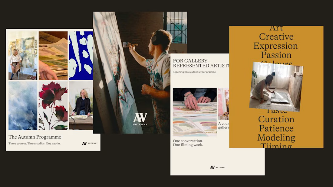
Arteway sells access to how working artists actually think. That's a hard thing to hold onto once you're at 15,000 students across 50-plus countries.
The risk with education platforms at that size is that the intimacy gets designed out. Everything gets standardized until it reads like a textbook with better photography.
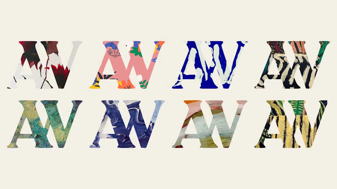
So the identity leans on the work itself. High-contrast type, a frame that behaves like a studio window, and enough restraint to let a canvas stay a canvas.
Scale doesn't have to flatten a brand. It just makes the original intention harder to protect.

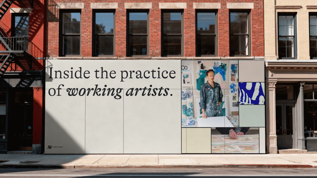
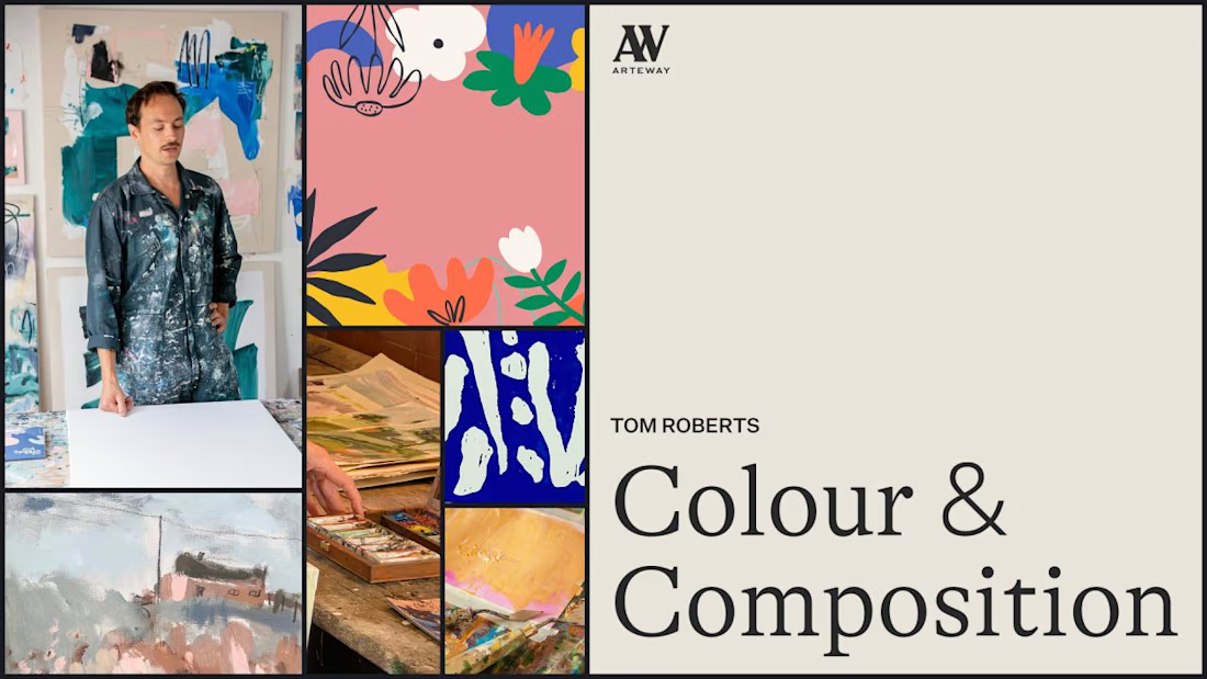

The intimacy usually dies in the product layer before it dies in the identity. At 15k students you are not writing copy anymore, you are deciding how many people share a cohort, how often the platform speaks to them, and whether the feedback loop runs through a human or a...

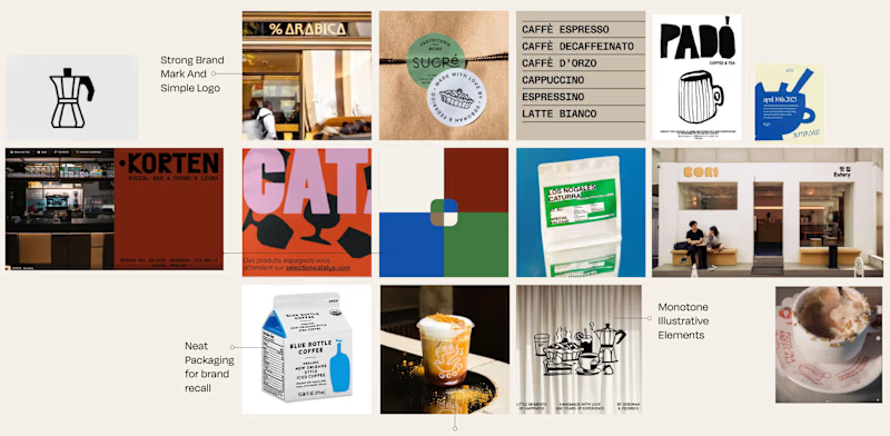
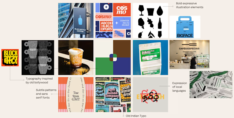
Is it Mood-board 01 or Mood-board 02!
Which mood-board do you think the client selected?


13 voted
76%
4 voted
24%
17 votes
Closed

Going with 01, it feels tighter and more intentional while 02 reads a little busy. Clients usually pick the one that looks safe to sign off on, and 01 has that calm confidence. Curious to hear which one won.