The network for creativity
Join 1.25M professional creatives like you
Connect with clients, get discovered, and run your business 100% commission-free
Creatives on Contra have earned over $150M and we are just getting started
Back to feedPost
Taste Test
Is it Mood-board 01 or Mood-board 02!
Which mood-board do you think the client selected?


13 voted
76%
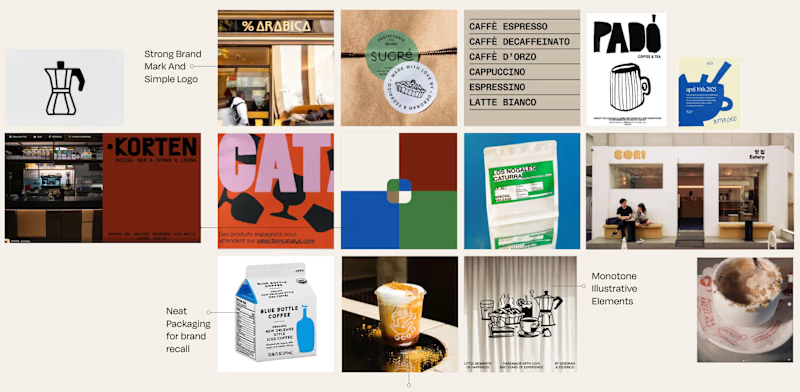
4 voted
24%
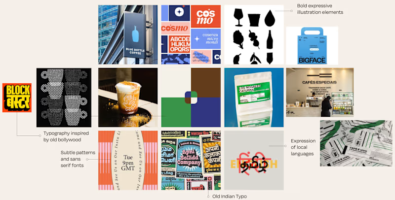
17 votes
Closed

1 feels more aligned!

Yeah, the client went with the 2nd one!

01, because the monotone mark and plain packaging are the easiest thing to brief a supplier from, and clients tend to pick the board with the least execution risk. 02 is the more memorable route though - the old Bollywood type and the local-language layer are what someone would...
Really like your thought process -would love to collaborate some day with you :) Interestingly, the client went with the 2nd one - local language integration was something that they wanted to include.

They went with the 2nd one, had slightly more variety.

Going with 01, it feels tighter and more intentional while 02 reads a little busy. Clients usually pick the one that looks safe to sign off on, and 01 has that calm confidence. Curious to hear which one won.
Yeah! Good to hear your thoughts - the clients usually do pick the safer one. But interestingly, they went with the 2nd one.

Top one are better I like it❤️❤️
Yeah! I too preferred that
The network for creativity
Join 1.25M professional creatives like you
Connect with clients, get discovered, and run your business 100% commission-free
Creatives on Contra have earned over $150M and we are just getting started







Related posts


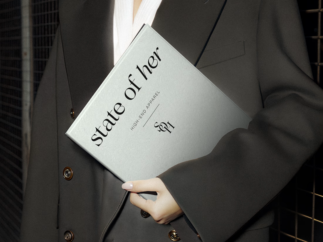
Introducing State of Her, a womenswear brand made for every state of her life.
Custom typography, sculptural monograms, and a softly grounded palette come together in an identity that balances confidence with ease.

Two Brands. Two Completely Different Creative Directions. 🎨
A brand’s visual identity can change everything about how its products are perceived.
✨ Option A: Cinematic Minimalism — elegant, refined, and luxurious.
🔥 Option B: Modern Editorial Collage — bold, expressive, and adventurous.
Both styles tell a different story, but which one captures your attention?
Vote A or B in the poll and tell me what makes your choice stand out!
Need eye-catching advertisement designs for your brand, product, or social media campaign? I create custom ad creatives tailored to your brand’s identity, audience, and goals.
Have a project in mind? Explore my services on Contra and let's bring your ideas to life.
1 voted
14%
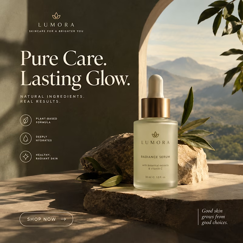
6 voted
86%
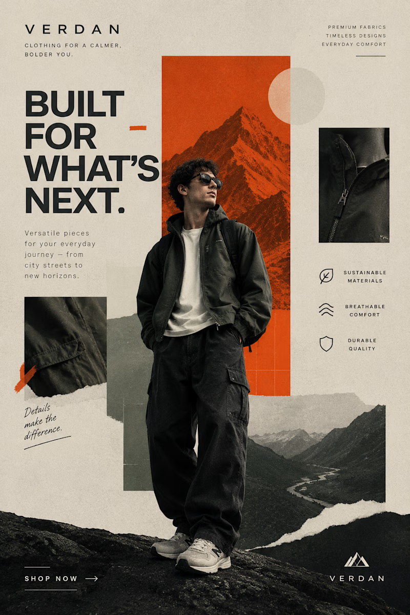
7 votes
Closed


I am a creative graphic designer passionate about turning ideas into eye-catching designs. I create unique and professional designs, including logos, social media posts, business cards, posters, banners, and branding materials. My goal is to bring your vision to life through creativity, quality, and attention to detail. I believe every design tells a story, and I am here to make your brand stand out with beautiful and meaningful visuals. ✨🎨