Creating what matters, for brands with vision.
- $1k+
- Earned
- 1x
- Hired
- 5.0
- Rating
- 93
- Followers
Creating what matters, for brands with vision.
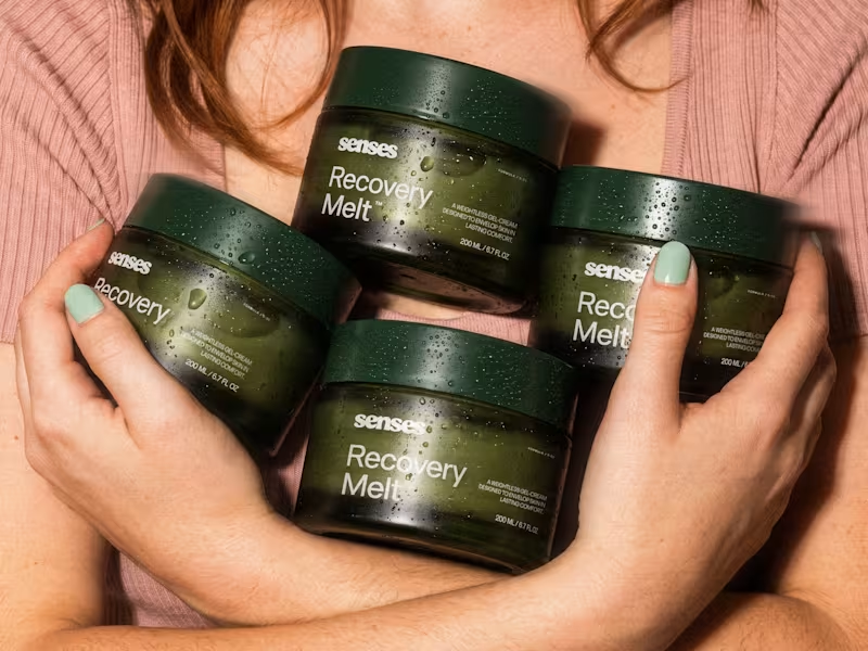
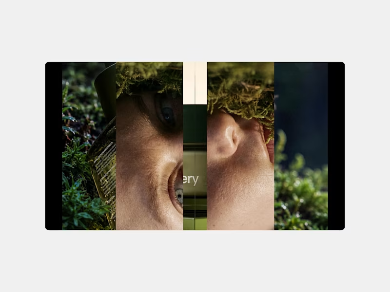
A first glimpse of Senses, a skincare rebrand I’ve been working on. Here's a few highlights from the identity, packaging and art direction.
There’s still more to reveal. Full project coming soon.
6
33
1.6K
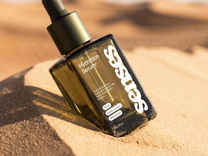
An early taste of Senses, a skincare identity built around the shift from overstimulation to comfort. The system pairs a fluid wordmark with clinical typography and an olive-glass form designed to feel precise, tactile, and quietly luxurious.
For this Hydration Serum study, I placed the same object between two sensory extremes: humid moss and sun-warmed sand. One speaks to replenishment; the other, to the need for it. Which world draws you in?
32
88
3.5K

Ecommerce Designer · Digital shelf, Shopify, AI-accelerated
- 5.0
- Rating
- 16
- Followers
Ecommerce Designer · Digital shelf, Shopify, AI-accelerated

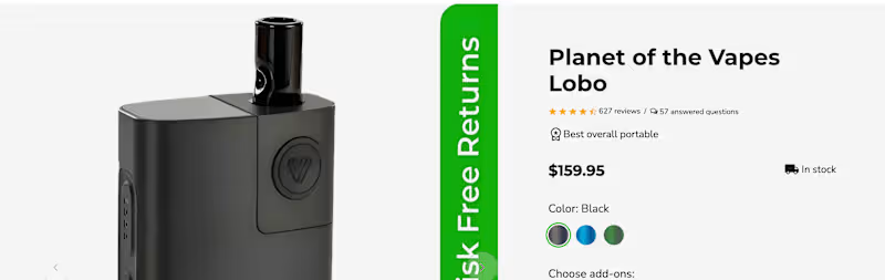
Your reviews are probably in the wrong place.
Most PDPs bury them at the bottom, after specs and shipping info. But shoppers look for proof the moment they hesitate, usually next to the price and the Add to Cart button.
Here's the layout I use on ecommerce PDPs:
Star rating + review count right under the title (tap to jump).
Two or three short snippets near the buy box that answer the top objection (fit, flavor, battery life).
Q&A right after the description, so doubts get answered before they turn into exits.
Full reviews lower down, filterable by use case.
Social proof works best when it shows up at the moment of doubt, not after it.
Where do your reviews live right now?
#Ecommerce #CRO #ProductDesign
3
146
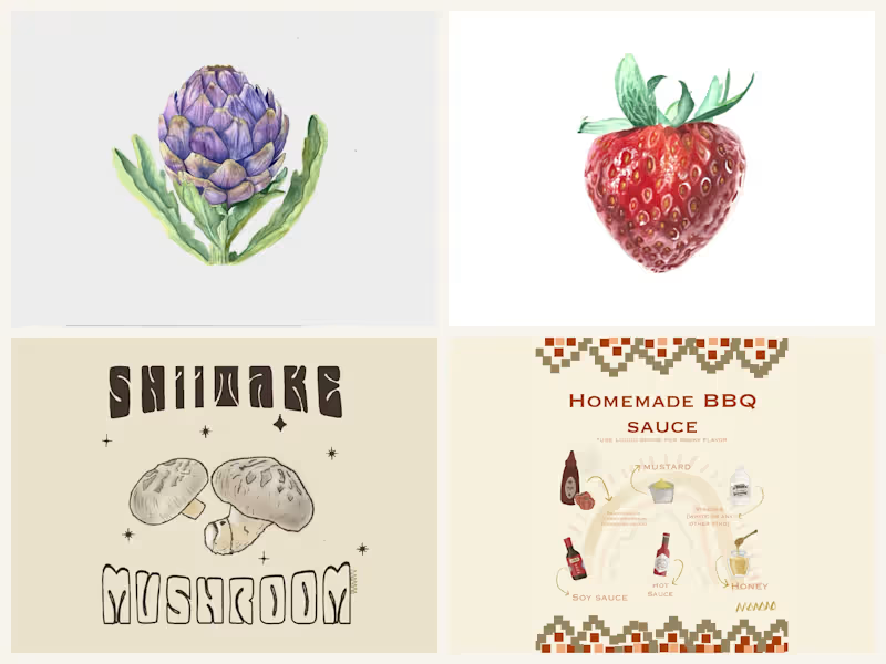

I like to create brands through people🌈🥰.
I like to create brands through people🌈🥰.
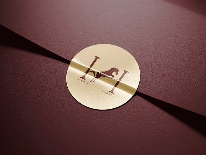


Freelance Logo, Brand and Motion Designer
Freelance Logo, Brand and Motion Designer



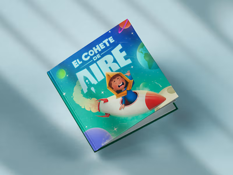

Community Manager, Journalist & Designer
Community Manager, Journalist & Designer


Digital developer - From start to finish
Digital developer - From start to finish


Art Director Building brands that connect, compete, and grow




Senior Creative Designer at Edelman
Senior Creative Designer at Edelman