
pro
Emerson Barona
Art Director Building brands that connect, compete, and grow
New to Contra
Emerson is ready for their next project!
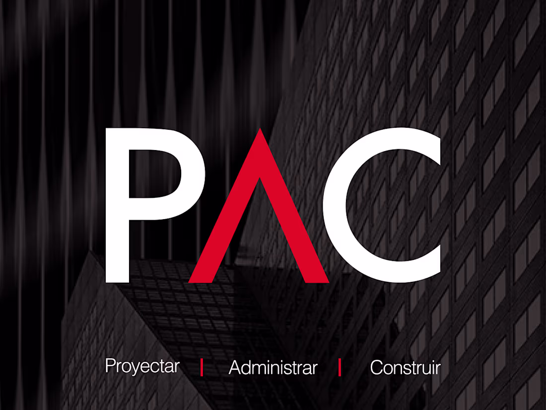
PAC — Brand Identity
PAC brings together over 30 years of combined experience in project management, property administration, construction, and maintenance services. The challenge was translating that depth of expertise into a visual identity that could compete on a different level —one that felt clear, modern, and professional in a sector where most players look the same.
The project was built from scratch: every visual asset and communication strategy developed with a single goal in mind —differentiation. The result is a brand that reflects the seriousness and scale of what PAC actually delivers, and has since become a recognizable presence in their market.
0
76
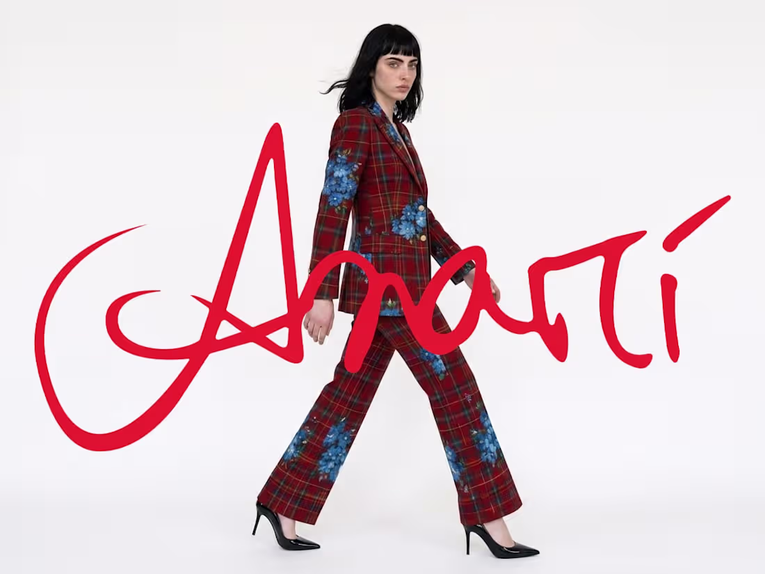
Anarí — Brand Refresh
Anarí already existed. It worked. But there was a gap between what the brand actually was and what it was showing the world.
Behind Anarí is an independent fashion designer with a distinct voice, a genuine obsession with Vivienne Westwood, and an aesthetic that lives in the tension between punk rock and high fashion. The work was closing that gap —reinterpreting the brand's ideology and building a visual system that could finally match its real personality.
The process started with concept. Graphic elements from the designer's own creative process were recovered and reintegrated, the color palette was simplified, and an expanded visual language was layered in: punk rock, high fashion photography, torn paper as a graphic device, and the energy of strong, fresh-spirited brands like Stüssy. All of it held together by a system that doesn't constrain —it amplifies.
The deliverables covered the full refresh: new brand guidelines, website design, and art direction for the brand's audiovisual presence across social media and graphic content. Every piece built to say the same thing —an independent fashion brand that doesn't ask for permission.
0
113
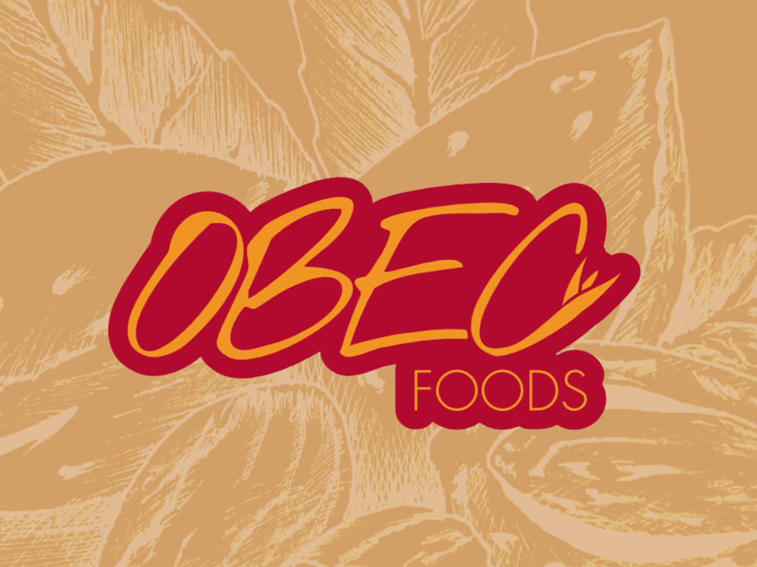
Obec Foods — Full Branding
Obec Foods had a starting point —but it needed a fresh start.
The brand produces oat-based cookies, granola, and muffins made from homemade recipes. The core idea is straightforward and honest: healthy snacks that complement an active lifestyle without asking you to give up what you love. That proposition became the center of gravity for the entire rebrand.
The project covered full brand development: concept, brand guidelines, handmade illustrations, packaging, and key visuals for graphic content. The illustrations were one of the most defining elements of the project —drawn by hand to reinforce the artisanal nature of the products and give the brand a warm, distinctive personality. The color palette follows the same logic: vibrant, natural, and health-forward, without falling into the visual clichés of the wellness world.
The result is an identity that holds together across every touchpoint —from packaging to communication pieces— and speaks directly to people who live actively and choose what they consume with intention.
Obec Foods isn't a diet brand. It's a brand for conscious enjoyment.
0
54
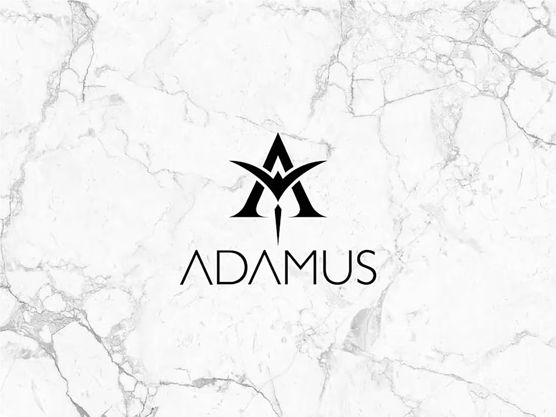
Adamus Accessories — Full Branding
Some brands arrive with a story worth telling from scratch. Adamus Accessories came with a singular material —bonded marble— and a clear conceptual obsession: alchemy. The challenge was building a visual universe from the ground up that could carry the weight of that inspiration.
With no existing identity to work from, the process started where it had to: concept. Three pillars defined the visual direction —gothic art, sacred geometry, and alchemy as the brand's philosophical and aesthetic keystone. Every design decision that followed had to earn its place within that symbolic system.
The logo was one of the most rewarding problems to solve. The brief was to compress three ideas into a single mark: the A as origin, the elemental star, and the phoenix as a symbol of transformation. The result fuses all three into a precise geometric form with a subtle resonance to masonic symbolism —enigmatic without being cryptic, distinctive without being loud.
The scope covered the full brand ecosystem: brand identity, brand guidelines, art direction for graphic and audiovisual content, social media, stationery, packaging, and e-commerce website design. Every touchpoint was treated as part of a unified experience, not a collection of isolated deliverables.
Art direction was the second major challenge —and the second major achievement. Translating the physical nature of the pieces into a visual language for screen and print required finding the exact tension between fashion, statement, and darkness. The outcome is an aesthetic that doesn't imitate its references —it distills them. Visuals that communicate the brand's personality before a single word is read.
Adamus isn't an accessories brand that uses alchemy as decoration. It's a brand built inside out, where the symbol and the object are the same thing.
0
121