
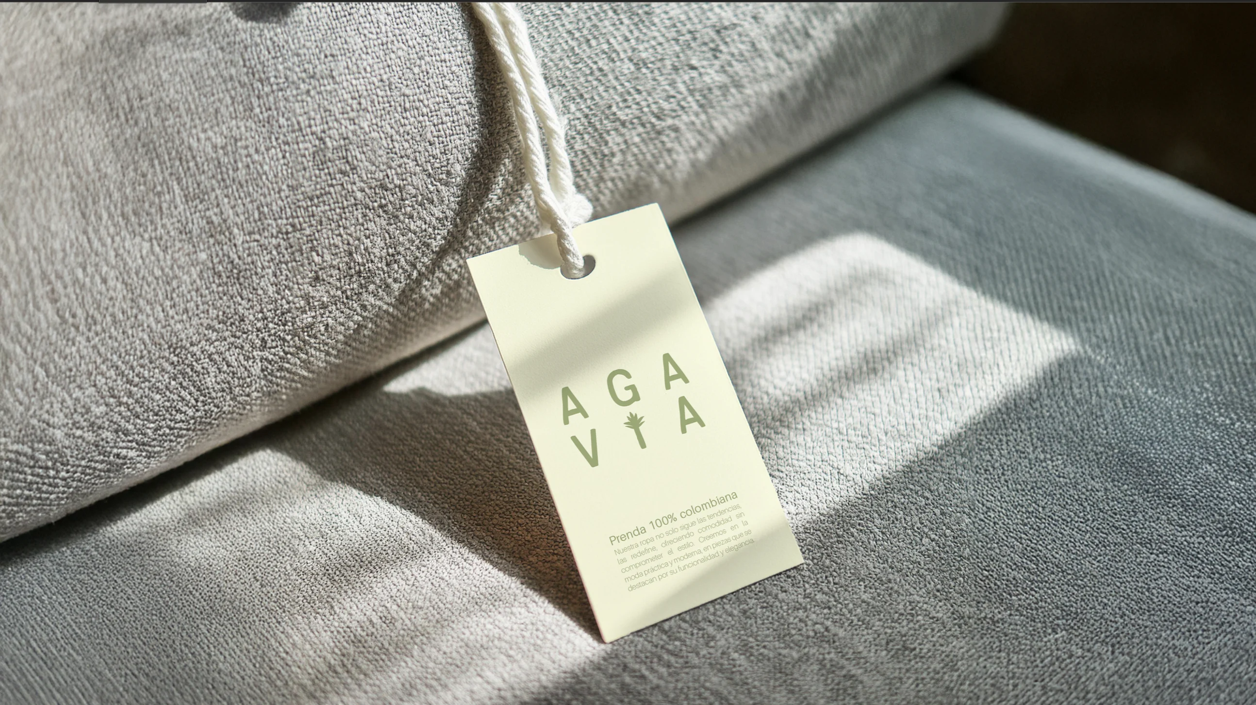
🌵What the Client Needed: The client sought to elevate their brand positioning and emotionally connect with their audience. They wanted AGAVIA to be perceived as a brand offering timeless pieces—cool, modern, and effortlessly stylish—while maintaining a strong connection to its roots, inspired by the agave plant.
✨How I Turned It Into Something Magical: By diving deep into the brand’s essence, I crafted a bold yet elegant visual identity that blends tradition with modernity. The rebranding process focused on developing a sophisticated and versatile aesthetic, combining a refined typographic system, an earthy yet contemporary color palette, and a compelling storytelling approach centered on the slogan "A raíz de los hilos" ("Rooted in Threads"). This created a unique brand experience that feels both aspirational and deeply authentic.
The transformation involved analyzing market trends, defining a cohesive brand narrative, and ensuring consistency across all touchpoints. We strategically designed the logo to reflect strength and elegance, developed a content strategy that reinforces the brand’s timeless appeal, and implemented a seamless digital and social media presence to enhance audience engagement.
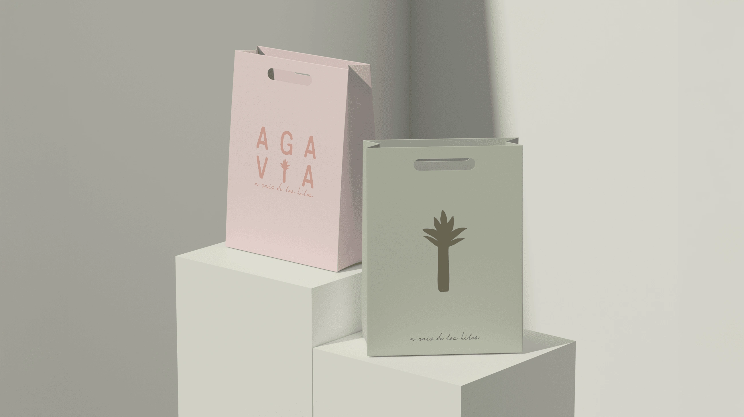
bag mockup.

brand icons.
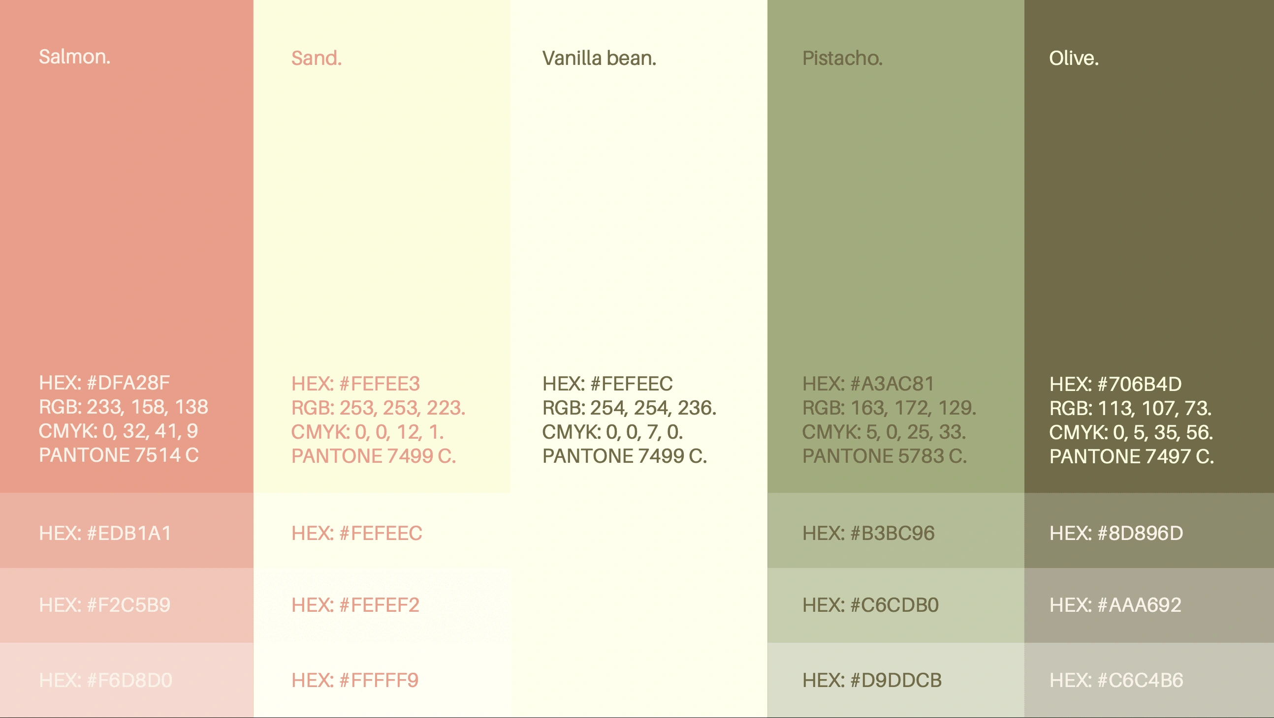
brand colors.
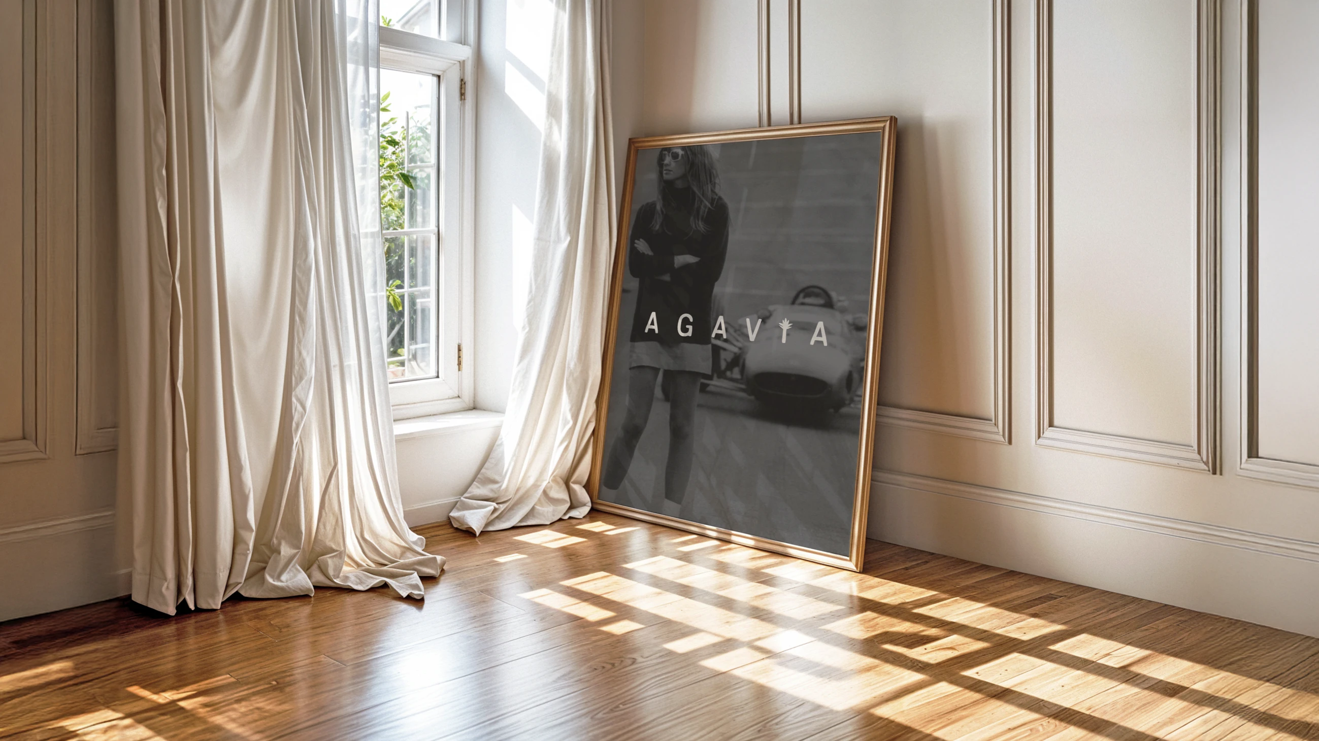
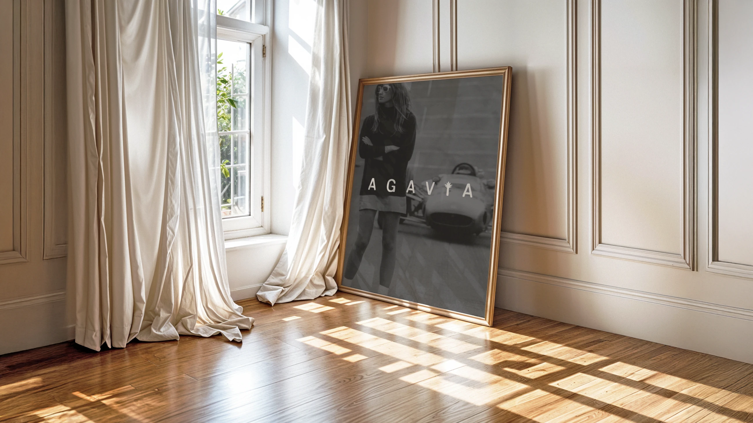
brand mockup.
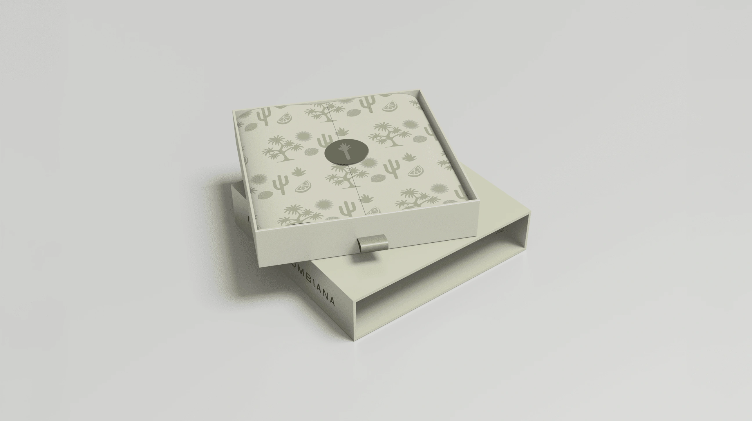
package mockup.
1 like · 15 views · Feb 12, 2025
Fashion as identity. Designing Agavia meant crafting a brand where minimalism meets bold self-expression, empowering women to stand out with authenticity.
Timeline
Nov 4, 2024 - Dec 2, 2024


