
AI, SaaS & Brand Websites That Make You Look Funded


AI, SaaS & Brand Websites That Make You Look Funded


I build high-converting SaaS landing pages in Framer.

I build high-converting SaaS landing pages in Framer.


Revamped my personal site (https://robbifirmansah.framer.website/) and simplified it into a one-pager.
6
11
735


Brand and Web Designer
Brand and Web Designer


Fractional PM

I built an AI-powered email assistant designed specifically for real estate agents. The system scans incoming emails and automatically categorizes them into high-priority actions such as buyer inquiries, showing requests, contract updates, and lender follow-ups.
Important emails are highlighted and prioritized so agents can immediately see what needs attention instead of digging through long inbox threads.
The assistant can also generate AI draft replies for common scenarios, allowing agents to respond with one click. This helps reduce time spent managing emails, ensures important leads are not missed, and keeps deals moving faster.
0
521


Wordmark Logo Specialist | Brand Identity Designer
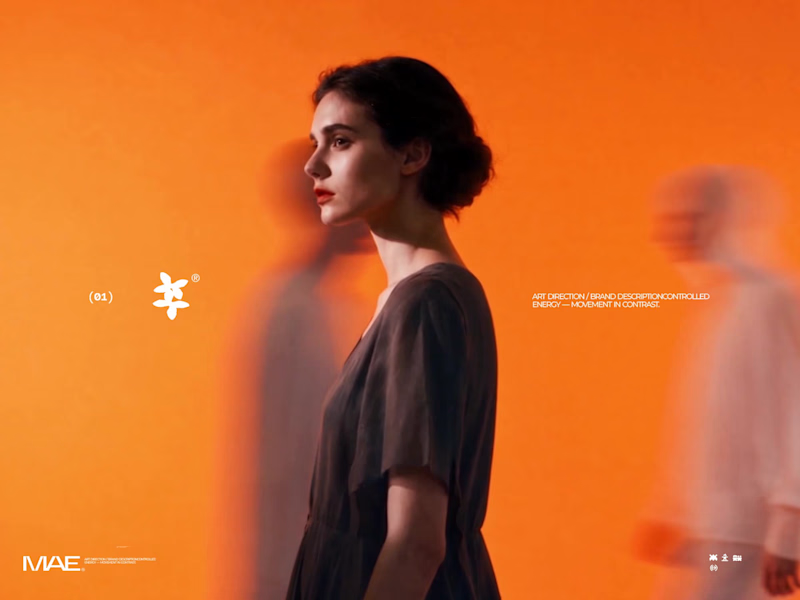
MAE — Art Direction & Brand Visual Identity
A visual identity concept developed for MAE, built around the idea of “Controlled Energy — Movement in Contrast.” The direction explores the tension between individuality and constant movement, using a sharp central subject surrounded by blurred figures to create a strong visual narrative.
The Challenge
The goal was to create a visual language that felt distinctive, contemporary, and emotionally engaging without relying on excessive graphics or conventional branding. The challenge was to communicate movement and energy while keeping the brand feeling refined, minimal, and controlled.
The Solution
I developed an art direction centered around contrast — stillness vs. movement, focus vs. distraction, and individuality vs. the crowd.
The orange environment creates a bold visual signature, while the motion-blurred silhouettes represent the constant movement surrounding the individual. The sharply focused central figure becomes the visual anchor, communicating confidence, identity, and control.
The same visual language was then extended into the brand composition through minimal typography, logo placement, graphic symbols, and structured spacing, creating a system that can work across campaigns, social content, editorial layouts, and brand communications.
My Role
Art Direction · Brand Identity · Visual Concept · Graphic Design · Typography · Brand Composition
I was responsible for developing the visual concept, defining the art direction, establishing the graphic language, and translating the concept into a cohesive brand presentation.
Concept → Art Direction → Visual System → Brand Application
13
23
3K

Digital Content Creator | UI/UX Designer | Framer Developer
- 1x
- Hired
- 5.0
- Rating
- 16
- Followers
Digital Content Creator | UI/UX Designer | Framer Developer


Project Systems Specialist for Clear Execution
- 1x
- Hired
- 5.0
- Rating
- 6
- Followers
Project Systems Specialist for Clear Execution


Combining technical skills with Strategic experience


View more →