
What if your favorite skincare brand got a Halloween makeover? 🕷️
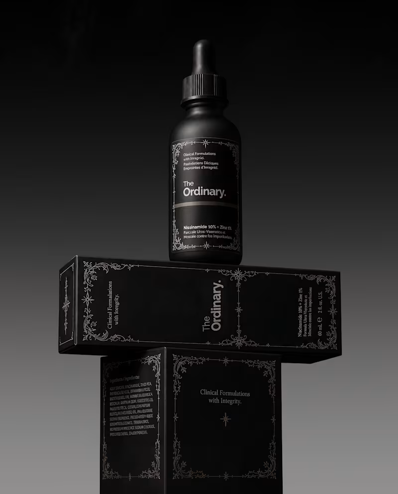
For this little experiment, I’m giving The Ordinary a 𝔤𝔬𝔱𝔥 alter ego.
The challenge was keeping the things that make the brand instantly recognizable: its straightforward logo and typographic editorial layout, clinical packaging, and no-nonsense aesthetic.
Instead of turning it into a completely different brand, I wanted to push those same elements into darker territory with 𝔢𝔢𝔯𝔦𝔢 tones🕸️ , gothic details, and a more mysterious product presentation.
Even in costume, you should know exactly who you're looking at.
Which brand would you love to see get a Halloween makeover next? 👻
19
66
2.3K
A little packaging design appreciation 🌞
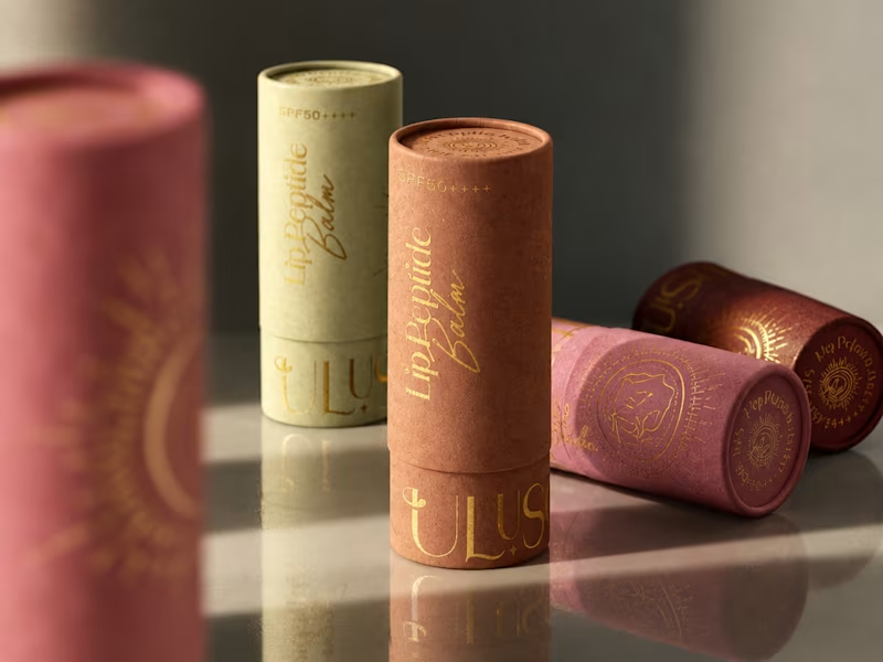
UluSoleil was one of my first big clients, and over time, I helped bring four of their products to life through packaging design.
This lip balm tube was all about balancing a delicate, feminine aesthetic with clear product communication, thoughtful typography, and functional packaging.
I’m still working on the full case study, but I wanted to share a little peek at the process!
More to come ✨
62
110
4.4K
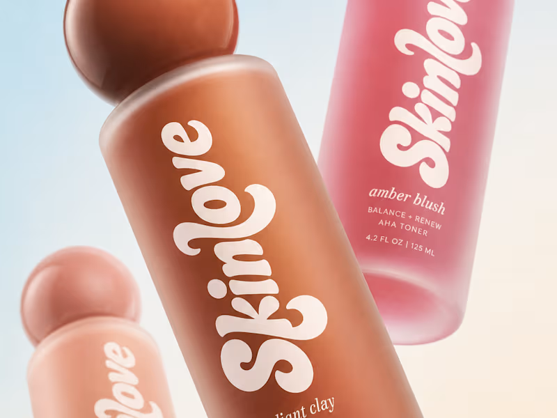
Why do half the skincare and fashion brands launching this year look like they share the same designer?
Serif logotype, tight tracking, one accent color. ✅ It reads as elevated the first time. By the twentieth brand, it reads as a template, not a decision.
Safe typography isn't neutral, it's a choice too, sometimes one that avoids taking a position 🤭.
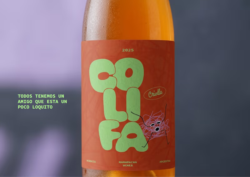
So I designed a set of mockups with custom letterforms built to argue the opposite: type with weight, texture, and enough attitude to hold its ground on a shelf full of quiet logos. 💅
What's the last fashion or skincare brand whose type actually made you stop scrolling?
9
46
2.5K
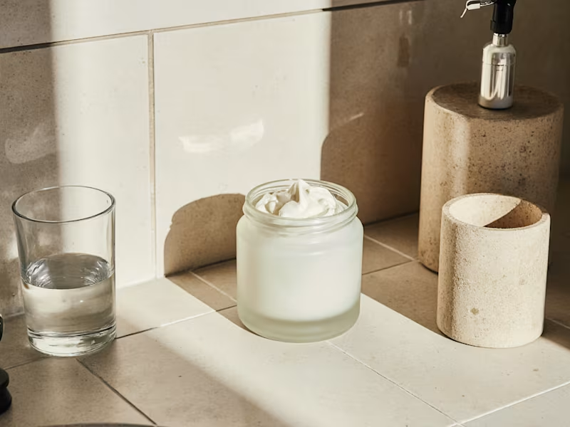
Do you want to generate consistent, eye catching images and mockups like these for your wellness or cosmetic industry clients?
I’ve been creating AI-generated packaging and lifestyle imagery, and I recently made a few updates to my Brand Image Prompt Kit for Skincare Brands.
If you’re tired of getting random results that look nothing like your brand or are inconsistent, this product ✨ will help ✨
Includes 4 core prompt scenarios, and 20+ ready to use images.
🔗 Brand Image Prompt Kit (https://contra.com/products/jStCKO3s-brand-image-prompt-kit-for-skincare-brands?utm_source=chatgpt.com)
17
38
3K
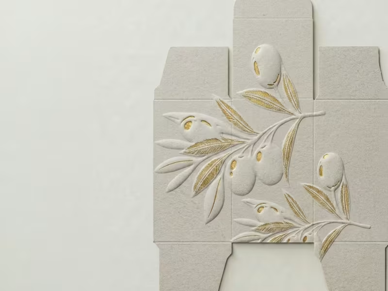
How do you design a skincare brand inspired by olives… without making it look like olive oil? 🤔 🤌🏼 That's the challenge I'm currently working through!
The hero ingredient naturally brings to mind food, kitchens, and grocery shelves. But this brand belongs in a premium skincare space.
So instead of focusing on the fruit itself, I'm exploring the Mediterranean lifestyle, botanical illustrations, tactile packaging, earthy color palettes, and editorial typography to communicate the ingredient without feeling edible.
This project is still a work in progress, but I thought it would be interesting to share the exploration before the final result.
Curious... if you had to communicate olives without illustrating an olive, where would you start?
38
127
8.8K