Brand Design Projects in BogotaBrand Design Projects in BogotaThere are design decisions that don't come from the client. They come from within—and sometimes, that is exactly the problem.
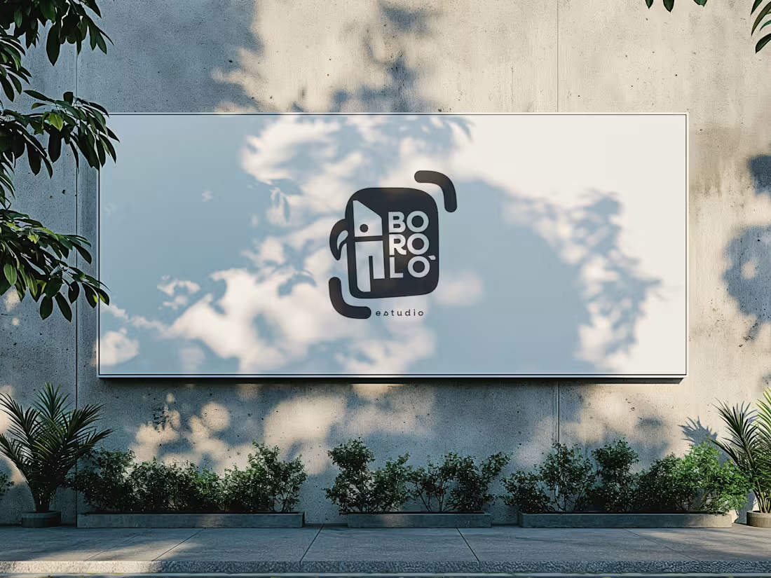
The previous logo for Boroló Estudio had soul. It had pre-Columbian roots, a hand-drawn stroke, and an indigenous character. It evoked drums, authenticity, and the Chocó—one of the most biodiverse and culturally rich regions in Colombia, a land of jungle, rivers, and a visual identity unlike any other. I loved it. And precisely because of that, I failed to evaluate the challenges the logo would face on real-world platforms: on a website, as an Instagram avatar, or in digital spaces.
The redesign wasn't about letting go of the logo. It was about letting go of the attachment.
The problem wasn't aesthetic—it was one of coherence. The studio’s brand had evolved, but the logo hadn't. A composition with too many elements in tension made the icon struggle to be memorable; what people saw didn't connect with who Boroló truly is.
The new system retains the bird—now geometric, set in negative space within the icon. The inner container references the studio’s actual architectural blueprint: the diagonal of the cyclorama ceiling and the two zones of the space. The brackets refer to photographic framing. No layer imposes itself over the other—they are discovered.
The result is a versatile system: imagotype, vertical logo, and wordmark. It works on a sticker, a billboard, an avatar, or a website. It scales without losing its identity.
Redesigning doesn't mean the initial design was bad. It means communication needed to evolve. And from that point of view, the change isn't a correction—it’s a decision. La Mie, Brand Identity and Custom Mascot Design
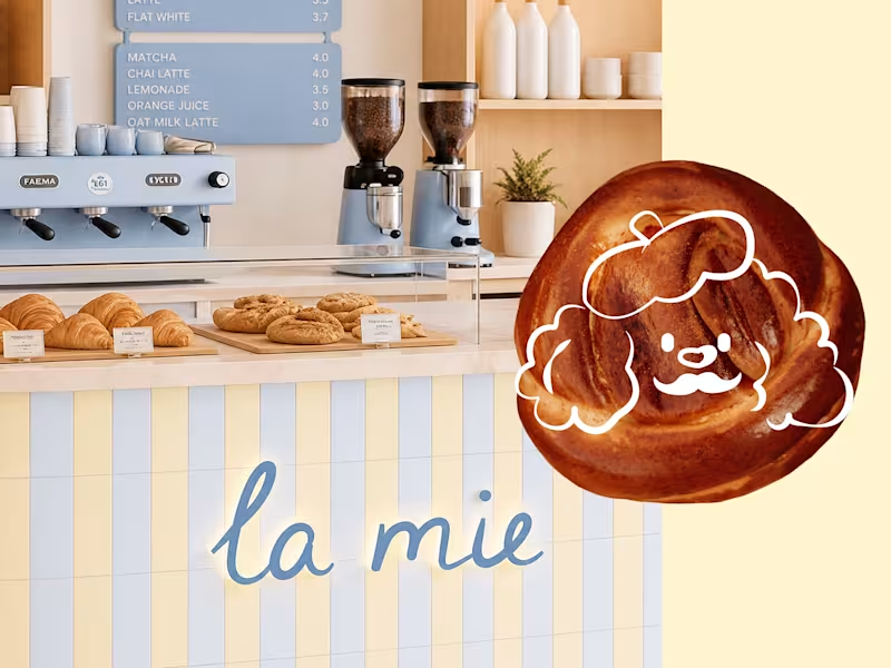
We created a cozy, emotionally driven brand identity for la mie, a conceptual French bakery built around the tagline "buns as airy as a cloud." Aiming for a 100% original, contest-compliant solution, we bypassed generic stock graphics and avoided pre-existing brand redesigns, developing the entire project from scratch using the platform’s asset ecosystem.
The creative sprint started with bakery market research, naming iterations, and AI-assisted layout exploration. The brand’s anchor is a custom mascot, a charming poodle in a beret, hand-sketched on a tablet and vectorized for perfect scalability. To amplify the warm, artisanal vibe, we replaced commercial fonts with custom hand-lettered typography for the primary logo, while pairing it with clean supporting fonts from the platform’s approved library. The final presentation integrates a soft pastel palette of biscuit yellow and cloud blue with AI-generated packaging mockups, including branded coffee cups and pastry bags curated straight from the gallery. MRH — Website Redesign & Ecommerce Optimisation Project Type: UX/UI Redesign, Shopify Development & SEO Sector: Streetwear & Urban Apparel
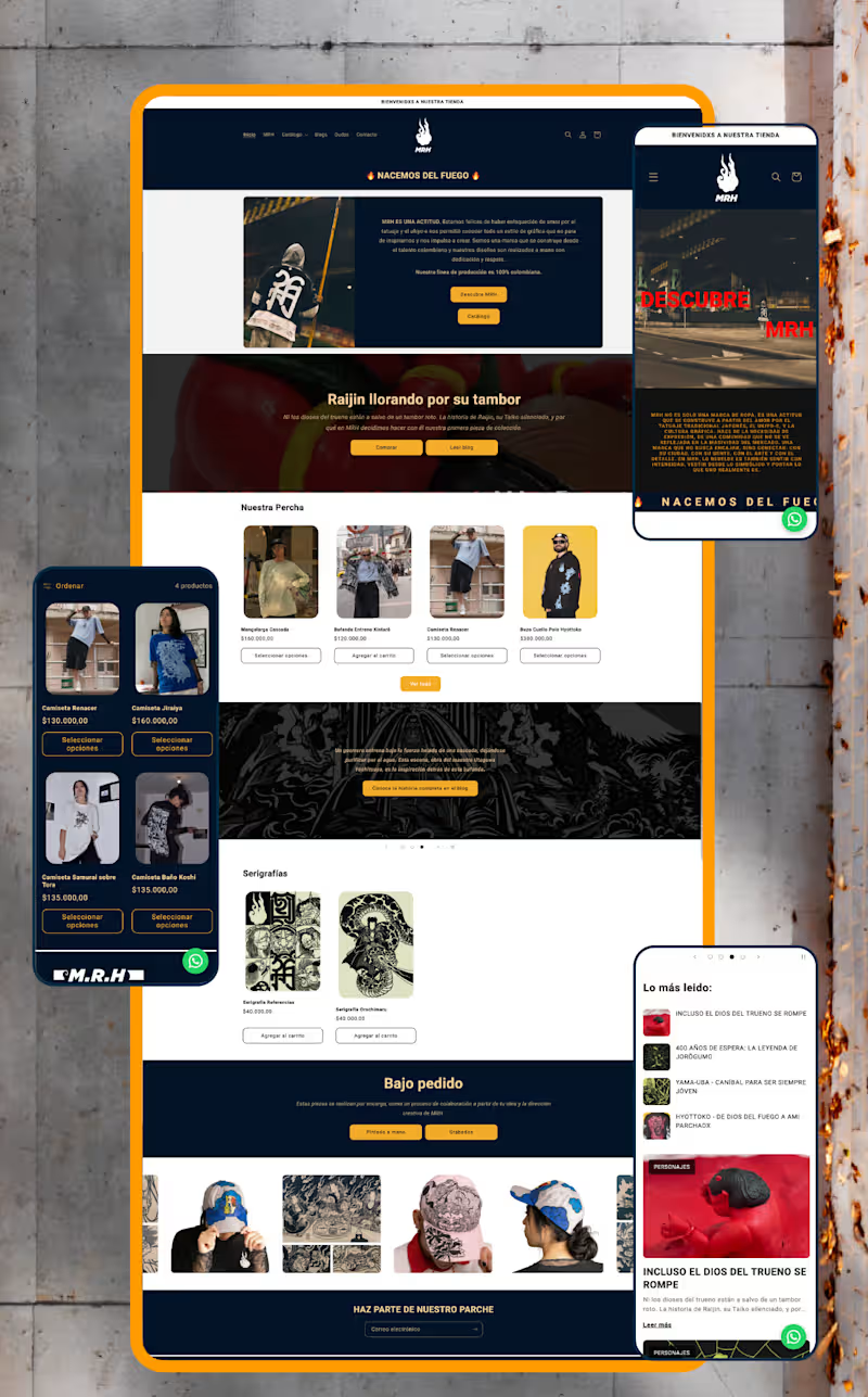
The context: MRH already had an online store, but it lacked structure, consistency, and a clear customer journey. Rather than redesigning isolated screens, I approached the project as part of a broader brand strategy — identifying friction points across the entire shopping experience and rebuilding the site around usability, storytelling, and scalability.
My role: I led the full redesign end to end — from information architecture through custom Shopify development and SEO — working directly within the brand system I had already established for MRH.
What I did:
Reorganised the site's information architecture, simplifying navigation, menus, and product discovery for a more intuitive purchasing flow
Redesigned the homepage — the highest-abandonment section — into a clearer introduction to the brand and its universe
Separated storytelling from technical product information across product pages to improve readability and purchase decisions
Built a dedicated blog giving each illustrated character its own narrative, connecting editorial content to ecommerce without interrupting the buying experience
Developed custom Shopify components using Liquid, including interactive size-chart pop-ups (managed through metafields), dynamic product characteristics with visual icons, FAQs, trust indicators, and automated "Notify Me" functionality for out-of-stock items — all designed for the client to manage without touching code
Restructured product categories into a dedicated Products section (previously a single catalogue-all page) and built a custom Collaborations page that auto-groups tagged products by partner brand
Ran a complete SEO optimisation pass: restructured product descriptions, built keyword-focused URLs and metadata, and created a scalable metafield system so new products publish following the same optimised structure
Set up quick-response templates in WhatsApp Business to streamline customer service
Created a dedicated brand page explaining MRH's origins and philosophy, strengthening the connection between visual identity and digital presence
The result: A website that isn't just visually stronger — it's easier to manage, more discoverable through search, and built to support MRH's growth long after launch.
Full case study on Behance
(https://www.behance.net/gallery/253684079/Website-Redesign-Ecommerce-Optimization)Live web (https://mrh-brand.com/)