Rebranding Project for Elena Kether's Coaching Service
Qürnovi Nicolás
A PERSONAL AND BUSINESS COACH WITH OVER 15 YEARS OF EXPERIENCE THAT THROUGH HER OWN DEVELOPED METHOD HELPED HER CLIENTS AND PATIENTS TO MAKE THEIR LIFES BETTER.
Project Type & Role
re-Branding / Visual - brand Designer
Tools Used
Figma, Photoshop, Illustrator
Elena Kether, or EK, is a business & life coach who helps people to improve their life and lifestyle through the use of alternative healing methods. Such as reiki, hypnosis, biodecoding, etc.
She gets her patients through a full digital mentorship process, that usually lasts 3 months, where the person would get work material, books, audio files and 1:1 sessions with Elena.
Main Challenge:
The main challenge of this project was to achieve a brand system robust enough to cover the whole patient process through the time, being cohesive and clean, but delicate enough to reflect trust and professionalism, and the 15 years of experience that back up Elena.
Concept:
The idea for this project was to primarily understand what Elena Kether does, how she does it and how will the patient goes across the process, to use that information as base point from where start developing a complete system that would cover every part of the process and would help the patient to feel confident through it.
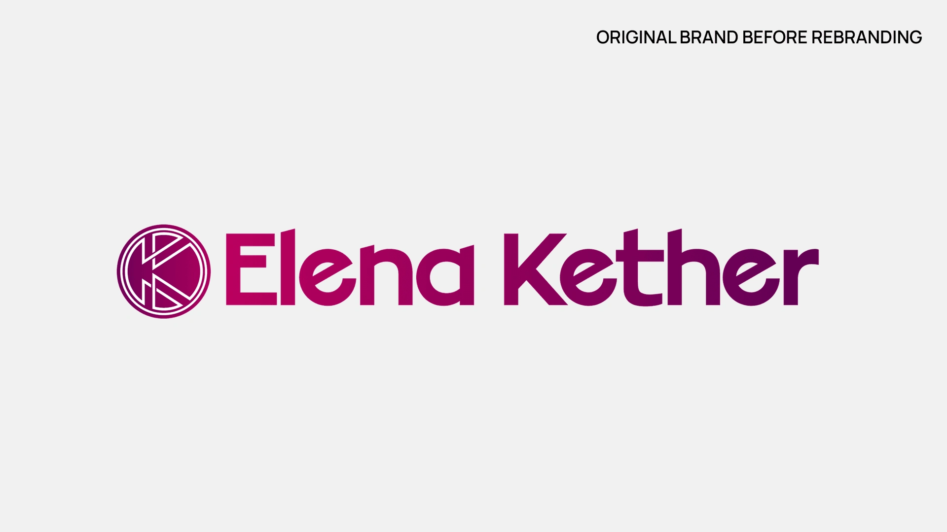
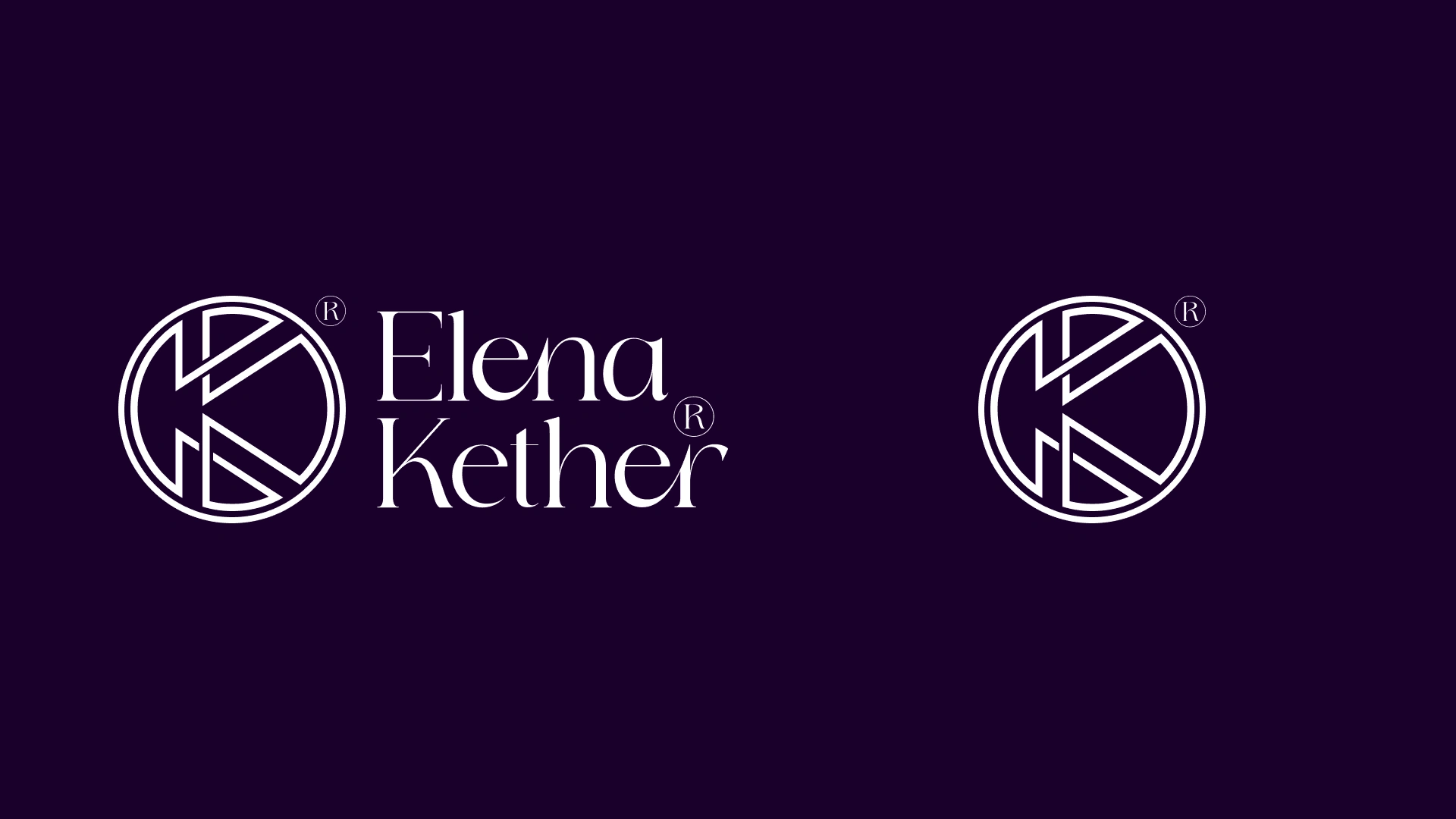
The original logo had a great structure and balance, it was composed by the "K" symbol, which is a kind of coat of arms for the Kether surname, and her name. A logo which has been used for several years and carried a great recognition among the community.
Although well done, the overall feeling no longer represented what Elena wanted to be known for, in her own words "feels childish".
The approach:
After the discovery process and understanding what she really wanted to reflect with her brand now and who she was I landed some conclusions. The structure works, the coat of arms is indispensable, her goal is to show her whole experience. She is an empathic, close, direct and attentive person, the patient process was something precious for her.
And I wanted the brand to reflect that, I wanted it to reflect her.
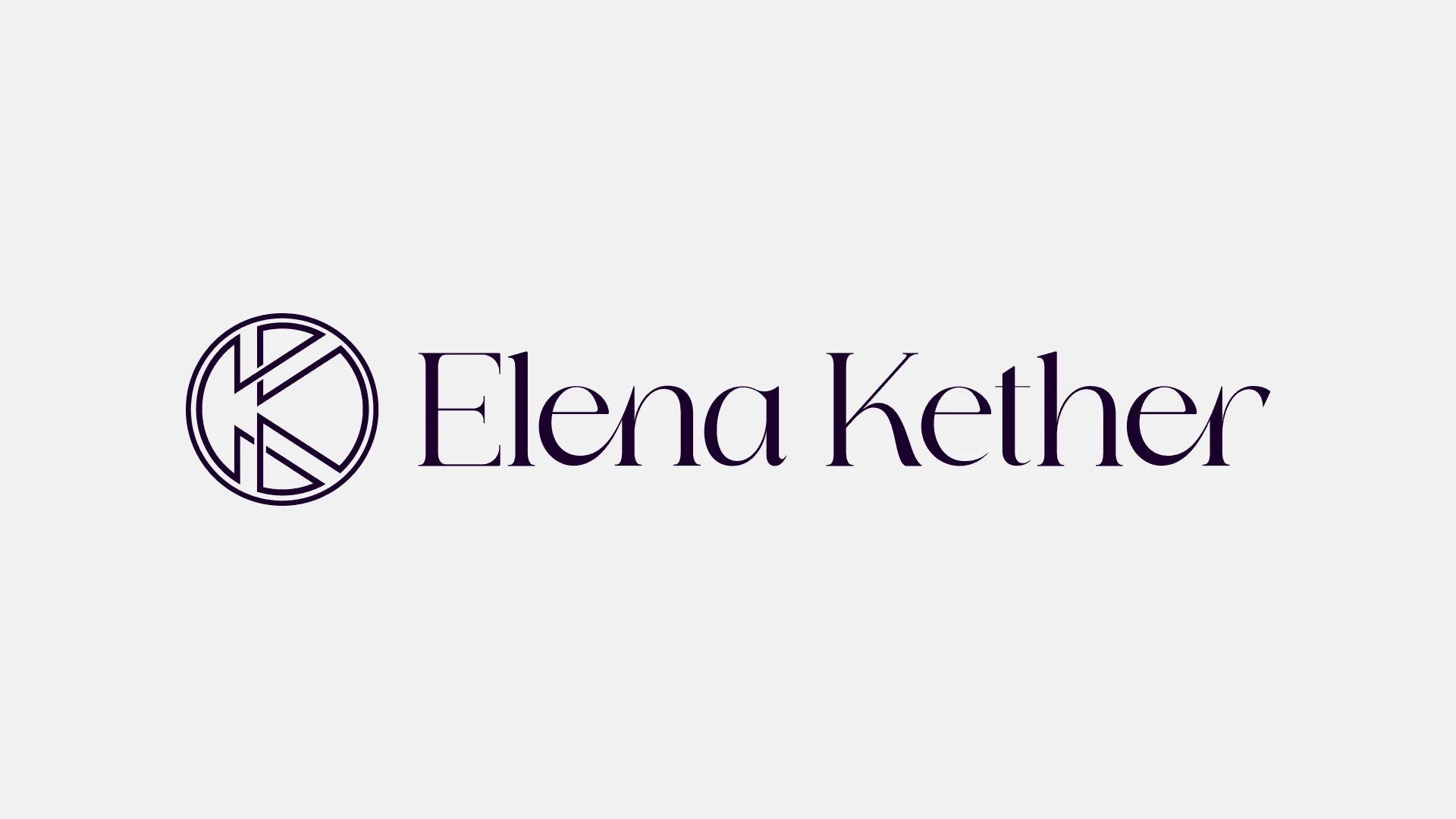
That's how the new EK logo was born.
The full EK breakdown:
By polishing the proportions and the "K" symbol, and choosing a type with movement and delicacy for the name. The new logo conveys an exclusive and high end professional feeling.
This new logo comes with 5 different versions to any possible application that it may have.
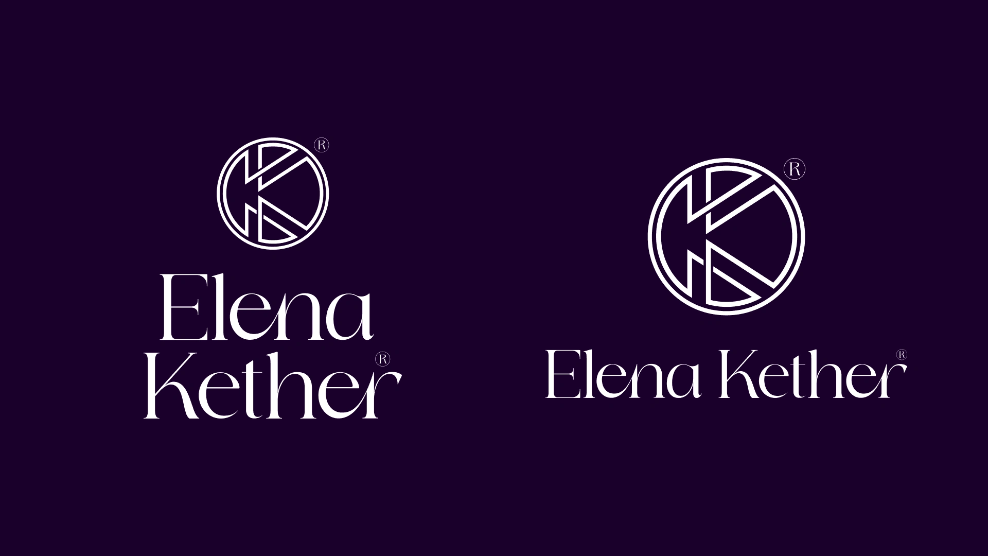
Alongside the logo, the type system and color palette were built to display and complete the whole visual identity for EK. A visual identity that not only feel premium and high-quality, but reflects professionalism and attentiveness.
A visual identity that generates trust in the patients and that is delicate enough to feel safe while getting through the path.
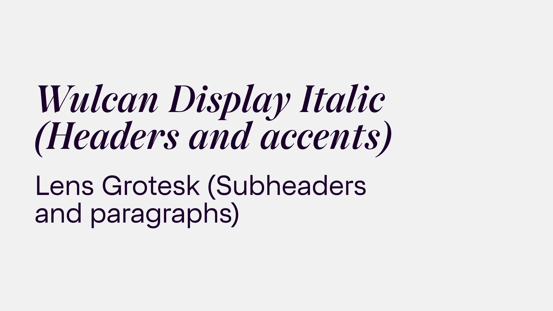
The type system is conformed by two families, Wulcan Display, a type with movement and personality which transmits the human feeling behind, and Lens Grotesk, a type with structure that reflects maturity, perfect for readability at long texts.
The color palette was intended to give a sensation of peace and tranquility. A space where the people would feel safe.
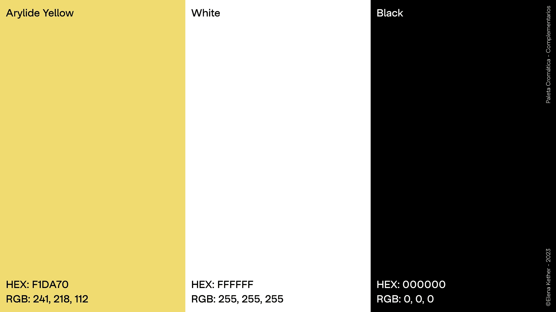
The main chosen colors were shades of purple, symbolizing spirituality and exclusiveness. The secondary colors are even more sober, to balance and contain the process. And the complementary palette is formed by 4 tones of higly noticeable and saturaded colors, this because the intention for them is to draw attention since they're used to highlight important parts in the process and documents.
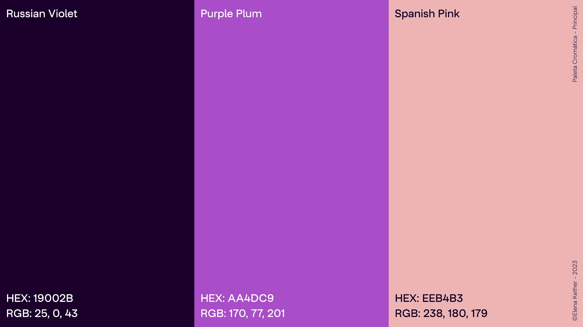
↑ The primary color palette ↑
↑ The secondary color palette ↑
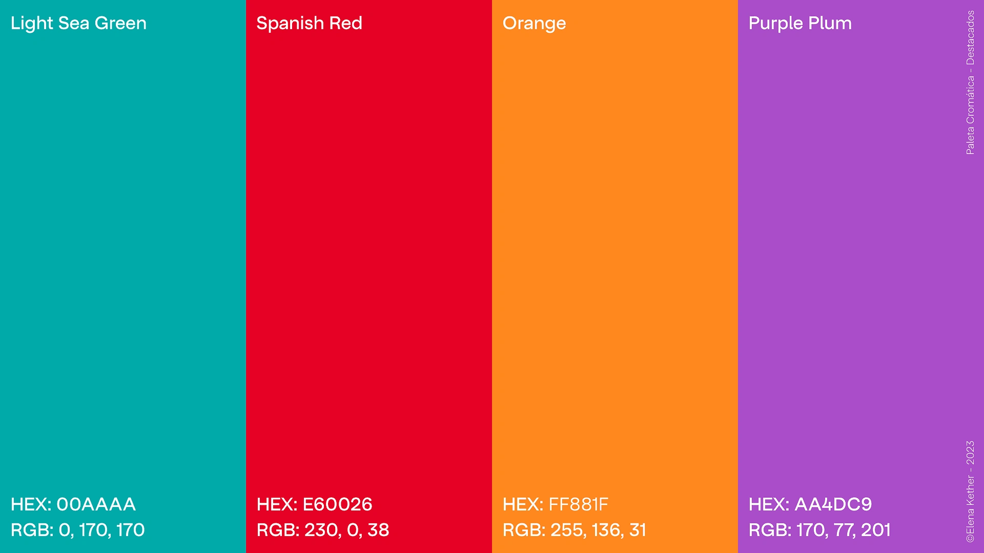
↑ The complementary palette (used to highlight important parts in text)↑
The after visual identity development:
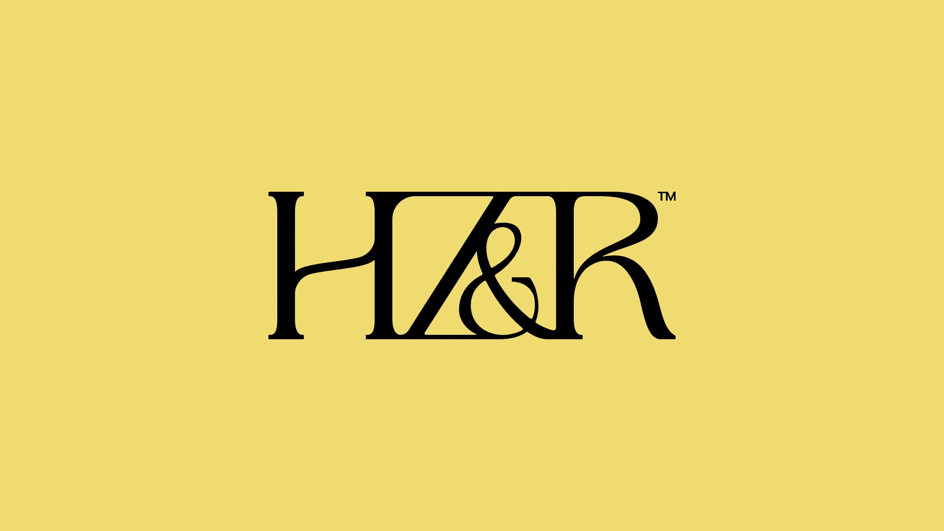
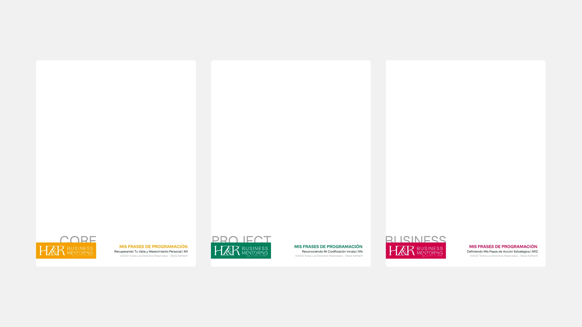
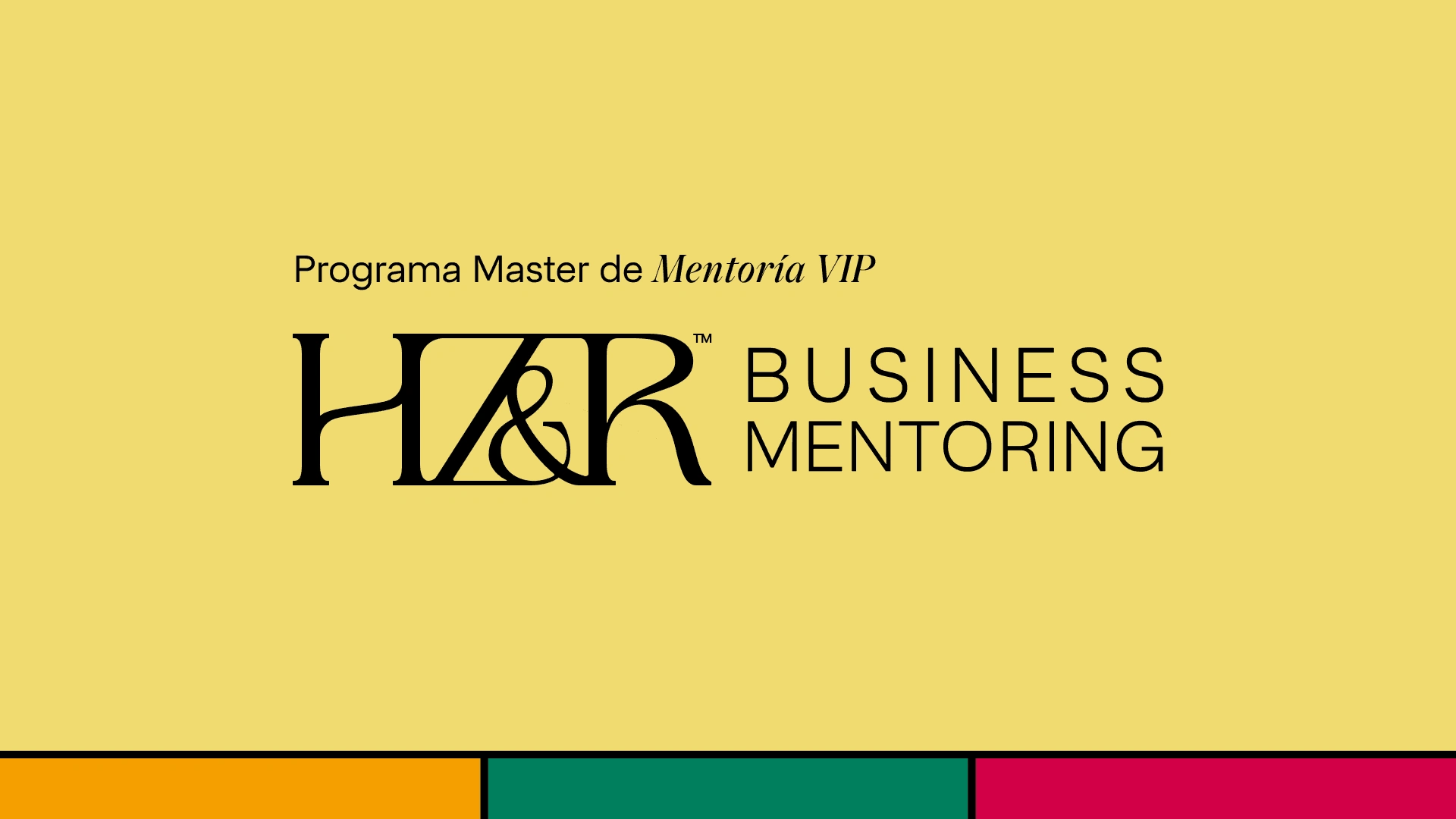
As Elena works with long-term processes, she developed a method/framework called "HappyZen&Rich" or "HZ&R" for the business mentoring processes. It needed its own identifier to distinguish it from the personal mentoring services and digital products she offered, and to give more internal structure for her clients when enrolled in the mentorship.
The HZ&R identity was crafted to be functional and versatile, besides being able to live in the same space as the main EK logo. It uses the secondary color palette as main, and for the internal phases of the process a colors and visual identifiers were crafted.
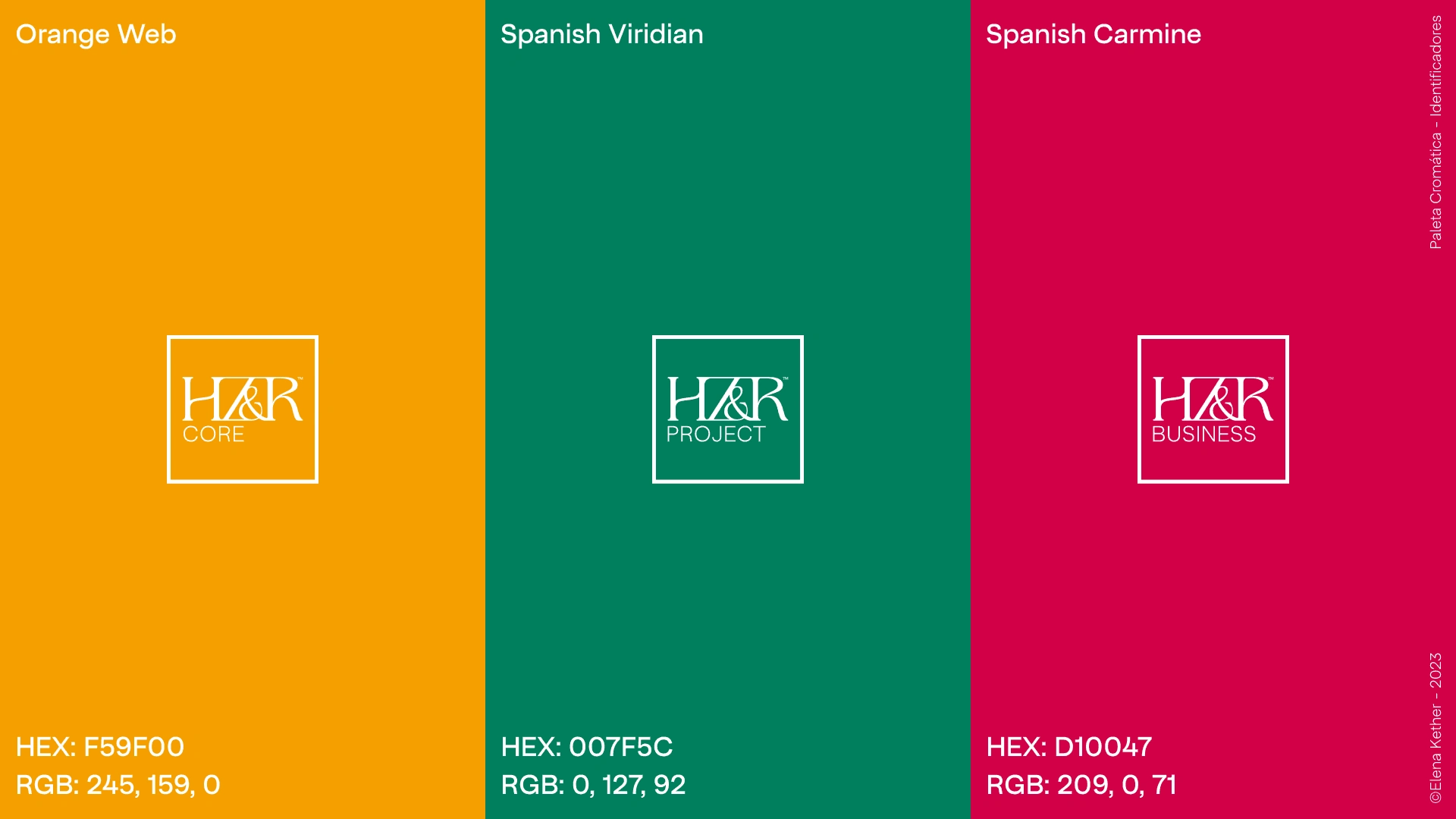
This is an example of how both interact:
Elena loved the final result of the whole process, she once again gained the feeling of ownership over her brand. And the clients found a huge improvement in structure and accesibility inside the processes.
After the rebrand, Elena grew her base of clients for the mentorships and got a bigger number of former clients who returned to consume the newer versions of the processes that she released. Getting to accomplish over 20K usd in income in just one month.
Elena is a great example on how, in some cases, the only missing thing to fly like a rocket is just some structure and effective communication.
This is Elena Kether.
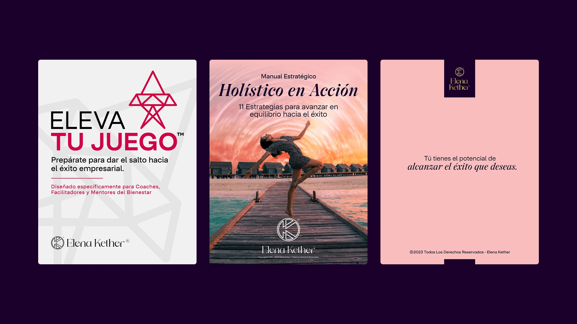
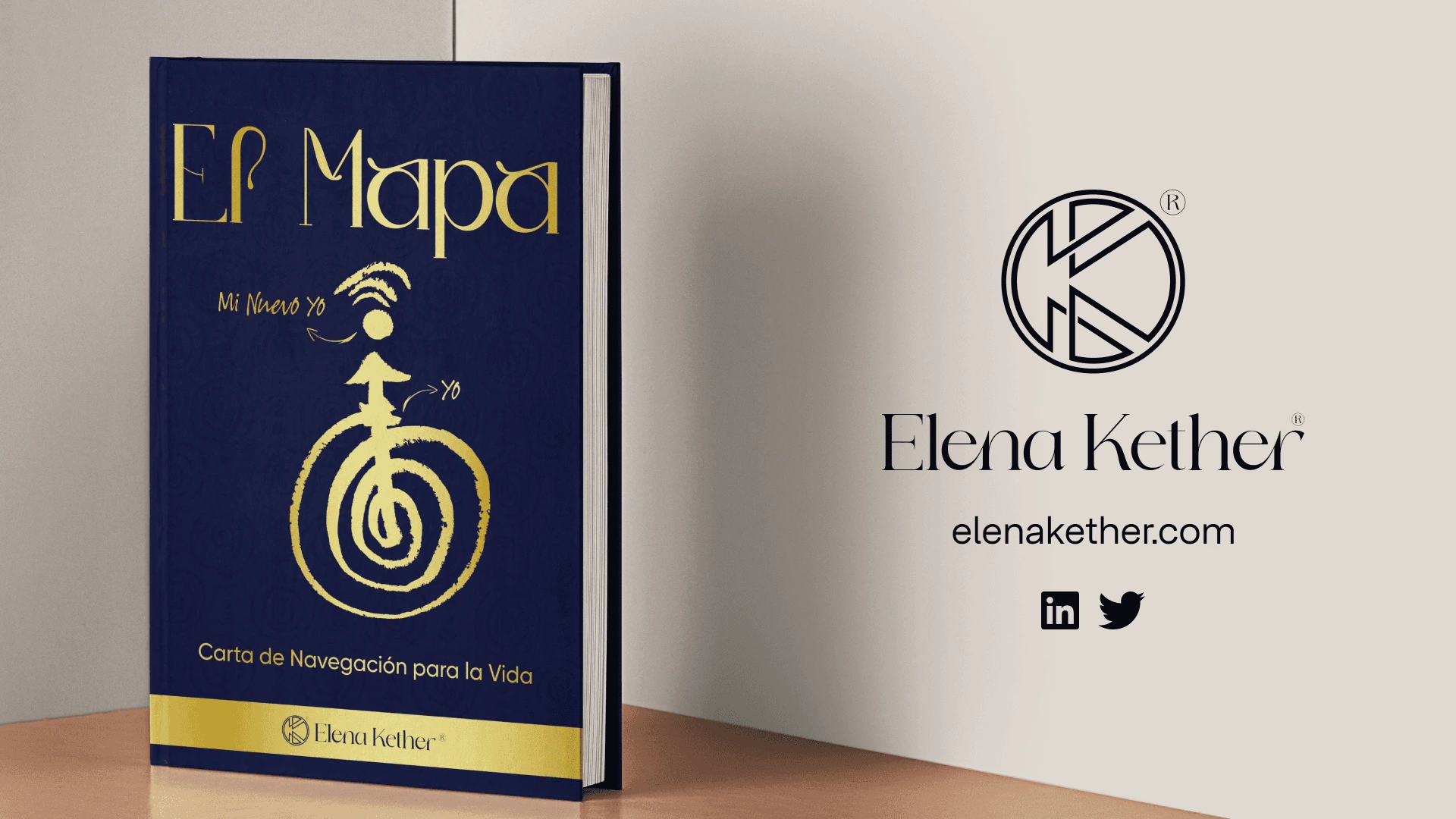
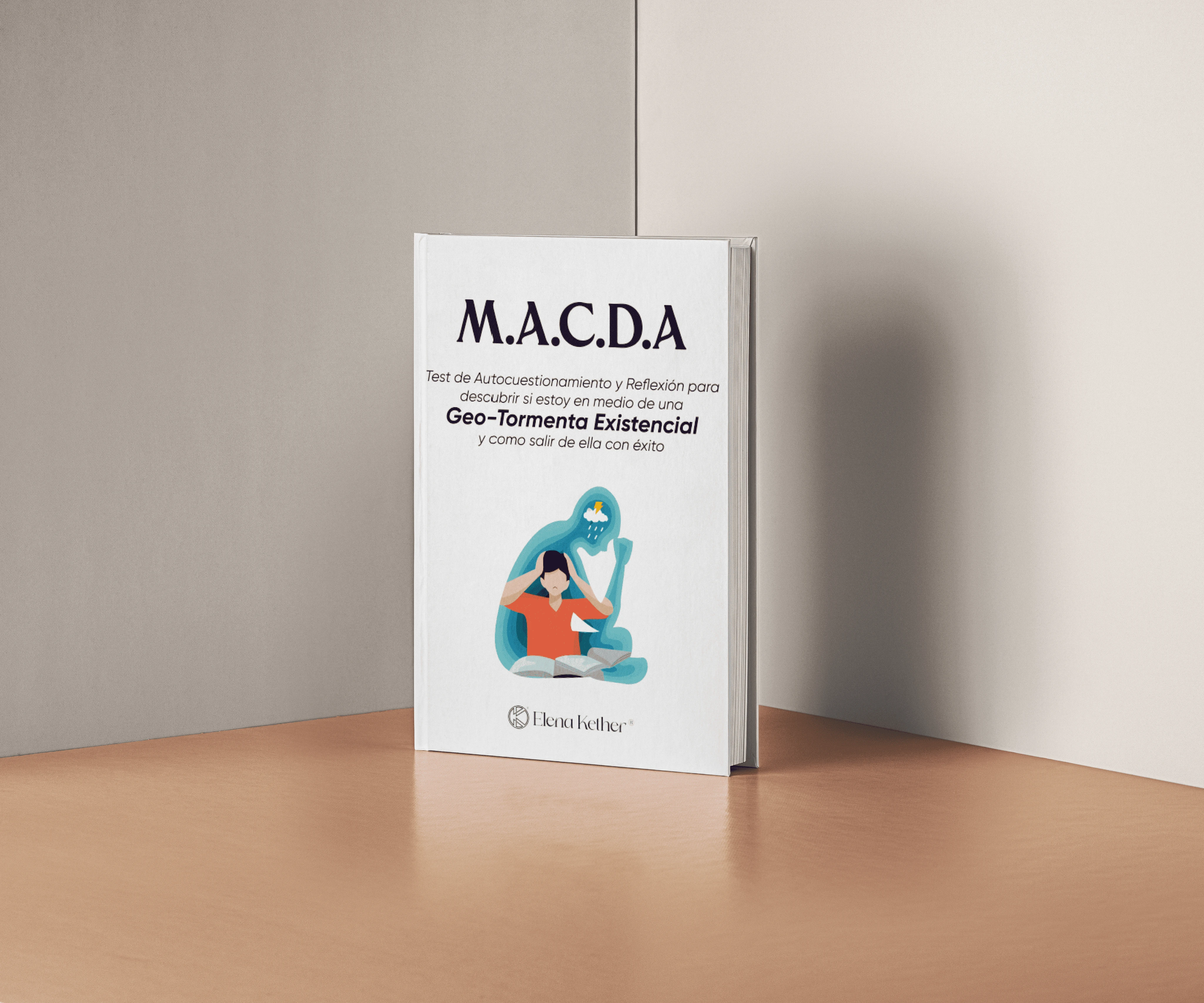
Some more design assets that i designed for this project:
As part of the whole process many assets and e-books were designed. Here are some samples of the final work.
Like this project
Posted May 17, 2026
Rebranded visual identity for Elena Kether, enhancing brand's professionalism and client trust.
Likes
0
Views
0