Unrulymind Brand Identity Development
Qürnovi Nicolás
Unrulymind
A BOLD LUXURY FASHION BRAND THAT HELPS PEOPLE EXPRESS THROUGH CONCEPT DRIVEN PRODUCTS AND EXPERIENCE
Project Type & Role
Branding / Visual - brand Designer
Tools Used
Figma, Jitter, Illustrator, Photoshop, Blender
Unrulymind was born as a high-end streetwear brand which endorses intrusive thoughts and behaviors as a natural part of the humanity, and more specifically, the millenials. Using the coffee “need” and “having no filter” as base for their narrative as resources for their audience to express without speaking.
The main goal was to craft a brand identity which reflects the self-expression and “mental chaos” in a functional way. Strong enough to communicate their essence just with the presence of the brand but sober enough to not scream for attention.
Main Challenge:
The main challenge to address was to find the balance point between a strong disruptive feel and a sober and clean visual. Keeping it functional and versatile to work across every possible touchpoint
Concept:
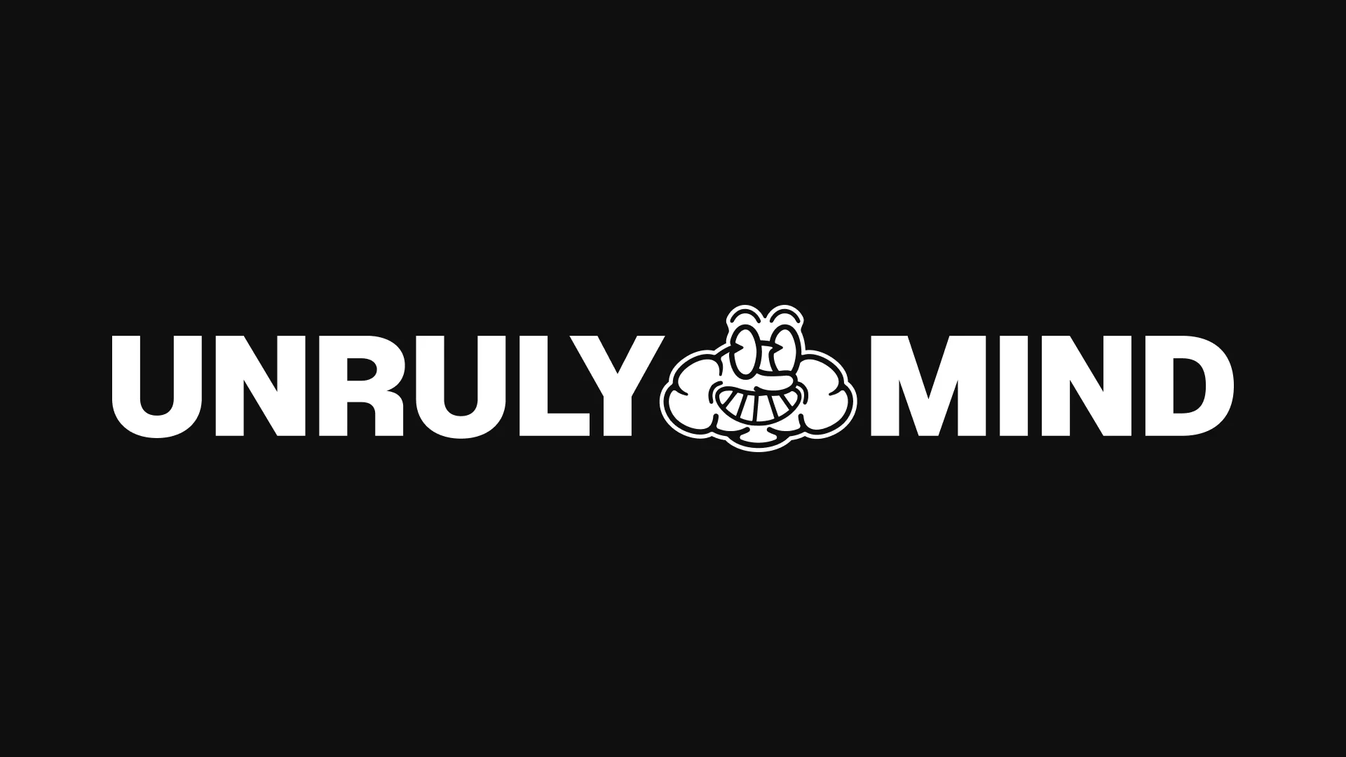
In order to address the challenge I developed a concept born by the need of expression in a strict society. “What happens in the mind, stays in the mind”. That feeling of privacy, yet freedom, by being able to say what one really thinks in the mind, is what lead to the creation of “UNRULY”, the brand mascot.
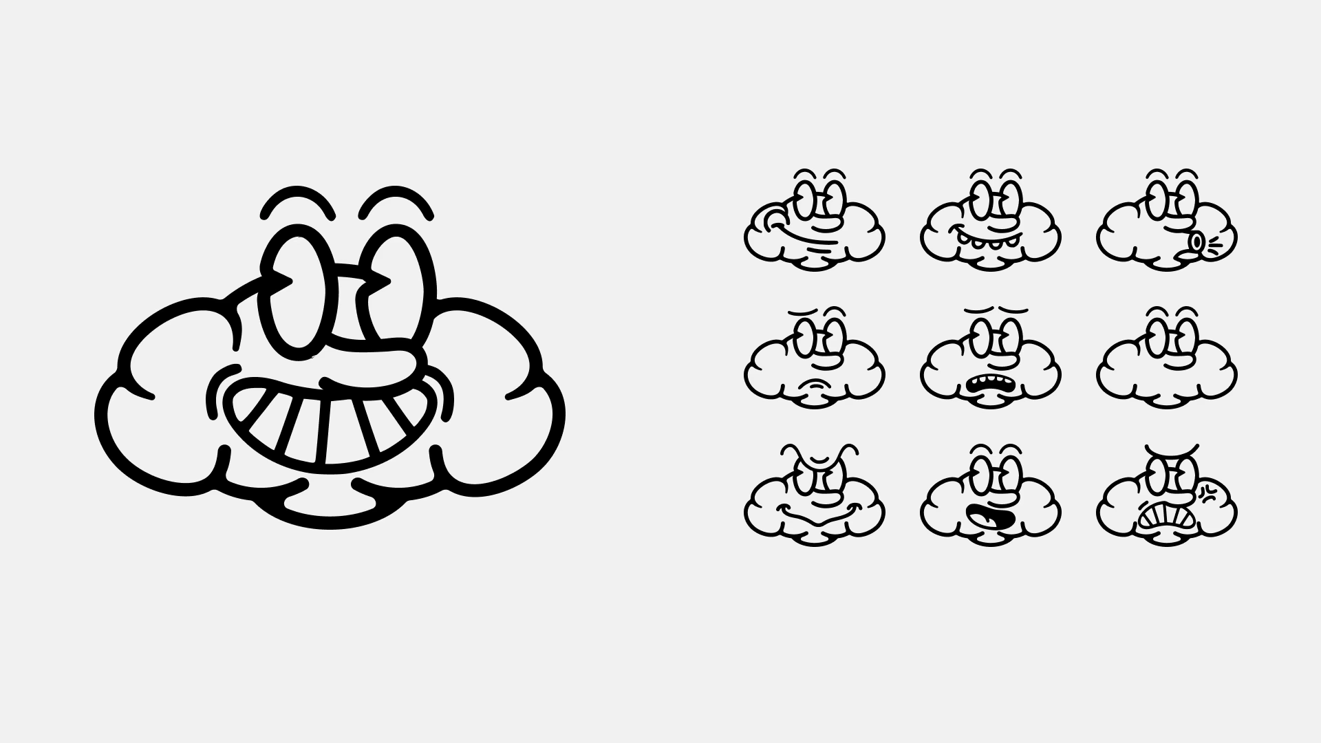
UNRULY is a little brain who does whatever it wants, the catch? It is just a brain, no body, no actions, no repercussions... Just expression at its purest.
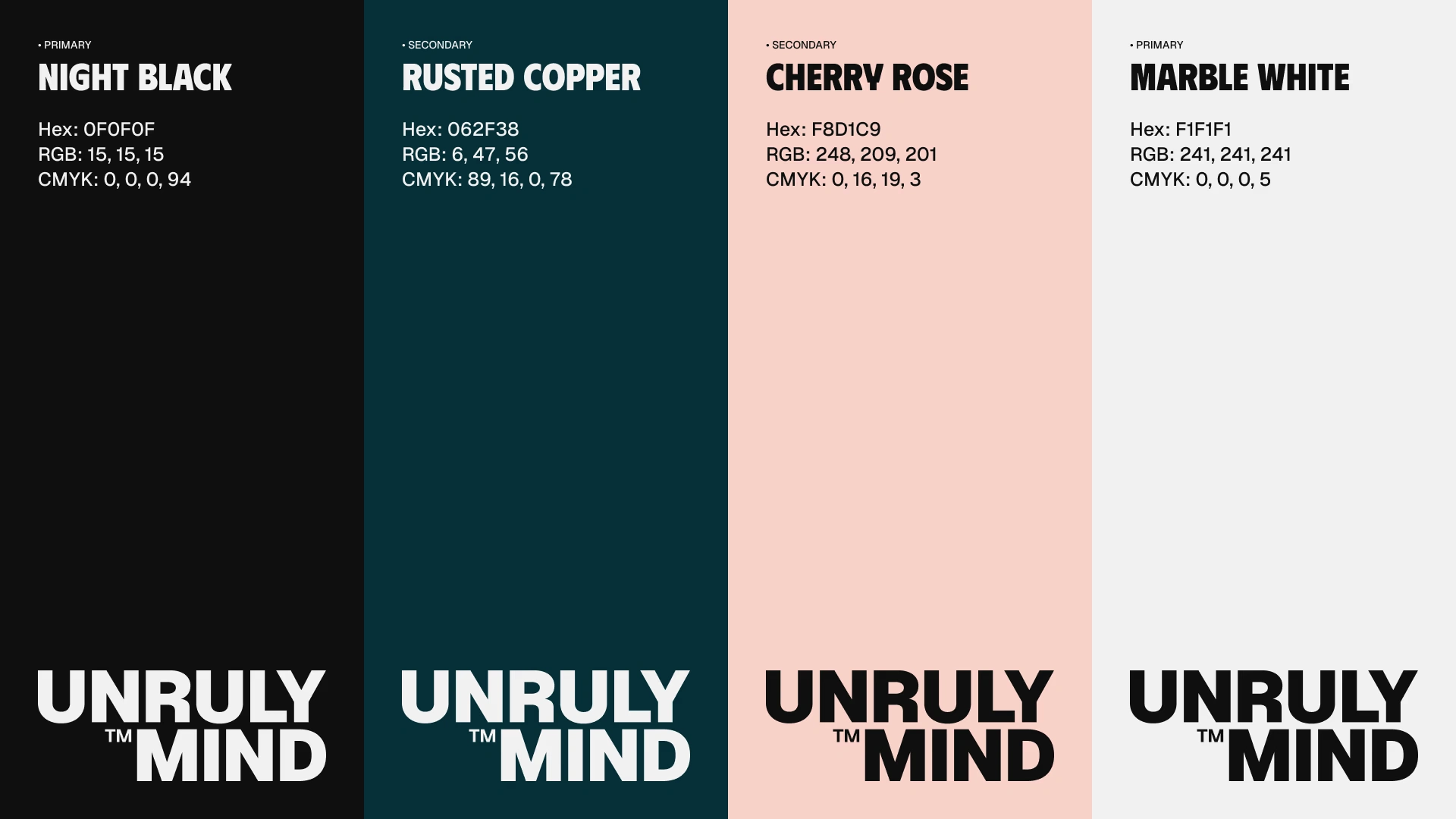
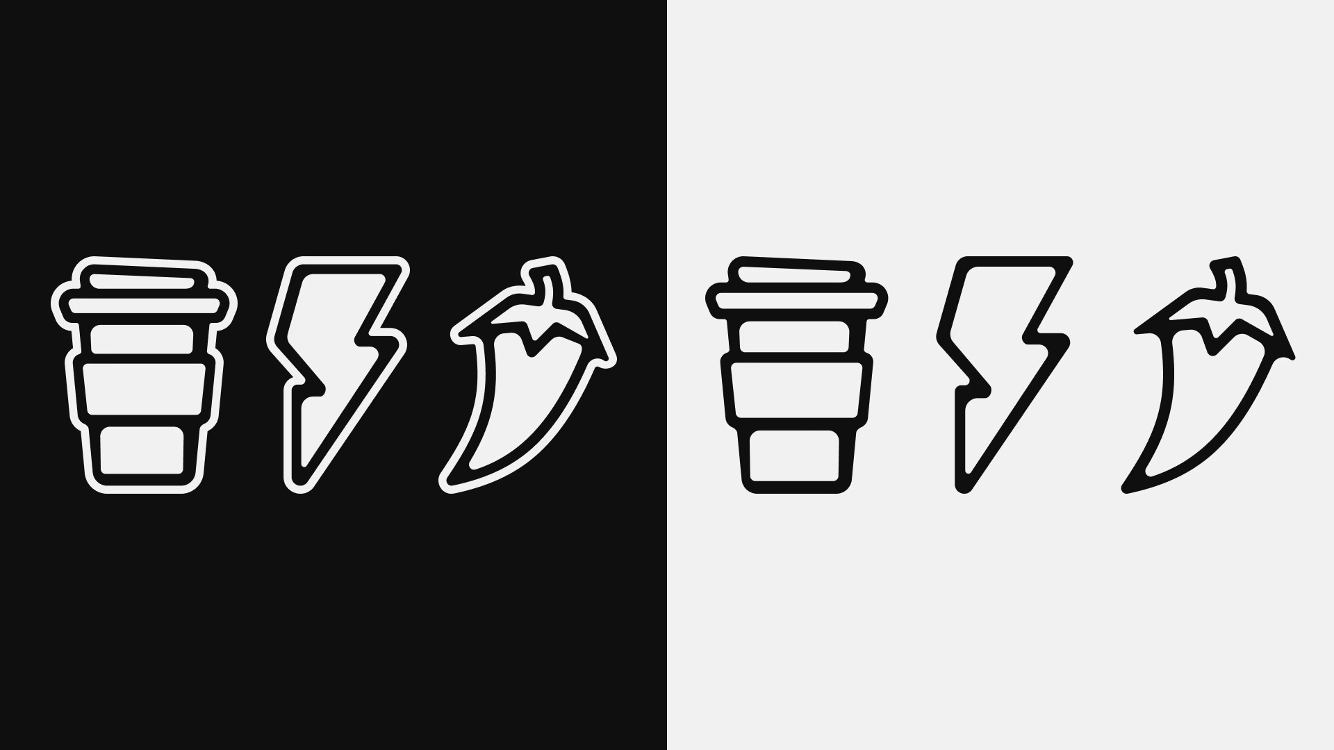
Alongside UNRULY, I crafted a visual system that carries all the impetus of the mascot, balancing the overall feeling of the brand. A system composed by a firm and simple logotype and two color tones (and its shades) complementing the base of black and white.
At this point of the process, the typographical system, secondary elements and logo versions were in process.
But, when everything was looking towards the end… The clients decided to change everything.
The clients made a decision, they wanted to change directions and turn towards other scopes. This is the plot twist.
The changes:
The clients decided to change audience and niche. They picked to leave the streetwear behind and now, focus into a luxury and conceptual fashion niche.
What didn't changed:
Although the direction changed, they kept the brand foundations, self-expression and mental chaos remained as base. Just that they wanted it to be more conceptual and refined, and way more subtle. The elegance as the connection point.
What was the new approach?
The following step was simple and clear. Optimize.
All the past resources already met the desired aesthetics. So I filtered what works and what doesn't. I already had my marble stone, I just had to make my way through to the monument.
And this is what UNRULYMIND became, the v2.0:
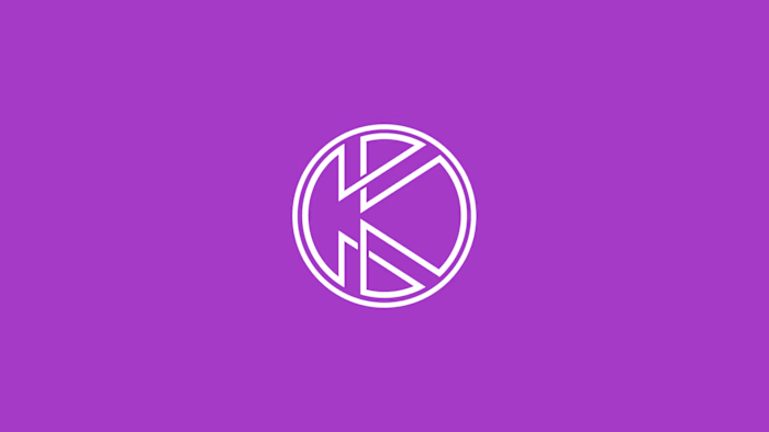
I got rid of the mascot, the secondary elements and most of the brand applications, leaving just the logotype, turning it into the secondary version, I even left only one font family to use. Alongside, crafted another logotype for the primary use.
Now, two logotypes? Yes.
It might sound weird at first sight to have to logotypes, it may feel like they will fight for the spotlight. They don't.
This is the idea behind it.
The two logotype system:
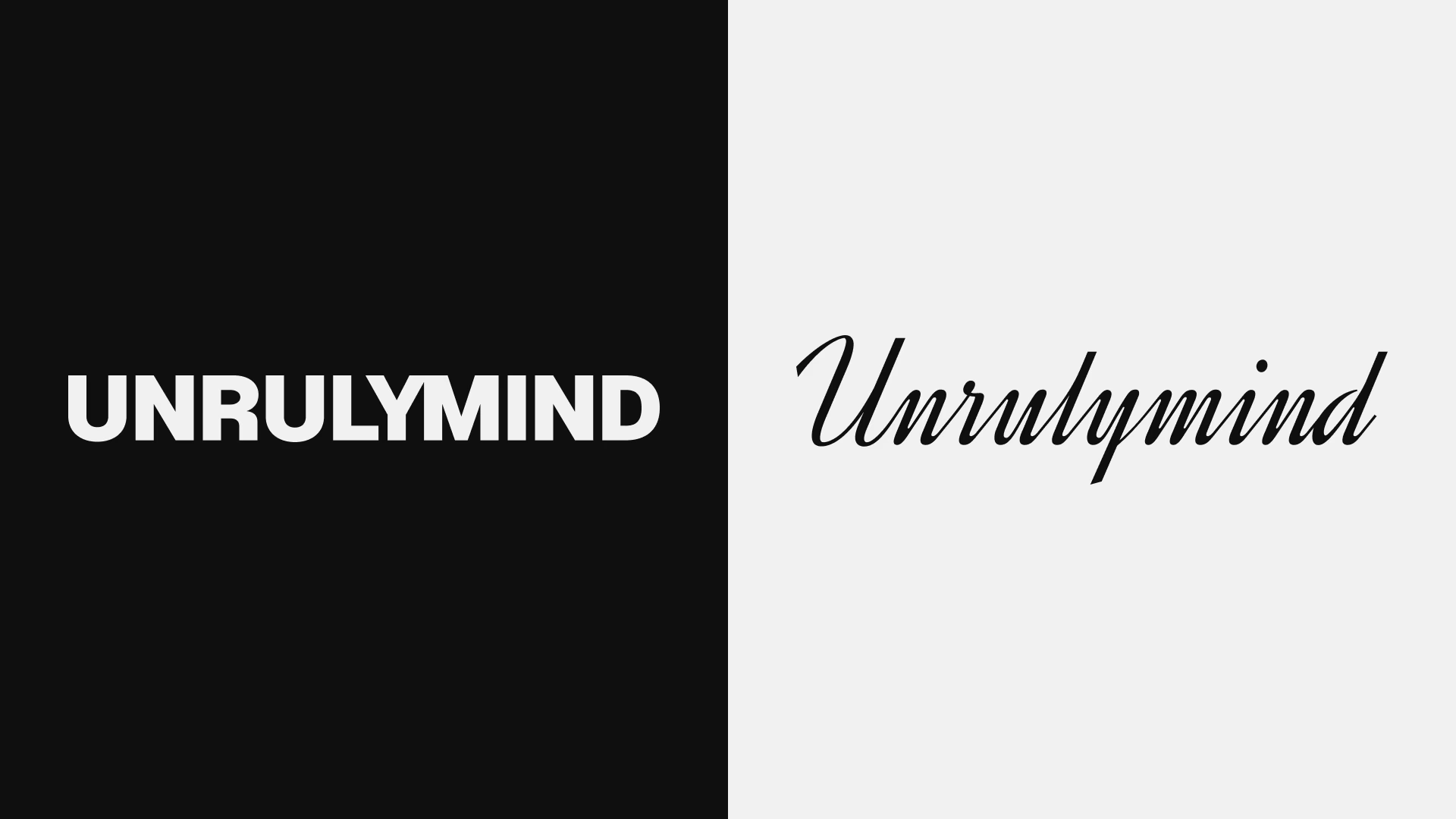
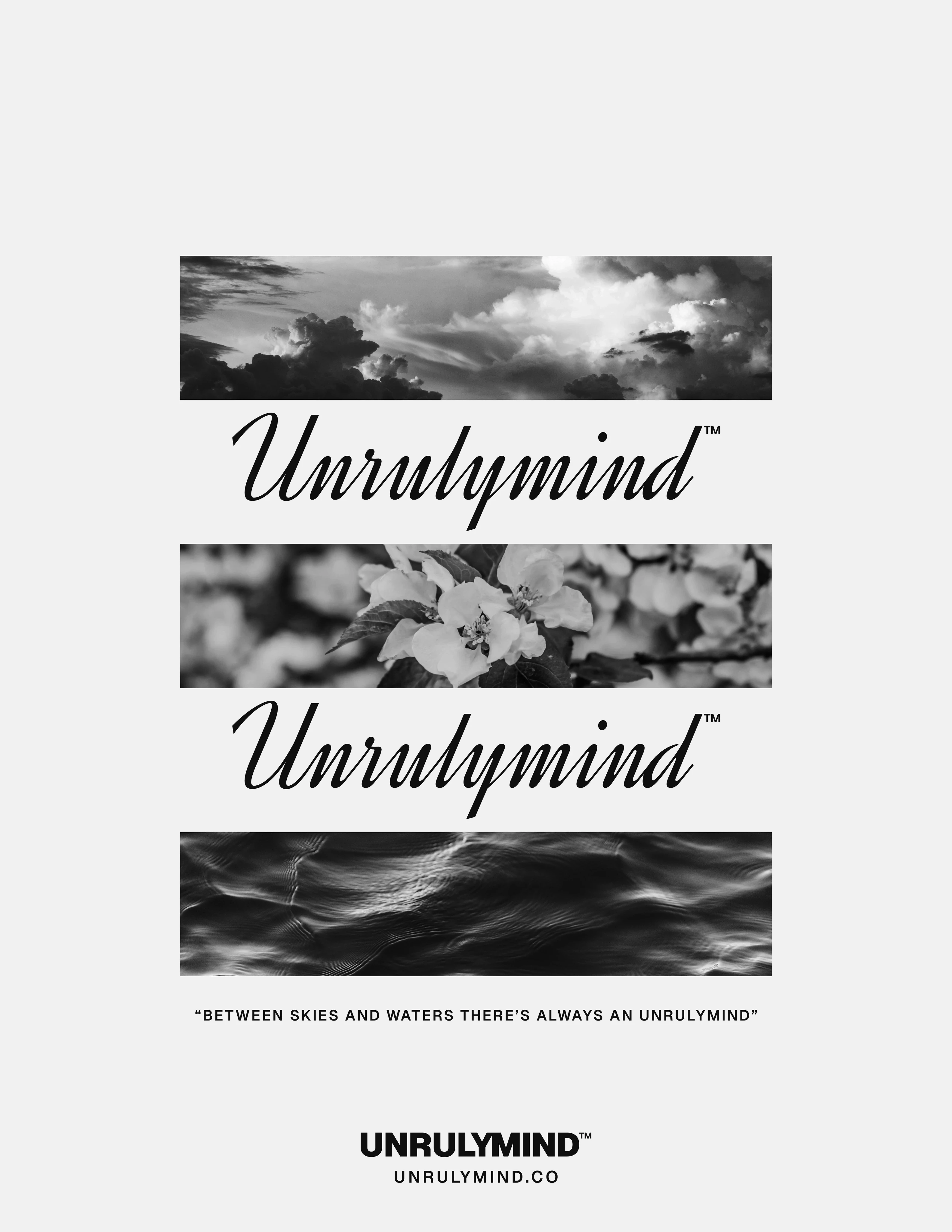
The decision of using two logotypes has a reason. They complement each other. One represents the strong & direct communication (left one, perfect for small sizes and formal applications),the other one represents the chaos & self- expression (right one, perfect as a decorative asset that gives the luxury feeling when used).
The contrast between serif and sans-serif reflects UNRULYMIND’s dual nature — structured yet expressive.
Working together to represent both sides of the panorama.
The full unrulymind breakdown:
The double logotype concept was approved. My goal now was to make the brand as cohesive as possible, as I metioned before what I've done is OPTIMIZE the brand assets already created. The color palette went from 4 to 3 colors (and its shades). The font families were reduced from 3 to 1. The logo versions and mascot became just two logotypes.
This has a reason, with the clients we landed to the conclusion that now the product is the main character. Their products became bold and conceptual, the brand has to contain them.
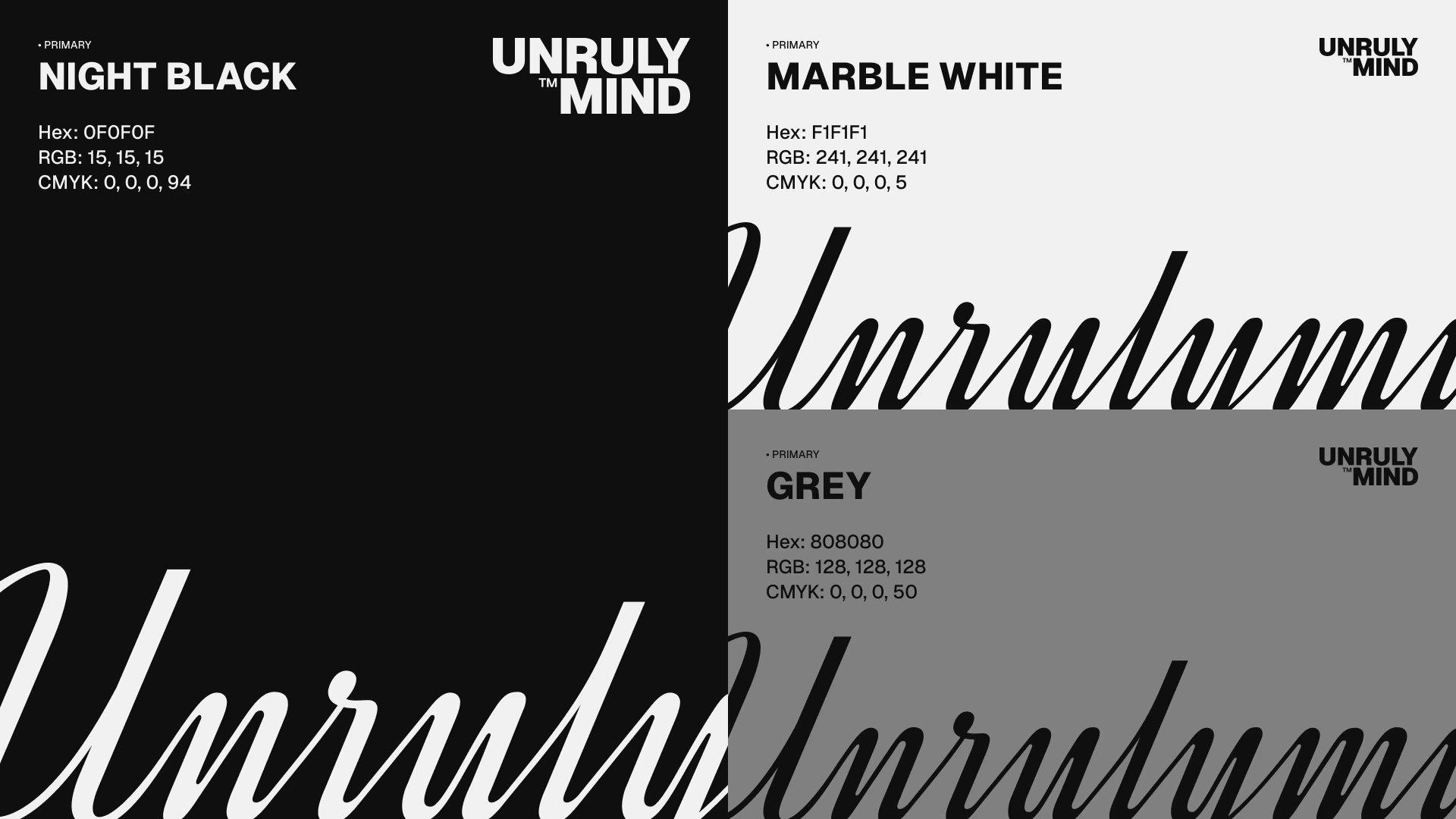
Black and white where chose as primary colors to give the products a canvas where it can display with full strength, focusing the audience attention into the product. The grey was added to give the whole palette a sense of depth, as it is a mid point in between the two primary colors.
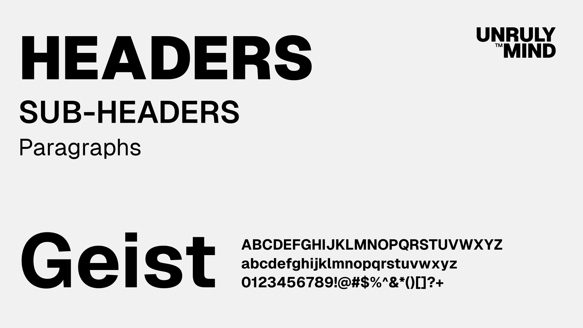
Geist became the only font family for the brand visual identity. Geist have 9 weights, being a big family, versatile enough to serve as header, sub-header and paragraph and still maintaining a clear hierarchy. Its readability makes it perfect for long texts and being a Google font is nearly impossible to not find it in almost every software.
After this whole path, that went through changes and iterations, the output resulted into a simple, yet powerful, brand and visual identity that reflects how a rebel mind works. Rebel minds that are just considered as such because they didn't followed the stablished rules and went for the big picture.
That's UNRULYMIND.
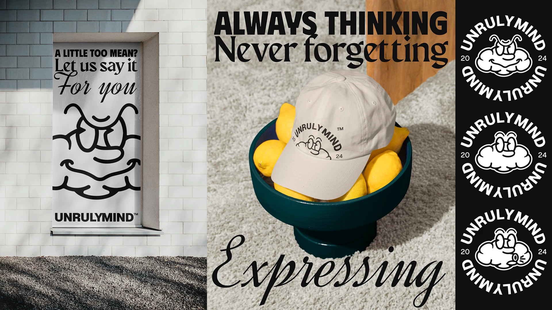
Some more design assets that i designed for this project:
To finish I'd like to show you some more images of what UNRULYMIND ended up becoming, and how the brand works in the real life.
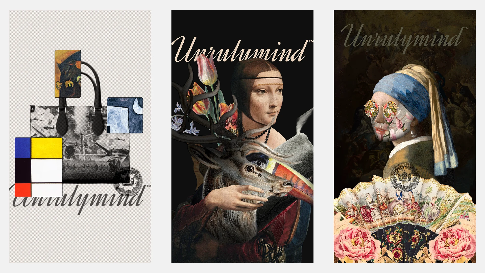
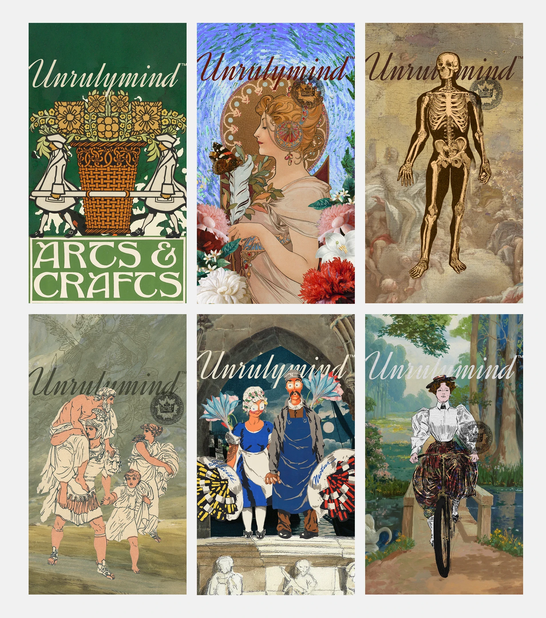
↑ Some of the social media posts that were after animated with jitter ↑
Like this project
Posted May 17, 2026
Developed a cohesive brand identity for Unrulymind, focusing on self-expression and mental chaos.