Freelancers using Claude in Bengaluru
Sign Up
Post a job
Sign Up
Log In
Filters
2
Projects
People
Divan Raj
pro
Bengaluru, India
Product Designer · Mobile & Web · Motion Design · AI
$50k+
Earned
16x
Hired
5.0
Rating
938
Followers
Top
expert
+11
Follow
Message
Product Designer · Mobile & Web · Motion Design · AI
1
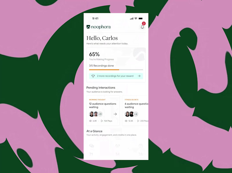
AI-native Audio Platform Design for Noophora
1
1
2
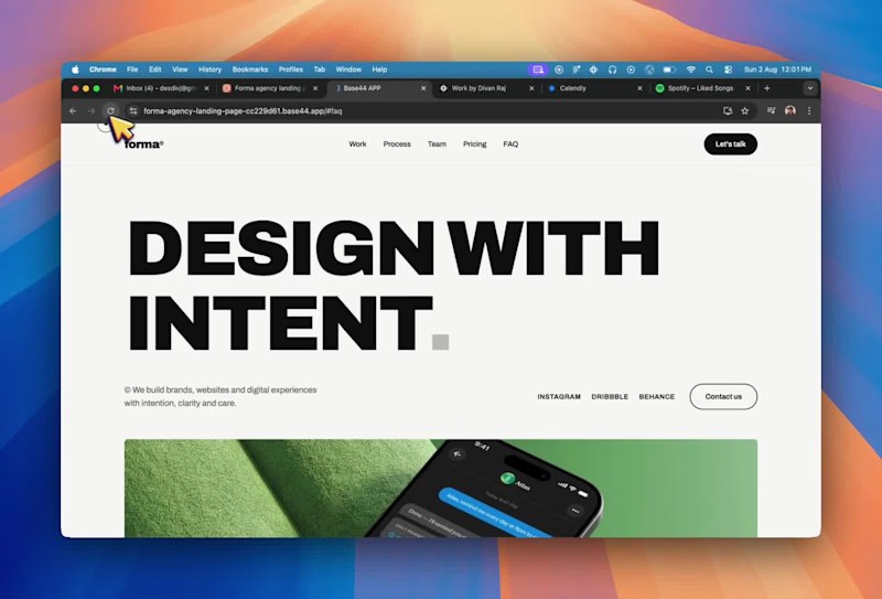
Agency Landing Page Design with AI Tools
2
8
4
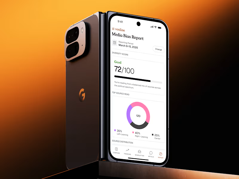
Mobile App Compilation - AI Agent Taste
4
81
$1.5K+ earned
42
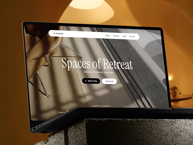
Website design project for an architecture firm
42
877
Claude
(3)
Follow
Message
Praveen Kumar
max
Bengaluru, India
Product Designer
$100k+
Earned
19x
Hired
4.7
Rating
641
Followers
Top
expert
+3
Follow
Message
Product Designer
5
Autumn AI (YC W26) - Landing page
5
226
7
Gojiberry AI (YC S26): Website Development
7
180
1
Travel App — UI/UX & App Store Presentation
1
56
5
Veda - Healthcare App UI & Branding
5
56
Claude
(8)
Follow
Message
Aryabhatta @SanganakHQ
pro
Bengaluru, India
Top 1% | Founders-Led Studio | 25+ Products Shipped
$10k+
Earned
12x
Hired
5.0
Rating
163
Followers
Expert
Follow
Message
Top 1% | Founders-Led Studio | 25+ Products Shipped
13
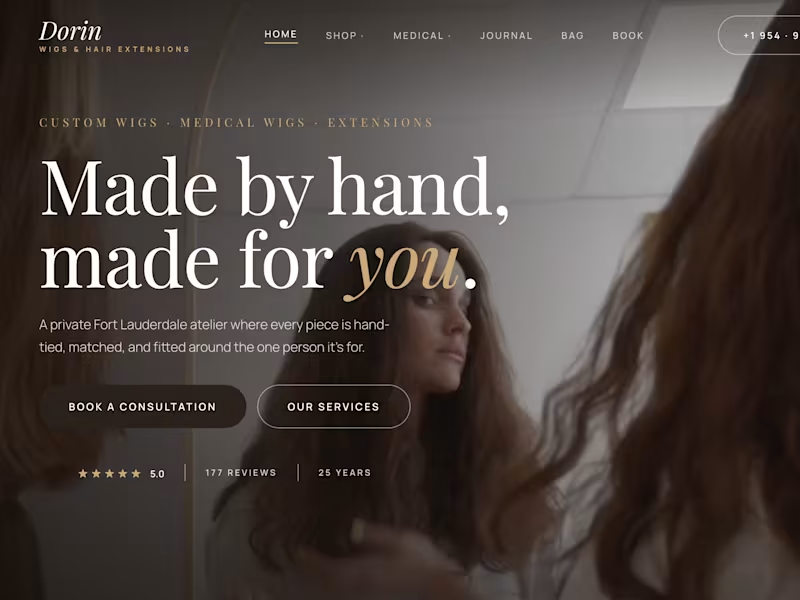
Dorin Wigs International — Full-Scale Shopify Revamp
13
16
1
Patina & Light — Brand Identity for Curated Living
1
1
1
Activate Method — Full-Funnel GHL Automation System
1
7
0
The Centre Stone — Luxury Shopify Build, Dubai
0
6
Claude
(1)
Follow
Message
Daxesh V
pro
Bengaluru, India
Full Stack Developer - Android | iOS | SwiftUI | AI Apps
$5k+
Earned
1x
Hired
5.0
Rating
9
Followers
Follow
Message
Full Stack Developer - Android | iOS | SwiftUI | AI Apps
0
Sun Optimization – VitalSun App - App Store
0
6
0
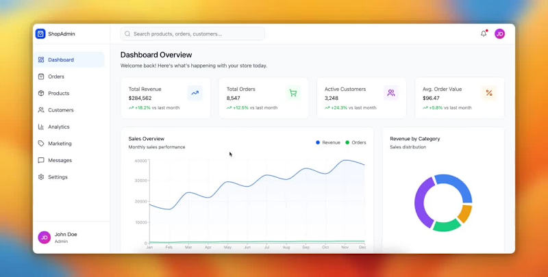
Something I’ve learned working with clients: They rarely need “fancy.” They need results. Two weeks ago, a client came to us overwhelmed by their data. They had sales data scattered across spreadsheets, apps, screenshots, and random exports. They were making decisions based on guesses, not facts. We built them an e-commerce sales dashboard that cuts straight to what matters — revenue trends, top products, customer behavior, and real conversions. And here’s the lesson: Most businesses aren’t struggling because they lack data. They’re struggling because they can’t understand it. Once you turn information into clarity, everything else becomes easier. And we’re not done yet. AI-driven sales insights are coming next. Stay tuned.
0
192
1
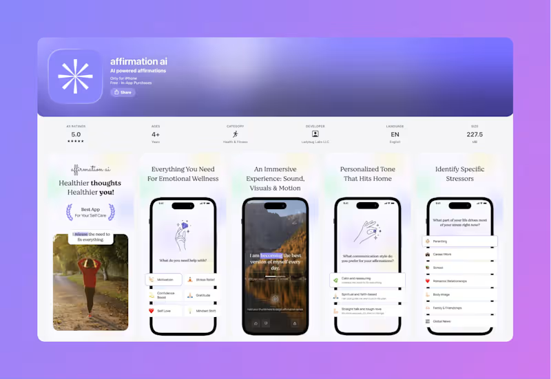
Affirmation AI – iOS App Development
1
6
0
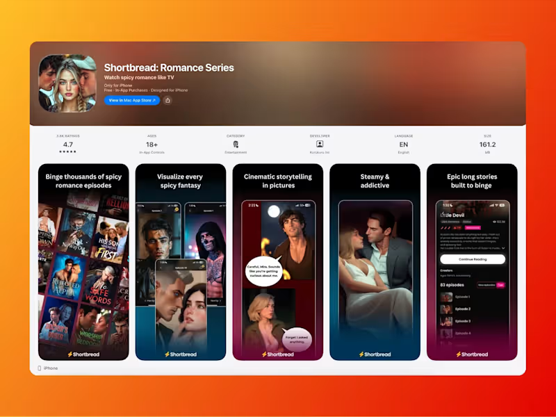
Shortbread Romance Comic Mobile App
0
3
Claude
(1)
Follow
Message
sakshi Jadav
Bengaluru, India
Cinematic AI Ad Films & Brand Videos | Visual Director
New to Contra
Follow
Message
Cinematic AI Ad Films & Brand Videos | Visual Director
1
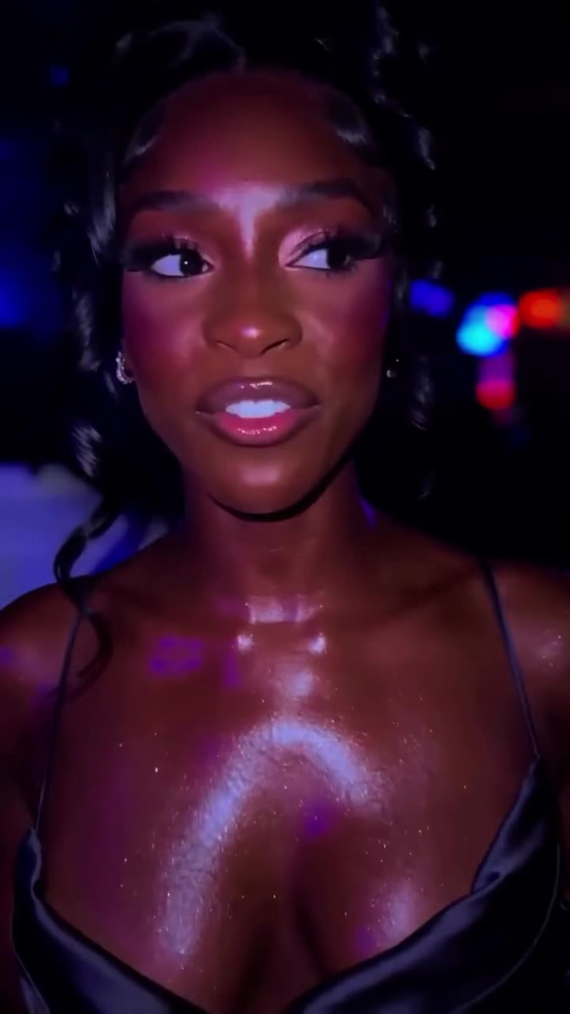
Orphic Beauty — AI-Generated Spec Ad (Nightlife UGC) A 15-second spec ad created entirely with generative AI for Orphic Beauty's Shimmer Dry Oil, designed to feel like authentic UGC nightlife footage rather than a traditional commercial. The brief I gave myself: make a beauty ad that doesn't look like a beauty ad. No studio lighting, no perfect framing, no product hero shots. Just a girl at a club, a guy who can't stop filming her, and a casual reveal of why she's glowing. Built as a single continuous shot in Seedance 2.0, no cuts, no edits, no compositing. The character, performance, environment, dialogue, and product reveal are all generated. The goal was to push past the "AI commercial" aesthetic that's becoming saturated and produce something that genuinely passes as real handheld phone footage.
1
43
1
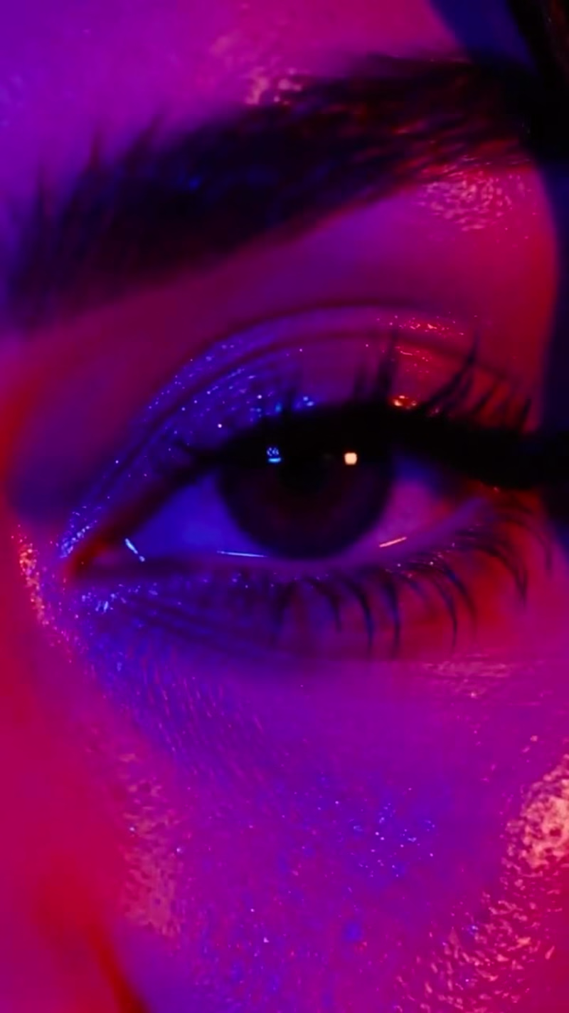
A 15-second cinematic AI brand film created as a concept piece for Half Magic Beauty's Magic Drip Glitter Lip Gloss in shade "What's Your BFF", a milky baby-blue gloss with iridescent lilac reflex. The concept treats the gloss as a sensory beauty montage: hyper-close-up product texture, glassy lips, glittery eye makeup, rhinestone nails, and slow editorial movement under hard purple-magenta lighting. Inspired by Euphoria-era beauty visuals and Donni Davy's signature aesthetic. Built around three signature visual moments — the gloss drip mid-air, the duochrome lip profile light catch, and the direct-gaze hero frame — the film is designed to function as both organic Reels content and paid social creative. Concept, art direction, AI generation, and edit by me. Tools: Seedance 2.0, custom prompt engineering, post-production grade. Format: 9:16 vertical, optimized for Reels, TikTok, and paid social. Turnaround: 5–7 days. Open to brand collaborations in beauty, skincare, fragrance, fashion, and lifestyle. Custom AI brand films, product reels, campaign content, and concept pieces. Available for paid projects, retainers, and agency partnerships.
1
73
0
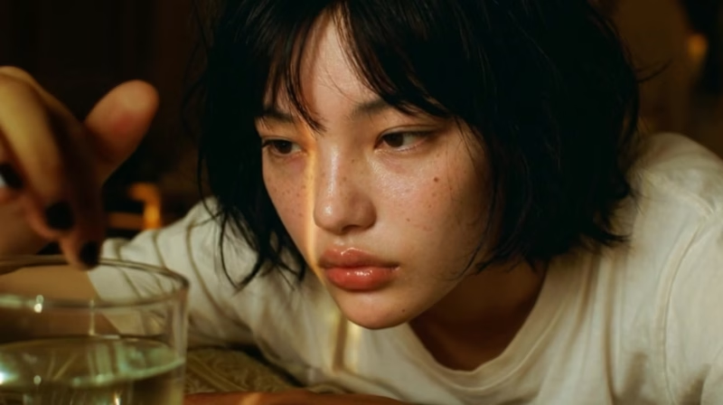
This project is a cinematic concept for an imaginary headphones brand called Echo Noise, built around the idea of music as an escape. The story begins with a girl sitting in a quiet, everyday setting, slightly disconnected from her surroundings. The moment she puts on the headphones, her world shifts, she is transported into a more expressive, dreamlike space where she becomes the center of attention, singing and fully immersed in the music. The focus was on capturing that emotional transition from stillness to confidence, showing how music can transform an ordinary moment into something personal and powerful. Using AI, I explored cinematic lighting, smooth transitions, and a performance-driven visual style to create a piece that feels immersive, expressive, and rooted in a strong “main character” experience.
0
63
0
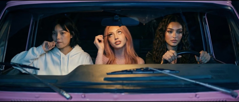
This project was inspired by the visual style and energy of Sabrina Carpenter, focusing on a confident, feminine, and slightly playful aesthetic. The idea was to create a short visual piece featuring three distinct characters, each representing a different mood while still feeling part of the same world. Instead of telling a direct story, the focus was on attitude, presence, and visual rhythm, similar to how music videos build a vibe rather than a narrative. I explored composition, lighting, and character styling to give each girl her own identity while maintaining a cohesive tone across the frames. The visuals lean into a pop inspired aesthetic that feels bold, expressive, and slightly stylized, with an emphasis on personality and confidence. Using AI tools, I was able to experiment with multiple looks and moods quickly, allowing me to shape a cohesive visual concept that feels dynamic, modern, and made for social-first storytelling.
0
101
Claude
(5)
Follow
Message
Daiyaan Syed
Bengaluru, India
Founder @studio_omakase
Follow
Message
Founder @studio_omakase
0
There's something broken about the job market that nobody with the power to fix it has the incentive to fix. Job boards make money per listing. Real or fake, they get paid either way. Companies face zero consequences for posting roles they never plan to fill. And the entire cost of this system falls on the person spending 45 minutes tailoring their resume for a position that was dead before they opened it. These are called ghost jobs. Listings that companies keep active to look like they're growing, to collect resumes for later, to satisfy internal HR metrics, or to make current employees feel replaceable. This is not a fringe problem. A January 2025 Clarify Capital study found that 1 in 3 employers have posted listings with no intention of hiring. ResumeBuilder surveyed 650+ hiring managers and found that 40% of companies posted at least one fake job in the past year. In tech, 79% of those fake listings were still active when researchers checked. A LiveCareer survey of 918 HR professionals found that 93% post ghost jobs either regularly or occasionally. I kept seeing people I know burn weeks applying to listings that had been up for months with hundreds of applicants and zero movement. The frustration wasn't about rejection. Rejection is fine. It was about silence. About spending real time and emotional energy on something that was never real to begin with. So I built Verity. It's a free Chrome extension that scores job listings before you apply. Open any listing on LinkedIn, Indeed, or Glassdoor. Verity analyzes it in seconds and gives you a verdict: likely real, uncertain, or probably a ghost. Every verdict is transparent. You see exactly why. Posting age. Repost history. Whether a recruiter is attached. How specific the description is. Whether salary is disclosed. How many applicants are piling up with no sign of hiring activity. No black box. No subscription. No data collection. I didn't build this because I think I can fix the hiring system. I built it because the least we can do is give people the information to stop wasting their time on listings that were never meant for them.
0
57
0
People don't just go out for coffee anymore. They go out for vibes. Aura is an iOS app that helps you discover beautiful places near you- rated not by food or service, but by aesthetic atmosphere. Every place is tagged with traits like Warm Minimal, Golden Hour, Lush Courtyard, Old World Charm, and Moody & Intimate. Each spot carries an Aura Score representing its visual atmosphere. The entire product- concept, design system, interface, data structure, and implementation in React Native + Expo- was built in under 4 hours. Seeded with 35 locations across Bengaluru. A constraint-driven experiment in building software around feeling rather than function. Sometimes the fastest way to explore an idea is to build it and see how it breathes.
0
73
0
Everyone knows they overspend. Nobody changes because of a pie chart. Tilt is a financial awareness app for the Indian market. Instead of charts and dashboards, it uses a persona named Aubrey a sharp, slightly cynical voice that watches your spending and actually reacts to it. Three food orders in one day? Aubrey notices. 90% of income gone with a week left? She has thoughts. A 14-day logging streak? Acknowledged reluctantly. The thesis: people don't change because of numbers. They change because of narrative. Under the surface sits the Council six AI personas, each with a different financial philosophy. Only Aubrey ships in the MVP. The rest unlock as you build history. Dark UI. Monospaced type. Single orange accent. Designed to feel like mission control, not mobile banking.
0
71
0
Designed a complete brand identity system for a chain-abstracted crypto wallet - from logomark and color system to merchandise, co-branding, and digital touchpoints. The Brief: Astra Wallet set out to simplify the multi-chain crypto experience with a single, unified balance across all networks. The product promise - "All Chains, One Balance" - needed a brand identity that could match: accessible enough to onboard newcomers, sharp enough to earn credibility with crypto-native users. I was tasked with developing the full brand identity system from the ground up - logo, color palette, typography, brand applications, and co-branding frameworks. Direction A - "Signal" (Blue) Concept: The logomark is built around a speech-bubble-meets-portal form - a shape that suggests both communication and movement between worlds (chains). The cutout within the mark hints at a keyhole or passage, reinforcing the idea of access and entry. Color System: A bold, saturated blue (#0038FF range) anchors the identity, giving it instant recognition and a confident, institutional feel without being corporate. The palette pairs with deep gradients (violet to magenta) for editorial and social moments. Typography: Clean, lowercase sans-serif wordmark. The all-lowercase treatment keeps the tone approachable and modern - no shouting, just clarity. Applications designed: Social media profile and header system (Twitter/X) Branded merchandise - hoodie, tote bag App icon and smartwatch UI Laptop sticker and device mockups Co-branding lockup with ecosystem partner Twitter Spaces event promotional asset Editorial/blog cover system Why this direction works: It's instantly ownable. The blue is aggressive in the best way - it cuts through the noise of the typical Web3 visual landscape (dark themes, neon gradients). The logomark scales beautifully from a favicon to a tote bag. Direction B - "Terrain" (Teal & Green) Concept: This direction takes a different posture - quieter, more editorial, with a nod to sustainability and groundedness. The logomark is a folded flag or ribbon shape, suggesting movement and signaling without being loud. Color System: Deep teal (#0D4D4D range) paired with a bright mint/green accent. The combination feels fresh and distinct - almost no one in Web3 owns this palette. A soft lavender is used as a secondary accent for editorial content. Typography: Bolder, more expressive type treatment with mixed-weight pairings. The editorial moments (like "Inside the System: Chain Abstraction") lean into magazine-style layouts. Applications designed: Editorial/blog cover with photography integration Branded merchandise - t-shirt, tote bag, sticker pack in sealed packaging App icon and mobile device mockup Co-branding lockup with ecosystem partner Conference/event branding Twitter Spaces event promotional asset Social media profile system Why this direction works: It carves out a completely different lane. Where most wallets go loud and techy, this direction feels like a lifestyle brand that happens to be in crypto. The editorial system is especially strong - it could power a content-driven growth strategy naturally. Across Both Directions Each direction was developed as a complete system, not just a logo. The goal was to demonstrate how the brand would live across every touchpoint a crypto wallet actually needs - from the app icon someone sees 50 times a day, to the merch a community member wears to a conference, to the co-branding moment with an L2 partner. Key deliverables across both: Primary logomark + wordmark lockup Color system (primary, secondary, accent) Typography system Social media templates Merchandise design (apparel, accessories, stickers) Device and app mockups Co-branding/partnership framework Event and editorial content templates Outcome Two fully realized brand directions presented as competing visions - each viable, each with a distinct strategic rationale. The project demonstrates end-to-end brand thinking: from a product truth ("All Chains, One Balance") through to the tote bag someone carries at events.
0
50
Claude
(3)
Follow
Message
Ekta Bhoraniya
pro
Bengaluru, India
Product Designer & Framer Expert ✨
2x
Hired
4.9
Rating
33
Followers
expert
Follow
Message
Product Designer & Framer Expert ✨
2
Website redesign for meinGPT AI Platform
2
9
3
Healthcare app dashboard design
3
97
4
AI Platform user onboarding journey cards
4
32
2
Flexiple Job Portal: Redesigning the Onboarding Experience
2
122
Claude
(2)
Follow
Message
Tanya Deep
Bengaluru, India
UI/UX & Product Designer building AI-native experiences
$5k+
Earned
12
Followers
Follow
Message
UI/UX & Product Designer building AI-native experiences
1
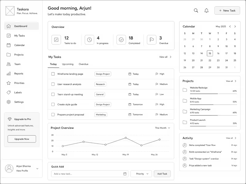
Wireframes are where the real UX decisions happen — before any colour, font, or component touches the file. This is Taskora, a productivity dashboard wireframe I designed around a single question: what does a user actually need to see the moment they open this app? The overview stats sit at the top so your day's status is never buried. The task list defaults to Today, not All Tasks, because most productivity tools overwhelm you on open. Calendar and projects stay visible but secondary — supporting context, not competing for it. Every layout choice here has a reason behind it. That's what wireframing is for. Currently open to UX wireframing projects starting at $200 — feel free to check out my Wireframing service or drop a message if you want to chat about your product.
1
209
2
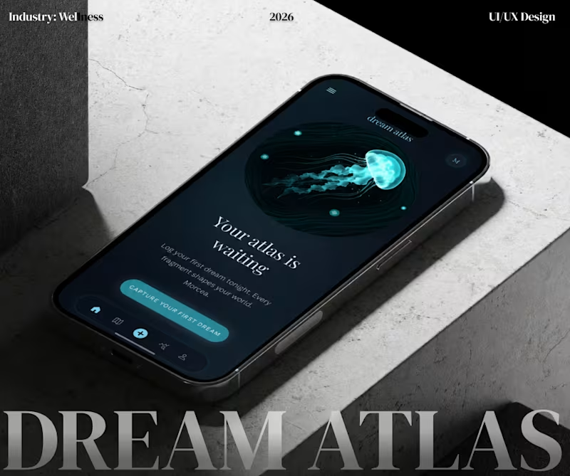
Dream Atlas is a conceptual AI-powered mobile application that transforms dream journaling into an immersive self-discovery experience. Instead of storing dreams as journal entries, the app visualizes them as an evolving landscape of memories, emotions, and recurring patterns. Designed in Figma, the project combines AI product design, mobile UX, interaction design, and visual storytelling to create a calm, atmospheric experience focused on reflection and exploration. Users can capture dreams, uncover recurring themes, and navigate a personalized subconscious world through AI-powered insights. Project Highlights: - AI-powered dream interpretation and pattern recognition - End-to-end mobile UX/UI design - User research and product strategy - Information architecture and user flows - High-fidelity UI design in Figma - Design system and reusable components - Interaction and experience design - Wellness and self-discovery product concept - Dark mode interface with immersive visual storytelling Tools: - Figma - Figma Make - ChatGPT (UX ideation & product strategy) - Claude (documentation & product planning) Let me know you thoughts.
3
2
200
1
SESSION.LOG — Every Desktop Tells a Story What if the only record of our civilization was the laptops we left behind? SESSION.LOG is an interactive storytelling prototype set in a future where humanity has rebuilt after a global collapse. As researchers recover devices from the old world, each desktop becomes a time capsule—preserving fragments of ordinary lives through files, folders, notes, wallpapers, and digital habits. Instead of reading biographies, users reconstruct identities by exploring authentic desktop environments. Every interaction uncovers another clue, gradually revealing the stories of an architect, a marine biologist, an astronaut, and a grandmother. I designed the prototype in Flowstep, using its AI-powered workflow to rapidly iterate on multiple screens, then leveraged its design-to-code capabilities to transform the concept into a fully interactive React application. SESSION.LOG explores how interfaces can become a medium for storytelling—and how our digital footprints may one day become history. Flowstep canvas: https://app.flowstep.ai/file?activeFileId=c179fcc0-3fc3-4fdc-b1bd-6c7a103f8bc6 X: https://x.com/design_verse_/status/2082852760408768526 Experience here: https://session-log-lovat.vercel.app/
1
82
16
Built an interactive museum where old interfaces become digital artifacts. For the Wonder Challenge, I wanted to explore a simple idea: What if, centuries from now, our interfaces were displayed in museums? That idea became CTRL+ALT+PAST—an interactive experience set in the year 2475, where visitors step into the role of a curator restoring humanity's last surviving digital relics. Instead of preserving paintings or sculptures, the museum preserves interactions we once took for granted: 🖥️ Windows XP 💬 MSN Messenger 📱 Nokia 3310 🎵 iPod Classic ⏳ A loading screen forever frozen at 99% The goal wasn't to recreate these products, but to capture the tiny interactions that made them unforgettable. Built with Wonder for ideation, rapid iteration, and interface generation, and VS Code to bring the interactions to life. This was one of those projects that started with a random "what if?" and turned into something I genuinely enjoyed building. File: https://app.wonder.so/tanya/files/019f230a-adfe-7daf-a99b-85fa200d50da LinkedIn: https://www.linkedin.com/feed/update/urn:li:activity:7479580277091258368/
5
16
864
Claude
(2)
Follow
Message
Explore people