Built with Jitter
AI-native Audio Platform Design for Noophora

Divan Raj
$7.5K+ earned


Noophora: designing an AI-native audio platform where the audience is part of the product
Role: Product Designer
Tools: Figma, Claude
Timeline: 4 Weeks
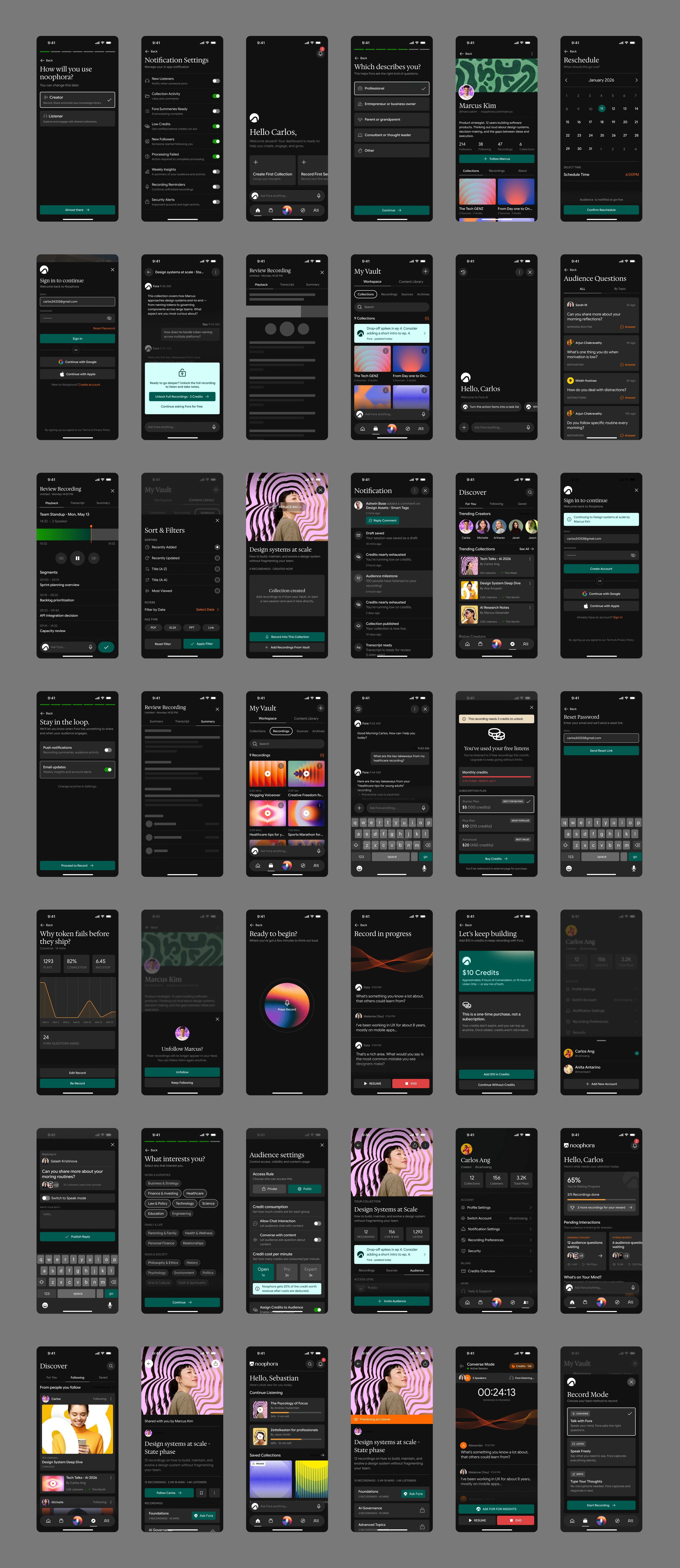
Scope: ~150 screens across the full product, light and dark
What Noophora is
Noophora is an audio recording and knowledge-sharing platform. People record, publish, and build a body of spoken work, and an AI presence called Fora lives inside the product to help them do it.

The thing that made this project worth doing properly: Fora isn't a chatbot bolted onto a sidebar. It's a participant. It shapes how a recording gets made, how a listener finds their way into it, and how an audience forms around it. That framing set the design problem for everything downstream.
The problem
Most AI features in consumer products are treated as an accessory. You open a panel, you type at it, you close the panel. That works for tools. It falls apart when the AI is meant to be a presence that both the creator and the listener encounter.
So the question I kept returning to was: what does an interface look like when the AI, the person recording, and the people listening all occupy the same space, without any one of them crowding out the other two?
Three constraints shaped every decision:
Fora had to be reachable from anywhere without ever being in the way. Buried means unused. Loud means it hijacks the product.
Creator and listener had to feel like one product. A lot of audio platforms are effectively two apps stapled together. A listener should be able to slide into creating without hitting a wall.
It had to hold at scale. Around 150 screens by the end. Nothing survives that surface area unless the system underneath is genuinely load-bearing.
Process: architecture before pixels
Before any visual work I mapped the entire product structure. I used Claude as a thinking partner through this stage, stress-testing the hierarchy: where a recording lives, what the relationship is between a collection and an audience, what a guest sees versus a signed-in user, where Fora sits relative to all of it.
I'd propose a structure, argue for it, and get pushed on the edge cases I'd glossed over. What came out the other side was noticeably cleaner than what I started with.
From there I built 140+ wireframe screens with flow connectors, so the whole product could be walked end to end before anything got polished. That's the main reason 150 hi-fi screens was feasible at all. By the time I got to visual design, most of the hard decisions were already made and the work was applying a system rather than inventing one screen at a time.
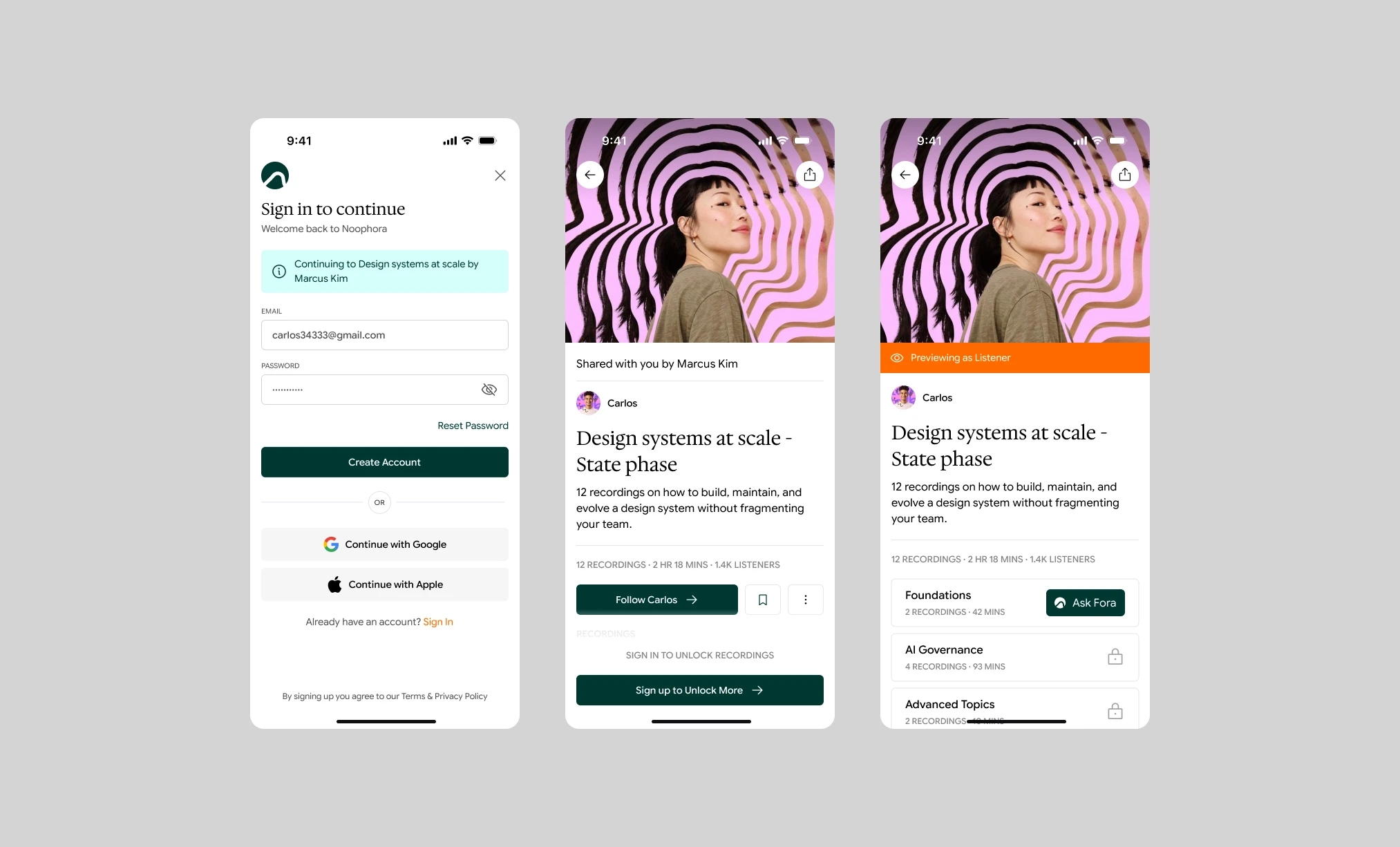
1. Login and account entry
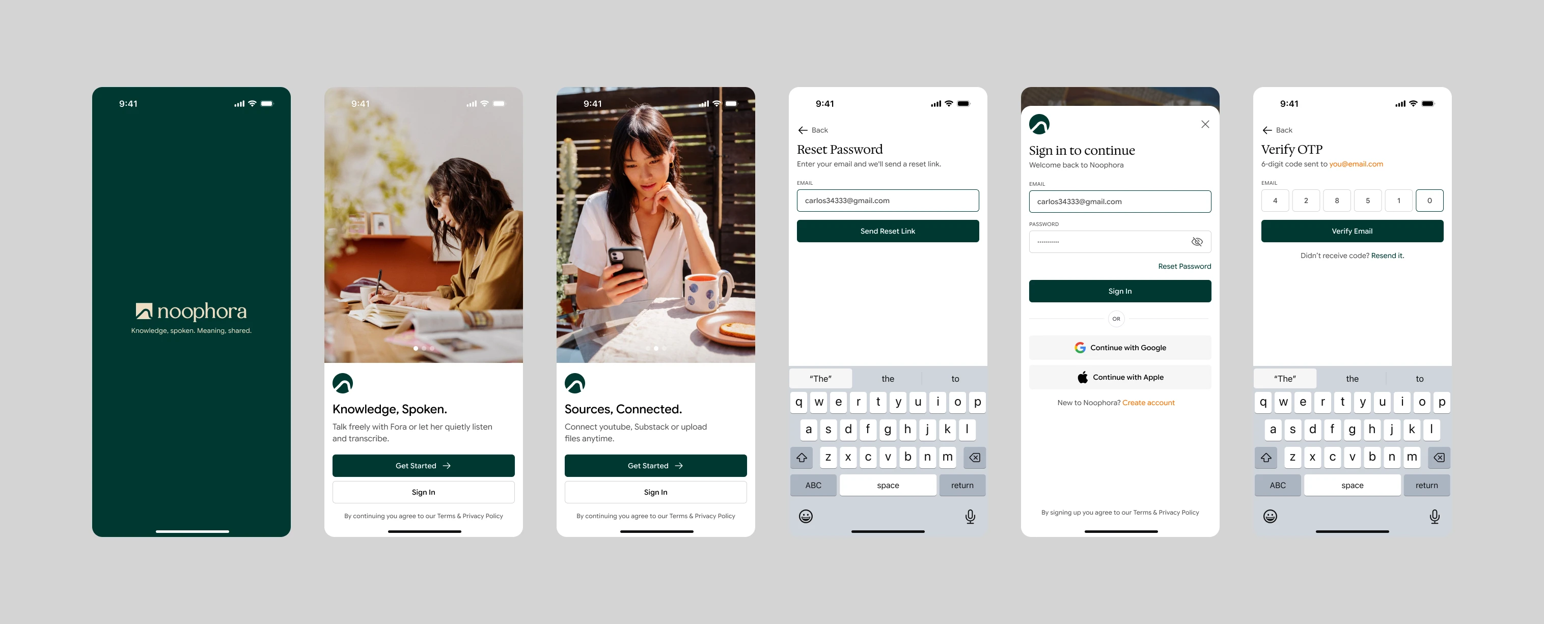
The design goal here was to get out of the way. Login is pure friction: nobody signs up because the sign-up screen was beautiful, but plenty of people leave because it asked too much too early.
Key decisions:
Minimum viable ask at the door. Account creation collects only what's needed to create an account. Everything about who you are and what you want from the product gets pushed into onboarding, where there's context for asking.
Guests don't have to sign in first. People can enter the product and encounter real content before an account is required. The account prompt arrives later, once there's a reason for it (see the soft gate pattern below).
The same entry point for both sides. Listeners and creators sign in through one door. There's no "are you a creator or a listener" fork, because that's a question people can't answer accurately before they've used the thing.
2. Onboarding
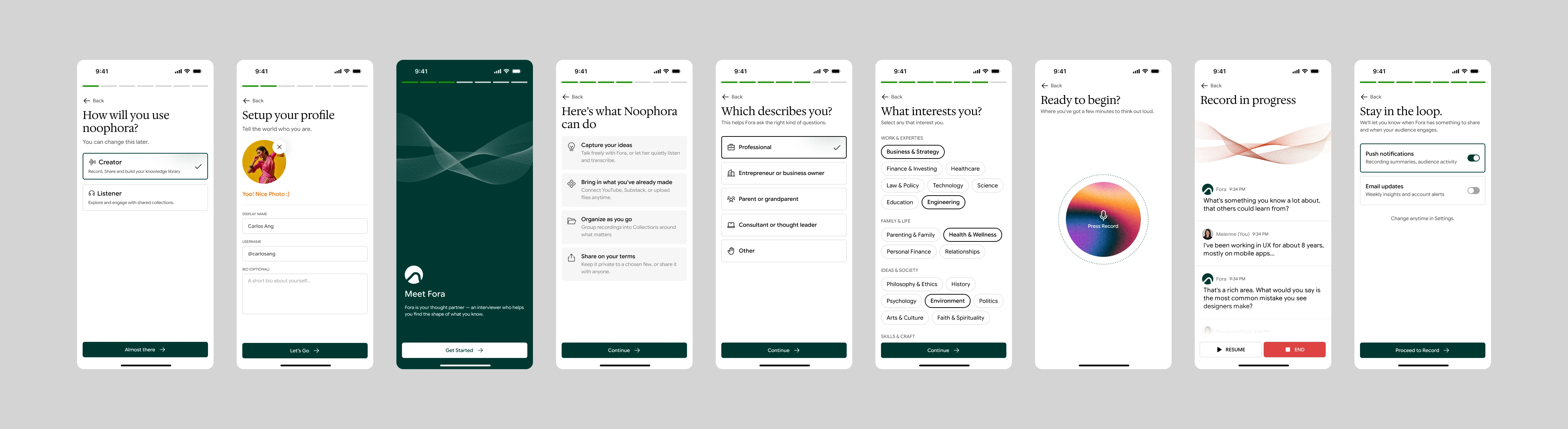
Onboarding had to do two jobs at once: teach the product, and introduce Fora as a presence rather than a feature.
Key decisions:
Introduce Fora by using it, not by explaining it. Rather than a carousel explaining what the AI does, onboarding puts people in a small piece of real interaction with Fora early. An AI presence explained in a tooltip is a feature. An AI presence you've already talked to is a character.
Progressive disclosure over an upfront tour. The product has a lot of surface area (Vault, collections, audiences, credits, recording modes). Front-loading all of it in onboarding would guarantee none of it landed. Most of it gets introduced contextually at the moment it becomes relevant.
First recording as the activation goal. Onboarding is designed to end with someone having actually made something, not with someone having read seven screens about making something.
3. Recording
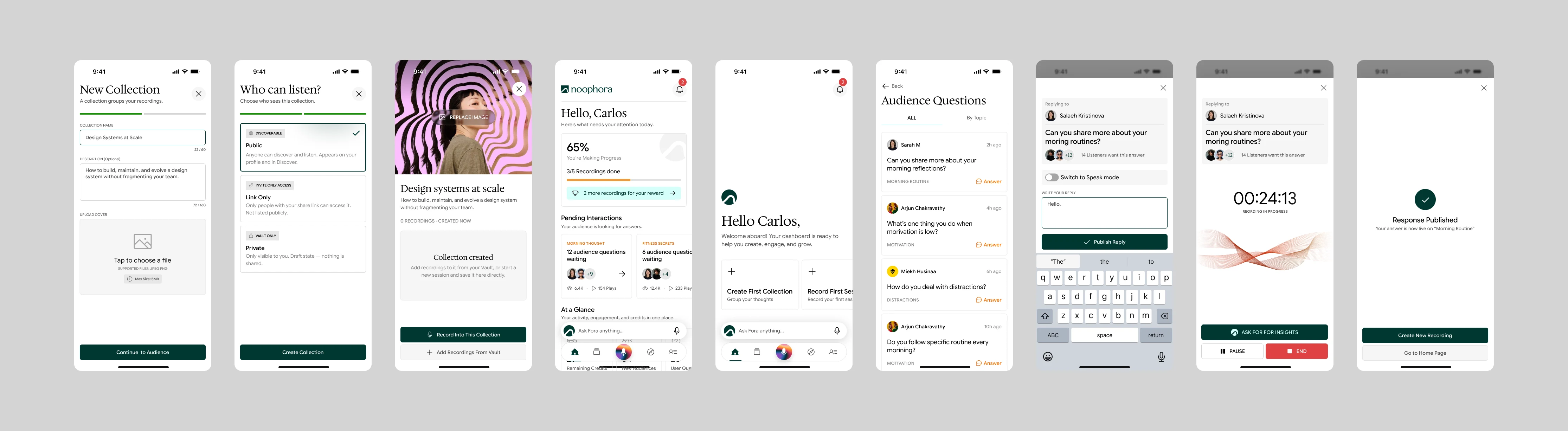
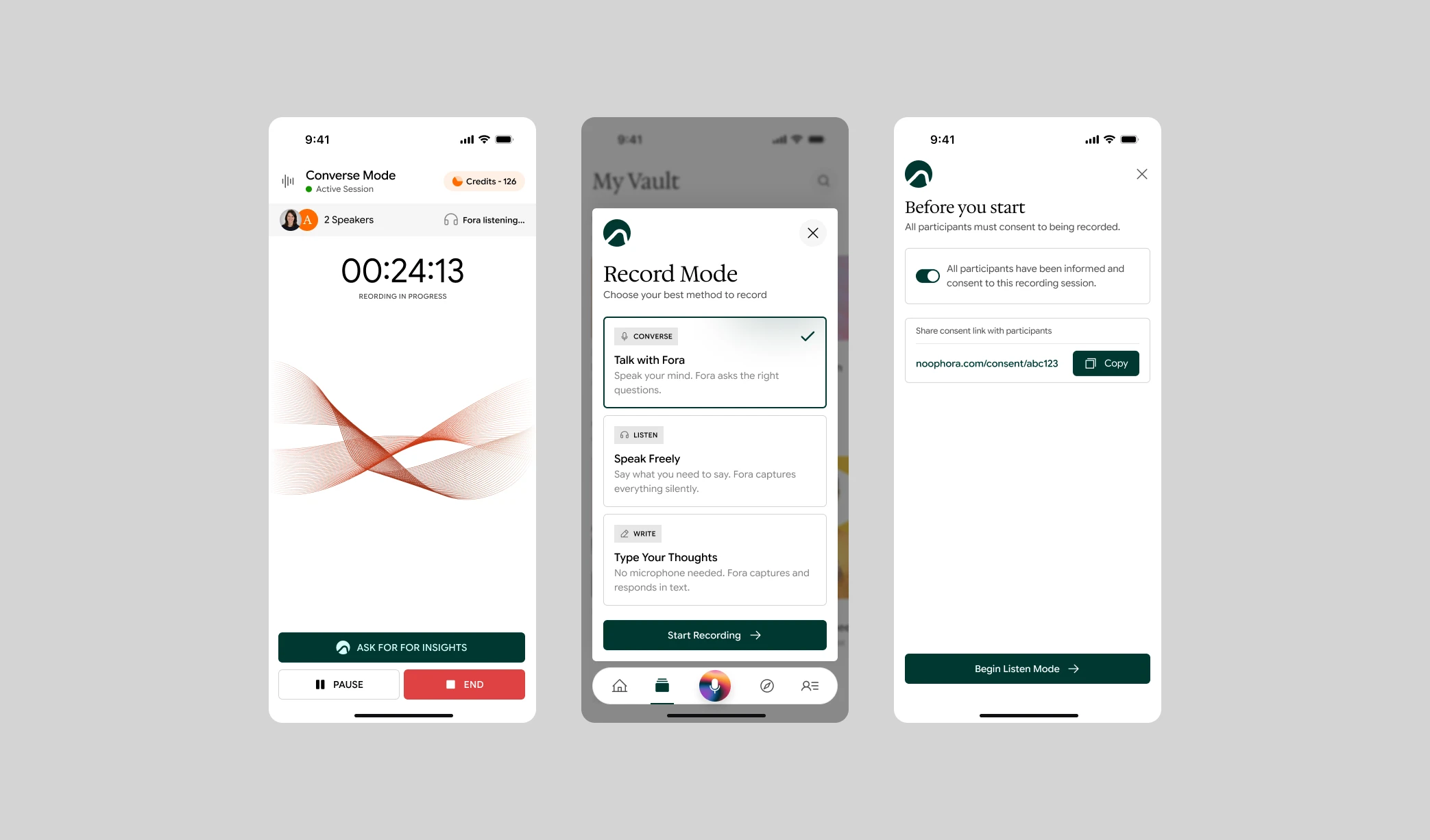
This is the core loop and the screen people return to most, so it got the most iteration.
Key decisions:
Multiple recording modes, one mental model. The product supports several ways of recording. Rather than giving each mode its own interface, they share a common frame with mode-specific affordances layered in, so switching modes doesn't mean relearning the screen.
Fora is present during recording without narrating it. The AI can shape the session, but the recording view stays visually quiet. Anything that pulses, animates, or demands attention while someone is mid-thought is actively hostile to the task.
The stop state matters more than the record state. Most recording UI over-designs the moment you hit record and under-designs the moment you stop, which is where the anxiety actually is. What happens next, whether it's saved, whether it can be redone: those needed to be answered immediately and visibly.
Dark by default in this flow specifically. Recording often happens in low light or in a focused, heads-down state. The dark treatment isn't a theme preference here, it's the appropriate default for the context.
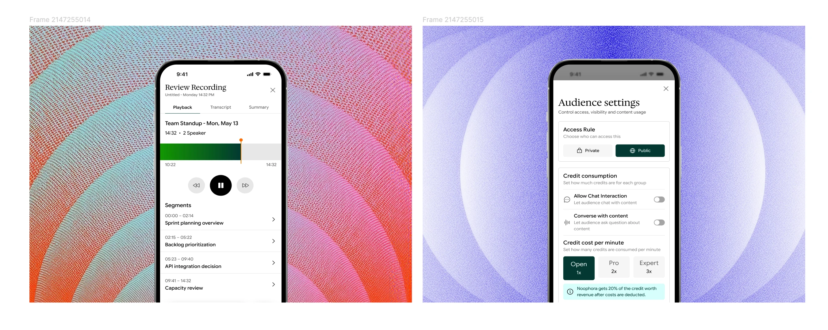
4. Review
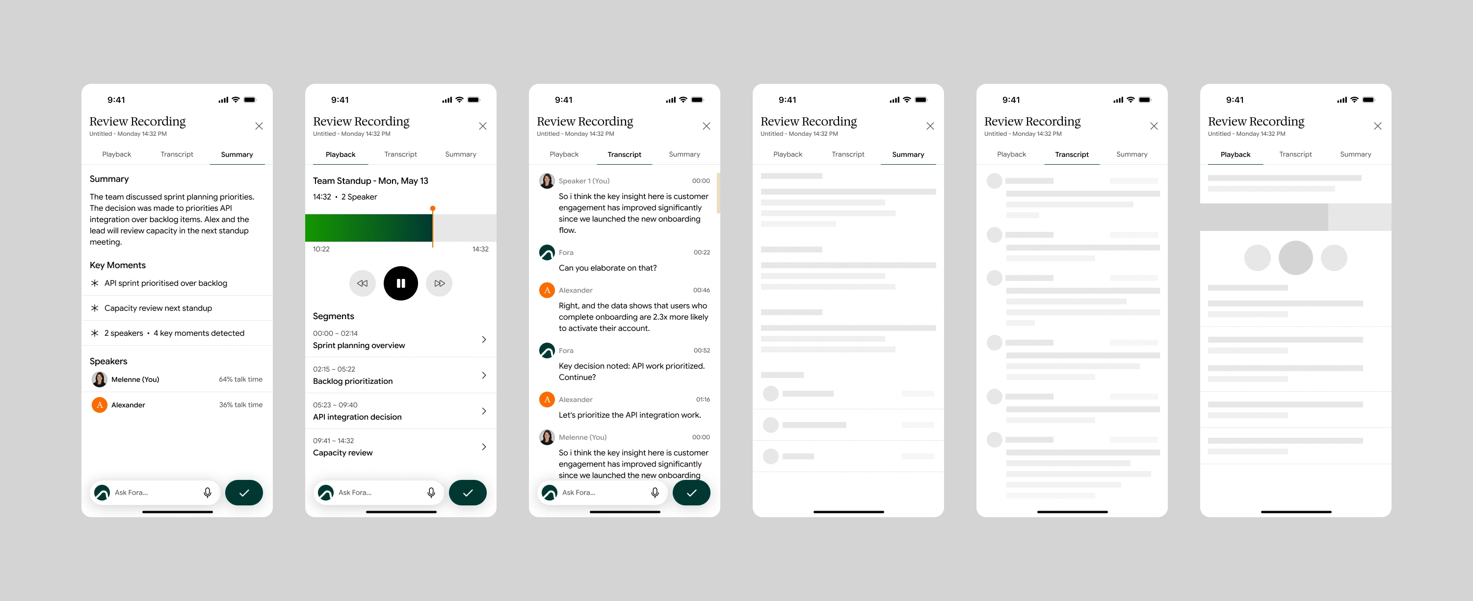
Review sits between recording and publishing, and it's where the AI does the most visible work.
Key decisions:
Editing is non-destructive and reversible. People need to be able to try a change and back out of it. If AI-assisted edits can't be undone cleanly, nobody trusts the AI enough to use it.
AI suggestions are proposals, never applied silently. Anything Fora offers in review is presented as a suggestion the person accepts or dismisses. The moment the system starts changing your recording on your behalf, it stops being your recording.
The original is always recoverable. Whatever gets processed, refined, or restructured, the raw take stays reachable.
5. My Vault
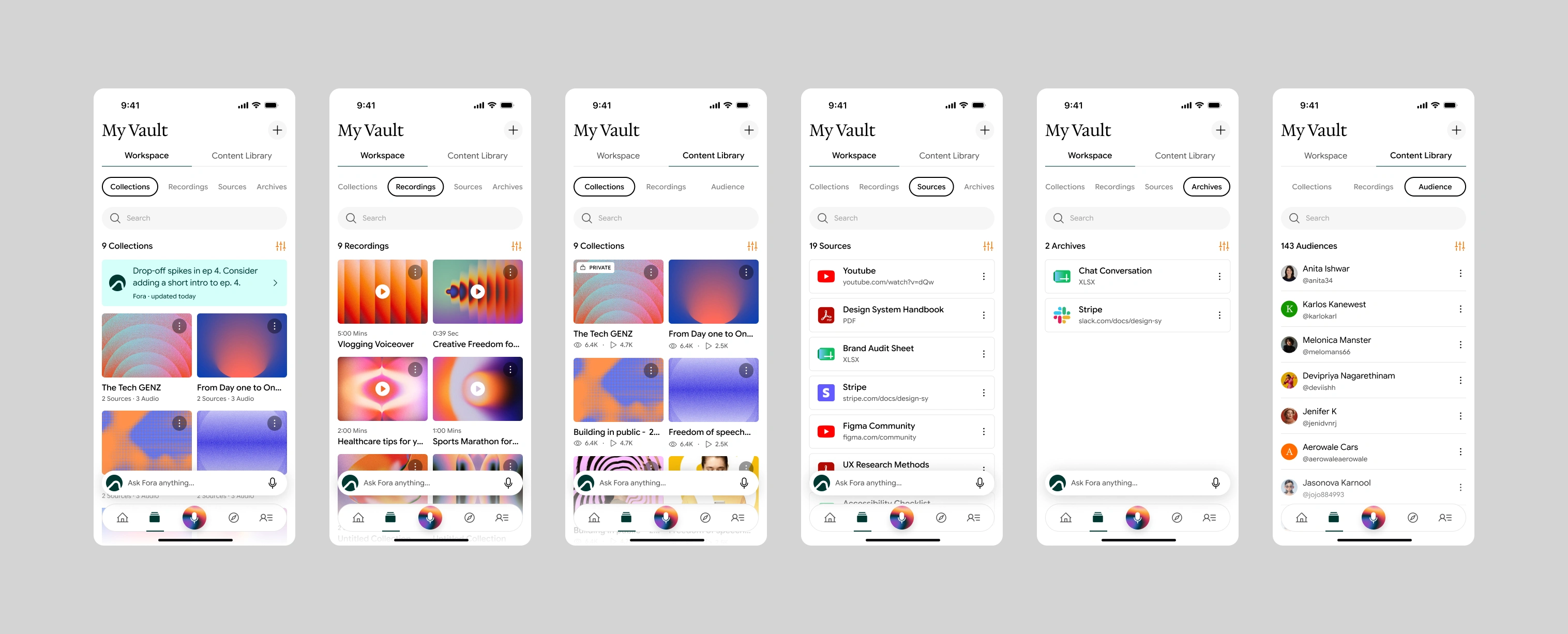
The Vault is where a person's body of work accumulates, and it's the screen that determines whether the product feels like a tool or a place.
Key decisions:
Built for a full library, not an empty one. It's easy to design a beautiful empty state and end up with something that collapses at 200 items. I designed the Vault around a mature library first, then derived the empty and early states from it.
Collections as the organising layer. Recordings group into collections, which is what lets the Vault scale past a flat reverse-chronological list.
Status is legible at a glance. Draft, in review, published, private: the state of a piece is visible in the list without opening it, because the most common Vault task is finding the one thing that needs attention.
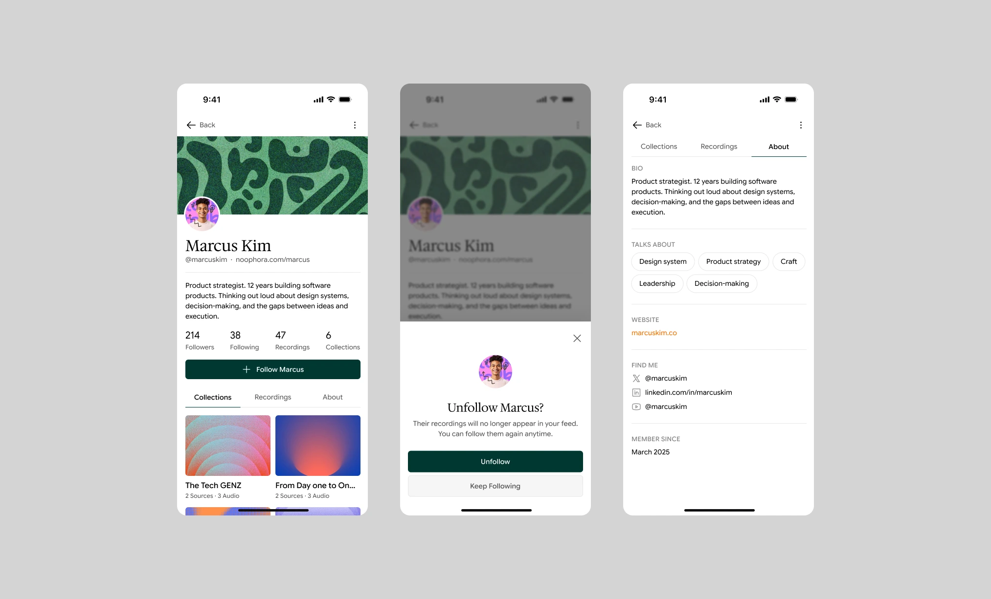
6. Profile
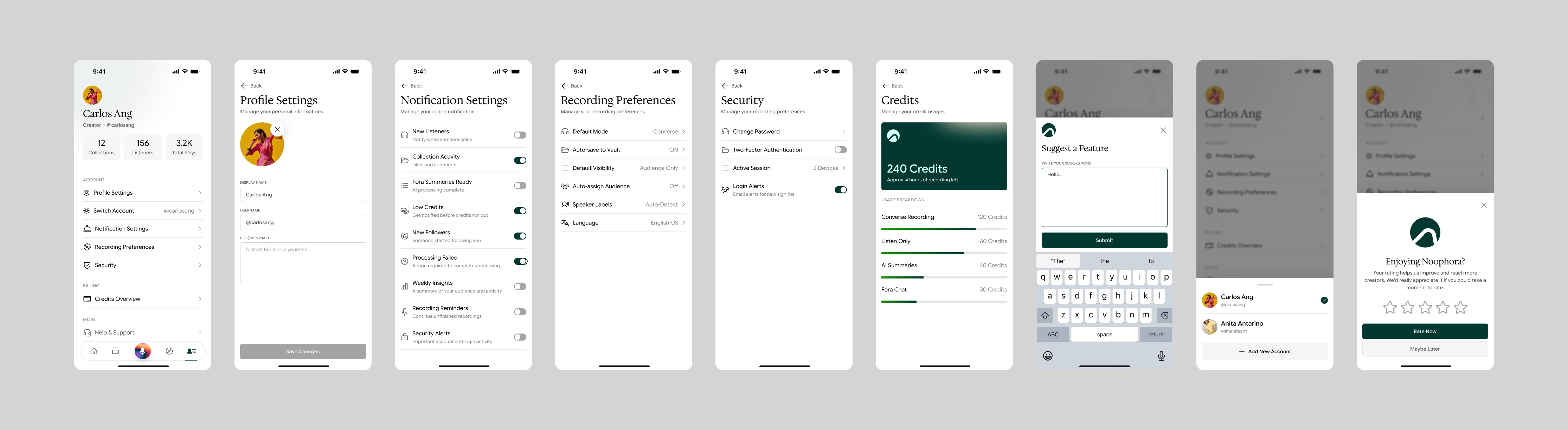
Profile is where the creator side and the listener side meet, and it's the screen that carries the most weight in whether an audience forms.
Key decisions:
The profile is the public artifact. It's not a settings page with an avatar on it. It's the thing someone lands on from a shared link and decides from.
Guest-visible by design. A profile has to work for someone with no account, because that's most of the people who will ever see it.
Account settings live elsewhere. Separating the public profile from private account management keeps both screens honest about what they're for.
7. Notifications
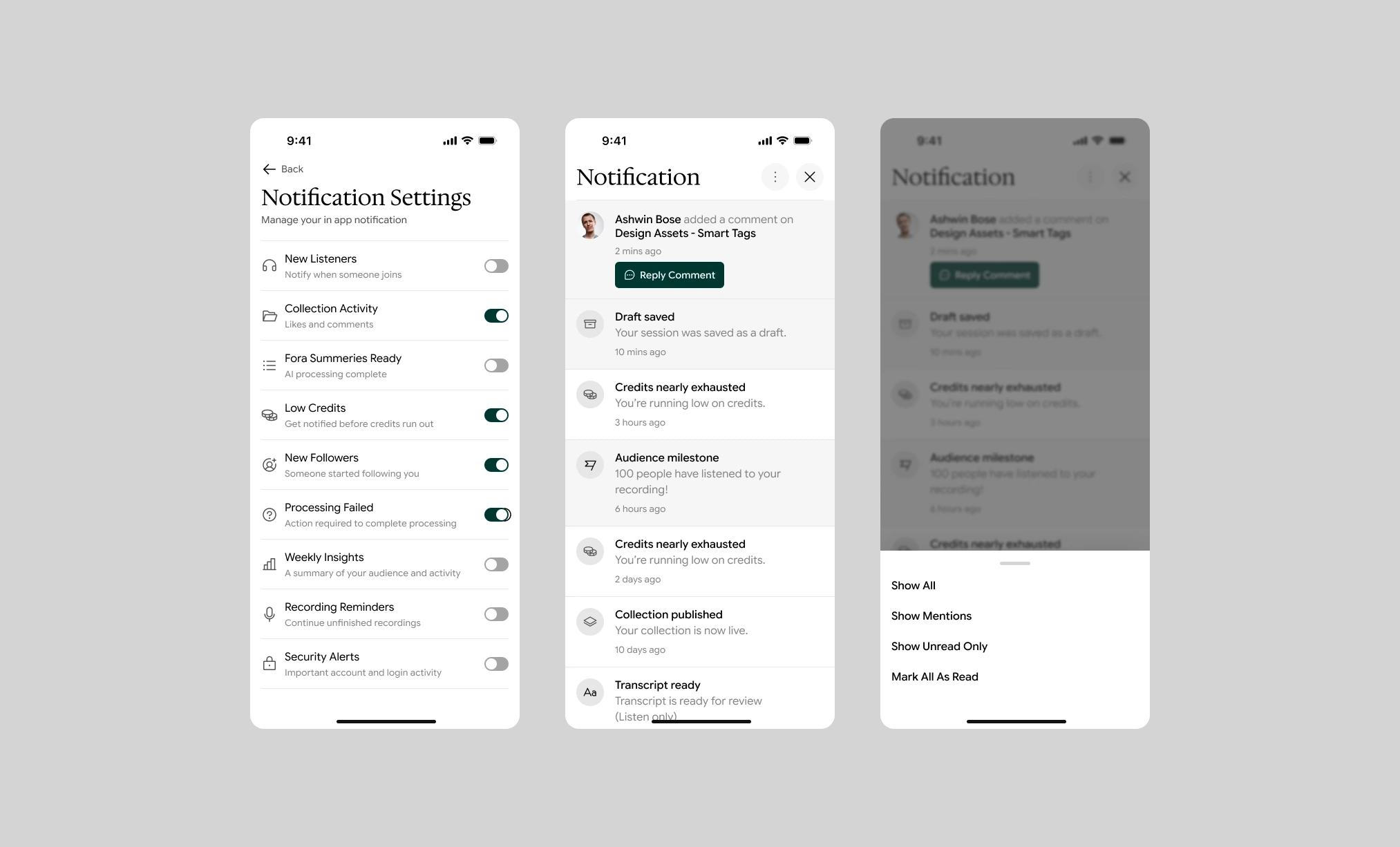
Notifications are the flow most likely to quietly wreck a product's relationship with its users, so the design brief here was mostly restraint.
Key decisions:
Two categories, kept separate. System and account events (something you need to act on) versus audience and social activity (something nice to know). Mixing them means the important ones get buried under the pleasant ones.
Fora doesn't get to interrupt. The AI operates inside the product, not in the notification tray. Push notifications from an AI presence cross a line quickly and cheapen the presence itself.
Batching over immediacy for social activity. Audience activity is grouped rather than fired one at a time, so a good day doesn't feel like an attack.
Cross-cutting decisions
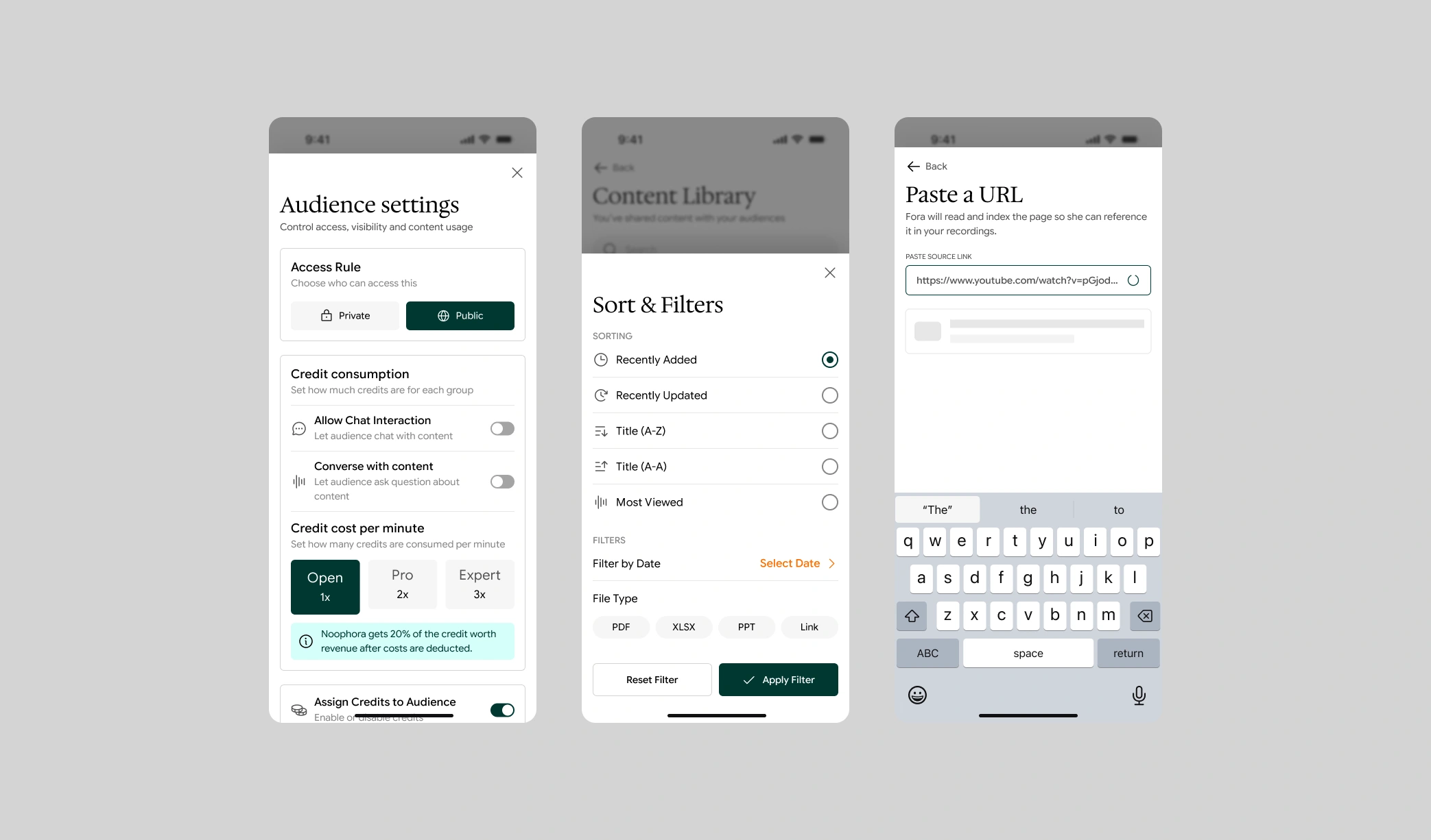
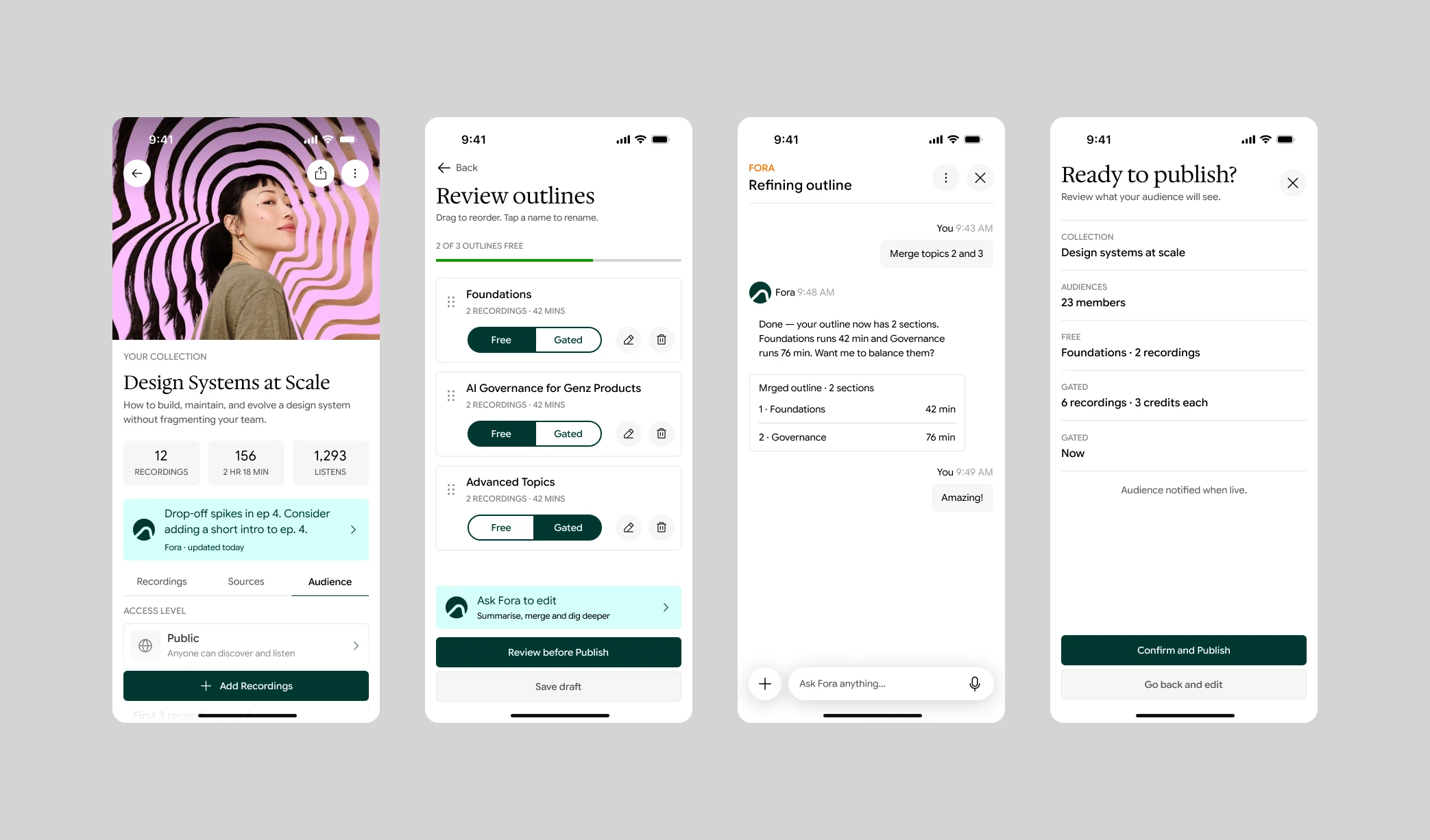
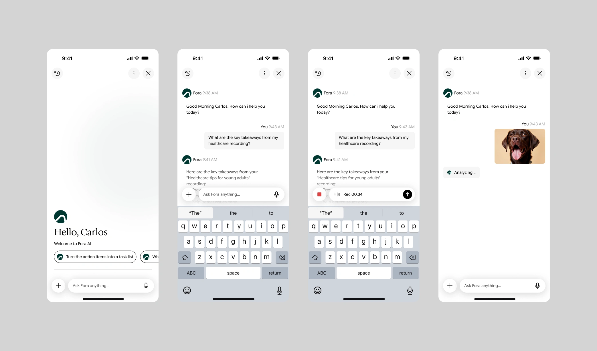
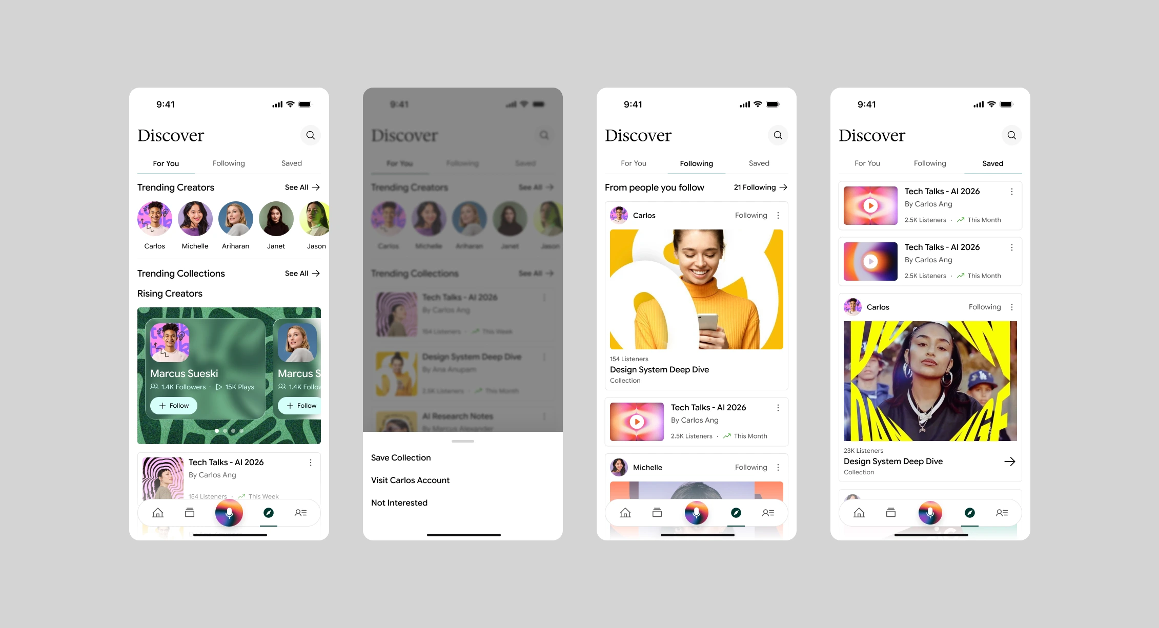
These held across every flow above, and they're the ones I'd defend hardest.
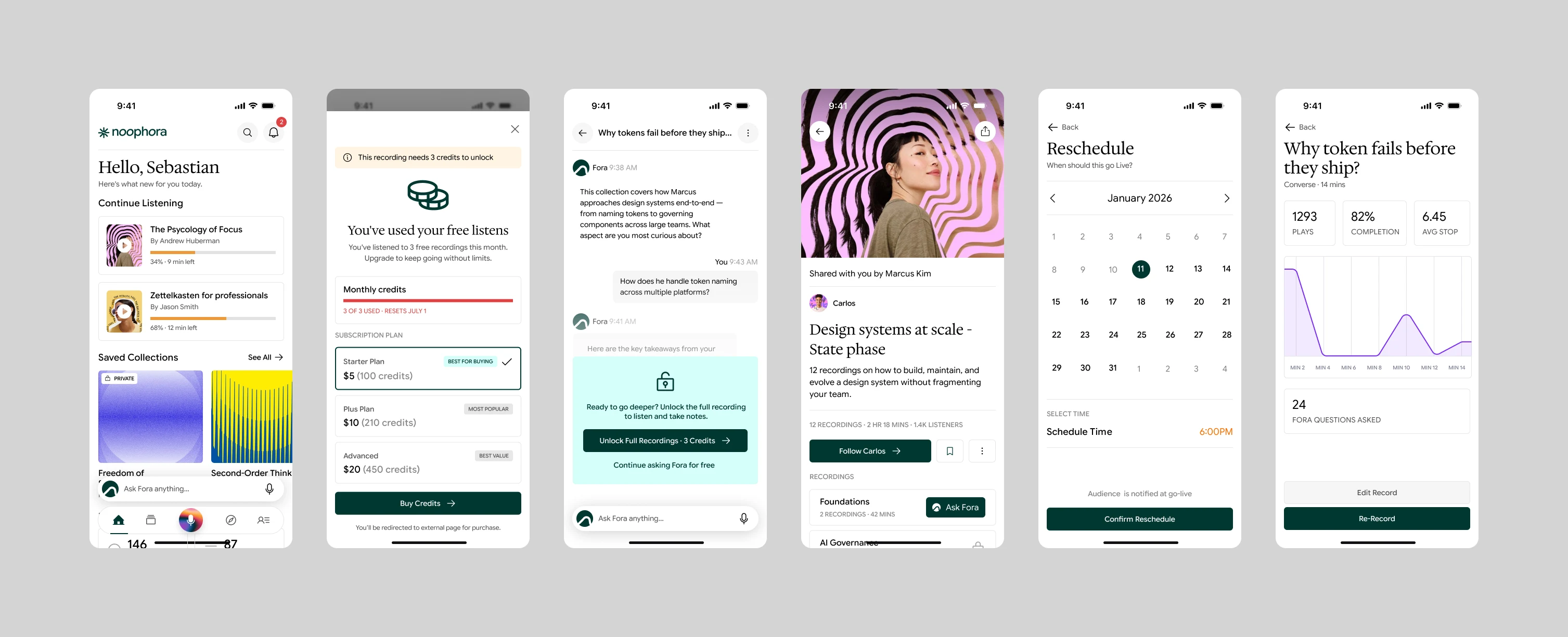
Fora persists as a bottom bar entry point, always. It doesn't appear contextually, doesn't slide in when the system thinks you need it, and never takes over the screen. Making it fixed furniture rather than a modal interruption changed the entire feel: Fora becomes somewhere you go, like a tab, instead of something that happens to you. It also meant every other screen could be designed without reserving space for an AI panel that might show up.
Guests see locked content, not hidden content. A small wording difference with a large design consequence. Hiding things means a guest sees a thinner, sadder product and has no idea what they're missing. Locking them means they see the actual shape of what's there and understand exactly what an account gets them.
Soft gates appear after engagement, not before. The sign-up ask arrives once someone has listened, browsed, or otherwise invested something. Asking at the door converts worse and feels worse.
Credits are one-time purchases, never subscriptions. This came from the recording behaviour itself. People record in bursts, not on a monthly cadence, and a subscription punishes that pattern. Designing billing around top-ups instead of tiers simplified the pricing surface and stopped the product from nagging during quiet stretches.
The visual system
The identity runs on dark teal (
#003832), beige (#EDDCC1), and a mid teal (#1D9E75), with Georgia as the serif and hexagonal halftone patterns as a recurring texture.The serif was a deliberate move away from the default AI product look. Everything in that category reaches for a clean geometric sans. Noophora is about spoken knowledge and the people making it, which wanted something with more weight and more voice. The halftone pattern gave the interface a printed, physical quality that keeps a mostly dark product from feeling sterile.
Dark mode was in scope from the start rather than retrofitted. I built the palette dark-first and derived the light treatment from it, which meant contrast relationships held in both directions instead of one mode permanently feeling like the compromise. On a product where the core activity often happens in low light, getting that order right mattered.
What I took from it
On AI placement. The instinct is to make an AI feature feel special: dramatic entrances, its own visual language, a distinct surface. Doing the opposite worked better. Treating Fora as ordinary furniture, in a fixed spot, built from the same components as everything else, made it feel like part of the product rather than a demo of the product.
On architecture. Three hundred screens sounds like a lot of drawing. Most of it wasn't. It was a lot of deciding, done early, then a lot of applying. The IA work was maybe a tenth of the calendar time and saved considerably more than that later.
On designing for two audiences at once. The temptation with a creator platform is to design the creator experience properly and let the listener experience be whatever falls out of it. Treating the listener side as a first-class flow, especially for guests, changed decisions in almost every part of the product.

Like this project
What the client had to say
Divan is a designer equally good in UI and art. His contribution to our app design meant he had to bring the human touch to our tech-driven designs. I am glad I let him do his work. Our early users have loved it. Thanks, Divan!


Carlos Ang, Avigate
Jul 26, 2026, Client
Posted Aug 4, 2026
Designed an AI native audio platform with 300 screens, crafting end-to-end UX/UI in Figma while collaborating with Claude for AI-assisted design workflows.
Likes
19
Views
262
Earned
$7.5K+
Timeline
Jun 7, 2026 - Jul 26, 2026
Clients
Avigate