Bditto ◦ iOS App & Dashboard
Ajeya Sharma
Newly designed critical user flows🔥
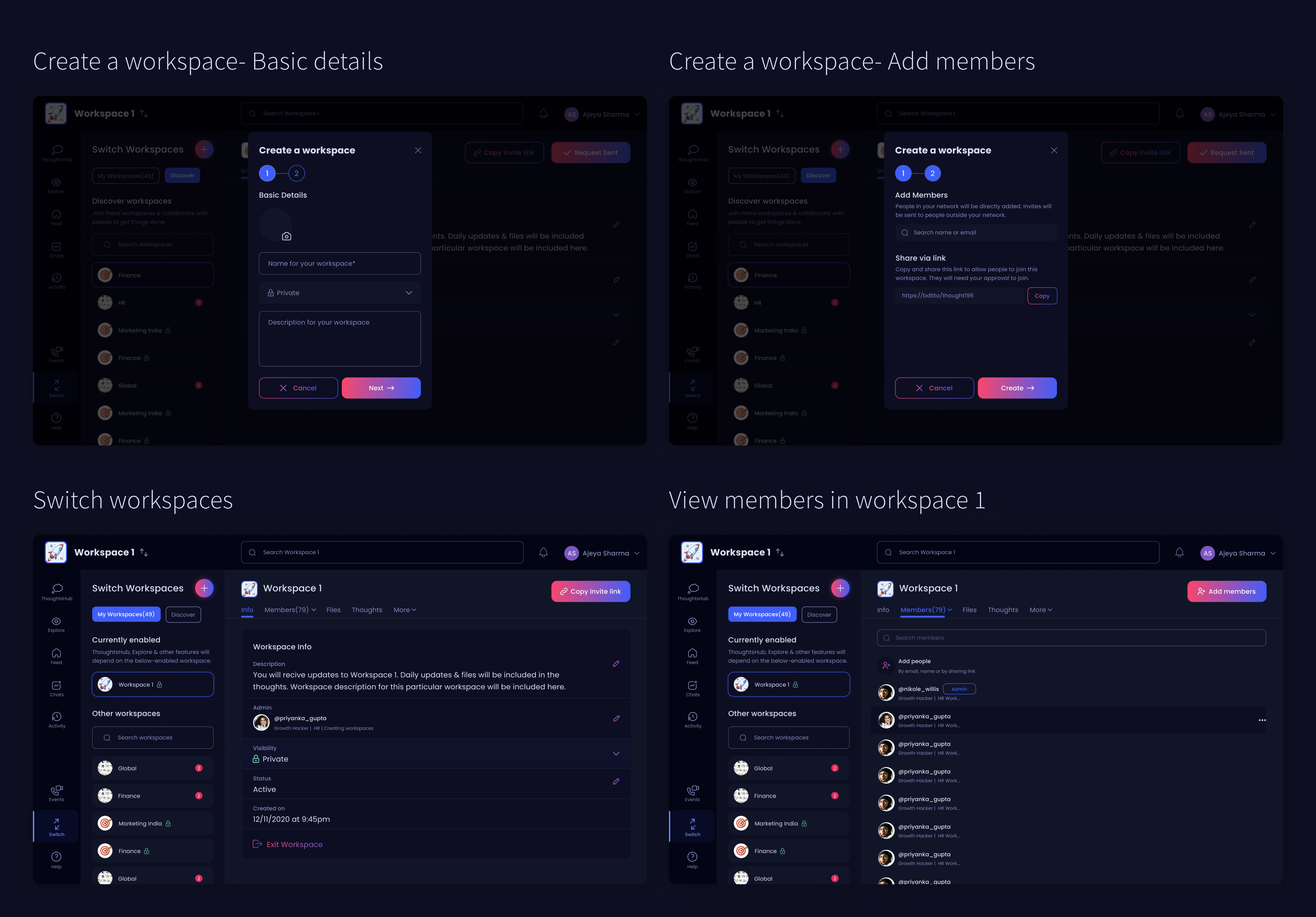
A. Workspaces
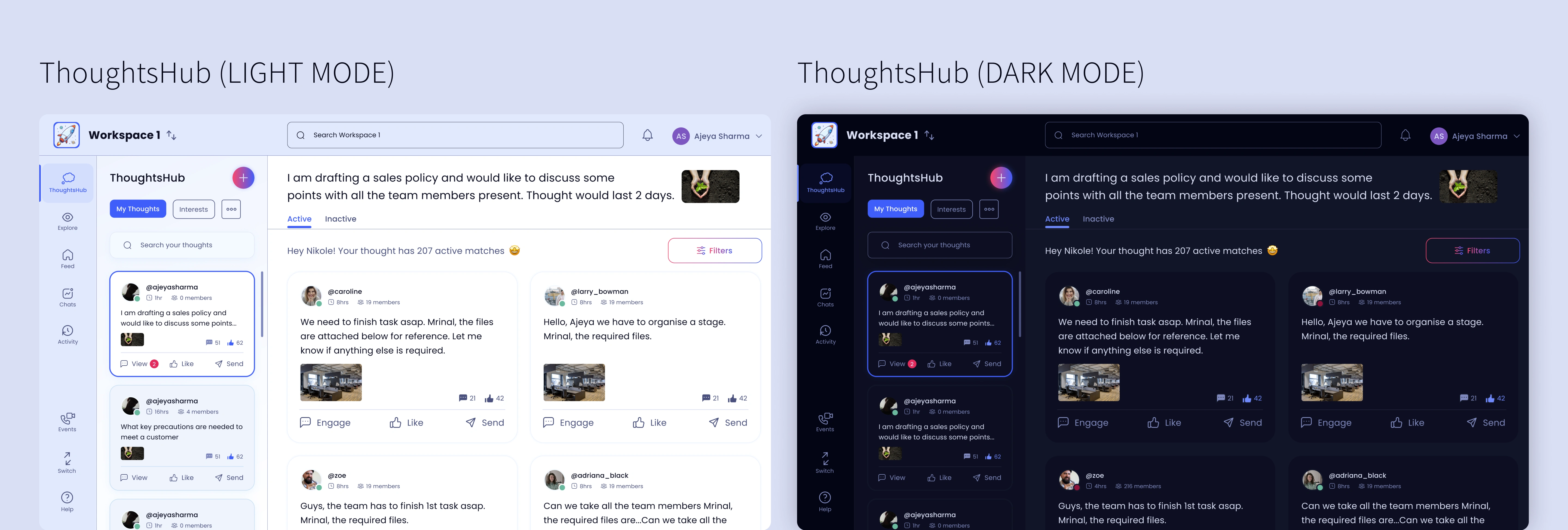
B. ThoughtsHub
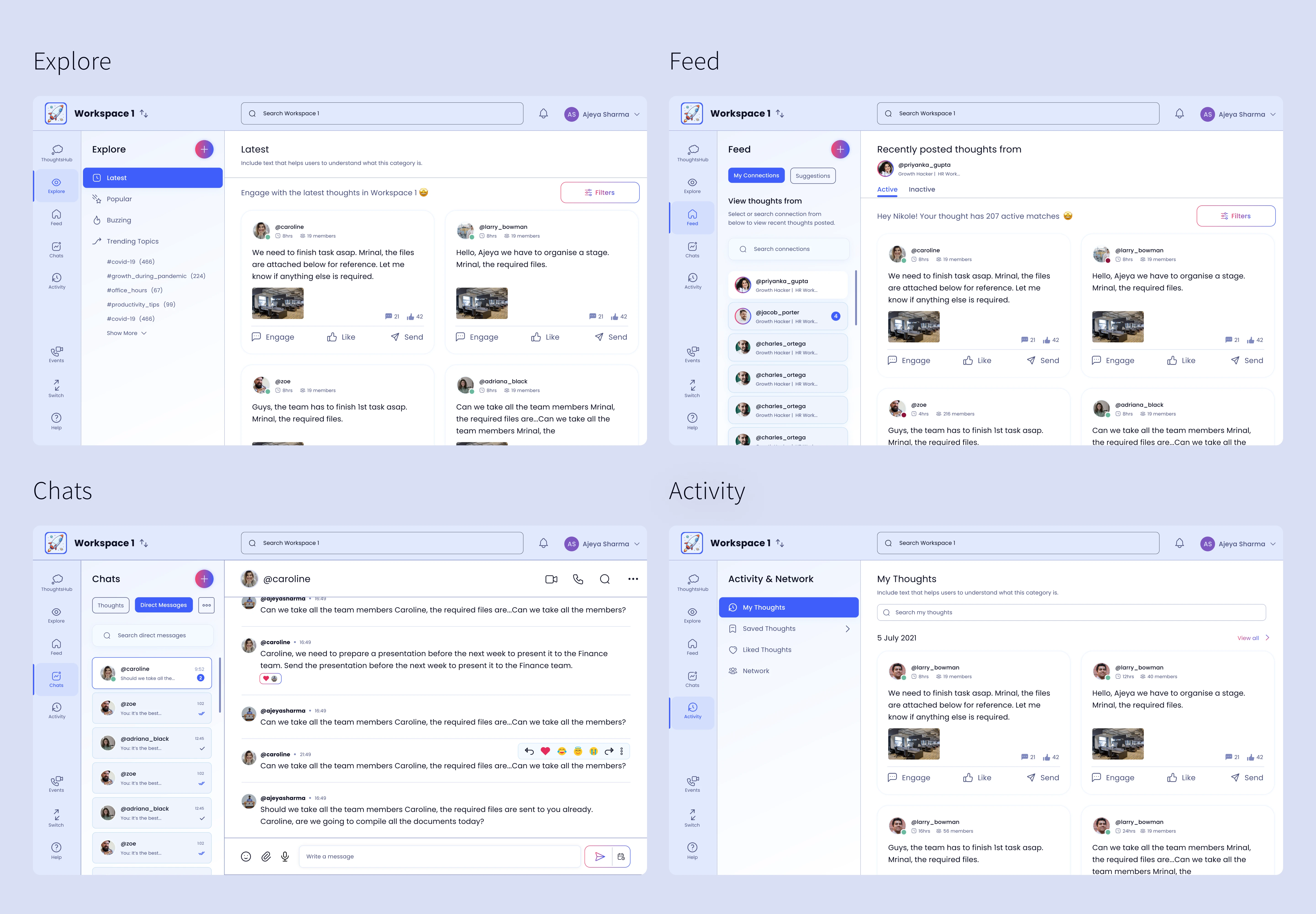
C. Explore, Feed, Chats & Activity
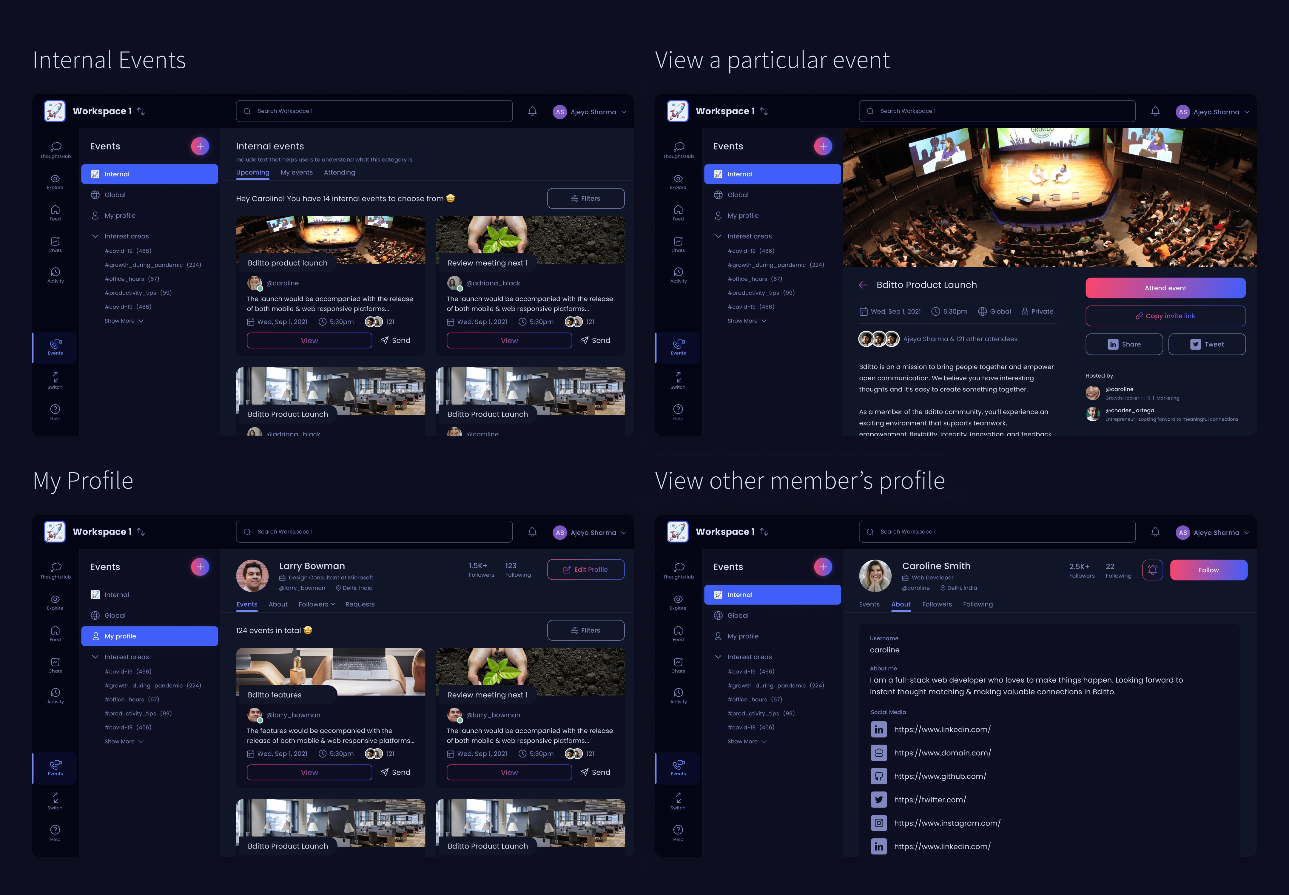
D. Events
🌓Designing light mode- giving control to users
Though there's a lot of research to understand which is better: light or dark mode, we at BDITTO believe it would be better to provide an option and design for both modes. Let the users decide for themselves.
This is the time when I got to work on creating components & a library for the design system of BDITTO.
Curious about the process?
Background
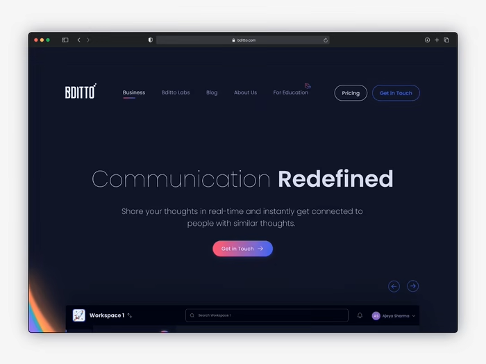
To solve inefficient and time-consuming collaboration within an enterprise, BDITTO allows users to share, connect and explore thoughts effortlessly & expedite the enterprise`s productive process. It provides a range of communication features that give users access to knowledge at their fingertips to get things done at the speed of thought.
My Role👋
For this project, I was the sole designer & worked on the MVP- version 1, version 2 & iOS app designs. To make it big, I collaborated with a lot of fantastic people on my team-
Engineers: To get to know the technical constraints & then design accordingly. I ensured that we launch the MVP-version 1.0 & version 2.0 effectively & within the target timelines.
CEO & CFO: To understand why we are investing in the redesign & why the current product is not functioning well. What is their vision & how does the redesigned product fits into it? What impact we are trying to achieve & what enterprise problems we are aiming to solve?
Users: To incorporate a user-centric approach & keep the product relevant to the needs & wants of our target audience. We want to create a product that people would want to use rather than one that we desire or imagine.
THE CHALLENGE
Why are we redesigning?💭
BDITTO had better & unique features to offer in the enterprise market, but
Did we have a product that was competitive to Microsoft Teams/Slack/Facebook Workplace in terms of experience, desirability & user interface? Not yet.
Did we have a product that could convince businesses to stop using MS Teams/Slack & instead use BDITTO? Not yet.
Did we have a product that could make investors & users believe in the impact that BDITTO aims to bring? Not yet.
I examined the old user flows to understand how every functionality worked. The old design did not focus on -
building the look & feel for an enterprise product
discoverability of the features present
usability by the target audience
user experience & accessibility of the platform
The old design did not focus on building the look & feel for an enterprise product, discoverability of the features present, usability by the target audience, user experience & accessibility of the platform
INITIAL GOALS
Build a highly competitive, easy-to-use & compelling product🎯
CEO, CFO & other key stakeholders briefed me about the goals planned for the redesign. Let's give it a shot, shall we?
Research about what's missing in the old dashboard design
Study business collaboration, competitors & recommend potential improvements
Visualise, brainstorm & include features/functionalities in sync with the developers
Get users involved to test features & validate design decisions
Positively impact the decision-making ability of businesses, companies & investors to get them onboard with BDITTO
Business & technical constraints⚠️
The website of BDITTO is live & our primary goal was to engage companies with the brand.
Earlier, we decided to work on all the goals defined above. But like any startup, the CEO & CFO wanted the product to be launched in the market as soon as possible (allowing businesses to use the product would be a win-win situation for BDITTO).
We realised that achieving the above goals would imply changing a lot in the old design & this can only happen only when time is invested in changing the frontend & backend of the product. (Technical Constraint)
BUSINESS DECISION: We were convinced that we should build an MVP-version 1 first, onboard businesses with BDITTO, gather user feedback & examine how the product performs in the industry.
REDEFINING GOALS
Initiating design for version 1🚀
The team considered all the factors, including the technical constraint, to improve UX & build business for BDITTO. Redefined goals-
I should prefer not to drastically change the old designs & user flows (goal- minimum number of changes in the frontend & backend)
We want our customers to be excited about our products, so we wanted to invest time in making BDITTO look desirable and attractive.
Work on including new user flows to improve UX, feedback system & usability of the product.
Troubleshoot existing usability problems & create impactful solutions.
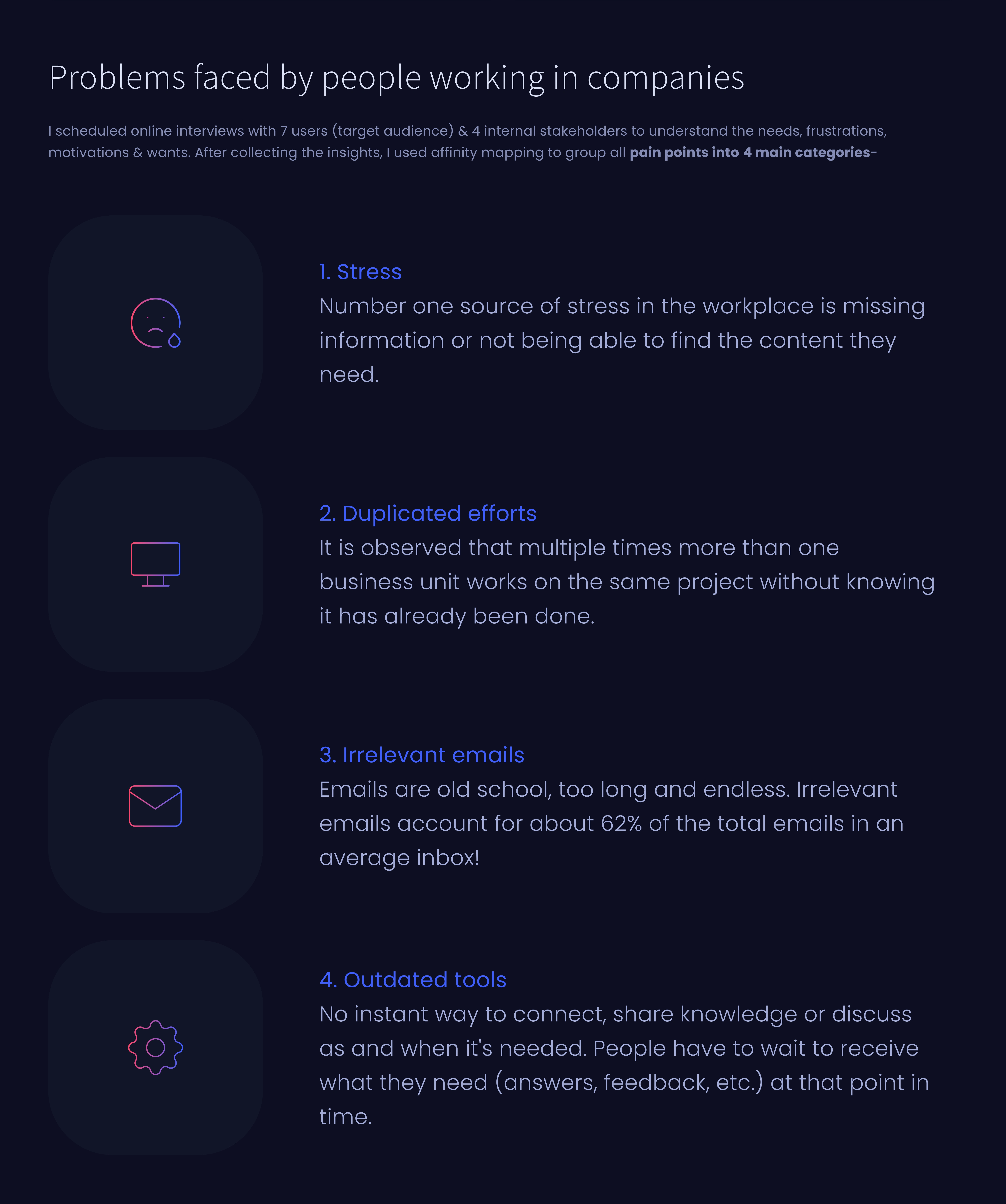
RESEARCH
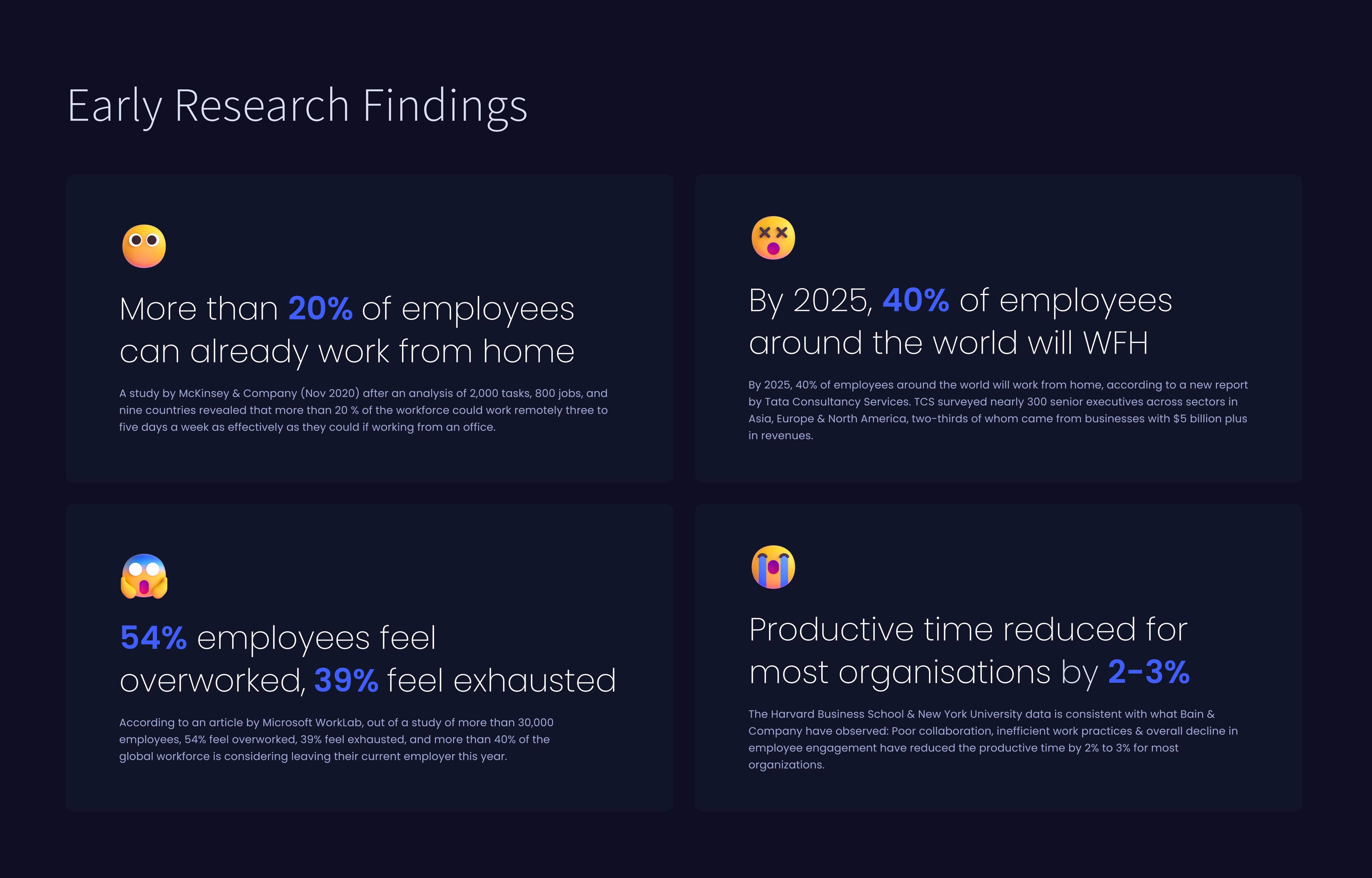
How enterprise collaboration was, is, and will be?
To know more about people working in companies before and during Covid-19 pandemic, I delved into multiple studies conducted by leading organisations- McKinsey & Company, Harvard Business School & many more.
Here's a snapshot of the findings & research conducted.
COLOR PSYCHOLOGY
Defining the brand & impacting users’ emotions (actions)🎨
Setting the mood is a very important step for any design project.
Primary colour defines & strengthens the brand. It will play a major role in how people perceive BDITTO.
Secondary colour will make certain design elements(eg-buttons, tabs) stand out in the website design.
Semantic colours will help us communicate with the users.
To cater to varied user needs + to establish visual hierarchy, I created extended colour palettes.
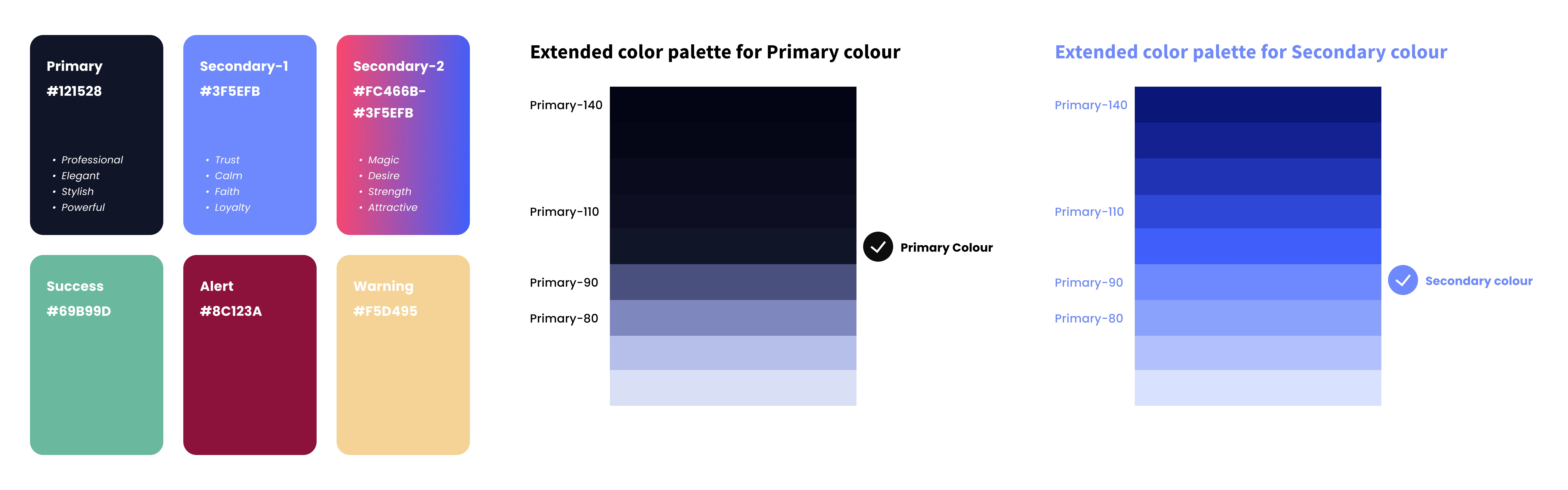
Primary goal was to create a brand image that is professional, meaningful, appealing to the target audience & one which gives a unique look to BDITTO
TYPOGRAPHY : TEXT STYLES
Creating a visual hierarchy👁️🗨️
For the past 2 years, I have interacted with over 30+ typefaces, and I understand the usage & purpose of each. For BDITTO, I filtered the options to top 5 typefaces with 8+ styles each & which were legible & readable, which included: Roboto, Open Sans, Poppins, Source Sans Pro & Montserrat. I mainly chose Poppins typeface because
It could achieve the desired look & feel for an enterprise product like BDITTO. We wanted to portray BDITTO as professional, trendy, sleek, modern & minimalist.
Poppins have a tall x-height & have better legibility at small font sizes, as white space within each letter is more legible. It is excellent for both headlines & paragraph copy to improve readability and style.
Includes 18 different font weights & will help us develop visual hierarchy within the design system.
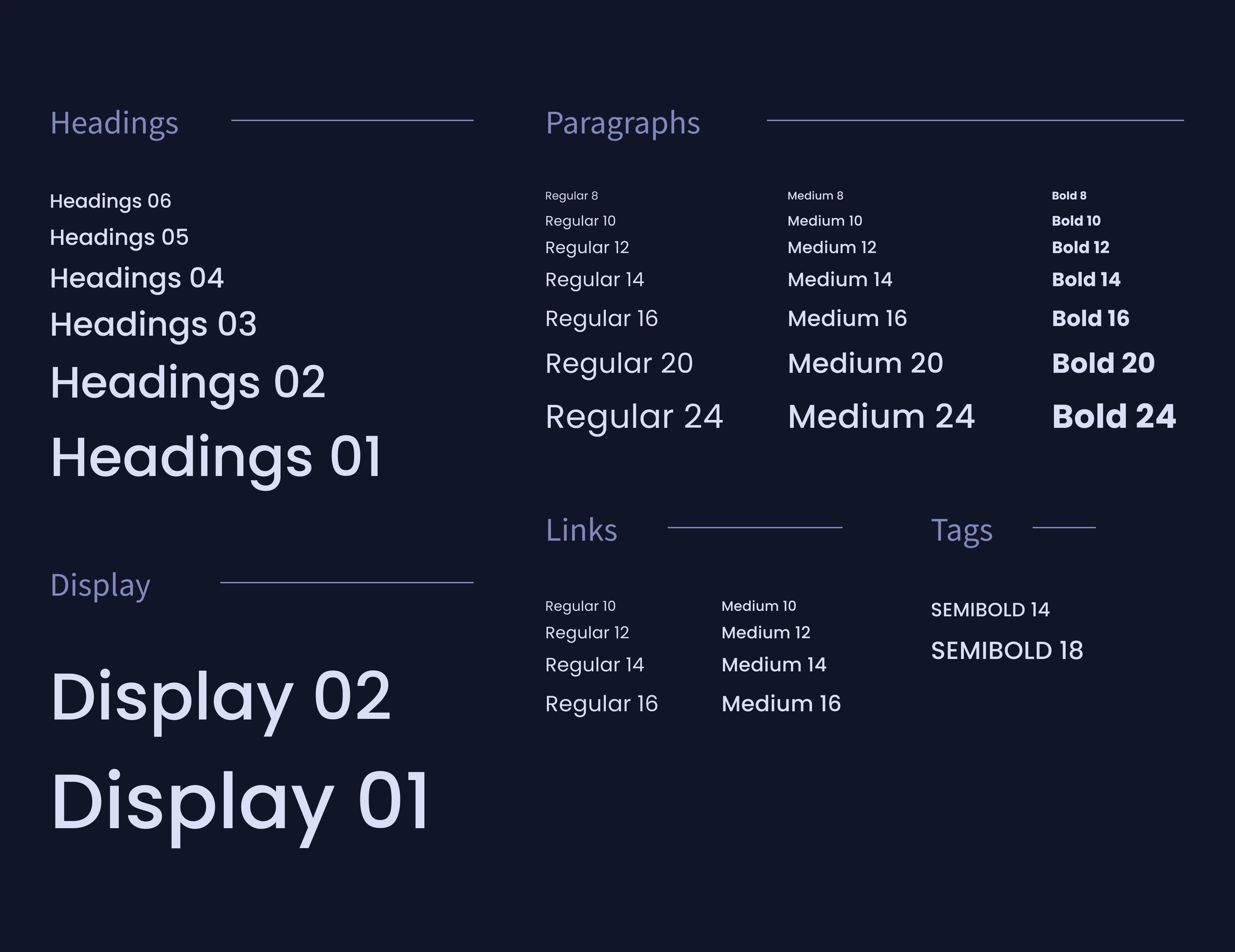
Poppins typeface- professional, readable & has 18 different font weights
PRODUCT REDESIGN
Rethinking every design element
Most of my efforts went into investigating "why" a particular design element was there & "why" was it created in this manner. What could be the potential enhancements?
If you're looking for a more in-depth look into the design decisions I took when designing the dashboard design version 1, then here you go! (You can compare the old & new versions)
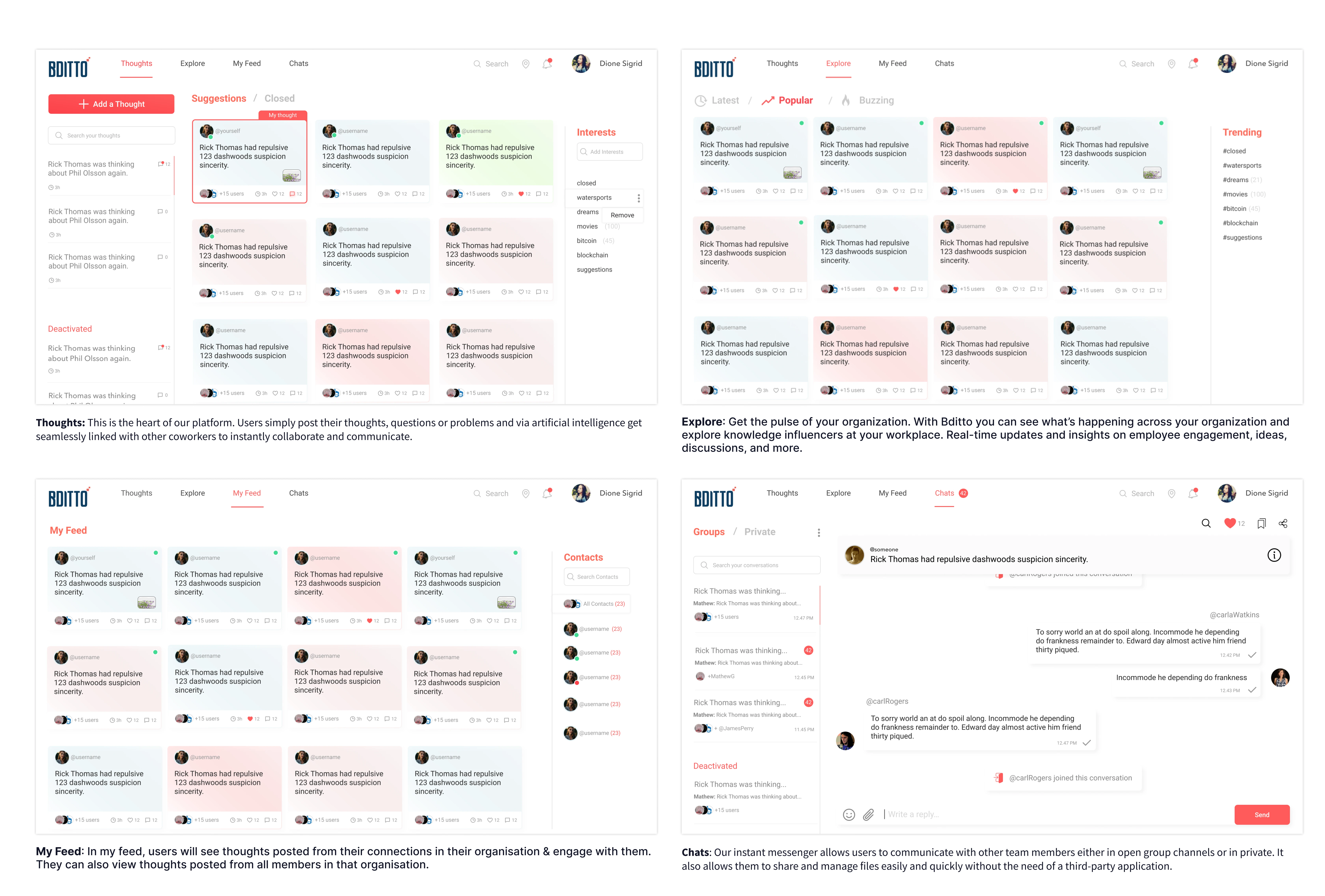
#1) Thoughts section
#2) Explore section
#3) My feed section
#4) Chats section
Introducing new user flows & interactions
Apart from enhancing the old designs, I also worked on improving the user experience by including new user flows & sections that would allow users to engage more with the MVP-version 1.
Features were prioritized & we only included those that would add maximum value to both users & business.
I'll not bore you with more images. Let's jump onto the interactions & prototypes that I made for the new sections!
#1) Groups (within a company)
Users can create private and public groups to have focused discussions within a particular topic or related to a particular department of a company. Users are allowed with an invite-only option in private groups, however public groups are open to any users in the company to engage and discuss.
And under each distinct group, the user can operate thoughtshub, explore, my feed & messenger features to communicate & collaborate.
#2) Private video calls
In the old dashboard design, we did have some screens for the private video calls but they were incomplete & not well thought. This helped me retrospect the whole user flow again & explain it to the stakeholders involved.
Head over to the private video call interaction-
Private video call(53s)
#3) Save thoughts that matter
Let's understand this user flow. Users post thoughts--they are able to view all the related thoughts from other people under "Suggestions."
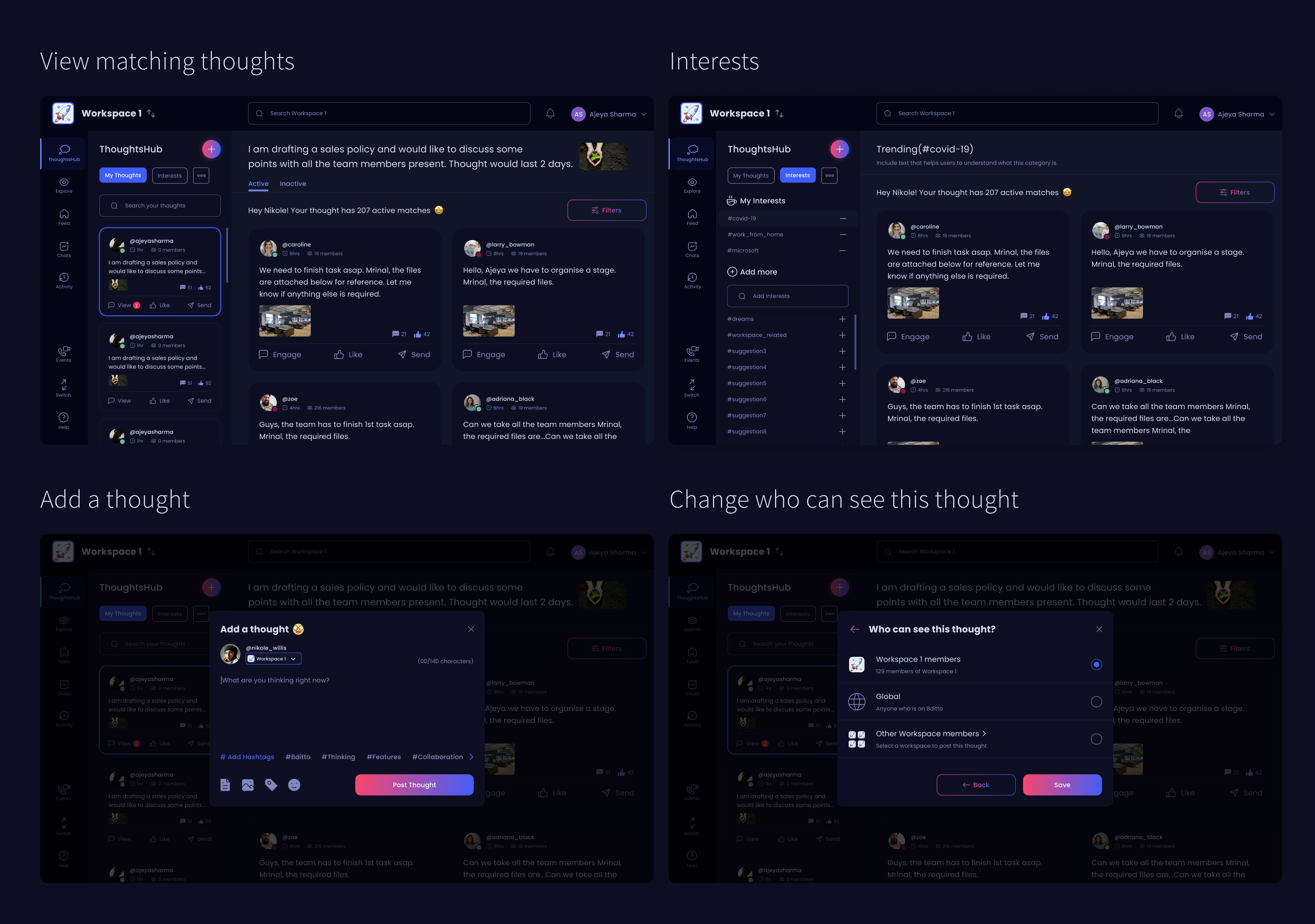
Now, what if they find any of the thoughts from other people valuable & might want to save the thoughts. That's why I worked on allowing users to save thoughts into their desired collection. Giving control to the users will help us in improving the experience for the dashboard.
Let's see how to save a thought.
Save thoughts(20s)
#4) And 100+ screens
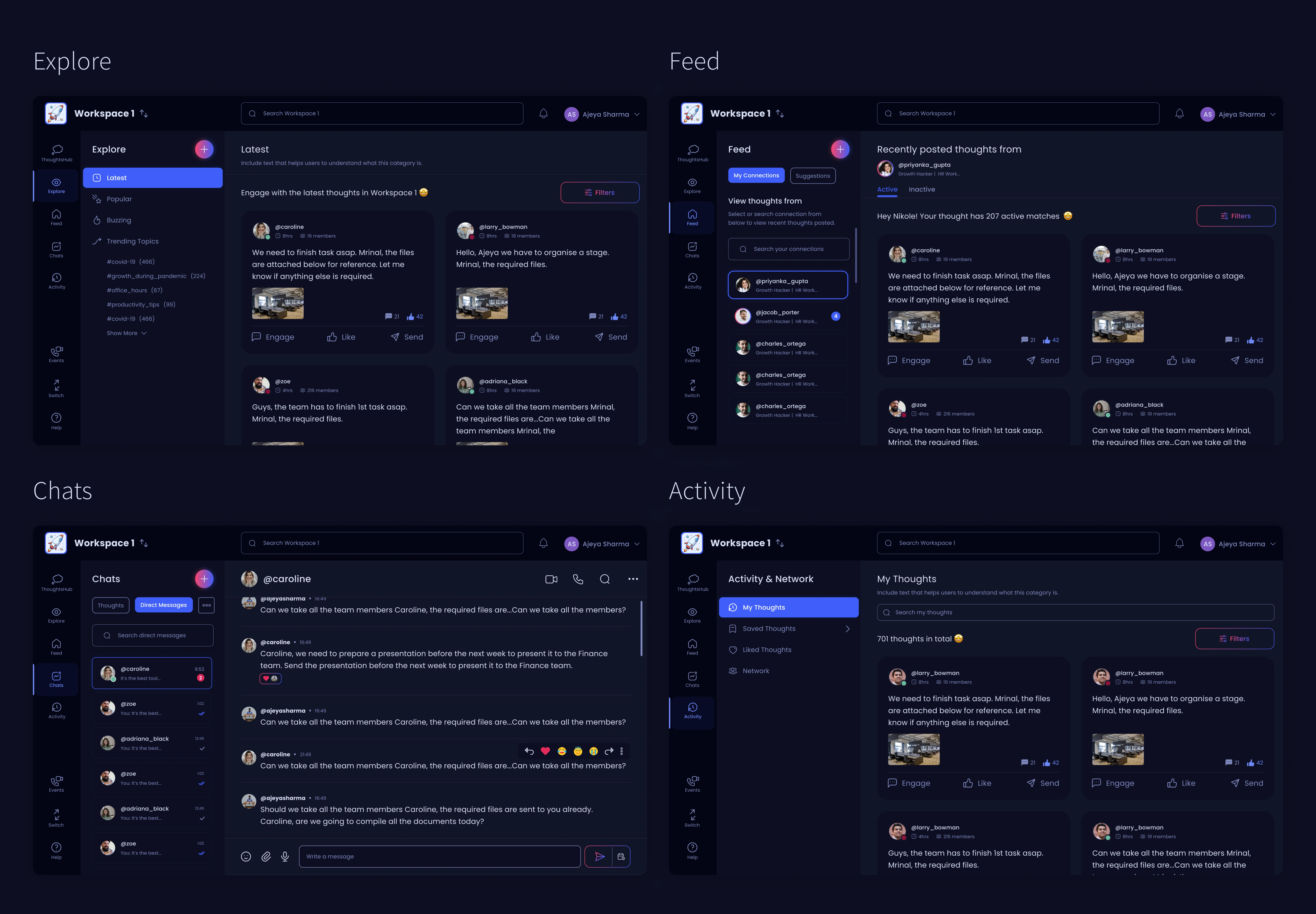
I made prototypes for all possible micro-interactions & user flows such as
Replying a message
User searching for liked messages
Conversation in private chats & group chats
Voice chat
Thoughts info menu
Add a thought
Profile popup
Searching for interests
Setting the location
Searching for thoughts, users & messages in BDITTO
Notifications
View profile
My account & preferences, Help center
THE ULTIMATE CHALLENGE
Kicking off design for version 2
After exporting resources & files to the developers, I started with version 2 of the dashboard redesign. Honestly, I'm was always looking forward to working on version 2 because there was no major technical constraint for it (like we had for MVP-version 1).
Accomplishing all goals outlined earlier🔥
I hope you remember the goals that were discussed in the initial sections. Though we dropped some of them to build the MVP-V1 first, this is the stage where I worked on all of them. Excited? Let's do this!
Study business collaboration & the target audience
Incorporate features such as master search, group video calls, audio channels & many more
Competitor analysis- Benchmark competitors & recommend potential improvements
Extensive research about what's missing in MVP & old dashboard design
Visualise, brainstorm & include relevant features/functionalities in sync with the developers
Positively impact the decision-making ability of businesses, companies & investors to get them onboard with BDITTO
"Build a highly competitive, easy to use & compelling product."
MY DESIGN DECISIONS & THOUGHT PROCESS
Decoding navigation for BDITTO
To understand my thought process, design decisions taken & how I designed version 2 from scratch, I would be delving deep into how I created the navigation in version 2. Let's take a step by step look.
#1- The dilemma : Complex & ineffective 5 level navigation
Before going ahead with the problem, it would be better to understand why we are creating new navigation & why navigations in the old dashboard design & MVP did not work.
To do that, let's look at how navigation was in the old dashboard design & MVP(version 1).
#2- Let's understand navigation in version 1
When we were building version 1, we had a constraint- “We should prefer not to drastically change the placement of the design elements in the old designs & user flows (goal-minimum number of changes in the frontend & backend)”
Still, we were able to create a desirable, minimalist & user-centric design with changes in UX for major sections.
Then why are we creating new navigation for BDITTO? To understand this, we will take version 1 & not the old dashboard design (the reason, why we transitioned from the old dashboard design to version 1, is already explained in the initial sections.)
Problems identified in the old navigation v1
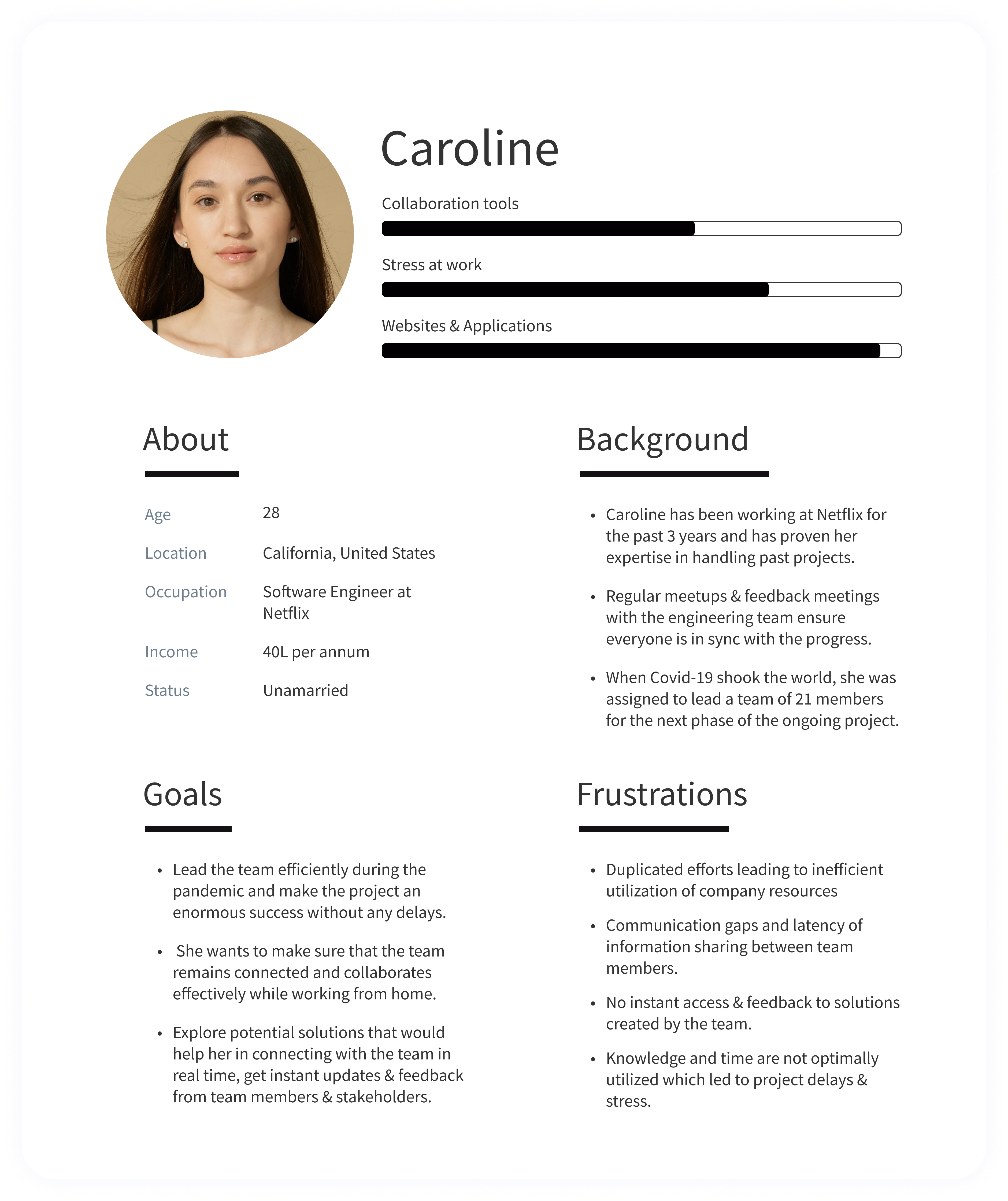
#3- Understanding the target audience
Creating personas will help me figure out our target audiences’ needs, experiences, behaviours and goals.The below persona made the design task at hand less complex, guided my ideation processes, and helped me work out the goal of creating a solid user experience for our target user group.
#4- Jacob's Law: Users spend most of their time on other sites
What are the goals for this competitor analysis?
To recognise navigation functionalities that BDITTO will attempt to add, to see if they already exist and, if so, how our rivals introduced them, and then what we can do to improve it.
To check the visual look and feel of other competitor websites (navigation & interactions).
To study the technical aspects of the solutions currently being offered for easy navigation in an enterprise product.
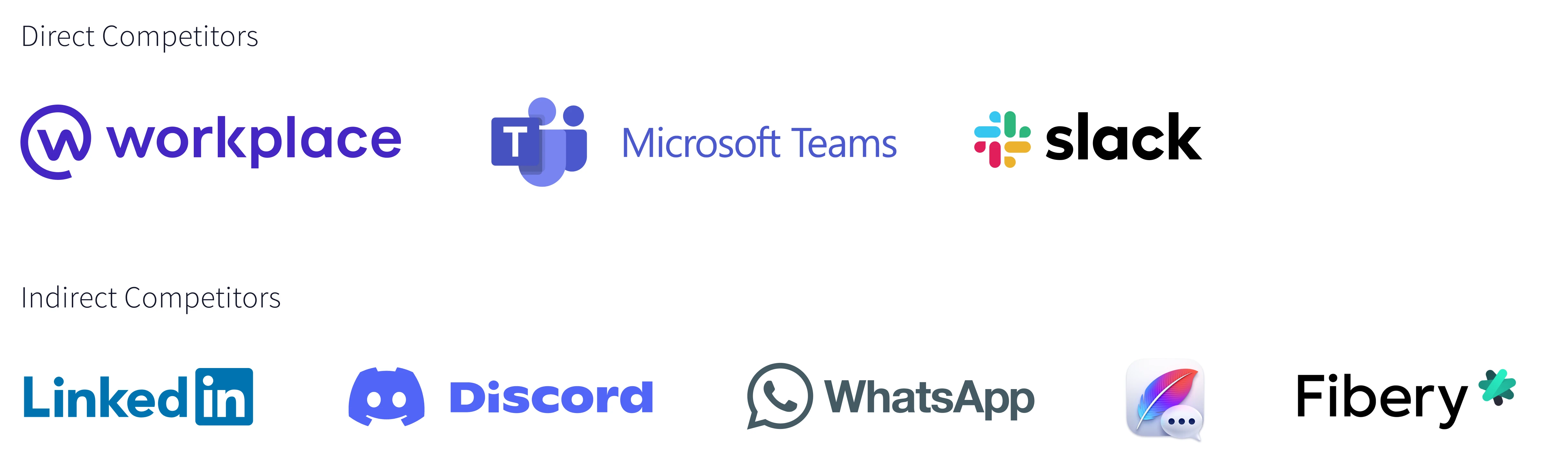
Why did we choose these competitors, particularly?
After thorough research, analysis and review of the enterprise space, we concluded that UX & UI analysis (including navigation) of these 3 major platforms(Slack, Microsoft Teams & Facebook Workplace) would help us improve BDITTO. Indirect competitors will also be analyzed & benchmarked at various points of the design process.
#5- Understanding brand presence of 3 direct competitors
Before even using any of the platforms, it is better to know what each platform offers & how it is perceived by the users in the enterprise space.
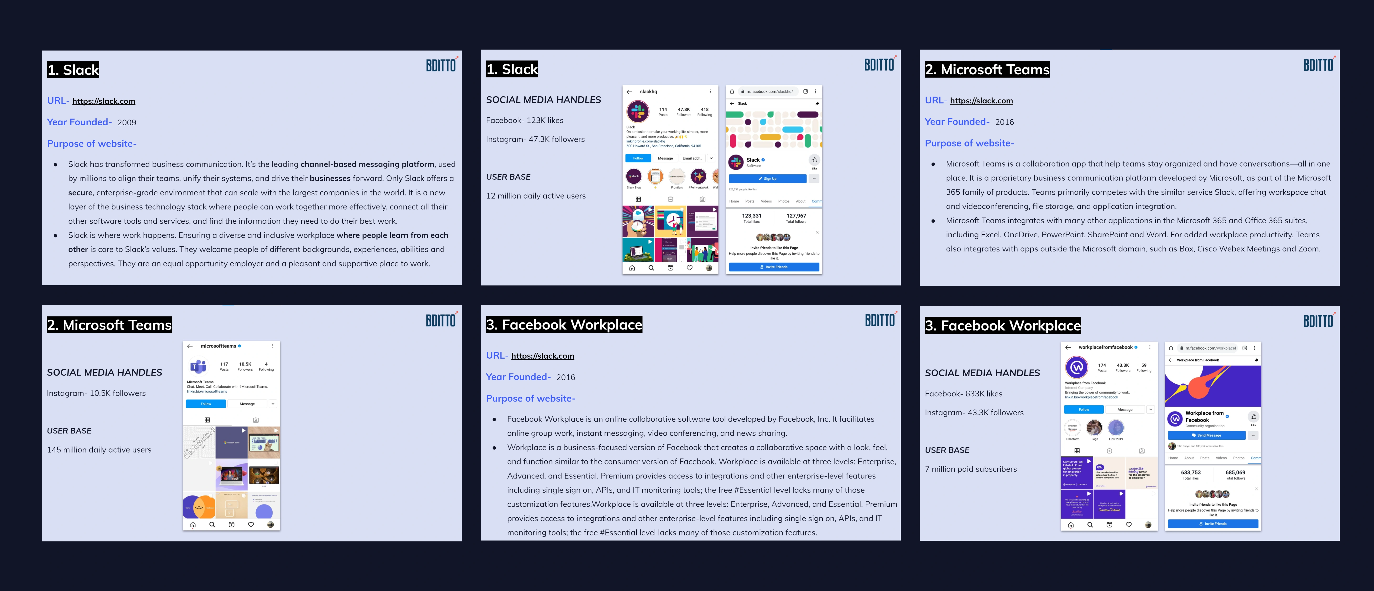
Slack vs Facebook Workplace vs Microsoft Teams
#6- Researching current business collaboration & competitors
We need to understand which enterprise collaboration tool is leading the market & why. This will help us analyze the UX & UI for different platforms accordingly & benchmark the one that is outshining the others.
Let's take a look at some of the findings that will shape our future design decisions.
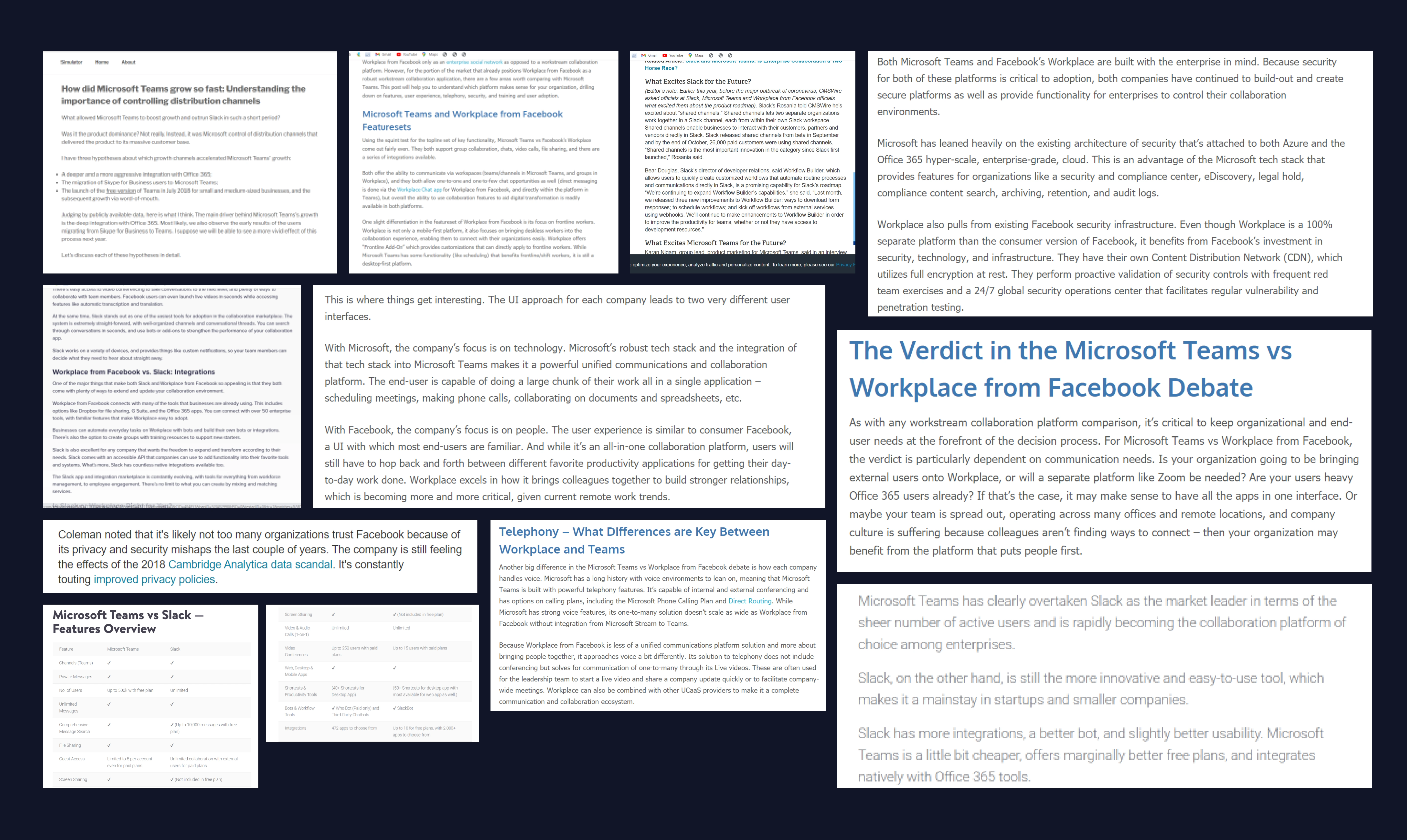
Slack vs Facebook Workplace vs Microsoft Teams
#7- Devising potential solutions
To design navigation for version 2 of the dashboard design, I demystified the navigation for all the competitors.
I majorly analyzed 3 direct competitors- Slack, Microsoft Teams & Facebook Workplace. Interpreted & drafted potential recommendations & solutions for BDITTO.
Potential soutions from competitors
#8- Considerations for navigation
CEO, CFO & other stakeholders already briefed about all the requirements we had for the navigation (based on findings of user needs & earlier set business goals).
To unify the data from mixed research, solutions from the competitor analysis, ideas from brainstorms & inputs from stakeholders, I consolidated 8 high-level guiding questions to focus on deeper insights & create design solutions for navigation.
Considerations: How can we?
#9- Visualising & sketching ideas
Studied BDITTO's user + content needs, business goals & solutions brainstormed to implement an intuitive left-hand side menu along with a sub-menu & other levels of navigation for BDITTO.
It was necessary to validate this type of navigation for all different kinds of content needs in BDITTO. Before going ahead with the interface, I validated the navigation structure with major sections- Explore, Feed, Chats & Activity in the menu.
Let's have a look at how navigation will work for other items in the menu.
#10- Design system: Visual look & feel
I first worked on the colour palette for the dark theme by improvising the usage of the earlier colour scheme used in website redesign & version 1 of dashboard redesign.
Multiple iterations & tests with the stakeholders were performed to work out this colour palette for version 2 of the dashboard.
To create a visual hierarchy & direct user flow, I again worked on the typography styles we already had.
The implementation of this color palette direly needed a change to create an everlasting impact for the visitors & an unmatchable appearance for the product.
#11- Introducing new navigation
High fidelity navigation designs were given life-
Visual & content hierarchy is enhanced & made more user-centric using the left side navigational structure & the new design guidelines defined for v2.
We need additional shades of the base colour to cater to varied use cases. Different shades of primary & secondary colours are used for the menu, sub-menu & content area to make the user movement, information recognition & accessibility of the product easier.
Lines are introduced to make the content look easily separated but still connected (wherever needed). This makes the UI look more defined & easier on the eyes. (UX automatically improves as now the users would be able to switch between the three sections (menu, sub-menu & content area in the navigational structure easily).
Brainstormed & changed the placement of every design element (CTA buttons, different sections & headings) in version 1 to create version 2 highly competitive, intuitive, attracting & usable.
#13- That's a wrap
This is how the navigational structure for dashboard version 2 was built. Brainstorming sessions were held with the stakeholders to challenge assumptions & biases that might have been incorporated during the design process.
Ultimately, we were able to create a navigational structure that met the needs of the product & the expectations of the users.
Designing critical user flows🔥
Wow, it feels like we're really making progress! Now that we have a solid navigational structure, let's work on the other critical sections/design elements of the dashboard next.
A. Workspaces
B. ThoughtsHub
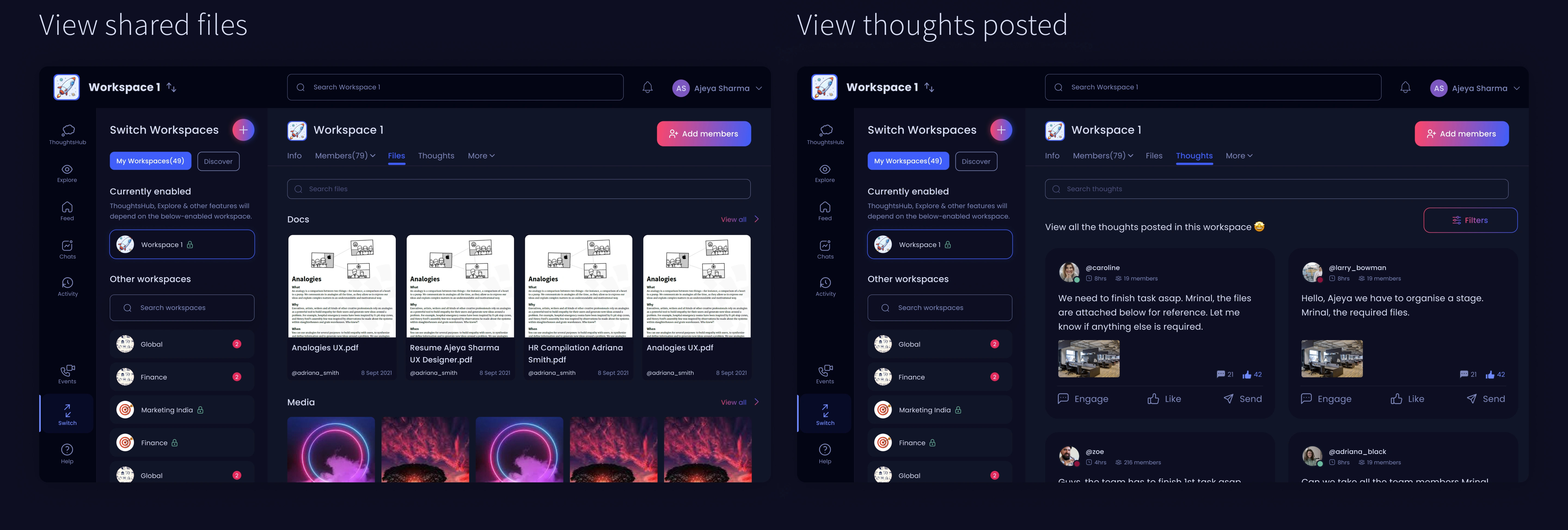
C. Explore, Feed, Chats & Activity
D. Events
🌓Designing light mode- giving control to users
Though there's a lot of research to understand which is better: light or dark mode, we at BDITTO believe it would be better to provide an option and design for both modes. Let the users decide for themselves.
This is the time when I got to work on creating components & a library for the design system of BDITTO.
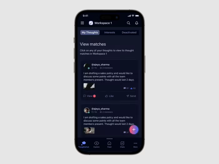
📱Screens for iOS App
Over the past 2 years, I have designed multiple Android apps (based on Material Design Guidelines) but this is the first time I was designing for the iOS platform. How did I go about designing these screens?
There was one constraint that we had to consider: Time. We wanted to launch BDITTO for maximum users across multiple platforms to make it highly accessible & inclusive. The timeline for the iOS app screens was 3 weeks in which we had to cover all the user flows present in the enhanced version 2 (product & dashboard redesign).
I equipped myself with the required knowledge by studying how to design for mobile (usability best practices) via IDF’s course- “Mobile User Experience (UX) Design.” Scored 95% & a Top 10% in class distinction. I also made sure that I study Human Interface Guidelines (User interaction, views, controls & many more) by Apple to create an app that is usable, intuitive & appealing to the target audience.
I started with the basic wireframes to make sure that the base/skeleton for the iOS information architecture is built effectively, keeping in mind the user requirements & business goals for the product.
After iterations & visualising the requirements, I designed over 100+ screens along with micro-interactions covering critical user flows in the app (took dashboard screens as reference) such as thoughts, chats, calls, workspaces & many more which we would interact with next.
Consistency is preferred to make the user flow & content recognition easier to absorb. I have tried to spark creativity in sections while following Human Interface guidelines to build every screen. I have benchmarked & created intuitive sections after conducting competitor analysis of Microsoft Teams, Slack & Discord as I moved on from one screen to another.
The journey isn’t over yet
Regular meetups with the developers were arranged to transform these design prototypes to develop them for the end-users. What did I do to ensure that they are perfectly implemented?
Made 20+ videos explaining critical user flows & how they have to be implemented in terms of experience & interaction
Renamed all the frames in Figma & grouped user flows (both in light & dark theme) that can be understood by anyone (stakeholders too).
Created a design system & library with precise directions for usage for the development team to apply.
Currently, the product is in the final development phase & would be launched in the coming months. I am conducting multiple reviews of the dashboard, iOS app screens & recommending likely improvements & changes to implement the designs exactly as it was decided.
Time to take a step back
It was a lot of exciting and overwhelming work, but it was worth it! I'm really excited to share what I've learned.
1. Feedback meetings kept me aligned
I always tried to schedule feedback & review meetings to keep all the key stakeholders in sync & also to avoid any project delays. I believe this makes it easy for me to receive constant feedback on my designs, make quick changes/iterations & achieve project & business goals efficiently :)
2. Learning is a part of the design process
From the start till the end of the project, there were multiple instances when I did not know how to do something that was required from me (also, this was the first time when I was working on a dashboard design). I had to take time out (usually during weekends) to learn relevant design principles & processes to meet the levels of expectations of the CEO, CFO & other team members.
3. Design is never done
Iterating on the created designs based on stakeholders' feedback is critical to any product's success. During this dashboard redesign, for maximum sections, there were 2-3 versions created. They were then tested with the stakeholders to find the one which will work out the best for both user needs & business goals. Plus, the team is constantly learning about what our users want. And then accordingly implementing relevant upgrades & improvements.
Thank you for making it to the end!
Like this project
Posted Apr 23, 2025
Redesigned BDITTO’s website, dashboard and iOS app experience (Switzerland-based). Achieved a 30% increase in leads📈