

Product and Web Design, UI/UX, Motion Design, Framer, Rive


Product and Web Design, UI/UX, Motion Design, Framer, Rive


Sometimes it's hard to find a parking space, especially when you're in a hurry to go to see your favorite movie.
The Gray Man is not my favorite movie, just in case 😂
4
2.1K


Sometimes you have to win your clients.
In 2020, we pitched the concept idea of super app (an app that lets you manage all of your daily needs in one place, book a transport, get flight tickets, book a hotel etc.), by quickly brought this concept to one of the largest companies in the MENA region, resulted us in a huge win worth more then ***,*** $!
29
76
1.7K


Beauty Focused Branding & Web Design Agency

Beauty Focused Branding & Web Design Agency


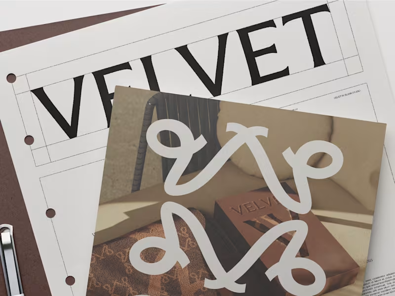

Web Design/ Branding/AI implementations 🌐



Certified FlutterFlow Expert Agency. TOP 1 Worldwide.

Certified FlutterFlow Expert Agency. TOP 1 Worldwide.
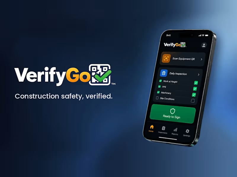
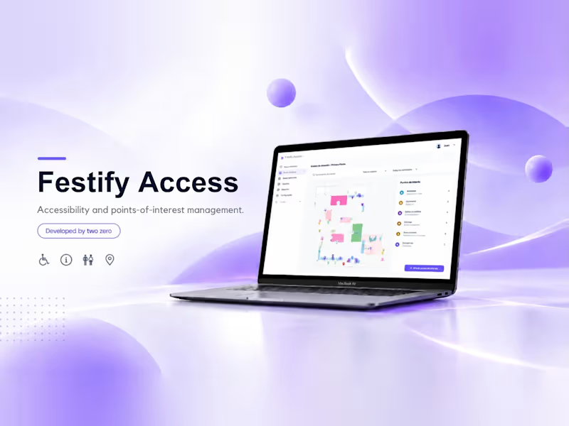
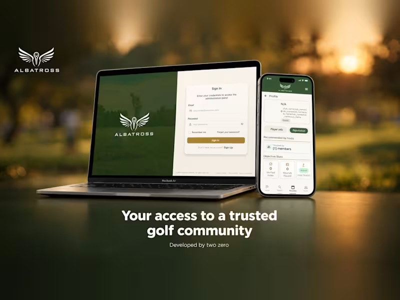


Quality Web & Product Design 🚀


Quality Web & Product Design 🚀


Just published a free Webflow component — a fullscreen scroll-driven image transition using SVG masks and horizontal blinds.
As you scroll, each image reveals itself through strips that open simultaneously from the center. Built with GSAP ScrollTrigger and Lenis. Includes clip-path text animations and a scroll progress bar. Zero Webflow interactions, pure JS.
Free to use in any Webflow project.
webflow.com/made-in-webflow/website/hero-blinds
9
15
564


Helping brands grow with strategic marketing visuals
Helping brands grow with strategic marketing visuals


Strategy-led branding for wellness, beauty & lifestyle.
Strategy-led branding for wellness, beauty & lifestyle.

When does a hand-drawn logo make sense for a brand?
In this case, a Barcelona-based creative studio founded by a team with decades of combined experience approached me wanting a hand-drawn identity that would feel unexpected for a team like them, a way to signal creativity and distinction.
They came with a strong concept: the sediment at the bottom of a wine glass. What stays after everything else fades. A nod to what good work leaves behind after years of experience.
The entire identity is built on hand-drawn illustration, so the logo needed to do something different. With so much personality already living in the visuals, we went for a logotype with weight and presence, something that could anchor the brand and communicate their expertise.
The hand is still there. Just in a different form.
Do you think hand-drawn elements are being used more as a trend than as an intentional choice?
171
410
66.1K


Digital Products | Websites & Apps

Digital Products | Websites & Apps


