Presentation Design - StudySmarter

Bram Dekkers
Verified


StudySmarter approached me with the content and presentation structure already prepared. My role was to transform the existing skeleton into a polished, on-brand presentation that matched their visual identity while making the content more engaging and easier to follow.
Reviewing the presentation structure
The overall flow and content were already defined, allowing me to focus entirely on the visual execution. I reviewed each slide to understand where design could improve clarity, hierarchy, and storytelling.
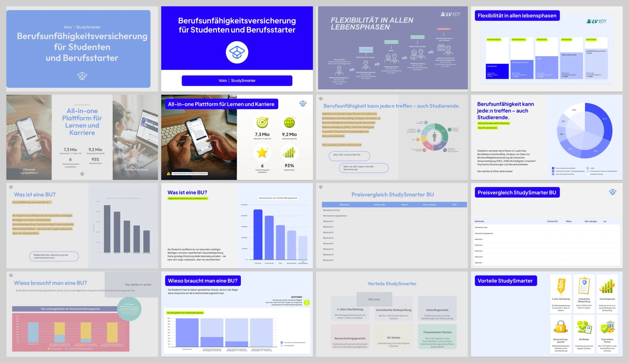
before vs after
On-Brand Visual Design
I redesigned the presentation to align with StudySmarter's branding by applying their typography, color palette, and design principles throughout the deck. To support the content, I created custom visuals and illustrations that helped explain key concepts and made the presentation more engaging.
Consistency & Refinement
Every slide was refined to create a consistent look and feel across the presentation. By improving spacing, layout, and visual hierarchy, the deck became easier to navigate while maintaining a professional and modern appearance.
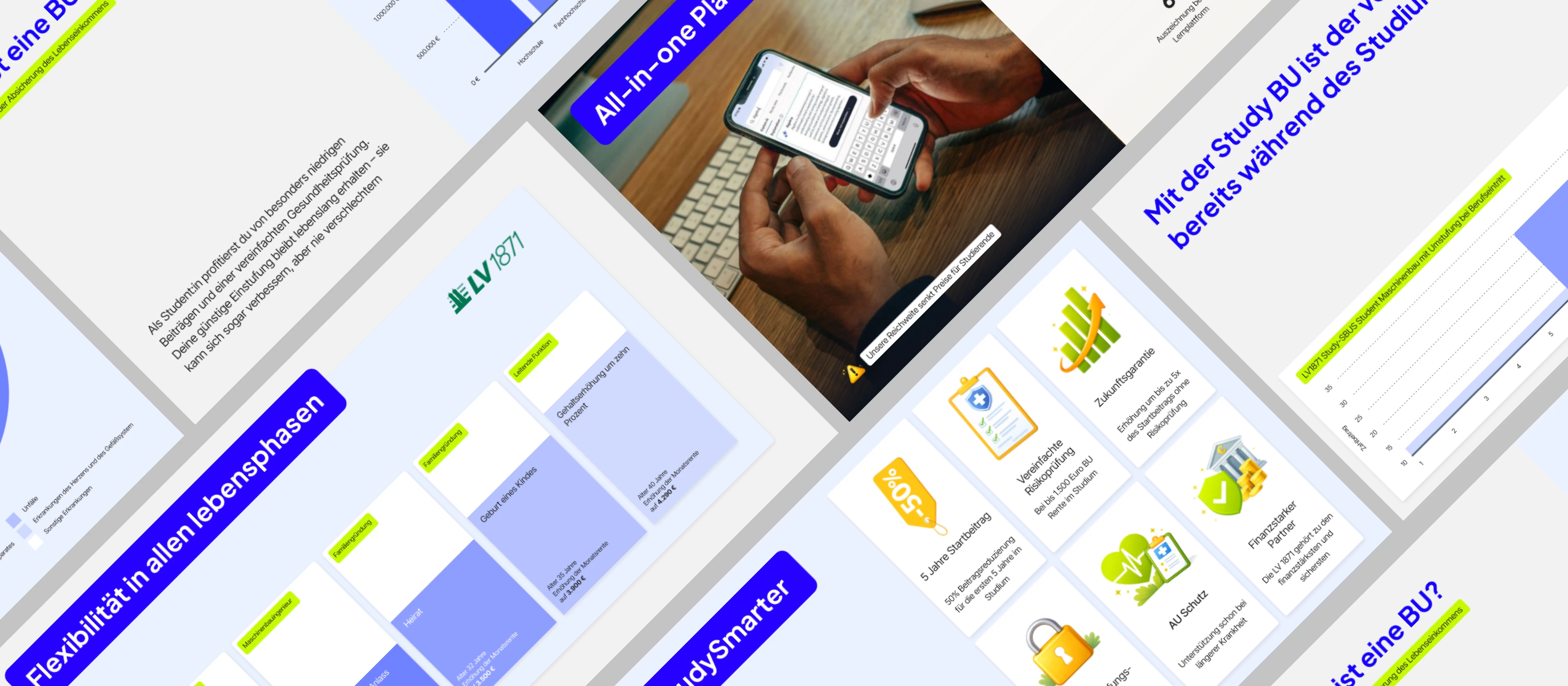
studysmarter presentation
Results
The result was a clean, fully branded presentation that transformed an existing content draft into a visually engaging deck. With custom visuals and a consistent design system, the presentation now communicates StudySmarter's message in a more professional and memorable way.
results slides
Skills & Tools
Presentation Design · Figma · Visual Design · Branding · Slide Design
Like this project
Posted Aug 2, 2026
Turned StudySmarter's presentation into a branded deck with custom visuals and improved slide layouts.
Likes
0
Views
15
Timeline
Dec 18, 2025 - Jan 26, 2026
Clients
StudySmarter/Vaia