

The best café brands don't introduce themselves. They just feel familiar from day one.
Most neighborhood café brands hide behind generic coffee cup icons, overused script fonts, and a color palette that could belong to a yoga studio or a juice bar or literally anything else. The logo promises character. The brand delivers nothing you'd remember by the time you reach the door.
Melo made familiarity the whole brief.
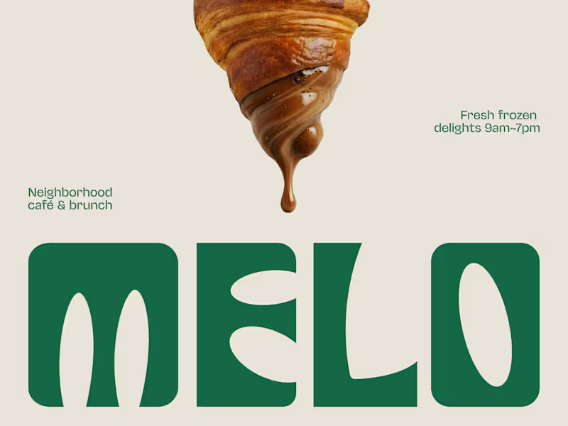
A custom palm tree emblem encircled in a clean oval, organic, architectural, impossible to mistake for anything else. Deep forest green across three environments: cream, burnt green, and dark olive, each one feeling as considered as the last. A rounded wordmark so confident it can fill an entire poster at display scale and still feel warm rather than loud. And right there on the campaign visual, a caramel-dripping croissant melted into the letterforms, like the food and the brand were always the same thing.
That's not just a logo system. That's a place people recognize before they even read the name.
Because a neighborhood spot that earns a place in someone's morning deserves a brand that feels just as inevitable.
What makes a café logo feel like it actually belongs to a place? 👇
2
4
473
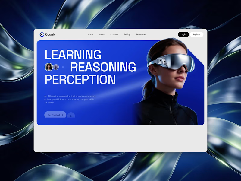

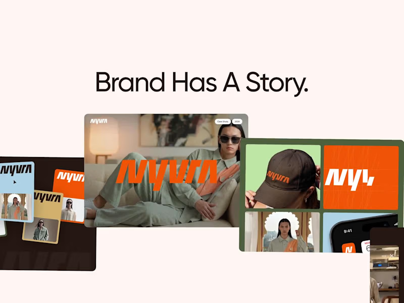
NYVRA — Fashion E-commerce Brand Showreel
NYVRA is a cinematic showreel showcasing the complete design journey of a modern fashion e-commerce brand.
The presentation brings together brand identity, visual systems, UI/UX design, and motion to create a cohesive digital experience that reflects a premium fashion brand.
From establishing a distinctive visual identity to designing an intuitive shopping interface, every element was created to ensure consistency, usability, and engaging visual storytelling across the customer journey.
2
3
298