Freelance Brand Designers in Bangladesh
Sign Up
Post a job
Sign Up
Log In
Filters
2
Projects
People
Jerin Nusrat
pro
Dhaka, Bangladesh
Brand & Website Designer | AI Video | UI/UX
$1k+
Earned
5x
Hired
5.0
Rating
274
Followers
expert
expert
+1
Follow
Message
Brand & Website Designer | AI Video | UI/UX
1
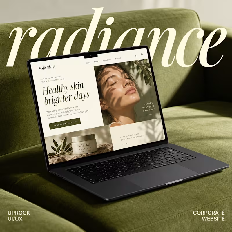
Website Design & Brand Identity for Sola Skin
1
2
2
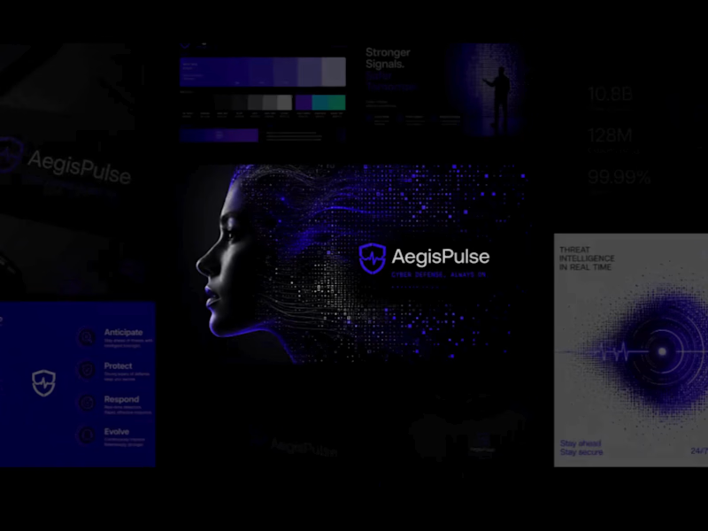
AegisPulse Brand Identity Development
2
7
2
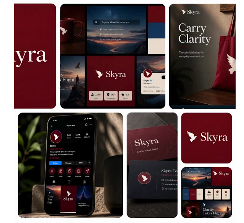
Brand Identity & Visual Direction for Skyra
2
17
5
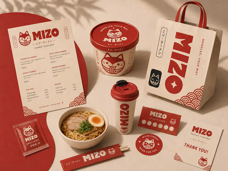
MIZO Ramen Takeaway Brand Identity & Packaging Design
5
22
Brand Designer
(21)
Follow
Message
sabbir hossien
pro
Chattogram, Bangladesh
Brand & Web Designer
$25k+
Earned
19x
Hired
5.0
Rating
49
Followers
Follow
Message
Brand & Web Designer
0
Personal Brand & LinkedIn Optimization for Mohan Menon
0
7
0
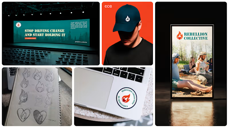
Rebranding Rebellion Collective
0
4
0
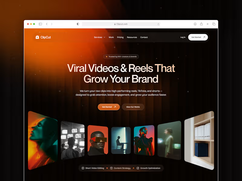
ClipCut Website Design & Build
0
6
0
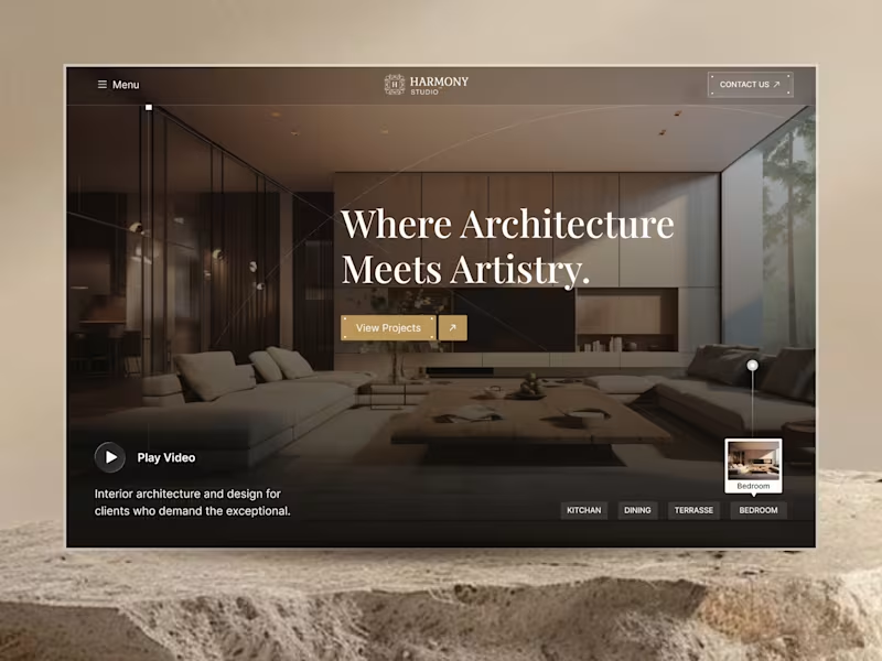
Harmony Studio Website by Framer
0
5
Brand Designer
(2)
Follow
Message
Hyaacin .
Bangladesh
Motion Designer/ Generative Visual Artist
$10k+
Earned
38x
Hired
5.0
Rating
141
Followers
Follow
Message
Motion Designer/ Generative Visual Artist
10
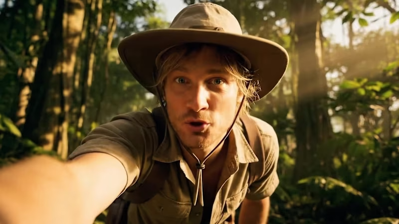
AI-Generated Vlogging-Style Video with Google Veo
10
335
4
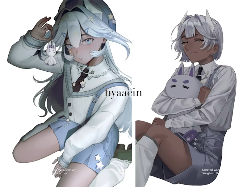
Heellooo creators!! 🚀 Hope you all are doing great! I made a short compilation of the work I did this past year, and I’d love to hear what you guys think. Can't wait to learn new things and execute even bigger ideas this year! 🔥 🎬
2
4
691
1
AI-Driven Video Production for Fanvue's Educational Course
1
44
13
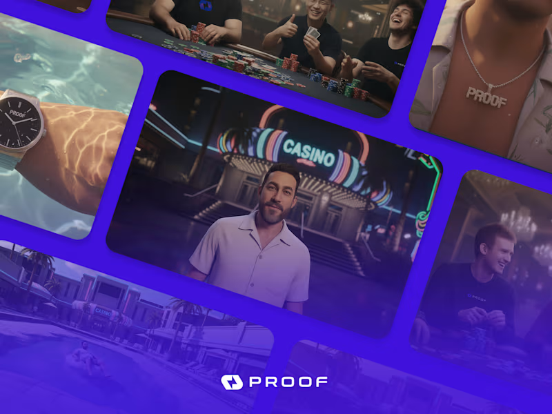
GTA V Style Cinematic Brand Video
13
354
Brand Designer
(1)
Follow
Message
Kabeer.
pro
Bangladesh
Motion Design for SAAS and Startups
$10k+
Earned
2x
Hired
5.0
Rating
25
Followers
Hired
Follow
Message
Motion Design for SAAS and Startups
1
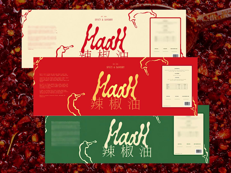
HaaH Packaging and Branding Design
1
1
8
0
Health Niche D2C Product Branding and Marketing Collaterals
0
6
4
Sagara Health • NexCM Created in collaboration with our friends at Recog Technologies, this promotional video introduces NexCM, Sagara Health’s AI-powered care management platform that turns conversations into structured records and actionable follow-ups. We focused on making a complex workflow easy to follow, bringing the product’s story to life through clear visuals, thoughtful pacing, and a clean, cohesive presentation. The story centers on a simple goal: less time on documentation, more time caring for people. Made by saasmotiondesign.com #MotionDesign (https://www.instagram.com/explore/tags/motiondesign/) #SaaSVideo (https://www.instagram.com/explore/tags/saasvideo/) #HealthTech (https://www.instagram.com/explore/tags/healthtech/) #ProductVideo (https://www.instagram.com/explore/tags/productvideo/)
4
4
283
0
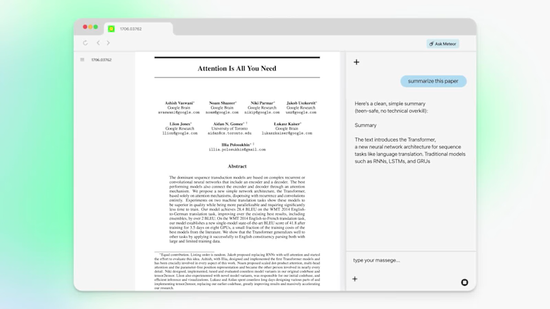
How do you prove a browser is the world's most intelligent? We teamed up with Meteor (YC S25) (https://www.linkedin.com/company/browsedotdev/) last year to bring that claim to life through motion design. The goal was simple to say and hard to execute: make Meteor feel as smart as it actually is, in seconds, before anyone leaves the website. Here's how we approached it: → Benchmarked Meteor against competitors so the difference was impossible to miss → Spotlighted niche, real-world use cases that speak directly to power users → Revealed multiple features in a flow that felt intuitive, never overwhelming Motion design isn't decoration. It's how a complex product clicks the moment someone sees it. A few snippets below. 👇 If you're building something ambitious and want your product to move the way it thinks, let's talk. At SAASMotionDesign.com (http://SAASMotionDesign.com), we help SaaS and tech companies turn features into stories that convert. Comment "Meteor" or DM me, and I'll send over our recent work. #MotionDesign (https://www.linkedin.com/search/results/all/?keywords=%23motiondesign&origin=HASH_TAG_FROM_FEED) #SaaS (https://www.linkedin.com/search/results/all/?keywords=%23saas&origin=HASH_TAG_FROM_FEED) #ProductMarketing (https://www.linkedin.com/search/results/all/?keywords=%23productmarketing&origin=HASH_TAG_FROM_FEED) #YCombinator (https://www.linkedin.com/search/results/all/?keywords=%23ycombinator&origin=HASH_TAG_FROM_FEED) #VideoProduction (https://www.linkedin.com/search/results/all/?keywords=%23videoproduction&origin=HASH_TAG_FROM_FEED)
0
203
Brand Designer
(2)
Follow
Message
Omayer Zishan
pro
Dhaka, Bangladesh
Providing Solutions, Not Just Skills| Award-Winning Designer
4x
Hired
5.0
Rating
420
Followers
Expert
Expert
+2
Follow
Message
Providing Solutions, Not Just Skills| Award-Winning Designer
3
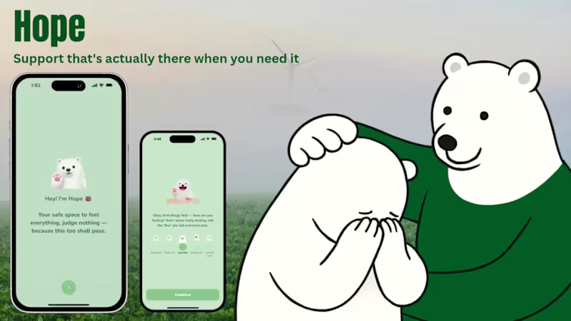
Hope: Your Go-To Friend for Mental Wellness
3
24
11
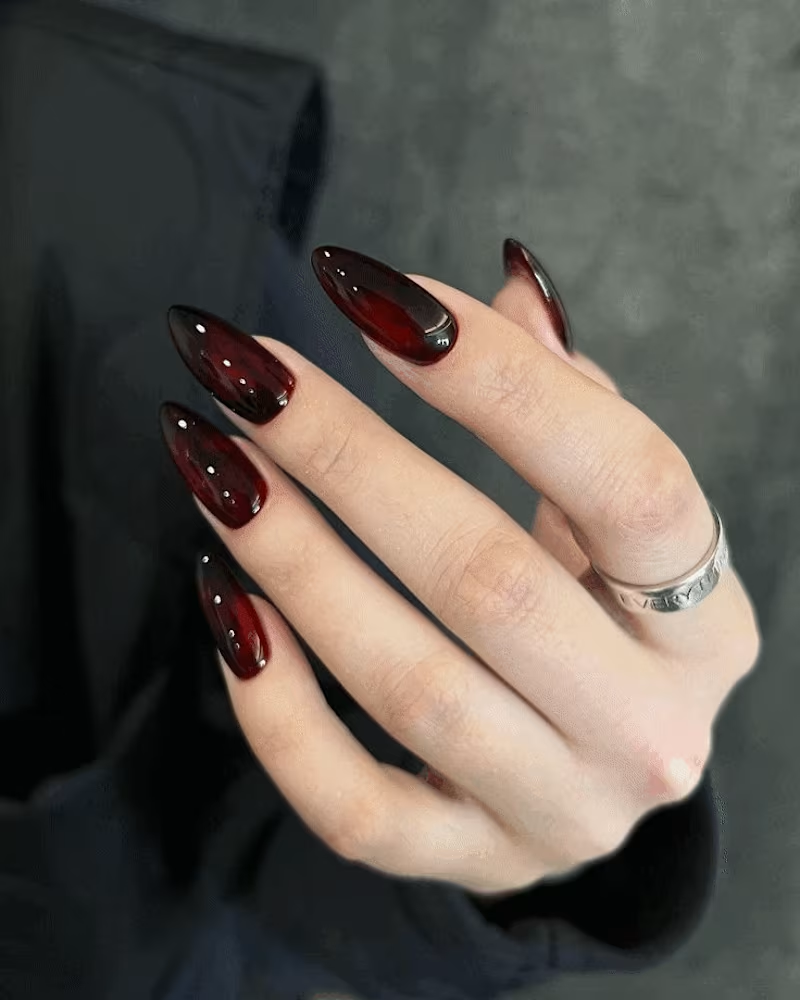
I just wrapped up an exciting conceptual project – 'Nailed It' – and it’s now live! 😊 It’s a nail studio with a goth twist, blending dark vibes with luxury nail art. I’m absolutely in love with how it turned out! Make sure to check out the project and share your thoughts in the comments! 🖤 Check it out here! (https://contra.com/p/7MbLZk3U-nailed-it-goth-inspired-brand-identity-for-a-nail-studio?r=omayer_zishan_ec59qqw0)
9
11
859
4
Nailed It: Goth Inspired Brand Identity for a Nail Studio
4
30
4
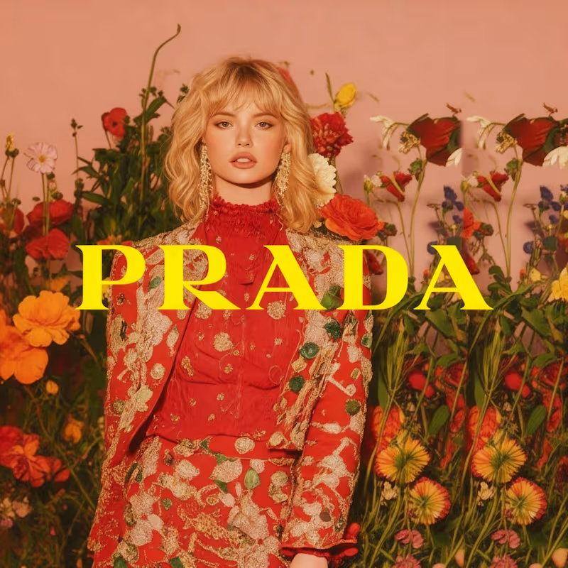
Prada x AI: Spring 2026 Campaign Concept
4
344
Brand Designer
(4)
Follow
Message
Orbix Studio
max
Dhaka, Bangladesh
UX-led product design & dev agency for b2b saas and AI
$25k+
Earned
1x
Hired
195
Followers
expert
Follow
Message
UX-led product design & dev agency for b2b saas and AI
25
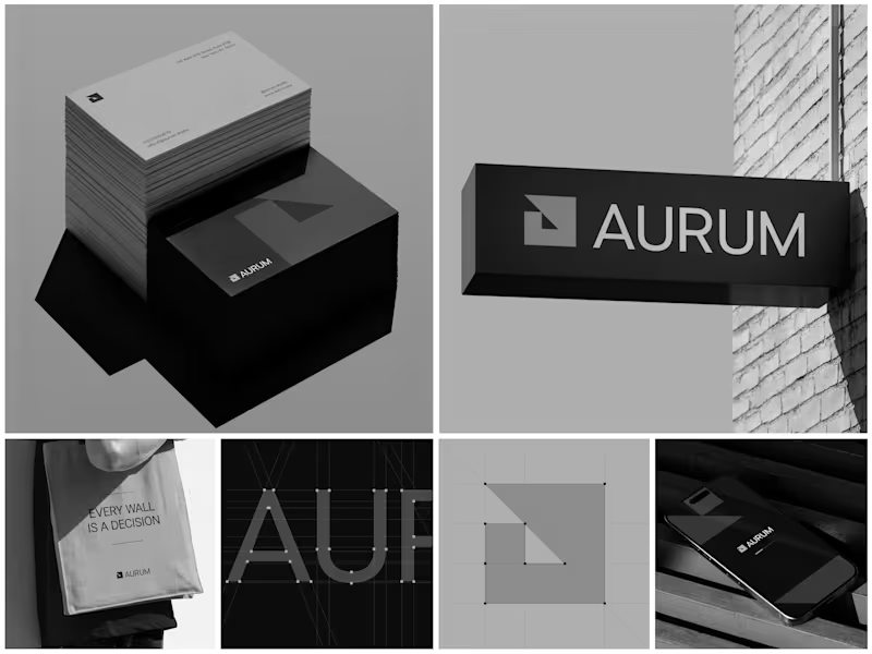
Aurum - Brand Identity System When Aurum came to me, they had a name and a vision a studio that wanted to feel deliberate, architectural, and unapologetically bold in every space it touched. No logo, no system, just a line that stuck with me from our first conversation: "every wall is a decision." That phrase became the seed for the entire identity. I started with the simplest possible geometry a square split by a triangle and built the mark from a strict construction grid so it would hold its proportions at any size, from a business card to a building-mounted sign. Once the mark was locked, I stripped the palette down to black, white, and grey. No color to hide behind just contrast, shadow, and negative space doing the work. From there, the system grew outward: letterpress-style stationery with generous shadow and texture, exterior signage designed to read cleanly against brick and daylight, a minimal mobile app screen, and a tote bag that turned the brand's own tagline into a quiet piece of merchandise. Every touchpoint had to pass the same test does it still feel like Aurum at this scale, in this material, from this distance? The result is an identity that's confident without shouting restrained enough for a business card, strong enough for a wall. Curious how I'd approach building out a system like this for your own brand want to talk through it?
9
25
1.5K
23
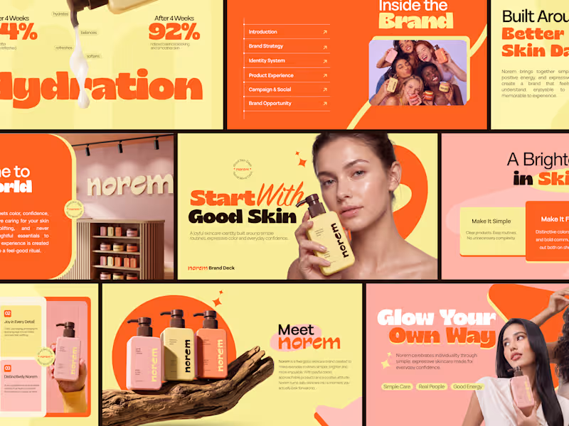
Most brand decks explain a skincare brand. This one makes you feel it before the second slide. Bold yellow, expressive orange, joyful product photography, and a brand strategy that turns daily skincare into a feel-good ritual 92% noticed balanced-looking skin after 4 weeks. Simple Care. Real People. Good Energy. Check it out (https://dribbble.com/shots/27709781-Norem-Skincare-Brand-Identity-Pitch-Deck-Design)
18
23
812
24
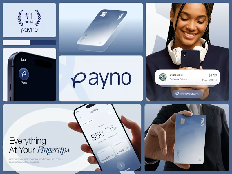
A fintech brand lives or dies on one thing does it feel trustworthy before anyone reads a word? Payno's brand identity was built around that question. The frosted glass Visa card that catches light like a premium product should. The deep navy wordmark with a looped P that feels handcrafted without being casual. An app icon that sits on a home screen and looks like it was always meant to be there. The color system does quiet work across every touchpoint steel blue, soft white, and deep navy that signals reliability without feeling corporate. The card design, the wordmark, the lifestyle collateral, and the #1 rated badge all speak the same visual language without repeating themselves. Most fintech brands look trustworthy. Payno was designed to feel it. Does this brand identity make you want to start with Payno? 👇 Designed by Orbix Studio (https://www.orbix.studio/) Tools: Figma , Illustrator #BrandIdentity #FintechBranding #LogoDesign #BrandDesign #ContraFreelance #VisualIdentity #PackagingDesign #BrandSystem
8
24
722
29
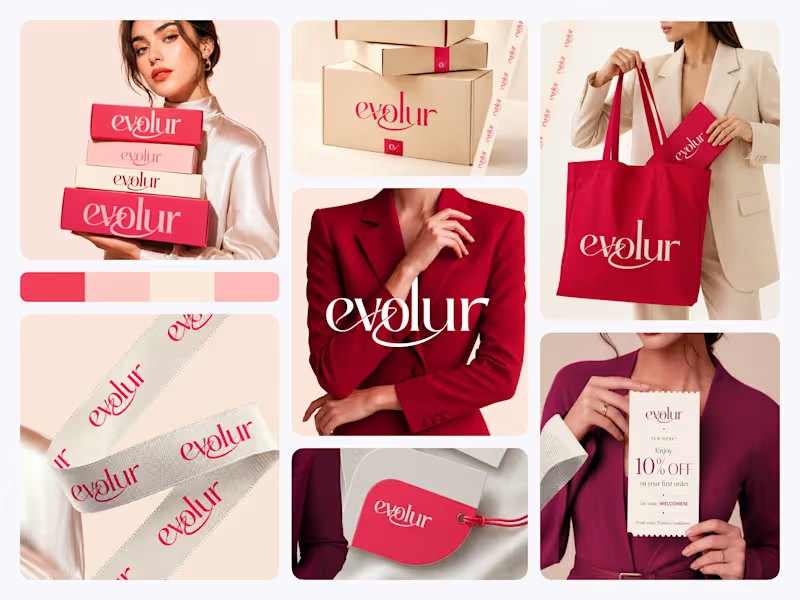
When building a fashion brand identity, most designers start with the logo. We usually do too. It feels like the natural anchor point. But when we worked on Evolur, we started with the touchpoint that gets touched last the packaging. Because for a fashion label, the unboxing moment is the brand. The first impression doesn't happen on Instagram. It happens when someone pulls a ribbon-wrapped box out of a delivery bag. So we built the identity outward from there. The wordmark came from asking what needed to look right on a swing tag at 2cm and on a tote bag at full size simultaneously. The crimson and blush palette came from asking what felt confident on kraft shipping boxes without needing a campaign photo around it. This is what fashion branding looks like when every detail is treated like the hero shot. What we noticed was that designing for physical touchpoints first made every digital decision easier. The hierarchy was already solved. The personality was already clear. "Fresh styles. Timeless confidence." The brand found its own tagline by the end. Does this feel like a brand worth wearing? 👇
15
29
1.3K
Brand Designer
(37)
Follow
Message
Masuder Rahaman
pro
Laksam, Bangladesh
Build a brand that stands out, and scales
$25k+
Earned
2x
Hired
5.0
Rating
20
Followers
Follow
Message
Build a brand that stands out, and scales
0
Travel Brand Identity Design for Wayfare
0
1
1
Core.hr HR Rebranding
1
9
0
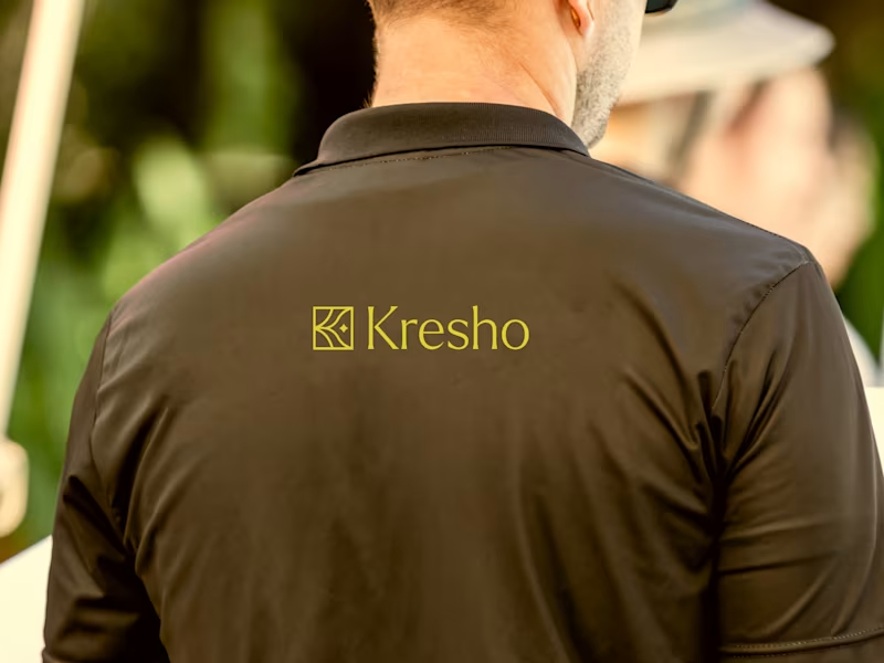
Kresho | Agriculture Brand Identity & UI/UX
0
13
0
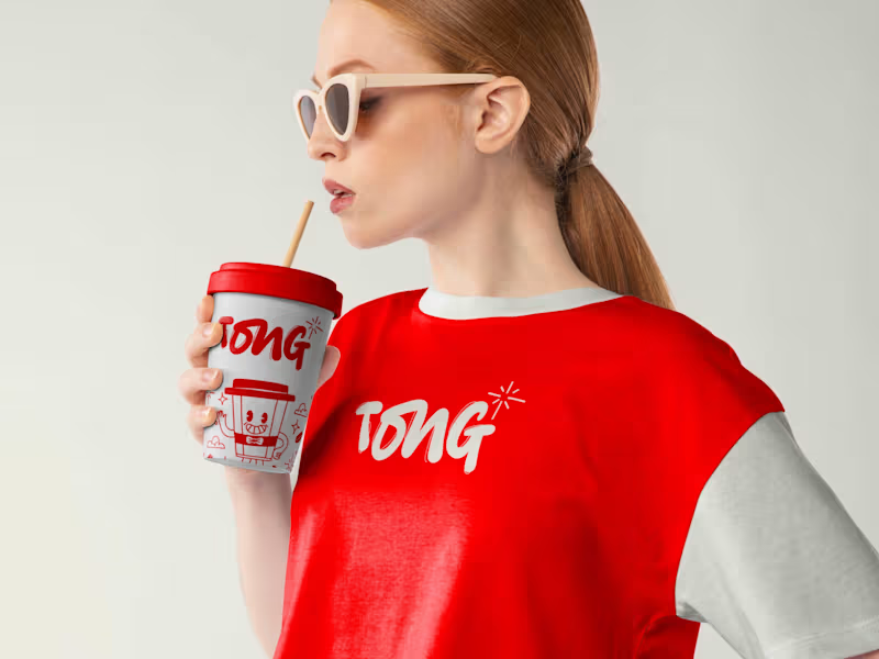
Coffee shop brand identity
0
11
Brand Designer
(4)
Follow
Message
Abdullah Noman
Barishal, Bangladesh
Growth-focused UI/UX Designer
$5k+
Earned
2x
Hired
4.9
Rating
38
Followers
expert
Follow
Message
Growth-focused UI/UX Designer
3
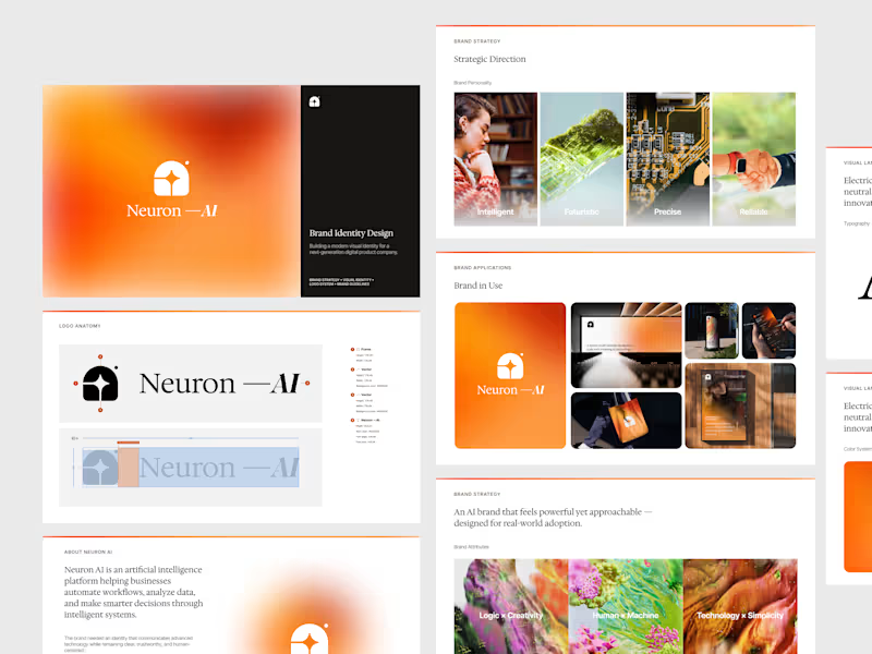
Neuron AI — Brand Identity Design Designed a modern brand identity system for Neuron AI, an artificial intelligence platform focused on automation, data intelligence, and smarter business decisions. The objective was to create an AI brand that feels advanced without becoming cold or overly technical. The identity balances precision and approachability through a minimal logo system, refined typography, and a warm gradient visual language — helping complex technology feel clear and accessible. Scope • Brand Strategy & Direction • Logo Design & Identity System • Visual Language Development • Brand Applications • Scalable Design Guidelines Built to work seamlessly across product interfaces, marketing assets, and real-world brand touchpoints. Available for branding, SaaS, and product design collaborations.
3
386
5
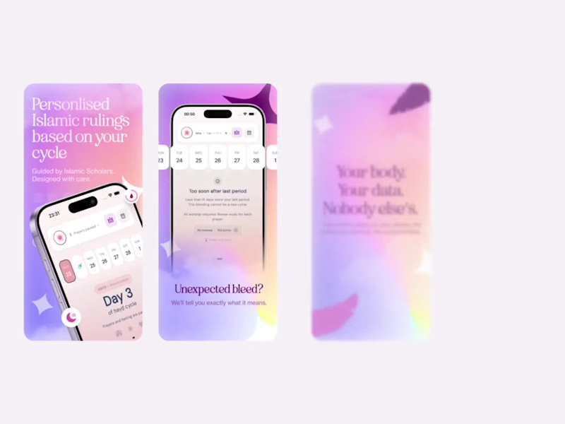
Just completed a new App Store Screenshot Design project — focused on transforming product features into clear visual stories that improve first impressions and drive installs. App Store screenshots aren’t just visuals; they’re conversion assets. Every frame is designed to communicate value, guide attention, and help users understand the product within seconds. Always fun working at the intersection of product design and growth. 🚀
5
389
3
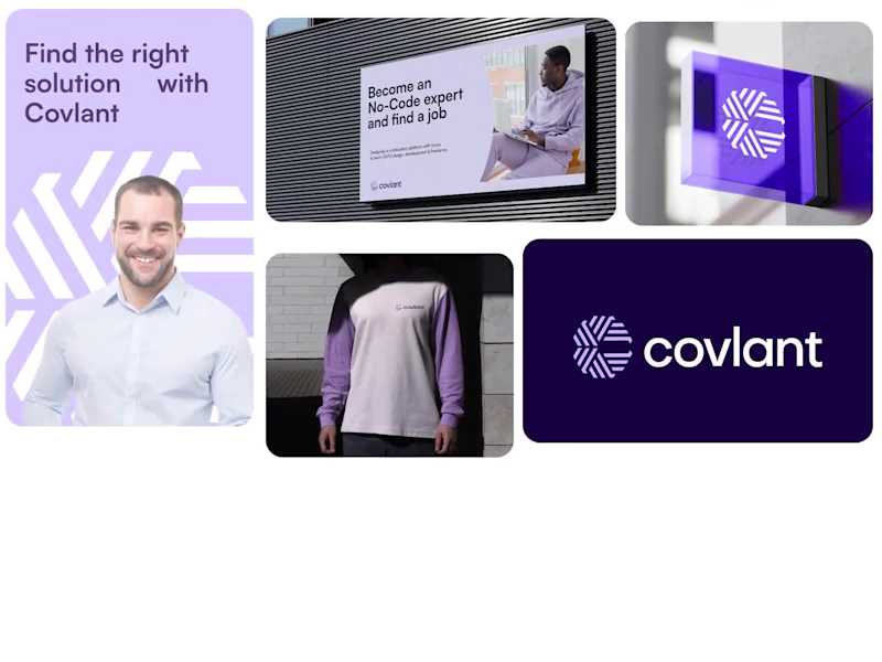
A complete brand identity for Covlant, a no-code education platform helping people become job-ready without traditional development barriers. Designed a modern, scalable visual system expressing innovation and accessibility through geometric forms, minimal typography, and a refined purple gradient palette. Scope: Brand identity, logo system, visual language, marketing assets, UI branding, guidelines. Tools: Figma, Illustrator, Photoshop. Available for new brand & SaaS projects.
3
351
6
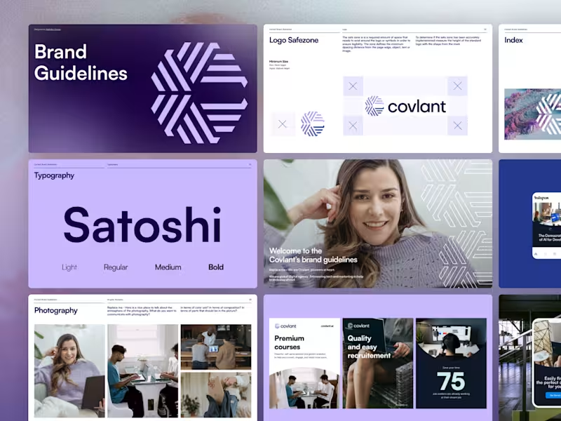
Branding is more than a logo — it’s a system. Designed a complete brand guideline framework for Covlant, ensuring consistency across product, marketing, and digital touchpoints. Open for branding & product collaborations.
3
6
405
Brand Designer
(6)
Follow
Message
Explore people