MIZO Ramen Takeaway Brand Identity & Packaging Design

Jerin Nusrat


MIZO — Ramen Takeaway Brand Identity & Packaging
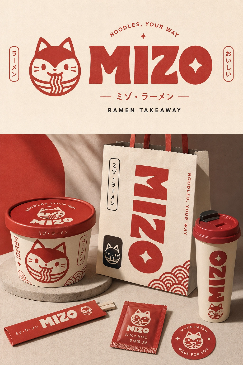
MIZO is a bold, playful ramen takeaway brand created around the energy of Japanese street food, combining a friendly character-driven identity with a warm, contemporary visual system.
The concept centers around a playful ramen cat mascot, expressive typography, Japanese-inspired graphic elements, and a strong red, cream, and warm neutral palette. The goal was to create a brand that feels instantly recognizable, energetic, and approachable while still maintaining a crafted food-brand aesthetic.
✦ Brand Concept
I wanted MIZO to feel like more than just another ramen takeaway. The identity was designed to capture the feeling of quick comfort food, Japanese culture, playful personality, and a modern noodle community.
The tagline “Noodles, Your Way” supports the idea of personalization and makes the brand feel casual, welcoming, and easy to connect with.
✦ Visual Identity
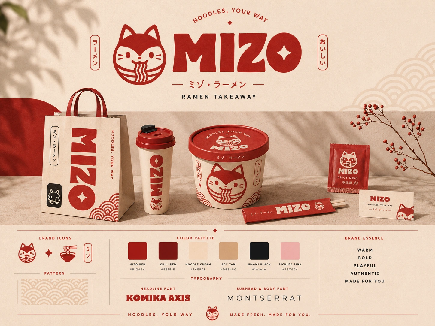
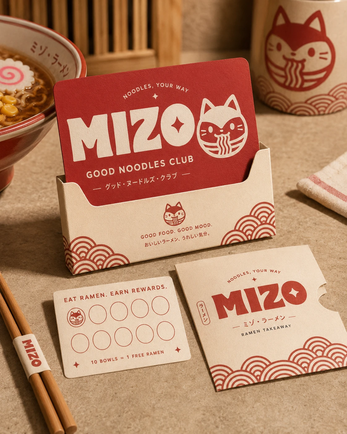
The identity combines bold custom-style lettering with a distinctive cat mascot inspired by traditional Japanese visual cues. The character becomes a memorable brand asset that can appear across packaging, promotional materials, signage, and digital applications.
The visual system includes:
Bold MIZO wordmark
Ramen cat mascot
Japanese-inspired graphic motifs
Custom supporting illustrations
Red, cream, and neutral color palette
Pattern and decorative elements
Strong typographic compositions
Playful brand messaging
✦ Packaging Design
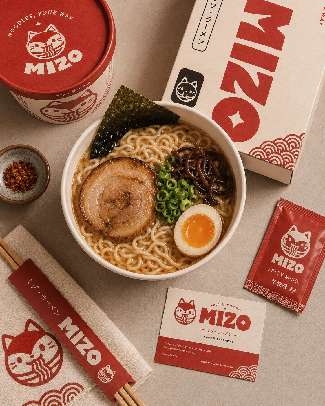
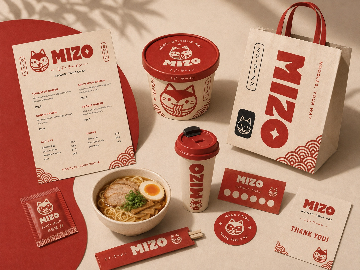
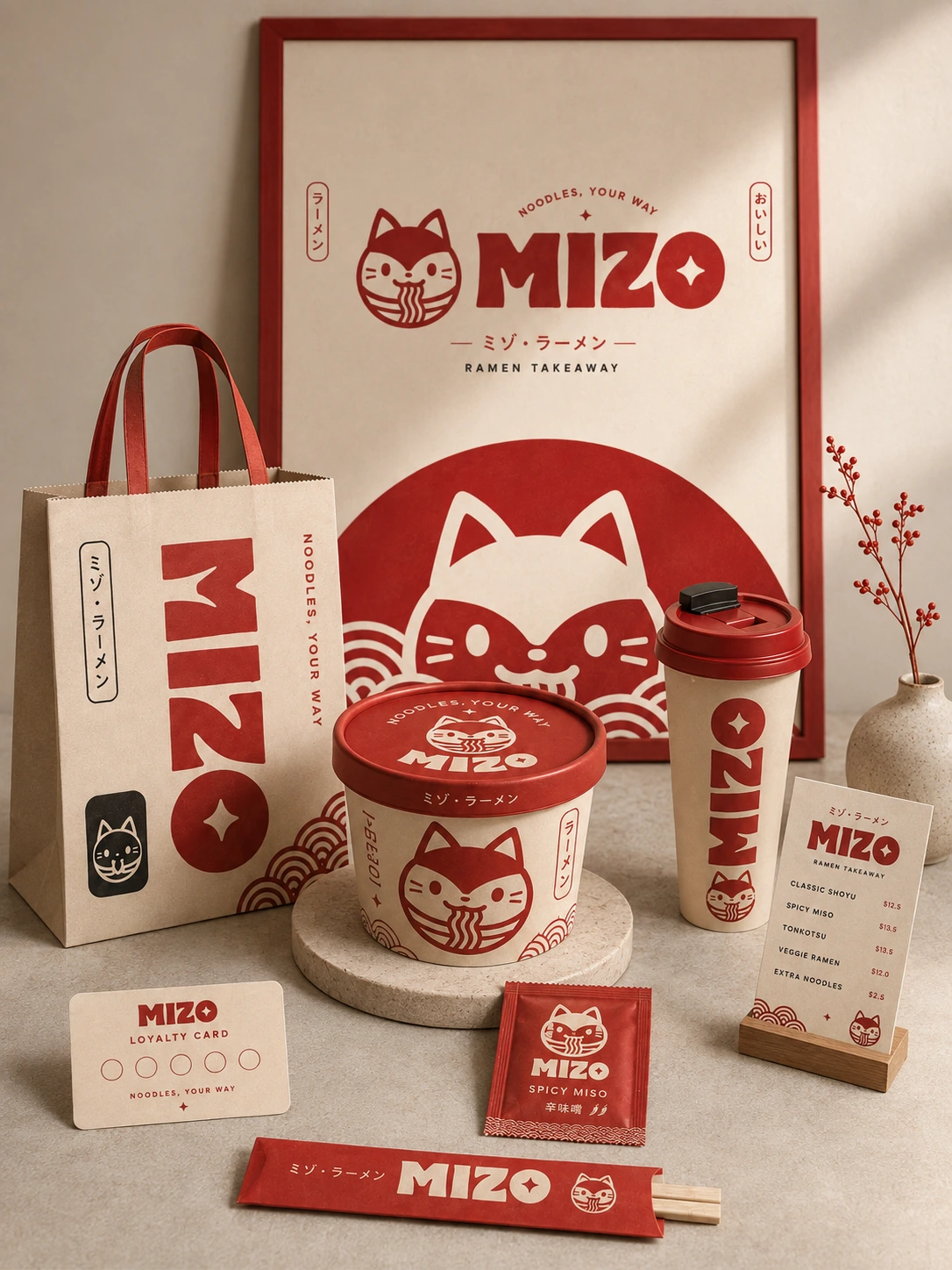
A major focus of the project was translating the identity into a complete ramen takeaway packaging system.
I developed a range of branded touchpoints, including:
Ramen bowls
Takeaway bags
Cups
Chopstick sleeves
Food packaging
Stickers
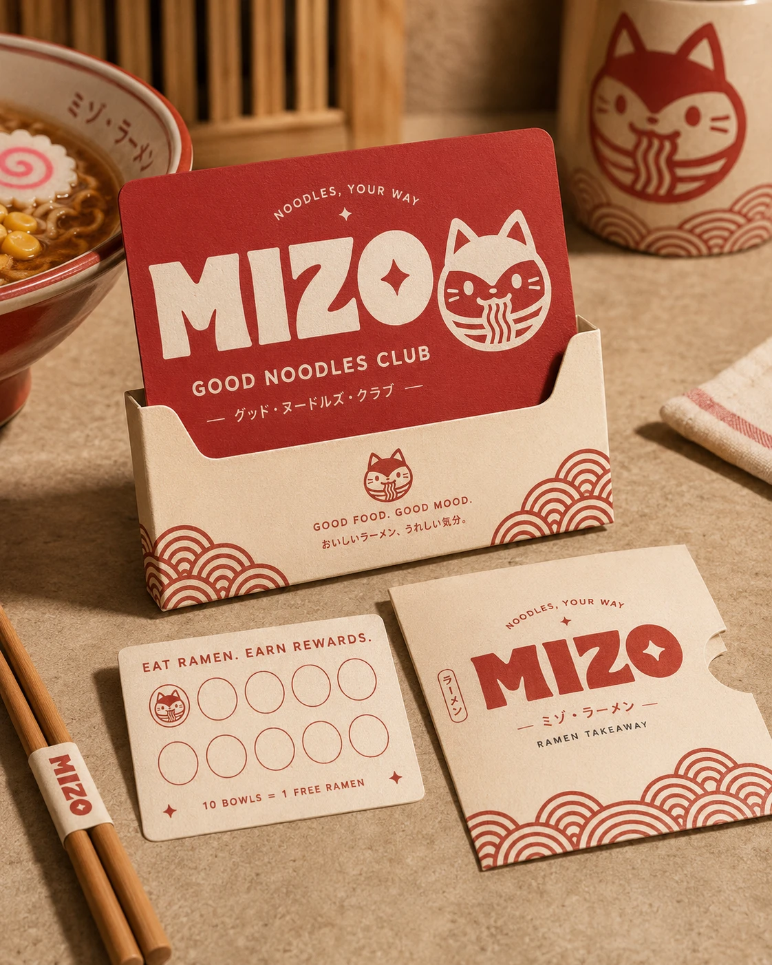
Loyalty/club cards
Promotional packaging elements
Each application uses the same core visual language while allowing different formats to have their own personality.
✦ Art Direction
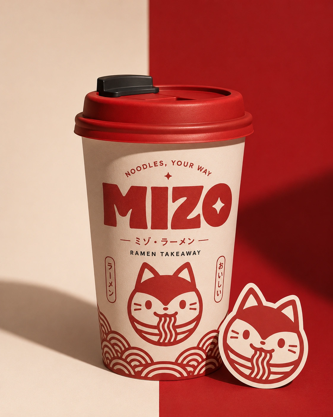
The photography and presentation were directed around a warm, tactile food experience. Natural shadows, textured surfaces, ramen imagery, and Japanese-inspired details help create a visual world that feels authentic, energetic, and inviting.
The combination of bold red graphics against soft cream backgrounds gives MIZO a strong shelf presence while keeping the overall system flexible and recognizable.

✦ The Goal
The goal was simple: create a ramen brand people can recognize before they even read the name.
From the mascot and typography to the smallest packaging details, every element was designed to build a consistent and memorable experience across the customer journey.
MIZO is playful. MIZO is bold. MIZO is made for noodle lovers. 🍜
Like this project
Posted Aug 29, 2026
Developed MIZO's playful brand identity and packaging with expressive typography, Japanese-inspired graphic elements, and a warm neutral palette.