Vitalo Brand Identity and Digital Experience Development

Jerin Nusrat


Vitalo — Fitness App, Brand Identity & Digital Experience
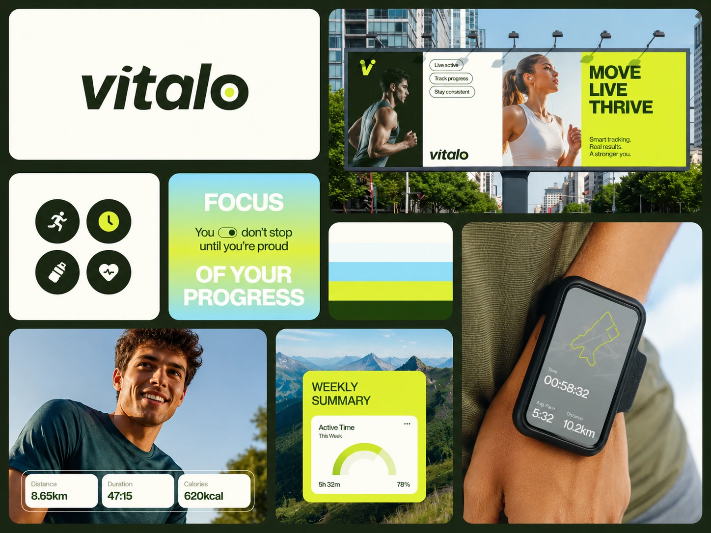
Vitalo is one of my most detailed branding projects, where I explored how a fitness brand can evolve into a complete digital and physical ecosystem. Rather than designing a logo alone, I developed a cohesive brand experience spanning mobile app screens, wearable interfaces, landing pages, social media, advertising, print materials, merchandise, and environmental branding.
The core idea behind Vitalo is simple: “Move. Live. Thrive.” The entire visual system was built around movement, progress, energy, and consistency-creating a brand that feels motivating while remaining clean, premium, and approachable.
The Vision
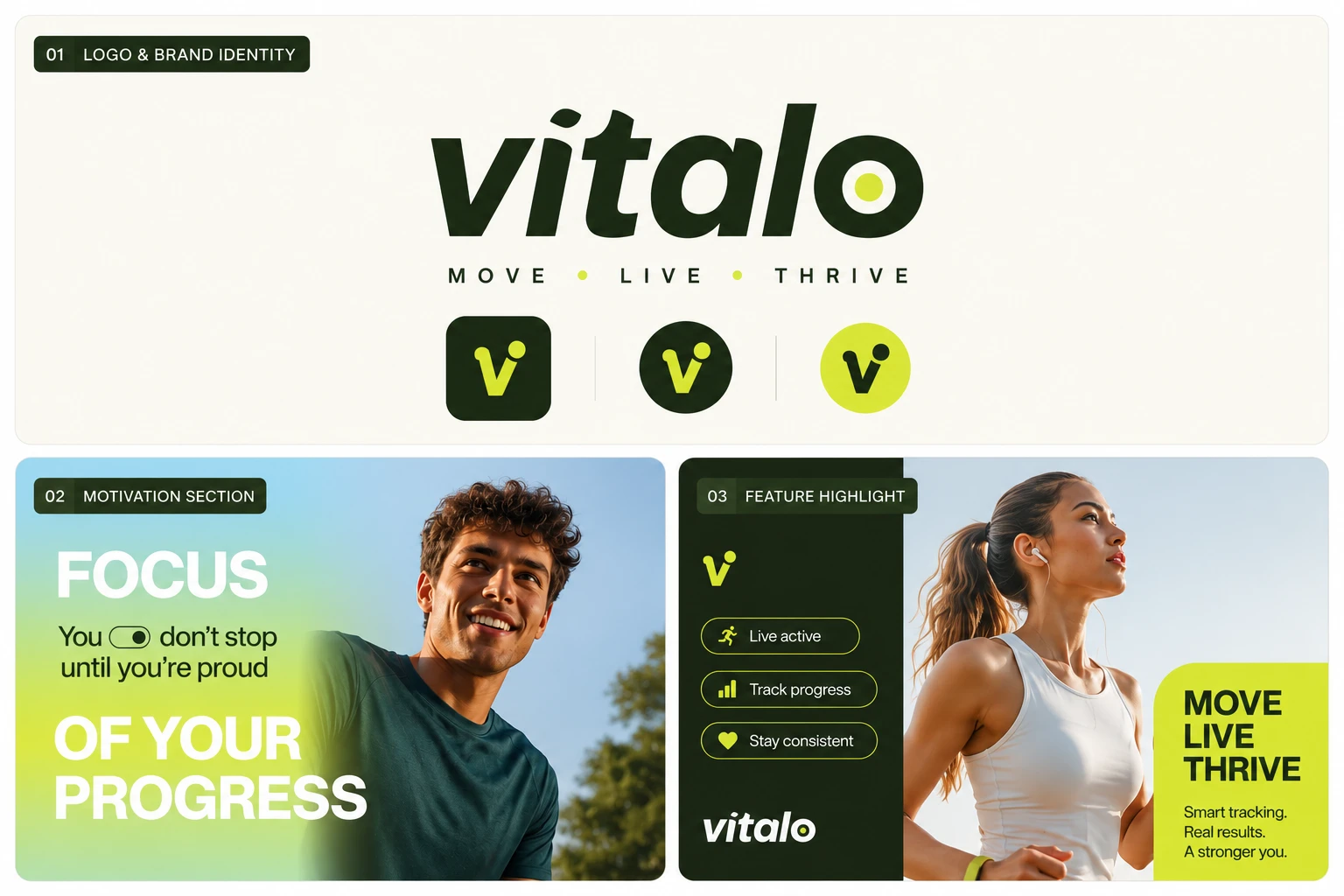
I wanted Vitalo to feel like more than another fitness app. The goal was to create a lifestyle-driven brand that motivates people to keep moving and makes their progress feel tangible.
The visual direction combines deep forest green, energetic lime, soft gradients, bold typography, and photography-led storytelling to create a distinctive identity that works beautifully across both digital and physical experiences.
Digital Product Experience
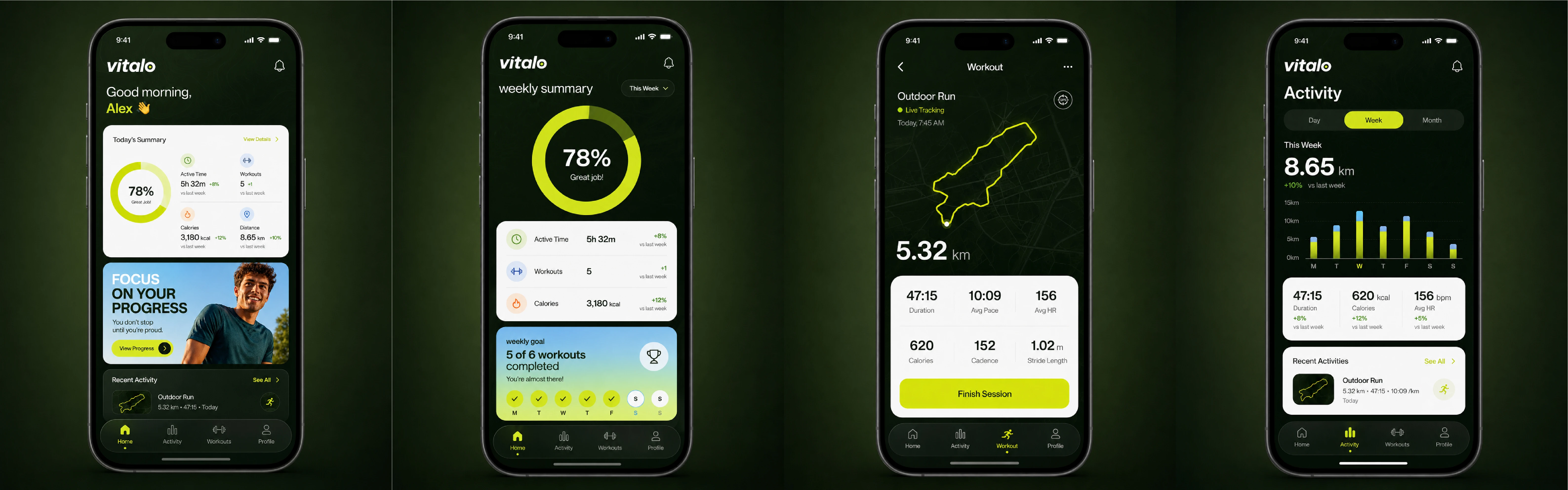
A major part of the project was designing the Vitalo fitness app experience.
The app concept includes:
Personalized home dashboard
Activity & performance tracking
Workout tracking
Heart-rate monitoring
Progress & goal tracking
Weekly performance summaries
Apple Watch-style fitness interfaces
Activity and notification experiences
The interface was designed to make fitness data feel approachable and motivating rather than overwhelming.
Brand Applications
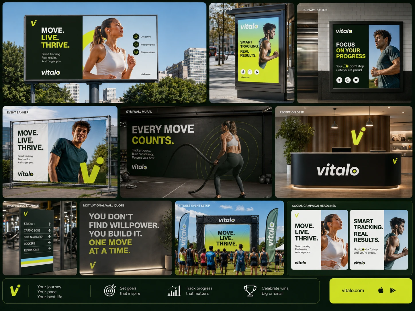
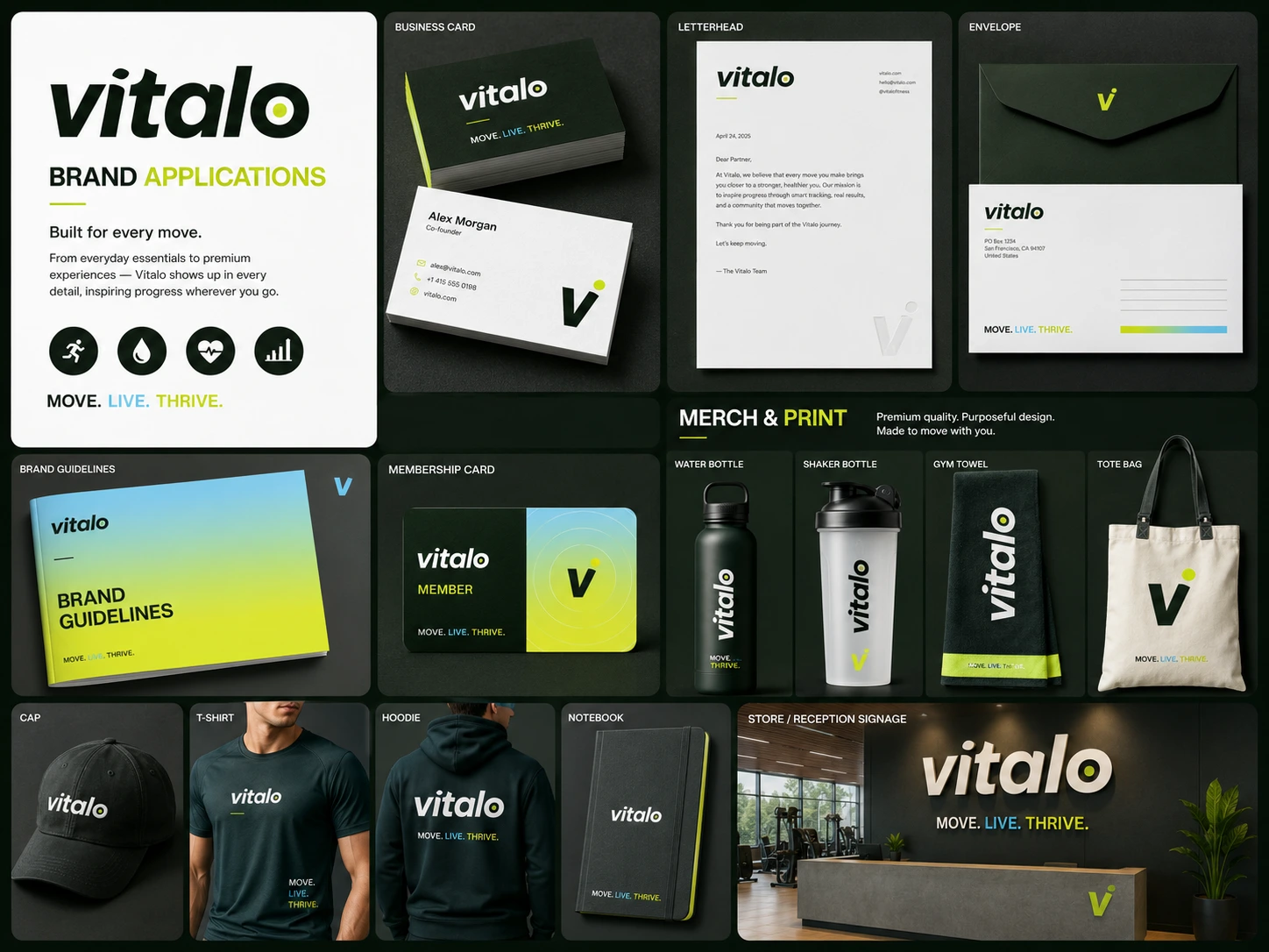
I expanded the identity across a complete ecosystem:
Mobile App UI
Wearable / Smartwatch UI
Responsive Landing Page
Social Media Campaigns
Digital Advertising
Business Cards
Letterheads
Envelopes
Membership Cards
Brand Guidelines
Water Bottles & Shaker Bottles
Gym Towels
Tote Bags
Caps
T-shirts & Hoodies
Notebooks
Store & Reception Signage
This allowed me to test the identity across different formats and ensure that the brand remained recognizable and consistent everywhere.
Visual Identity
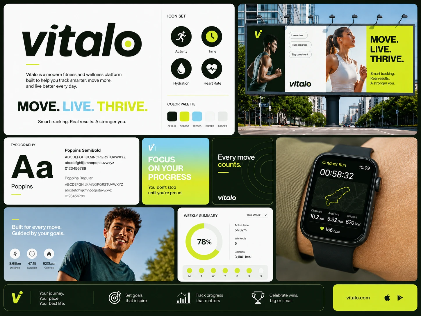
The Vitalo identity is built around a bold “V” symbol, representing movement and forward momentum. The typography is clean and confident, while the lime accent introduces energy and reinforces the idea of progress.
The combination of dark green + vibrant lime + soft blue gradients creates a visual language that feels contemporary, energetic, and distinctly fitness-focused without relying on stereotypical sports aesthetics.
My Role
I worked across the project from brand identity through digital product and marketing design, including:
Brand Identity Design
Logo & Symbol Design
Art Direction
UI/UX Design
Mobile App Design
Wearable UI Design
Landing Page Design
Social Media Design
Marketing Campaigns
Print & Stationery Design
Environmental Branding
Brand Guidelines
Design Process
The project started with defining the brand's personality and visual direction, followed by the development of the logo, typography, color system, and graphic language.
From there, I translated the identity into the app experience and gradually expanded it across marketing, print, merchandise, and physical environments.
The goal throughout the process was consistency without repetition-making sure every touchpoint felt unmistakably Vitalo while still being designed specifically for its context.
Outcome
Vitalo became a complete brand ecosystem rather than a standalone visual identity.
This project allowed me to combine my interests in branding, UI/UX, product design, digital experiences, and visual storytelling into one cohesive system. It's a strong example of how I approach design when the goal isn't simply to make something look good, but to create a brand that can genuinely live across an entire customer journey.
Like this project
Posted Aug 9, 2026
I developed a cohesive brand ecosystem for Vitalo, including mobile app screen, wearable interface, landing page, social media, advertising and print materials.
Likes
2
Views
28
Timeline
Aug 14, 2026 - Sep 3, 2026
Clients
Vitalo