The network for creativity
Join 1.25M professional creatives like you
Connect with clients, get discovered, and run your business 100% commission-free
Creatives on Contra have earned over $150M and we are just getting started
Back to feedPost

A fintech brand lives or dies on one thing does it feel trustworthy before anyone reads a word?
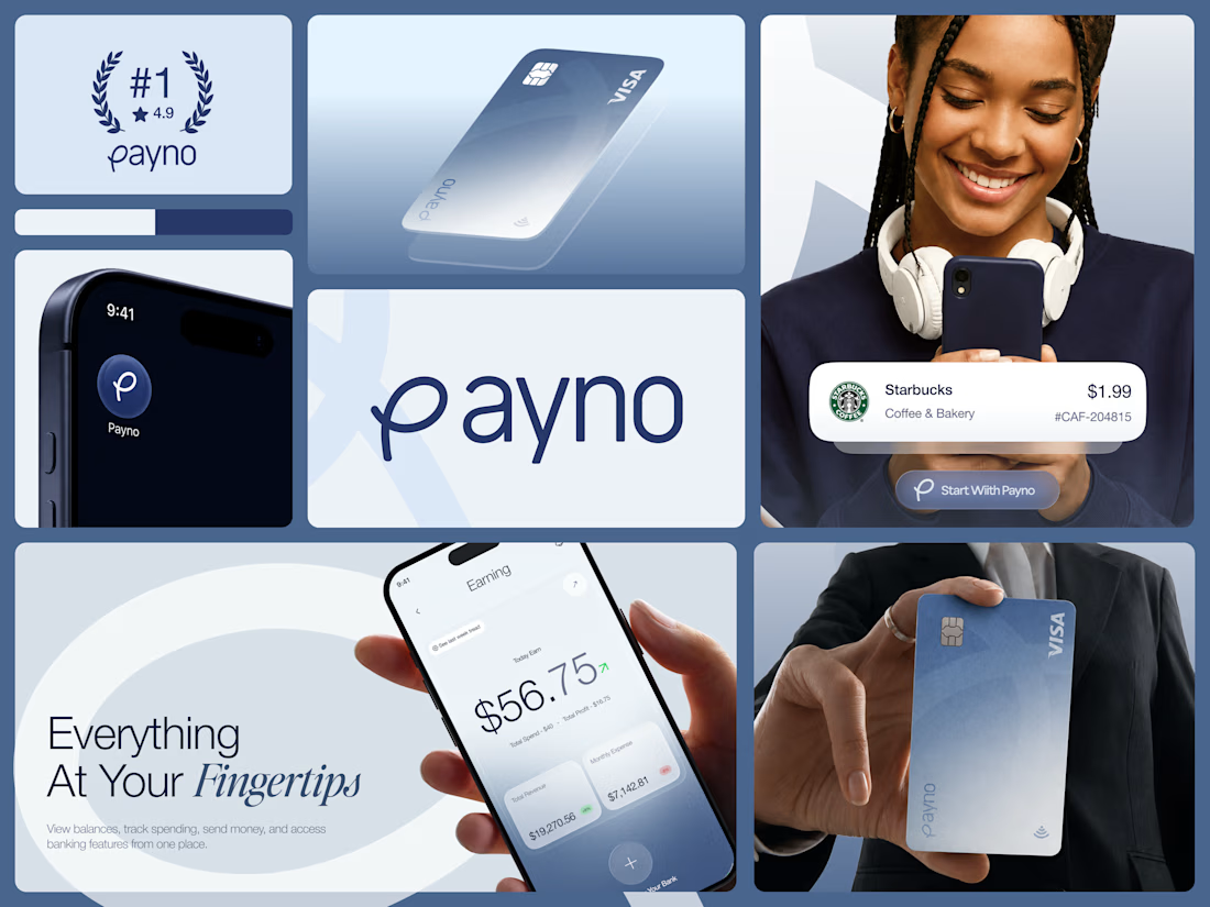
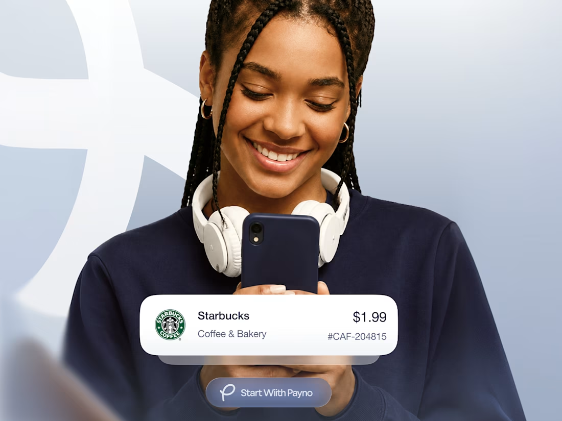
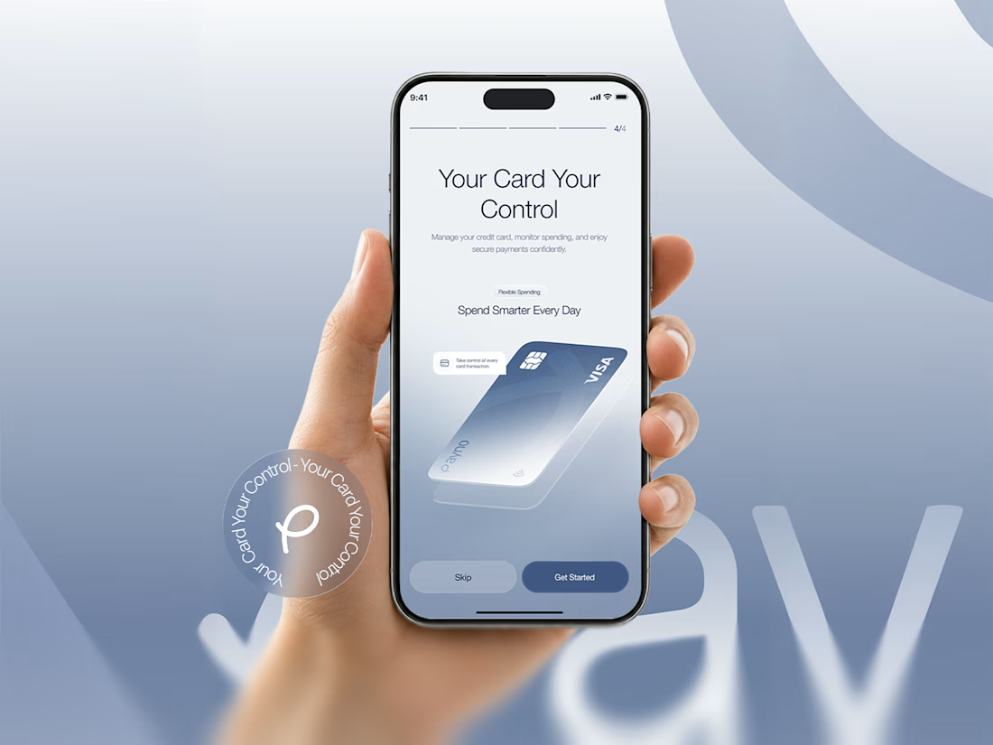
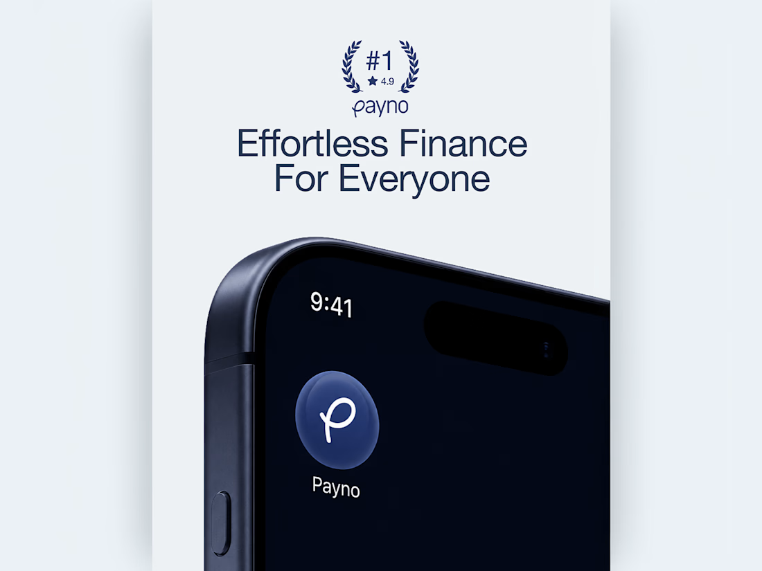
Payno's brand identity was built around that question. The frosted glass Visa card that catches light like a premium product should. The deep navy wordmark with a looped P that feels handcrafted without being casual. An app icon that sits on a home screen and looks like it was always meant to be there.
The color system does quiet work across every touchpoint steel blue, soft white, and deep navy that signals reliability without feeling corporate. The card design, the wordmark, the lifestyle collateral, and the #1 rated badge all speak the same visual language without repeating themselves.
Most fintech brands look trustworthy. Payno was designed to feel it.
Does this brand identity make you want to start with Payno? 👇
Designed by Orbix Studio
Tools: Figma , Illustrator
#BrandIdentity #FintechBranding #LogoDesign #BrandDesign #ContraFreelance #VisualIdentity #PackagingDesign #BrandSystem


Super refreshing color scheme, love this.

Premium vibes only. Outstanding visual balance

Amazing

This identity feels so polished. The navy and soft white work beautifully together🔥

Premium Branding :)


the frosted card looks so good. nice work!

Beautiful work!

Nice work!
The network for creativity
Join 1.25M professional creatives like you
Connect with clients, get discovered, and run your business 100% commission-free
Creatives on Contra have earned over $150M and we are just getting started





Related posts

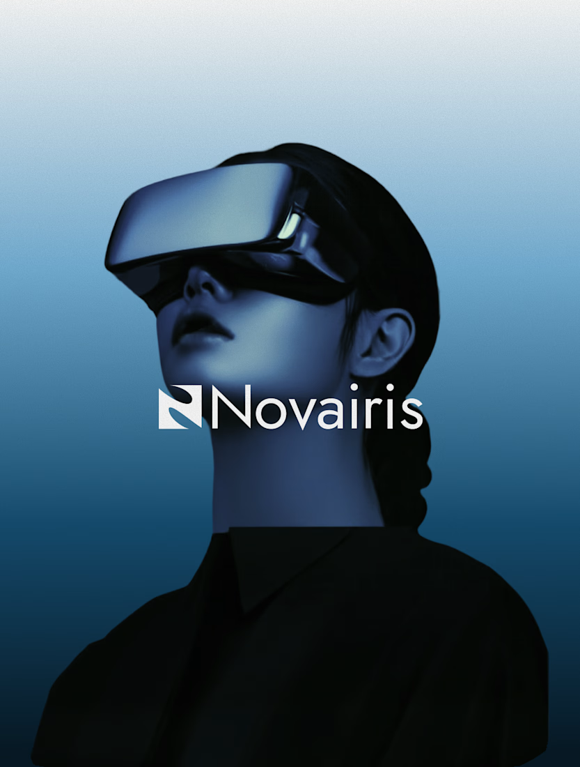
Good technology deserves a brand people can understand and trust.
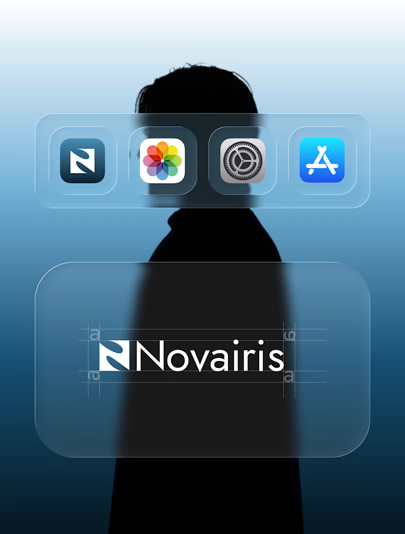
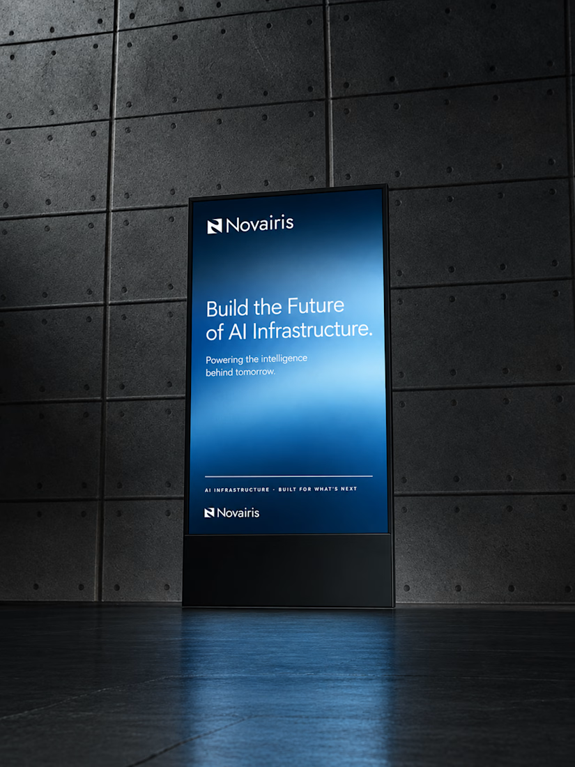
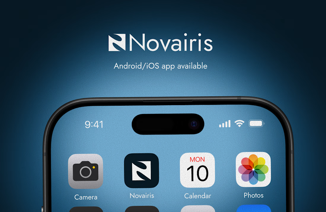
For NOVAiris, I built the brand around a simple problem:How do you make complex AI infrastructure feel clear, credible, and relevant to modern businesses?
From positioning and personality to the visual identity system, every decision was designed to make the technology feel intelligent, purposeful, and easy to engage with.
Strategy first. Identity follows.

Great work.



Designed the landing page for Smug — an AI support agent that resolves tickets, knows exactly when to escalate to a human, and has zero interest in pretending otherwise.
Most AI support tools go the humble, over-apologetic route. Smug does the opposite — the whole brand is built around a smug little cat mascot and copy like "Handled it. You're welcome." It's a genuinely fun brief: figuring out how to make confidence read as charming instead of obnoxious.
Bold electric blue and orange instead of the usual muted SaaS palette, because a product this confident shouldn't look shy about it. 💙


cool