The network for creativity
Join 1.25M professional creatives like you
Connect with clients, get discovered, and run your business 100% commission-free
Creatives on Contra have earned over $150M and we are just getting started
Back to feedPost

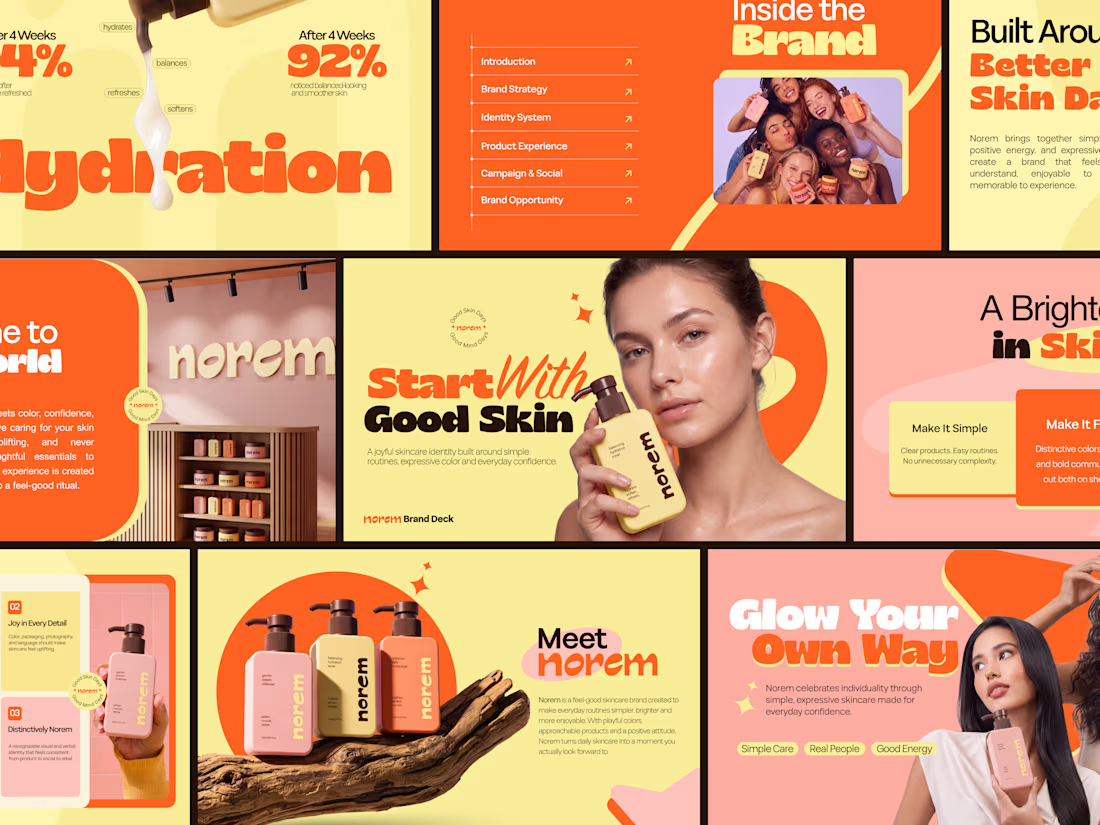
Most brand decks explain a skincare brand. This one makes you feel it before the second slide.
Bold yellow, expressive orange, joyful product photography, and a brand strategy that turns daily skincare into a feel-good ritual 92% noticed balanced-looking skin after 4 weeks. Simple Care. Real People. Good Energy.


Wow, this is exceptionally clean work.
Thank you! Really glad you found the work exceptionally clean!

So cool
Thank you! Really appreciate it!

Always Amazing :)
Thank you so much! Really appreciate your continued support!

Outstanding
Thank you so much! Really appreciate it!


Color and placement is on point, so good!

The strategy behind this deck is brilliant. Making the product feel like a daily ritual really sets the tone. Great work!

This is such a fun brand direction! The colors, typography, and product visuals have so much personality.

Excellent project

Cool!

Looking Cool

This looks so premium!
Thank you so much! Really glad you liked the premium feel
thanks a lot
The network for creativity
Join 1.25M professional creatives like you
Connect with clients, get discovered, and run your business 100% commission-free
Creatives on Contra have earned over $150M and we are just getting started





Related posts

Cleann🔥

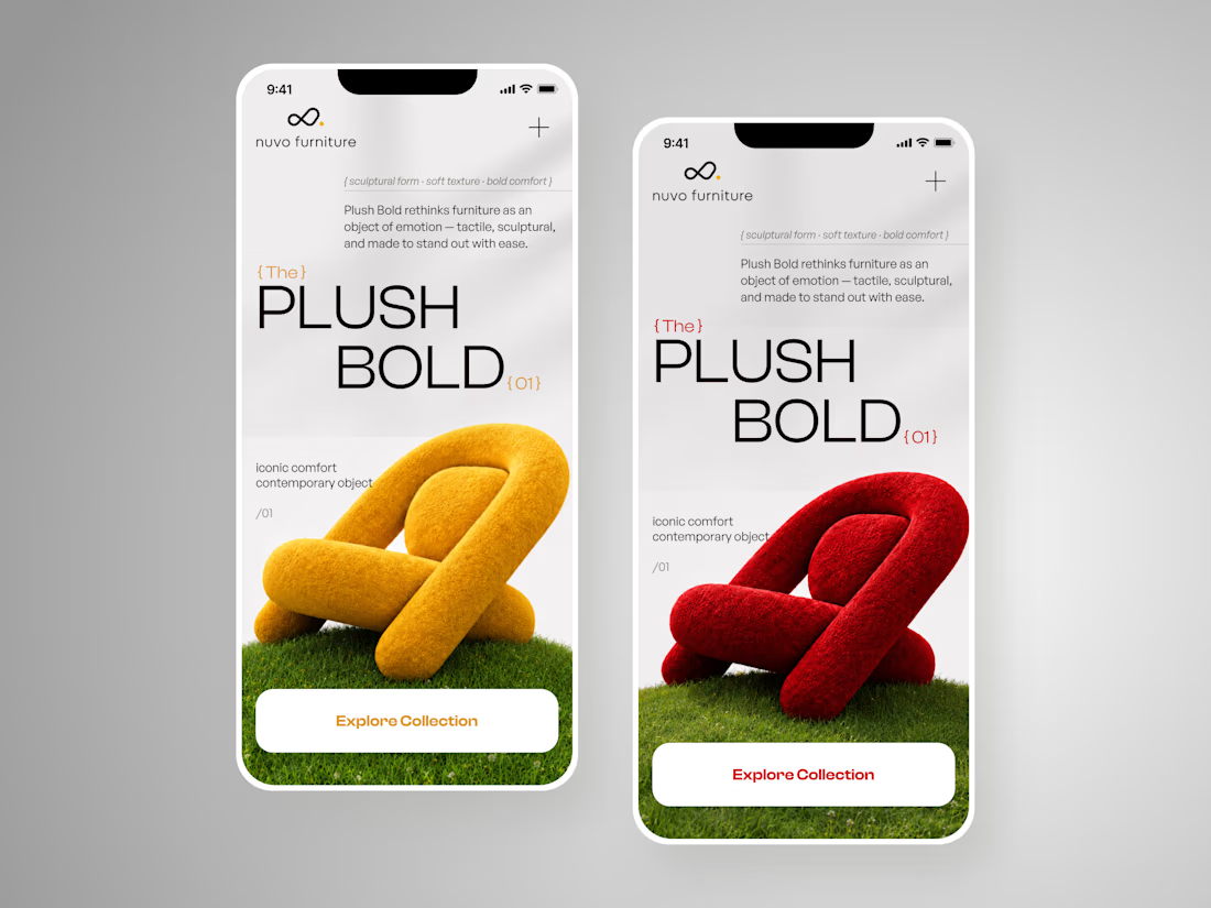
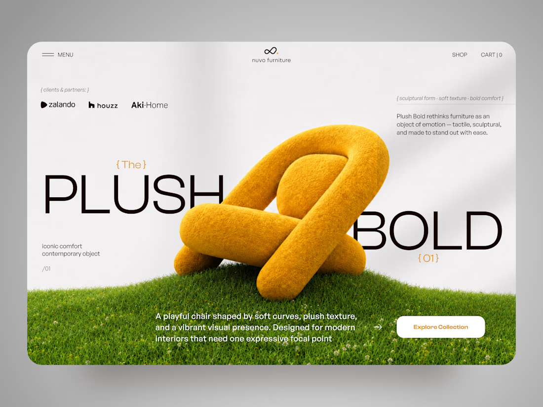
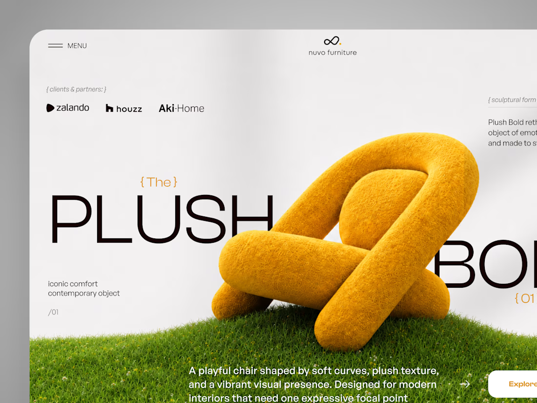
NUVO Furniture — Sculptural Furniture E-commerce Concept 🪑✨
NUVO is a contemporary furniture website concept built around one idea: let the product become the experience.
At the center of the concept is Plush Bold — an expressive statement chair designed to feel more like a...

Free AI Framer template we designed for B2B SaaS.
Arcon AI is a premium Framer template built for AI startups, procurement platforms, enterprise SaaS, AI agents, workflow automation, supply chain technology, and B2B software. Designed with a modern enterprise aesthetic, it helps you launch a professional website that builds trust, showcases your product, and drives conversions.
Get it for free: https://www.framer.com/marketplace/templates/arconai/

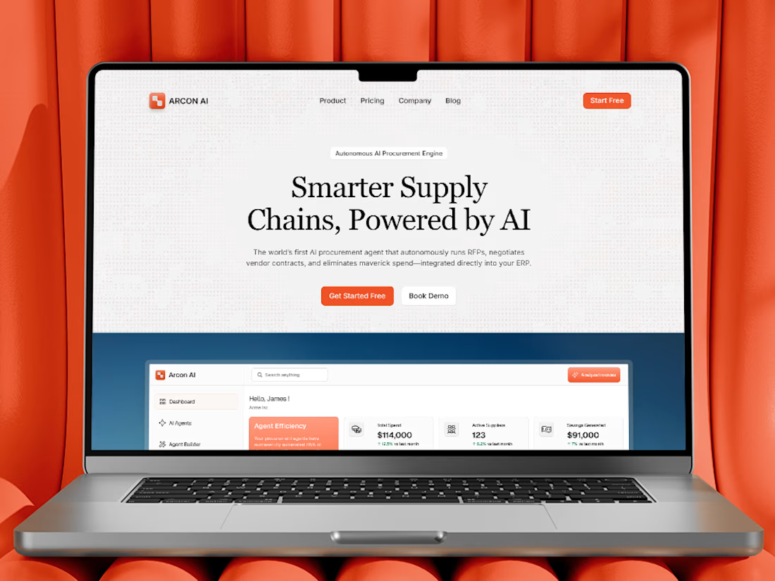
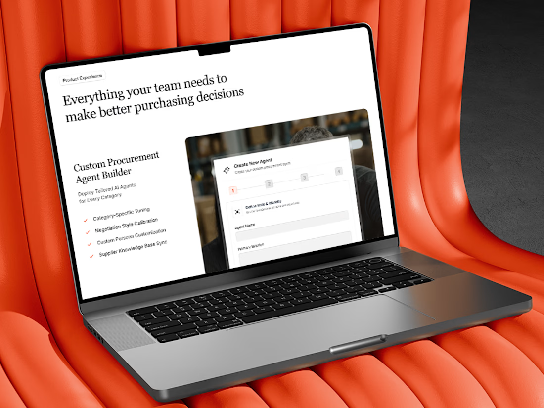
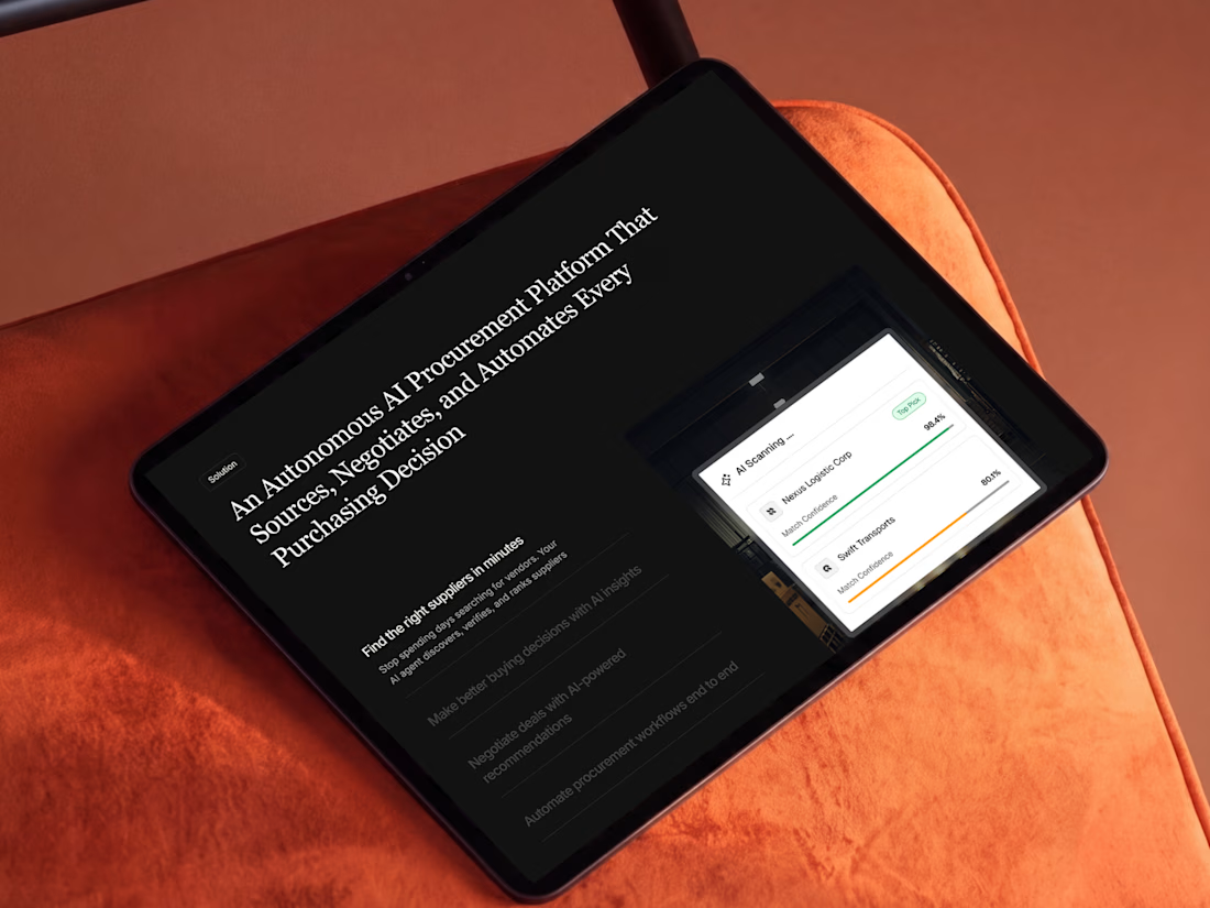
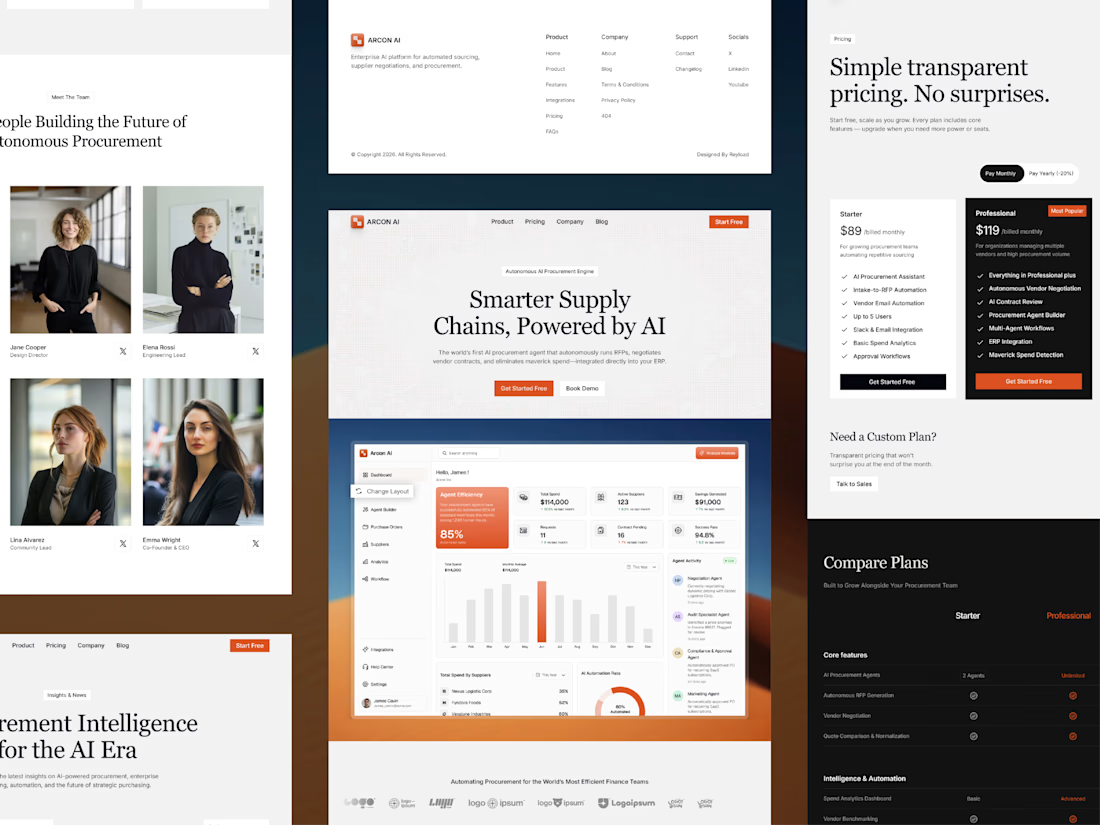

Lovely work

A jewelry brand shouldn't feel special only when the box is opened. For Mivessa, the goal was to build that feeling from the very first touchpoint.
The M monogram became the visual signature of the brand simple enough to remember, distinctive enough to own. Then we carried that identity into the full experience:
→ Jewelry boxes
→ Velvet pouches
→ Ribbons
→ Wrapping materials
→ Gift cards
→ Brand stationery
Deep green creates a rich, premium foundation. Gold adds warmth and elegance. And the consistent use of the identity turns separate materials into one recognizable brand experience. Because premium branding isn't only about how the jewelry looks. It's also about how the brand feels before, during, and after the purchase.
🏀 Full Design Showcase – Better View on Dribbble.
Premium Jewelry Brand Identity, Packaging & Brand Materials

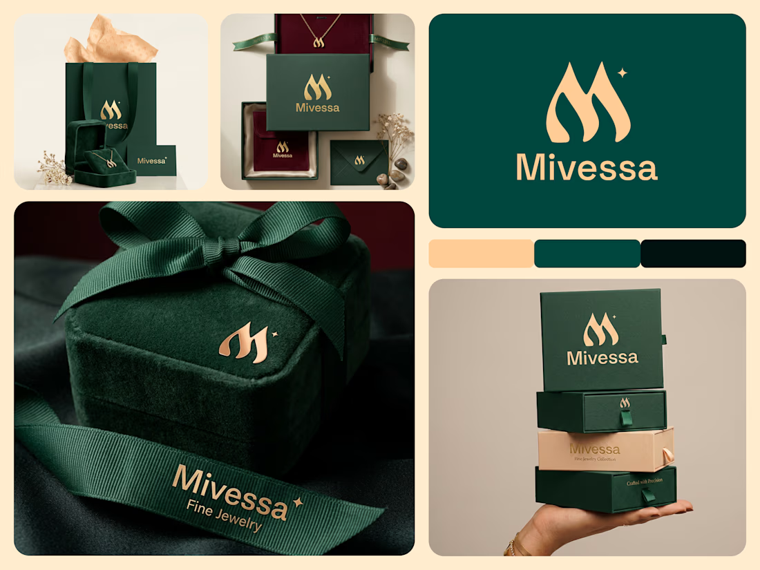

The monogram, packaging, and overall visual language feel premium.