Freelancers using Claude in Australia
Sign Up
Post a job
Sign Up
Log In
Filters
2
Projects
People
Jasmine Sotiropoulos
pro
Australia
Brand Strategy & Design savant with a 16+ year track record
5.0
Rating
239
Followers
Top
Follow
Message
Brand Strategy & Design savant with a 16+ year track record
0
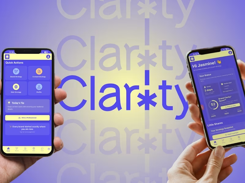
Clar!ty: AI Brand Strategist for Founders
0
22
0
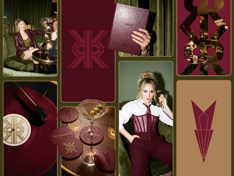
Resonance Place Personal ReBrand
0
8
3
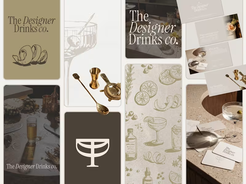
Premium Brand Identity Design for The Designer Drinks Co.
3
35
2
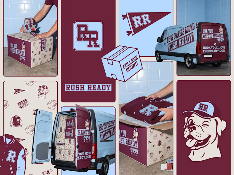
Rush Ready Brand Identity Development
2
22
Claude
(1)
Follow
Message
Rod Acevedo
pro
Sydney NSW 2000, Australia
Product Design, AI Products, Design Systems, Vibe Coder
1x
Hired
5.0
Rating
31
Followers
Certified Partner
Follow
Message
Product Design, AI Products, Design Systems, Vibe Coder
2
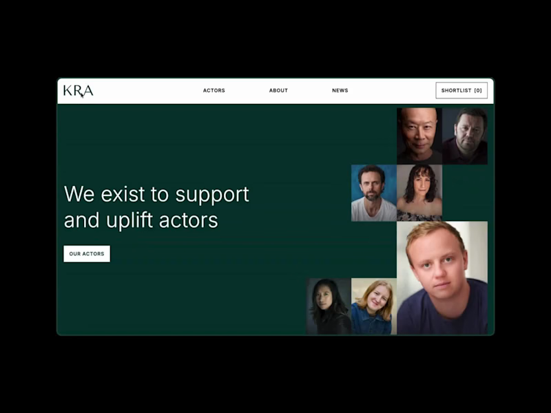
KR Actors AI Talent Database Automation
2
20
1
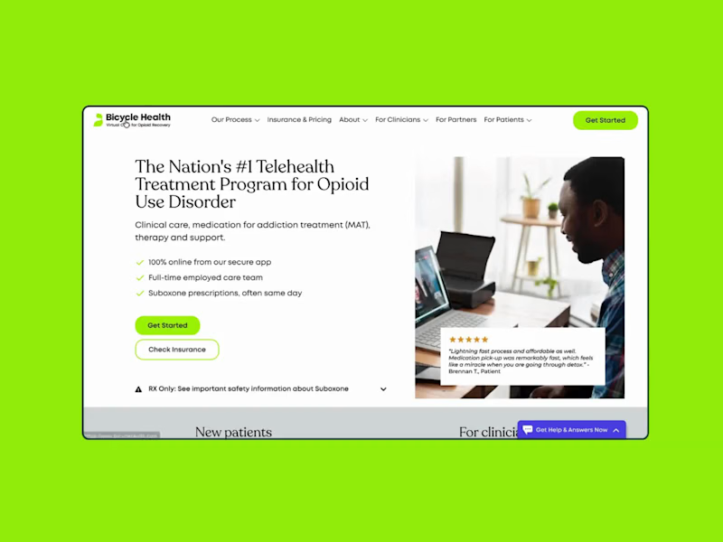
Startup: Bicycle Health Webflow and Growth Hack
1
21
1
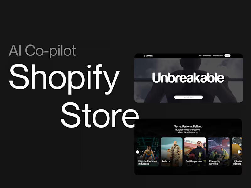
Shopify Store for UndaTech.COM.AU
1
20
1
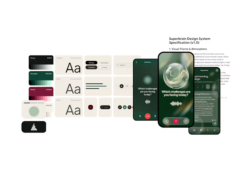
Claude, Cursor, v0, they'll all default to the same grey SaaS look unless you give them something better to work from. Before building Superbrain, a voice-first journaling tool, I wrote the entire design system in a single Markdown file. Colours, type, components, atmosphere, right down to how the interface shifts with context. Every AI tool reads that design.md (http://design.md) before generating a single screen. The result was screens landing on brand the first time, across every surface. No endless rounds of nudging the output back towards something that feels like the brand. A design system used to be documentation you wrote after the work. Now it's the brief the AI builds from. One file, and suddenly the machines have taste.
1
210
Claude
(7)
Follow
Message
Akash Datta
pro
Gobbagombalin, Australia
Product Designer for B2B SaaS
5.0
Rating
6
Followers
Follow
Message
Product Designer for B2B SaaS
1
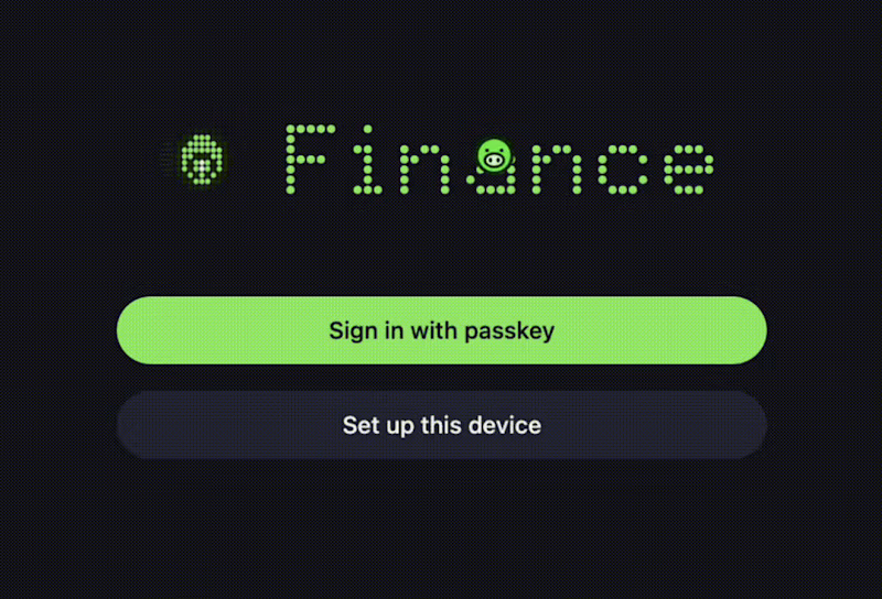
Fun little detail in the finance app I recently vibe-coded: piggy coin + dot-matrix animated wordmark. The wordmark is animated using variable Google font Doto controls. And then used that as a reference to create the rotating coin.
1
101
3
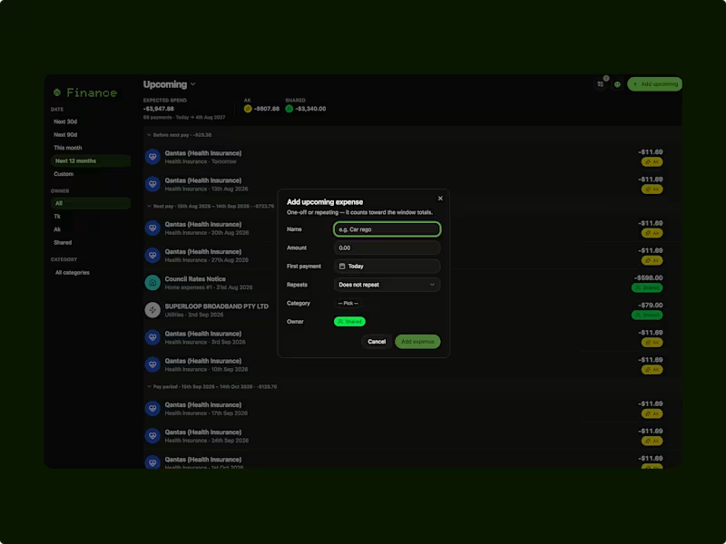
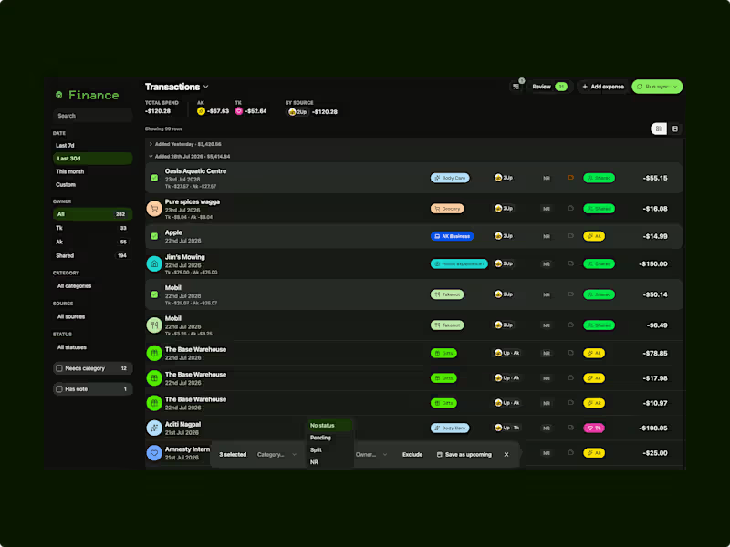
Personal finance dashboard — from an hour of admin to two minutes A weekly household finance workflow (manually pulling bank CSVs, splitting and categorising spends across two people, cross-checking shared expenses, reviewing totals against savings goals) was taking about an hour every week and still made it hard to tell at a glance whether spending was on track. Designed and built a dashboard that automates the pull, categorisation, and monthly view. My role: Research (mapped the existing manual workflow and pain points), UX design, and AI-assisted build of the dashboard. Outcome: Cut the weekly admin task from roughly an hour to about two minutes. Note on scope: Personal side project, not a client engagement. Included here as a live example of the kind of workflow-to-dashboard problem I take on for clients (repeat-purchase and admin-heavy flows, see Pet Circle and SafetyCulture project cards). Project details up on my profile.
2
3
199
0
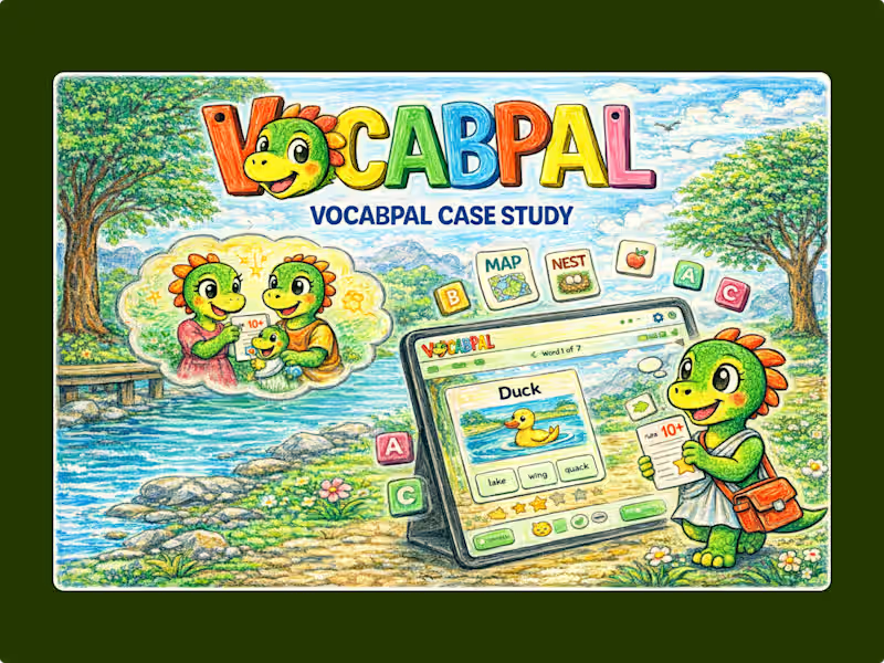
VocabPal Literacy Tool Development
0
5
0
AI-Powered Personal Finance Tool Development
0
10
Claude
(4)
Follow
Message
Victor T Tam Yan
pro
Sydney NSW 2000, Australia
Ghostwriter for Business & LinkedIn Copywriter for Founders
Follow
Message
Ghostwriter for Business & LinkedIn Copywriter for Founders
0
Victor T Tamyan vtbizonline@gmail.com
0
58
0
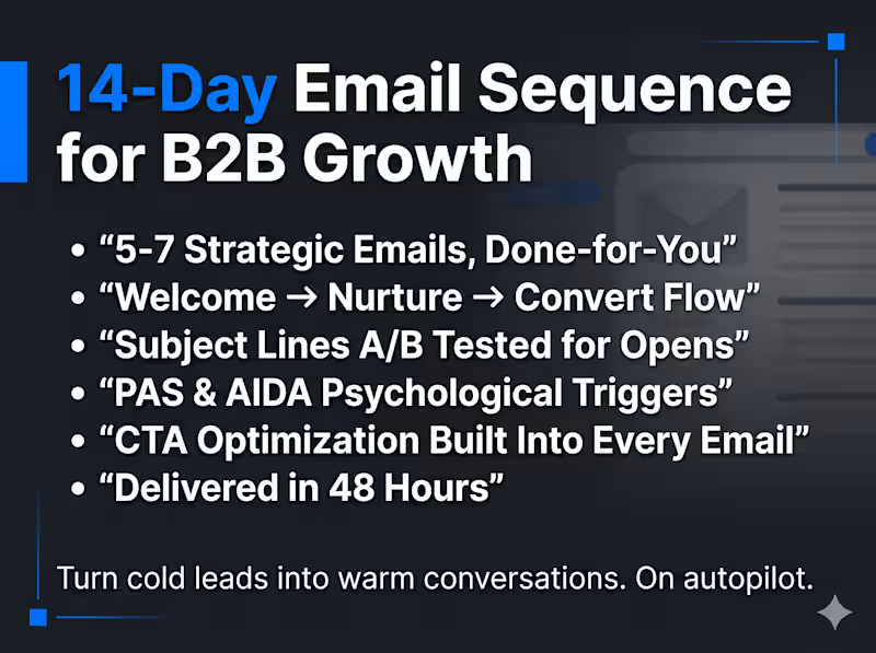
14-Day Email Sequence & Nurture Copy for B2B Growth You're getting leads. But they go cold before they buy. Someone visits your site, downloads your guide, books a discovery call, or signs up for your list. Then... silence. No follow-up. No nurture. No conversion. They forget you exist by Tuesday. The problem isn't your offer or your audience. It's that you have no system turning interest into trust, and trust into revenue. What I build for you A 14-day email nurture sequence engineered to take a cold lead from "who are you?" to "let's work together." Plus a 400-word anchor nurture piece (welcome email, lead magnet follow-up, or onboarding email) that sets the tone for the entire relationship. Every email is written with strategic intent: each one has a job, whether that's building credibility, handling objections, creating urgency, or driving a specific action. This isn't "just checking in" email. It's a conversion system. Built for B2B professionals who sell expertise This service is specifically designed for: Consultants & coaches who need to warm leads between discovery call and close Lawyers & accountants who want to nurture referrals and inbound inquiries without sounding salesy Real estate agents who need drip sequences that keep them top-of-mind through long buying cycles Small business owners who know they should be emailing their list but don't know what to say SaaS founders who need onboarding sequences that reduce churn and drive activation How it works Intake & Strategy: I learn your business, audience, and conversion goal. What action should the reader take by Day 14? We start there and reverse-engineer the sequence. Anchor Nurture Piece (400 words): I write your foundational email, the one that sets your voice, establishes authority, and frames the relationship. This is typically your welcome email or lead magnet follow-up. Short, sharp, and high-impact. 14-Day Email Sequence (14 emails, 150-200 words each): Each email is strategically sequenced using a trust-building arc: introduce, educate, prove, handle objections, create urgency, convert. Every email has a clear purpose and a single call to action. Delivery: Complete sequence delivered in a formatted Google Doc with subject lines, preview text, send-day recommendations, and CTA labels clearly marked. Ready to paste into Mailchimp, ConvertKit, ActiveCampaign, or any email platform. FAQs I'm not a tech company. Will this work for my industry? What email platform do I need? What's the difference between the anchor nurture piece and the 14-day sequence? Can you write for a specific conversion goal? What if I don't have a lead magnet or opt-in yet? Do I need to write anything myself? What if I want to adjust the tone or messaging?
0
94
0
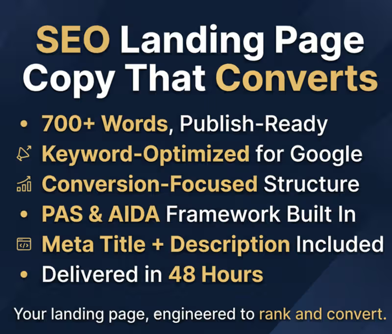
Your landing page exists. But nobody finds it. You built the product. You launched the site. But organic traffic is flat, bounce rates are high, and the page reads like it was written for a search engine from 2018. The problem isn't your offer. It's that your copy doesn't match what your buyer is actually searching for, and it doesn't move them once they arrive. What I build for you I write a conversion-focused SEO landing page grounded in real keyword research, not guesswork. Every headline, subhead, and paragraph is engineered to rank for the terms your buyers actually type, and structured to move them from curiosity to action. This isn't keyword stuffing. It's strategic copywriting built on proven psychological frameworks (PAS + AIDA) layered with SEO architecture so your page works for both Google and humans. I've done this for SaaS companies targeting competitive terms like "humanized AI" and delivered 2,000+ word pages built from multi-phase keyword research across intent clusters. You can see the full case study in my portfolio. How it works Keyword Research Phase: I research 3 primary keywords and 5 supporting sub-terms, analyzing search intent, competition, and opportunity. Structural Architecture: I map your page structure: H1 headline, 2-3 H2 subheads, body content, and meta description, all aligned to your keyword strategy. Copywriting Phase: I write 700+ words of conversion copy using PAS (Problem-Agitation-Solution) and AIDA (Attention-Interest-Desire-Action) frameworks. Q&A Section: 7 strategically written questions and answers that target long-tail search queries and reduce buyer objections simultaneously. Delivery: You receive the complete page copy in a clean Google Doc, ready to hand to your developer or paste into your CMS. Who this is for SaaS founders who need a landing page that ranks and converts Startups launching a new product or feature page Service businesses tired of paying for ads because organic isn't working Anyone who has a landing page that "looks fine" but generates zero inbound traffic FAQs - CHECK My Services for Answers Can you write for my specific industry or niche? What if I need more than 700 words? Do you just write copy, or do you also handle the SEO strategy? What do you need from me to get started? Can I get it faster than 2 days? What makes this different from hiring a regular copywriter? Do you offer revisions?
0
82
1
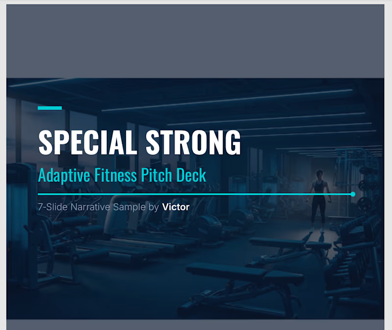
🚀 The 24‑Hour Pitch Deck + 90‑Second Video System (300 words) Every great pitch needs two things: a clear story and a compelling delivery. My Pitch Deck System gives founders, executives, and creators both—delivered fast, polished, and ready to present within 24 hours. I build 13‑slide, investor‑grade pitch decks using a proven narrative architecture that blends clarity, tension, and visual rhythm. Each deck is crafted in a slick, modern PowerPoint format with premium graphics, clean layouts, and optional tables, charts, or data visuals depending on what the executive needs. The result is a deck that feels sharp, confident, and easy to present. Your deck includes the full strategic arc: Title + Positioning Problem Market Insight Opportunity Solution Product Snapshot Value Proposition Business Model Traction Market Size Competitive Landscape Roadmap Call to Action / Closing Slide But the system doesn’t stop at slides. To help you pitch with authority, I also create a 90‑second scroll‑stopping video summarizing the entire deck. This can be a talking‑head style video, a clean voice‑over with visuals, or a hybrid format—perfect for LinkedIn, investor outreach, or internal leadership communication. The video distills your message into a tight, high‑impact narrative that captures attention and reinforces the key points of your deck. It’s designed to be shareable, memorable, and aligned with your brand. Everything is delivered within 24 hours: ✔ 13‑slide premium PowerPoint deck ✔ 90‑second video summary ✔ Script + messaging architecture ✔ Visual consistency + brand alignment
1
106
Claude
(15)
Follow
Message
David Affran
Brisbane City QLD 4000, Australia
Digital Experience Designer | Business Analysis
New to Contra
Follow
Message
Digital Experience Designer | Business Analysis
0
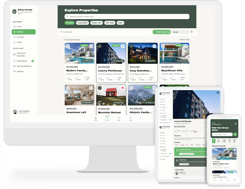
Affran Homes real‑estate SAAS prototype
0
2
0
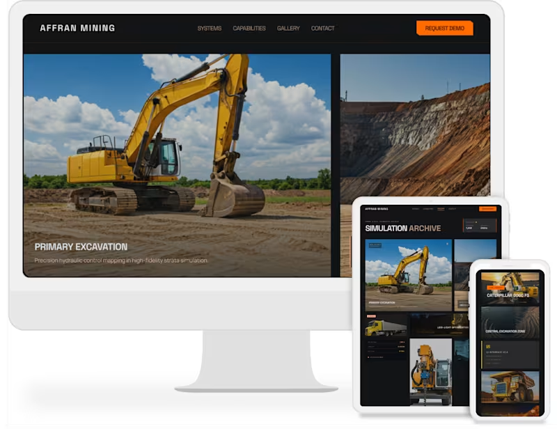
Affran mining training app
0
2
0
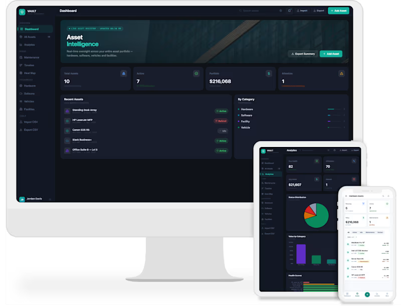
Asset management app (prototype)
0
2
0
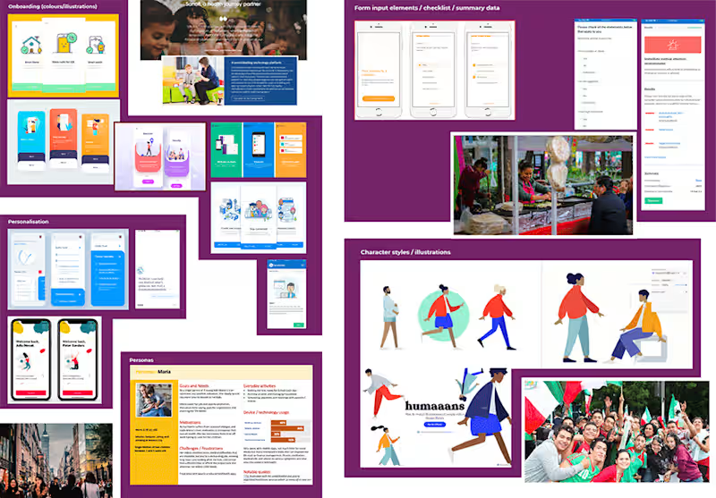
Respiratory self‑assessment app research
0
4
Claude
(3)
Follow
Message
Reece White
max
Surfers Paradise QLD, Australia
Building Landing Pages that Convert
$50k+
Earned
31x
Hired
4.8
Rating
518
Followers
expert
expert
+1
Follow
Message
Building Landing Pages that Convert
27
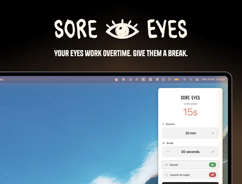
🫵🏻 You know that feeling. It's 2am, you're deep in a project, and your eyes feel like sandpaper. Sore Eyes (https://contra.com/products/p7pbZe1g-sore-eyes-give-your-eyes-a-break) is a macOS menu bar app reminding freelancers and remote workers to take eye breaks. Built on the 20-20-20 rule (every 20 minutes, look 20 feet away for 20 seconds), it's the gentle nudge your eyes need. With remote work booming and screen time at all-time highs in 2026, digital wellness is a growing market. Sore Eyes targets the 70M+ freelancers who spend 8-14 hours daily on screens with no one telling them to pause. Why You'll Love It: 🎯 Set and forget - runs quietly in the menu bar ✨ Calming animated glow reminders, not annoying popups ⚡ Lightweight - no battery drain 🌙 Dark mode for midnight grinders 🔇 Optional sounds - chimes or silence
6
27
2.2K
12
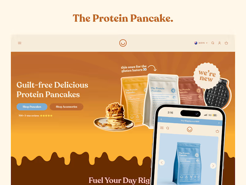
The Protein Pancake | Website Development + CRO 🥞
12
338
16
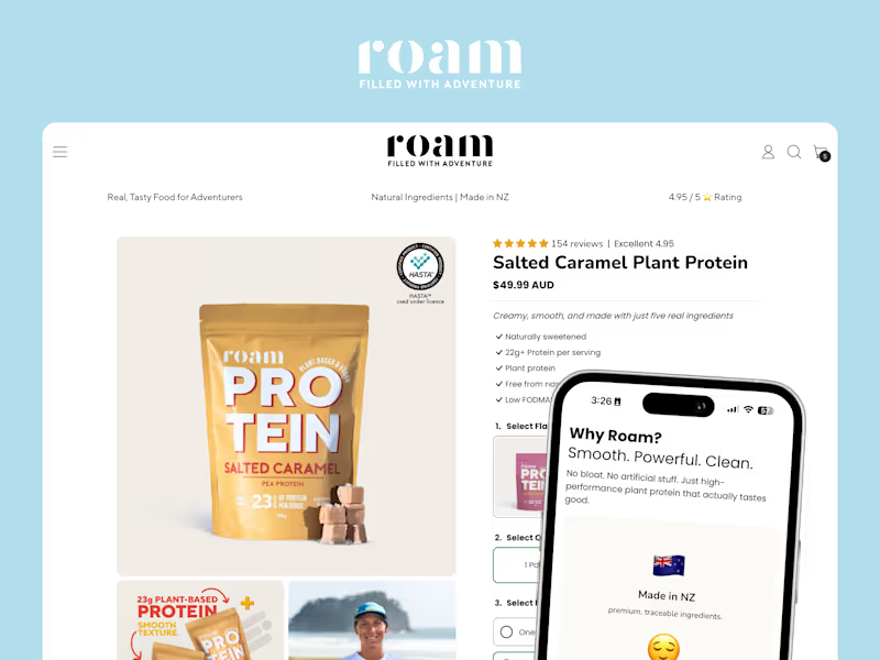
Roam Energy | PDP Development 🥜
16
336
39
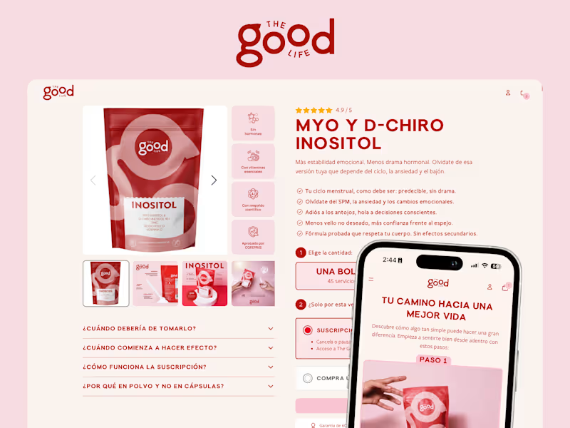
The Good Life | PDP Development + CRO 💖
39
838
Claude
(1)
Follow
Message
Harry Menday
City of Melbourne, Australia
Designer of intuitive digital products and websites
1x
Hired
11
Followers
Follow
Message
Designer of intuitive digital products and websites
3
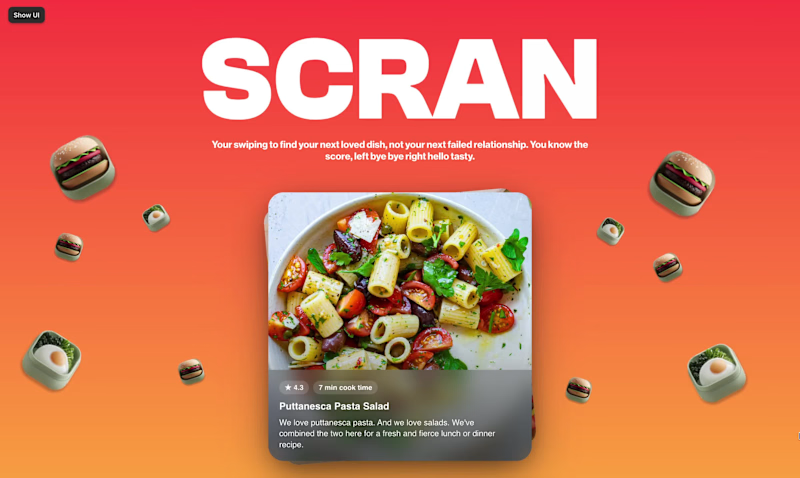
Swipe right on your next meal. New Framer component: a Tinder-style swipe mechanic but for built for food. The idea is simple. You're hungry, you don't know what you want, and scrolling a menu feels like homework. So instead — swipe. Like it, skip it, find your next meal in seconds. Built this as an interactive hero section to stress test the component and honestly, it's one of the most satisfying things I've made. The interaction feels fun, the animation is smooth, and the concept practically sells itself. No food app yet (if you're also interested hmu 😅). Framer components are too fun, more experiments to come!
3
3
283
1
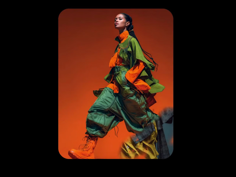
Creative exploration > perfection. New Framer component: a scratch-reveal effect that strips away the top image to uncover whatever's underneath. Customisable brush style, size, and particle control, and genuinely satisfying to interact with. Is it the most performance-optimised thing I've ever built? No. Load speed is a real consideration and I wouldn't throw this on a live site tomorrow. But that's not always the point. Testing, pushing, and understanding the limits of what's buildable in Framer is how you get better, and this was exactly that. May it find a home on the right project someday. For now, the component library grows. Three components deep. Just getting started.
1
271
2
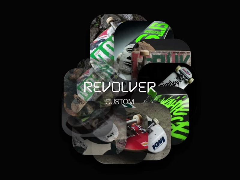
First Framer components. Built from scratch. Shipped same day. Set myself a challenge today, learn and build my first custom Framer components. Nothing groundbreaking, but functional & two of them. Revolver Text: a text scramble animation that cycles through characters before landing on the final word. The kind of detail that makes a hero section impossible to scroll past. Revolver Wheel: a fully custom 360° circular image animation. Smooth, continuous, and incredibly customisable. Both are built with full Framer UI controls, meaning they drop into any project and customise without touching a line of code. Day one of building Framer components. Not the last.
1
2
326
2
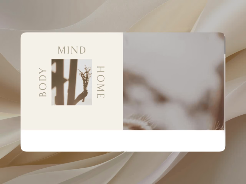
The House of Boheme: WordPress to Squarespace Migration for a Wellness & Lifestyle Brand The House of Boheme is a Norfolk-based wellness brand and they approached me to migrate their clunky, heavy Wordpress site to Squarespace. The client was insistent on moving to Squarespace. Not my platform of choice, I prefer the design freedom of Framer, but the brief was clear and the challenge was real: migrate a complex WordPress build, preserve the look and feel exactly, and make it work within Squarespace's constraints. That meant going deep on custom CSS to replicate typography, spacing, and layout details that Squarespace doesn't natively support. The result is a faithful recreation of the original site on a platform the client can confidently manage themselves.
2
331
Claude
(1)
Follow
Message
Angeline M
Melbourne VIC 3004, Australia
I help businesses deliver on-brand & scalable experiences
8
Followers
Follow
Message
I help businesses deliver on-brand & scalable experiences
1
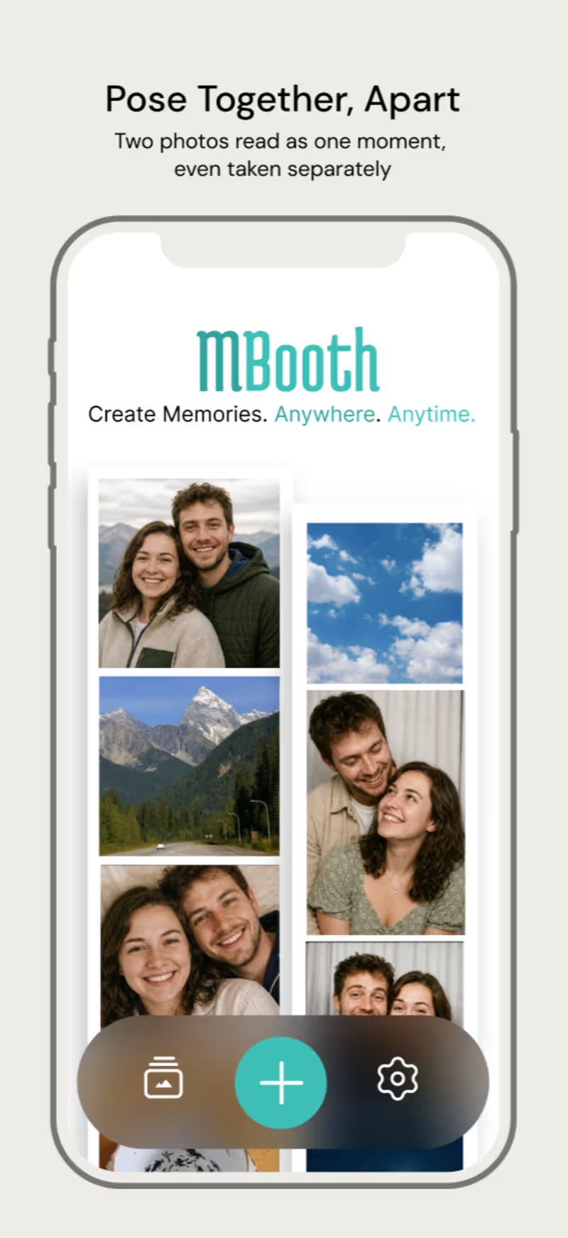
M.Booth turns two people's photos, taken apart, into one photobooth strip, as if they were taken together. It's built for long-distance couples who miss the small physical proof of a shared moment, the strip from a random Tuesday, not just the big anniversary photo. The core mechanic: one partner shoots first, the second partner joins via a link and poses against a live overlay of the first photo so the two line up naturally. Three snaps each, composited into a Korean-style photobooth strip, in a warm 90s-film style. - Started with Claude to create prompt - Generated design in Flowstep - Connected to Claude Code - Created an MVP web app : https://mbooth-nine.vercel.app/ (just the core mechanic of taking 1 photo asynchronously) - Created images in illustrator, gen AI - Refined, refined, refined in Flowstep and Figma https://app.flowstep.ai/file?activeFileId=932d9289-665b-41c8-a914-d8c0f5be037a
1
1
92
4
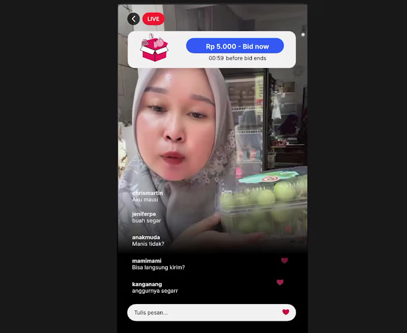
I built a live shopping UI concept built entirely in Rive, featuring original illustrated assets and a data-bound countdown timer that drives urgency into the flash sale experience. Every interaction is powered by Rive's state machine and timer data binding to feel truly connected to a real shopping stream. First time learning animation in Rive, honestly I spent too much time on debugging and figuring out how to make things work 😂 But I had fun doing the animation.
4
278
1
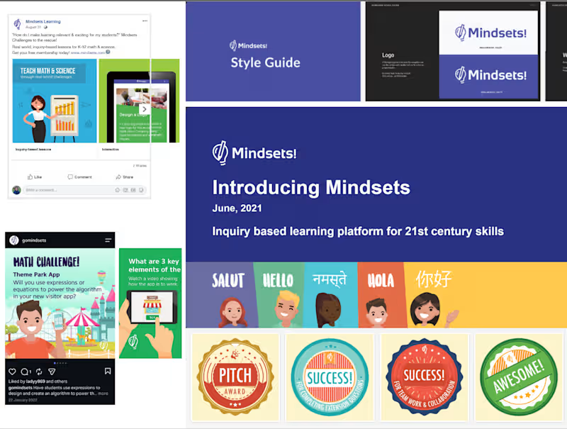
Building a cohesive digital media system for Mindsets Learning I built a cohesive brand system for Mindsets Learning, from style guide to social content, campaigns, website design, presentations, email, print materials, and video production.
1
97
14
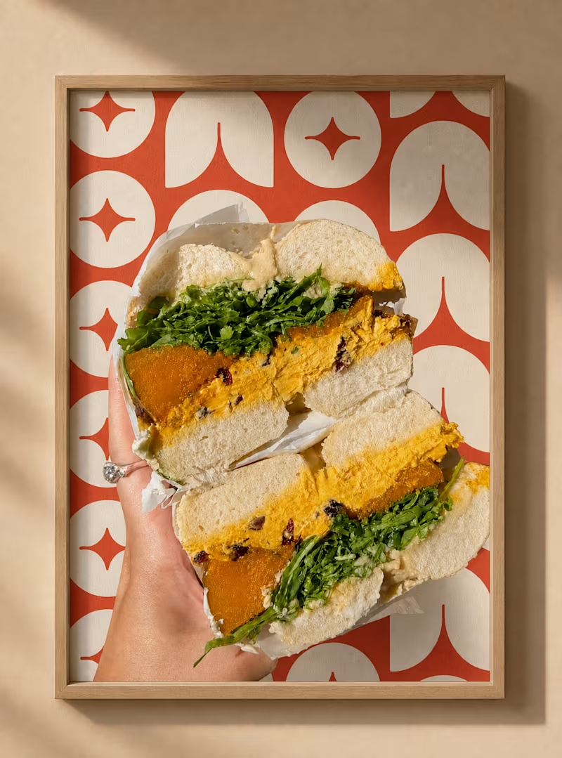
One day I want to open a bagel shop. For now, I got to prototype the whole brand instead, logo, packaging, poster, video using Envato's gen AI tools. It's a surprisingly solid all-in-one kit for image and video generation. My Workflow - Sketched the logo on paper first, pulling inspiration from Envato's geometric patterns, I go for a monochromatic, warm, geometric logo. - Built the final logo in Illustrator, then handed it to AI with clear sketches and direction. - Used AI to rapid-generate mockups across t-shirts, packaging, and posters. - Iterated through a brand animation, testing multiple storyboard approaches before landing on the final version. - Generate music via Envato AI then edit in After Effects. My Human by Design Moment My first animation storyboard for the logo was low-fidelity, so the AI output felt random. I assumed the fix was more detail, so I redid it with the final logo and tighter instructions. AI overcorrected. It added motion and elements I never asked for, and the result was more confusing, not less. I made a different call. Instead of adding more, I stripped the storyboard down to just two frames: a start and an end. No extra instruction for AI to misread, no room for it to improvise. Designers has design in mind, our goal is to visualise that vision. AI helps along the way, but only when I gave it clarity. Simpler instruction with examples what finally got a clean, consistent animation out of it, one I could adapt across other bagel without starting over. Curious on how other make the AI works? Youtube: https://youtu.be/-HQX598KRK0
12
14
861
Claude
(1)
Follow
Message
Explore people