
Brand & Webflow Sites for Health Practitioners
- $•••••
- Earned
- 13x
- Hired
- 5.0
- Rating
- 310
- Followers
Brand & Webflow Sites for Health Practitioners


ICTIM Brand Refresh — From Generic to Clinical
The Irish College of Traditional and Integrative Medicine needed its visual identity to match the institution it actually is. Academically rigorous, clinically grounded, and accredited. The original palette of navy and amber gold read as informal and inconsistent with the repositioning the brand needed.
The new palette centres on Ultramarine as the primary brand colour, with Dark Cyan as a secondary accent. Both colours signal precision and credibility to a healthcare professional audience, replacing the warmer, more casual tones of the original site. Inter was selected as the sole typeface across the site, PDFs, and all brand materials for its legibility and clinical neutrality.
A brand guide should be documented covering colour usage, typography, voice and tone, and UI components, giving the institution a single reference point for every future decision.
6
786

Visual Content Creator | AI Engineer

Presentation & Visual Designer

Excited to share this mockup brochure design for Summit Vista Marketing, a fictional full-stack marketing agency based in Boulder, CO.
The goal was to create a bold, professional, and engaging conference piece that captures the brand’s energy while keeping the layout clean and easy to navigate. The brochure highlights the company’s core services, key differentiators, and conference event details — all tied together with a consistent color palette, modern typography, and balanced white space.
32
376


Transforming Vision to Identity




Course Developer, Web, Logo and Brand Strategist, Life Coach

Course Developer, Web, Logo and Brand Strategist, Life Coach

Website Designer, Developer, & Full-Stack Marketer

Pitch deck expert: over $2.1 billion raised by clients


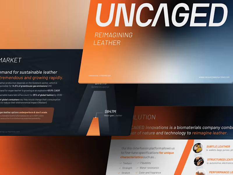

Crafting Dynamic Videos and Designs for Brands & Businesses
- 5.0
- Rating
- 14
- Followers
Crafting Dynamic Videos and Designs for Brands & Businesses

Designed this poster for the 2026 Fallout Fringe Festival, an art festival located in Las Vegas. When talking with the client, we discussed utilizing some sort of atomic bomb/nuclear imagery on the poster, whether it be a mushroom cloud from a nuclear explosion or some sort of rocket. I had the idea to create an atomic core, cracking and emitting a green glow, capturing the message that ideas are about to detonate at the festival.
I referenced a lot of historical images of cores that were used for atomic bombs, including the Oppenheimer atom bomb core. I also referenced a lot of 80s horror film posters to see what color schemes were used and how they were textured.
14
234


