Third Place Supply Animated Ecommerce Website

Halle Clark


Third Place Supply — Animated Ecommerce Website & Brand Experience
Project Overview
Client: Third Place Supply
Role: Website Designer, UI Designer, Frontend Developer
Tools: Figma Make, React, TypeScript, GSAP, ScrollTrigger, Tailwind-style styling
Project Type: Animated ecommerce website concept, scroll-driven brand experience, lifestyle product landing page
Third Place Supply is a lifestyle ecommerce concept built around portable kits for people who work, travel, reset, and move through different “third places” throughout the day. Think coffee shops, airports, hotels, parks, coworking spaces, and everywhere in between.
I wanted the website experience to feel like the brand itself: organized, warm, cinematic, and built for motion.
This project focused on creating a scroll-driven landing page with layered storytelling, product education, interactive animation, customer lifestyle imagery, and a premium e-commerce feel. The final result is a visually engaging website experience that turns a simple product category into a full brand world.
The Challenge
Third Place Supply needed to communicate a product idea that is both practical and emotional.
The kits are functional: they organize cables, chargers, travel items, notebooks, toiletries, and everyday carry essentials. But the deeper value is about helping people feel prepared, calm, and grounded wherever they are.
The challenge was to make that value clear without relying on a plain ecommerce layout.
Instead of building a standard homepage with product cards and basic copy, I wanted to create a scroll-driven brand experience that shows the user the problem, introduces the rhythm of a scattered day, and then reveals the kits as the solution.
The site needed to feel:
Premium but approachable
Editorial but still conversion-focused
Animated without feeling gimmicky
Useful for ecommerce but memorable enough for brand storytelling
The Solution: A Scroll-Driven Brand Story
I designed the homepage as a sequence of animated sections that guide the user through the brand’s core story.
The experience begins with the idea of a life in motion. From there, the animation introduces objects spilling out of an open kit, then transitions into product moments, a scattered-day problem section, a timeline-style day map, and finally the solution: Third Place Kits.
Rather than treating animation as decoration, the animation became part of the storytelling system. Each motion choice helps the user understand the product faster.
The site moves from:
Prepared → scattered → moving through the day → discovering the solution → social proof
That flow gives the homepage a narrative arc instead of making it feel like a static product catalog.
Design Direction
The design uses large visual moments, layered imagery, soft shadows, and scroll-based transitions to make the product feel tactile.
Key visual choices included:
A dark navy hero section to create a premium first impression
Warm ivory sections to give the page breathing room
Product and customer images layered like an editorial collage
Subtle grid textures to create structure
Rounded image cards for a softer lifestyle feel
Gold/tan accent details to guide attention
Large bold headlines that anchor each section
The site was designed to feel like a brand you would trust before you even read every word.
Engaging Animation System
Animation was one of the biggest parts of this project.
I used scroll-based GSAP animations to create an experience that feels alive as the user moves through the page. Instead of simply fading sections in and out, each section has its own motion behavior.
Some of the major animation moments include:
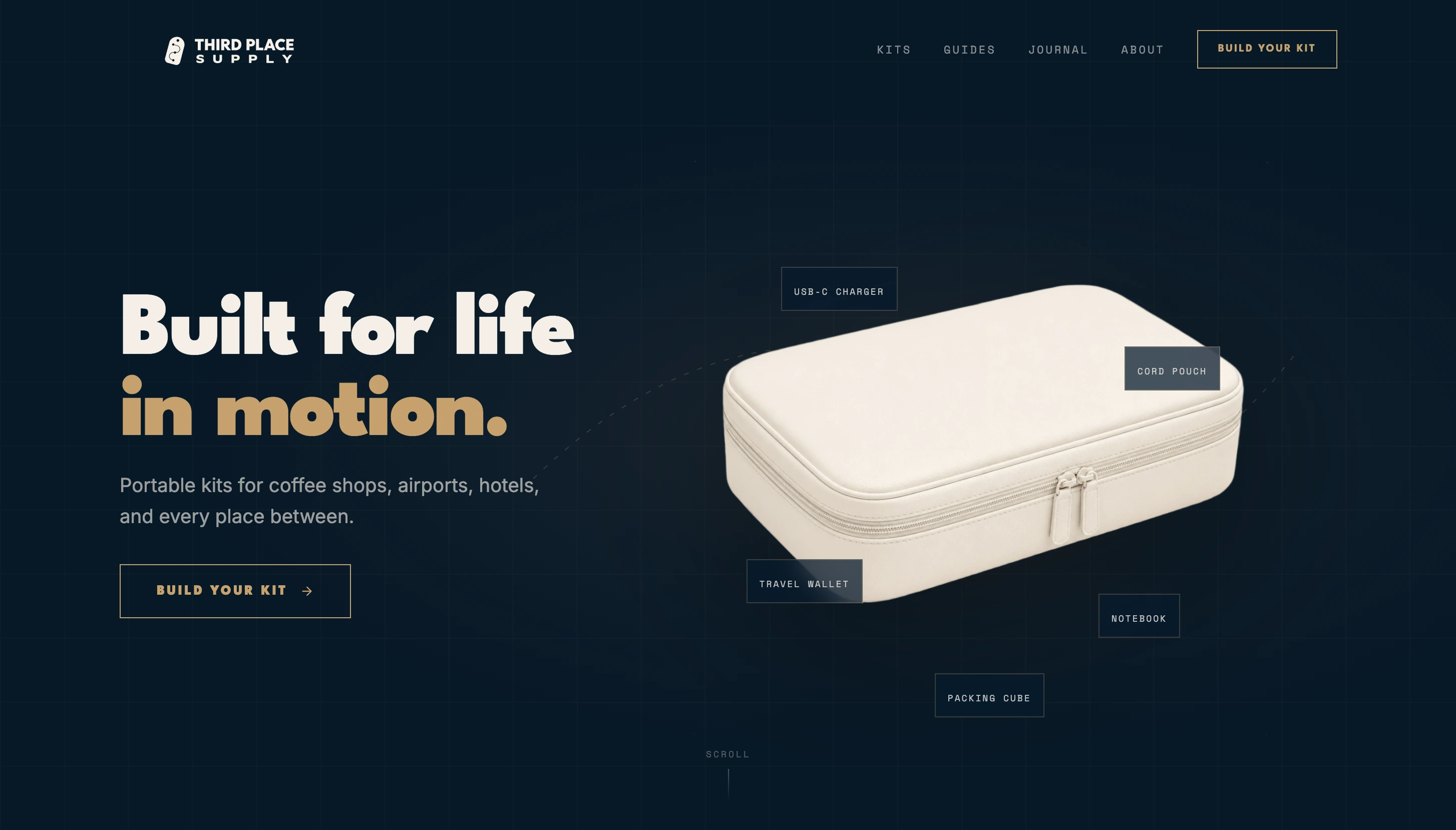
Hero Kit Opening Animation
The hero begins with a closed kit. As the user scrolls, the kit opens and objects lift out of it, float, and move through the canvas. This immediately communicates the product idea visually: a kit full of useful essentials for life on the go.
Product Moment Reveal
After the opening animation, the experience transitions into kits by moment. Product cards enter with staggered motion, creating a clean ecommerce section that still feels connected to the animated introduction.
Scattered Day Transition
The design then shifts into a warmer ivory section showing the everyday problem: scattered essentials, tangled cords, forgotten items, and the friction of moving through a busy day.
Day Map Timeline
The day map section uses a vertical timeline to show how quickly someone moves through different places in one day: coffee shop, coworking space, park bench, airport gate, and hotel room. The animation gives this section enough time to fully land on screen before transitioning into the kit solution.
Kit Solution Carousel
The kit solution section introduces a carousel-style product showcase. Kits rotate through the spotlight while supporting images frame the featured product. This makes the section feel dynamic without overwhelming the user.
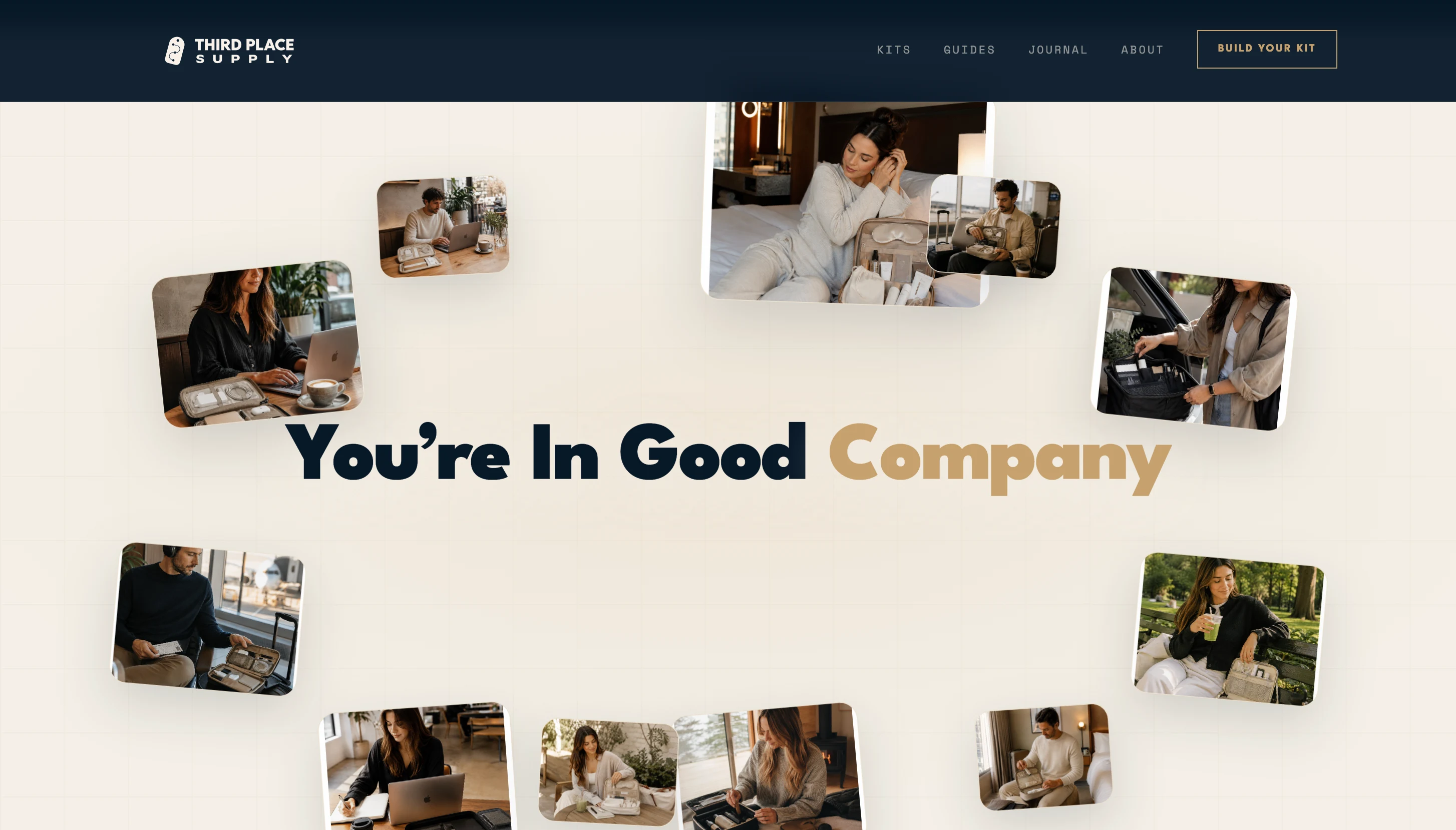
Good Company Customer Collage
The customer proof section starts with lifestyle images gathered near the center of the screen. As the user scrolls, the images scatter outward and frame the headline “You’re In Good Company.” This turns social proof into a visual moment instead of a static testimonial block.
This section was especially important because it makes the brand feel used, loved, and lived-in.
Results & Impact
The final concept feels much more like a premium brand experience than a standard ecommerce homepage.
The scroll interactions make the site feel memorable, while the product sections still remain clear and conversion-focused. The homepage now introduces the brand, explains the product use cases, builds emotional context, and creates social proof through lifestyle imagery.
The strongest result is that the site communicates the brand’s value quickly:
Third Place Supply is not just selling bags or organizers. It is selling a calmer way to move through the day.
The animations help make that message easier to feel, not just understand.
Like this project
Posted Jul 11, 2026
I designed and built an animated e-commerce website for Third Place Supply, a lifestyle brand offering portable kits for coffee shops, hotels, and other places.
Likes
1
Views
156