Common Ground Visual Identity Project

Halle Clark


Common Ground — Community Dining Brand & Visual Experience
Project Overview
Client: Common Ground
Role: Brand Designer, Visual Designer, Art Director, AI Creative Director
Tools: Envato Elements, Envato AI, Canva, DaVinci Resolve, ChatGPT
Project Type: Fictional restaurant brand, visual identity system, community-focused campaign, menu design, merchandise, social content, and environmental mockups
Common Ground is a fictional neighborhood dining concept built around shared tables, home-style food, and meaningful human connection.
The brand was inspired by the kind of neighborhood culture where people knew who lived next door, borrowed sugar or eggs, dropped off homemade dishes, and gathered around the table without needing a special occasion.
I wanted to translate that familiar warmth into a modern, inclusive community space where people of different ages, backgrounds, and experiences could come together over food.
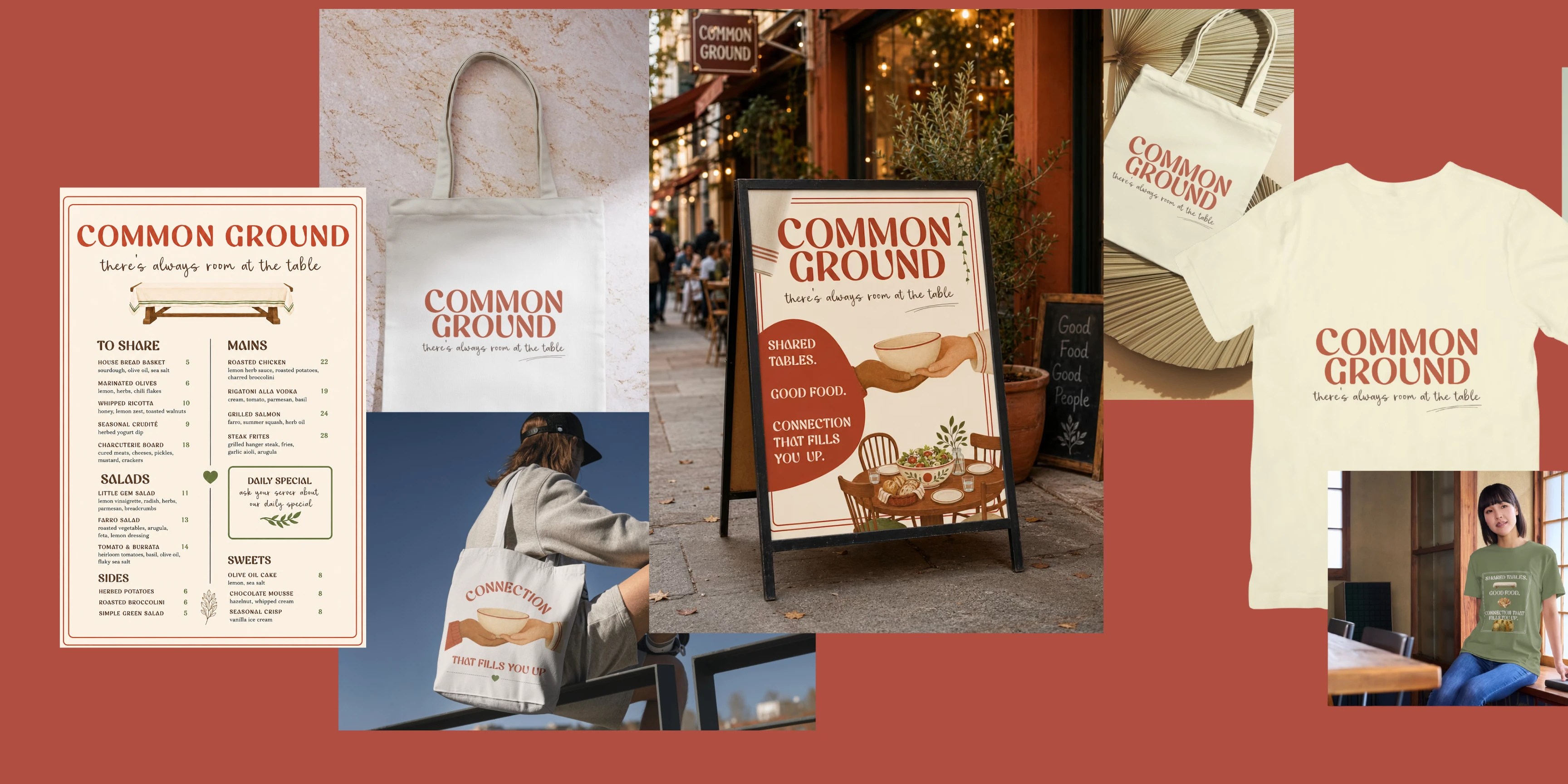
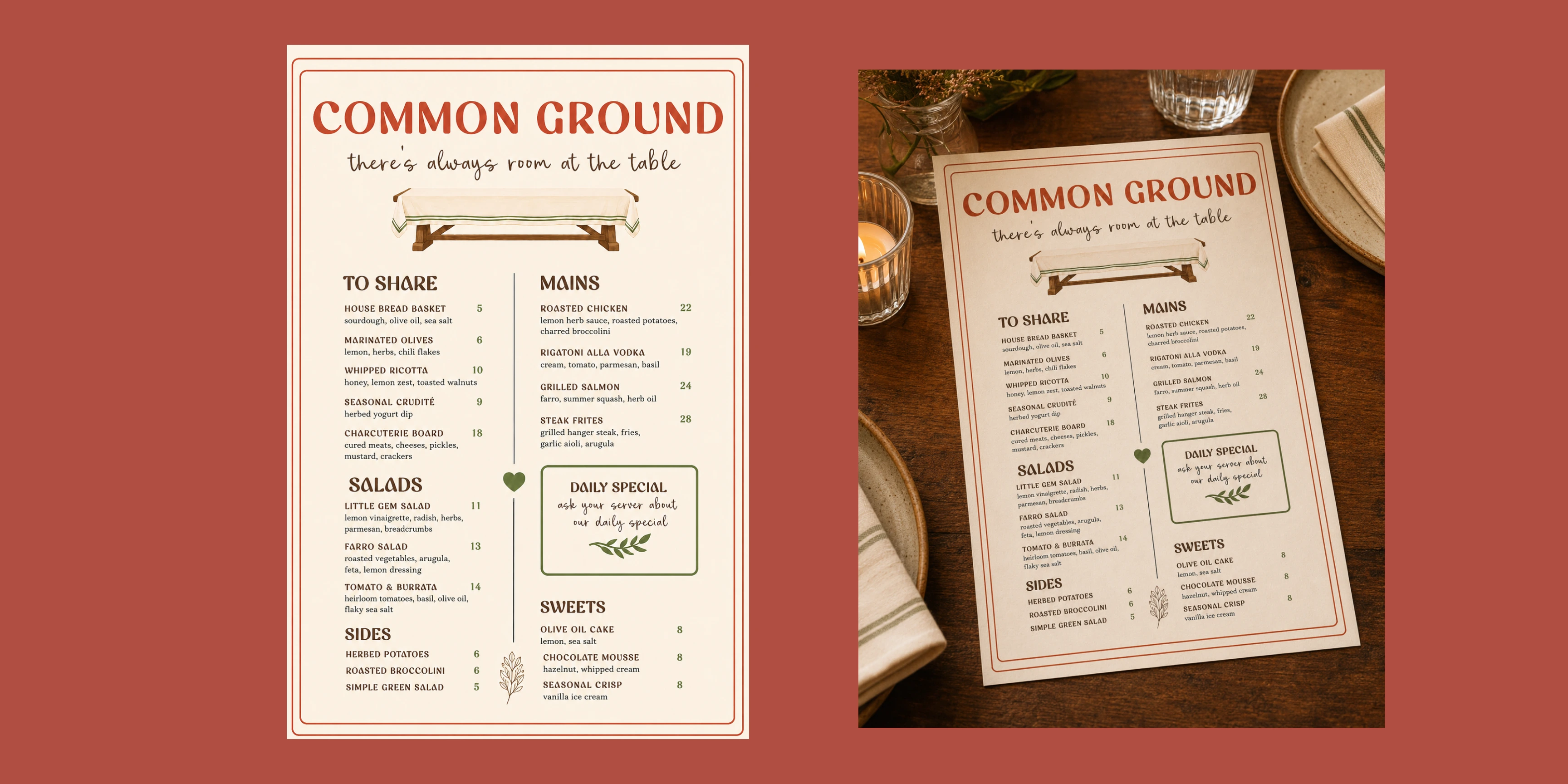
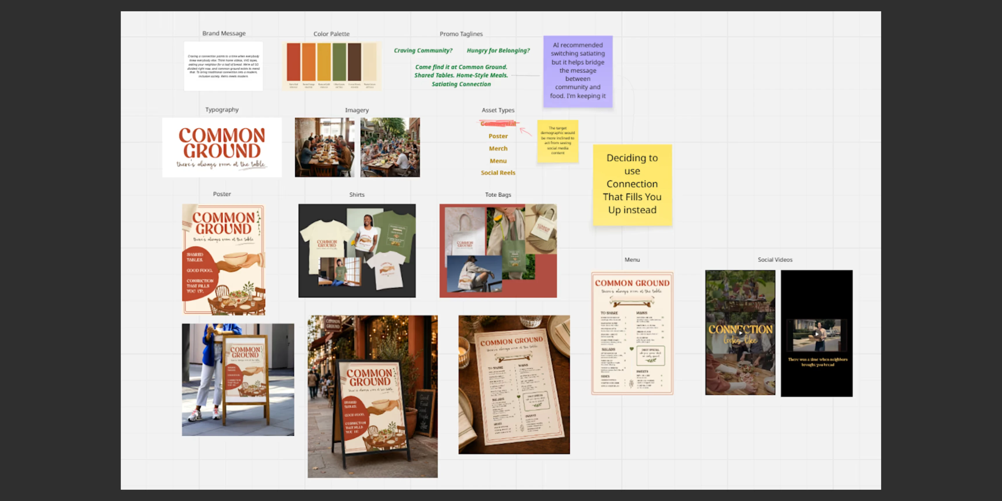
The project focused on creating a complete visual world for the brand, including the identity, campaign messaging, custom illustrations, AI-generated imagery, restaurant menu, promotional posters, merchandise, environmental mockups, and social reel concepts.
The final result is a warm, retro-inspired brand that feels nostalgic without being stuck in the past.
The Challenge
Common Ground needed to communicate an idea that was both practical and emotional.
On the surface, it is a neighborhood restaurant serving comforting, home-style food at communal tables. But the deeper value is about helping people feel welcomed, recognized, and connected in a time when everyday community can feel harder to find.
The challenge was to express that emotional purpose without creating a generic farm-to-table restaurant or relying too heavily on nostalgia.
The identity needed to feel:
Retro but still relevant
Warm without becoming overly rustic
Inclusive rather than exclusive
Expressive without feeling cluttered
Familiar enough to feel comforting
Distinct enough to feel like a real brand
My first direction used muted olive, brown, and cream tones with soft editorial typography and polished restaurant imagery.
It looked attractive, but it felt too safe.
The design communicated warmth, but it could have belonged to almost any modern neighborhood restaurant. It did not yet express the deeper story of Common Ground or the kind of connection the brand was meant to restore.
The Solution: Traditional Connection Reimagined for Today
I completely reimagined the brand as a modern community dining space inspired by the personality of a 1970s neighborhood supper club.
Instead of recreating the past literally, I focused on translating its most meaningful qualities: familiarity, generosity, shared rituals, and the feeling that someone would always make room for you.
The new direction introduced bold retro typography, warm handwritten accents, vintage-inspired food illustrations, tactile textures, and a richer palette of terracotta red, burnt orange, deep olive, cocoa brown, and warm ivory.
The visual identity became more expressive, recognizable, and emotionally specific.
The final direction can be summarized as:
Retro personality. Modern structure. Human warmth.
That balance allowed Common Ground to feel nostalgic while still representing a diverse, inclusive community in the present.
Brand Strategy & Messaging
Common Ground is positioned as more than a place to eat.
Connection is part of the experience by design.
The restaurant is imagined as a place for solo diners, families, newcomers, older neighbors, creatives, and anyone looking for a comfortable place to sit down and feel included.
The main tagline became:
There’s always room at the table.
This line captures the brand’s promise in a simple and emotional way. It speaks to the physical experience of communal dining while also expressing welcome, inclusion, and belonging.
Supporting campaign messaging included:
Craving community? Starving for connection?
Come find it at Common Ground.
And:
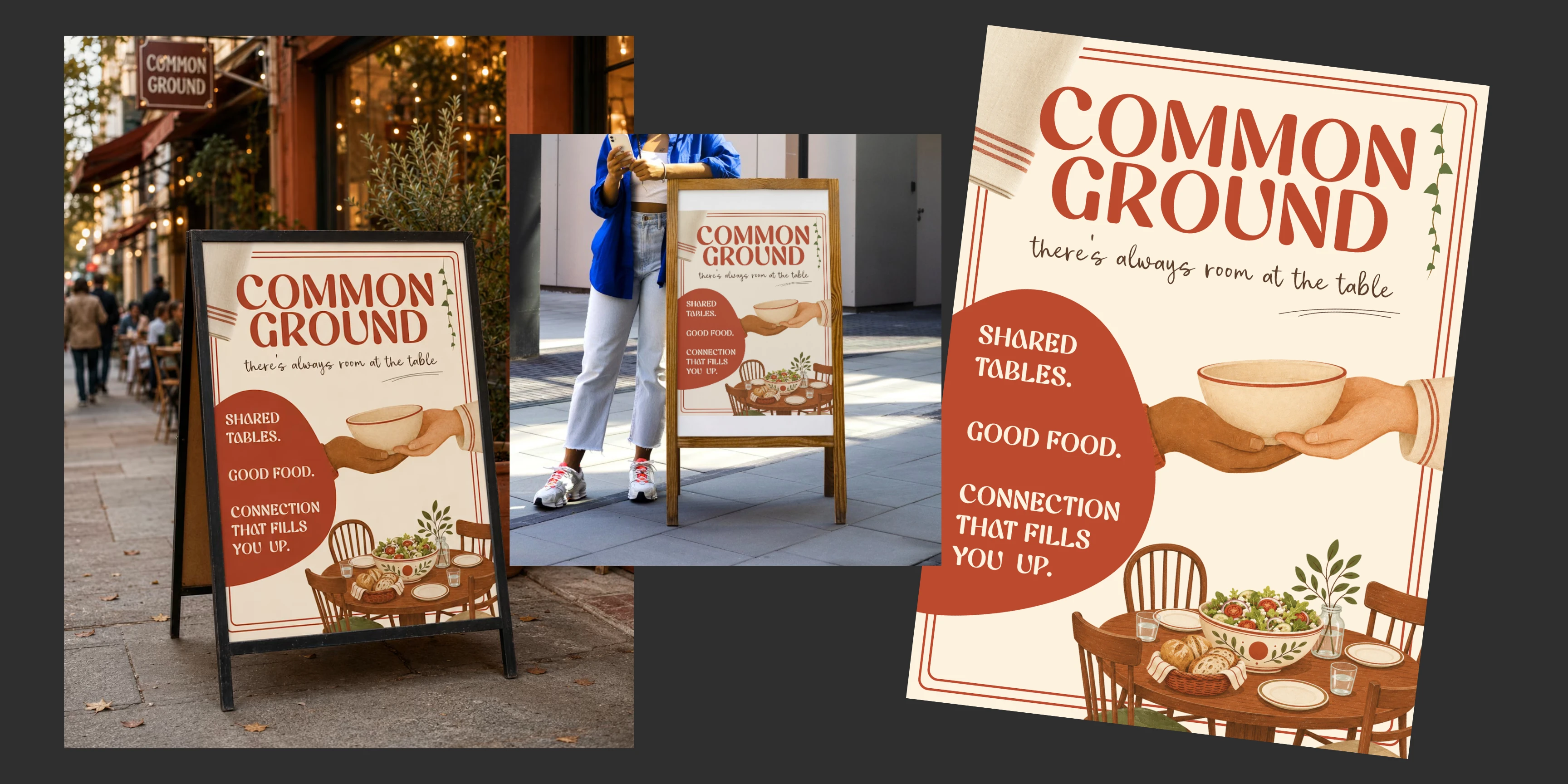
Shared tables. Good food. Connection that fills you up.
The copy uses food language to communicate a deeper emotional need. The meal may bring someone through the door, but belonging is what the brand ultimately provides.
Design Direction
The visual identity was inspired by vintage neighborhood restaurants, community posters, handwritten recipes, old cookbooks, family dining rooms, and 1970s supper-club graphics.
Key visual choices included:
A bold rounded display typeface for the primary wordmark
Handwritten script for personal, emotional messaging
Warm ivory backgrounds instead of stark white
Terracotta red and burnt orange for warmth and appetite
Deep olive for grounding and familiarity
Cocoa brown for typography, illustration, and structure
Soft print textures and subtle imperfections
Vintage-inspired food and hospitality illustrations
Clean modern spacing to keep the system from feeling dated
Inclusive community imagery showing different generations together
The logo is intentionally bold and expressive, while the handwritten tagline softens the identity and makes it feel personal.
The combination gives the brand enough personality to stand out while still feeling familiar and approachable.
Brand Strategy & Messaging
Common Ground is positioned as more than a place to eat.
Connection is part of the experience by design.
The restaurant is imagined as a place for solo diners, families, newcomers, older neighbors, creatives, and anyone looking for a comfortable place to sit down and feel included.
The main tagline became:
There’s always room at the table.
This line captures the brand’s promise in a simple and emotional way. It speaks to the physical experience of communal dining while also expressing welcome, inclusion, and belonging.
Supporting campaign messaging included:
Craving community? Starving for connection?
Come find it at Common Ground.
And:
Shared tables. Good food. Connection that fills you up.
The copy uses food language to communicate a deeper emotional need. The meal may bring someone through the door, but belonging is what the brand ultimately provides.
Design Direction
The visual identity was inspired by vintage neighborhood restaurants, community posters, handwritten recipes, old cookbooks, family dining rooms, and 1970s supper-club graphics.
Key visual choices included:
A bold rounded display typeface for the primary wordmark
Handwritten script for personal, emotional messaging
Warm ivory backgrounds instead of stark white
Terracotta red and burnt orange for warmth and appetite
Deep olive for grounding and familiarity
Cocoa brown for typography, illustration, and structure
Soft print textures and subtle imperfections
Vintage-inspired food and hospitality illustrations
Clean modern spacing to keep the system from feeling dated
Inclusive community imagery showing different generations together
The logo is intentionally bold and expressive, while the handwritten tagline softens the identity and makes it feel personal.
The combination gives the brand enough personality to stand out while still feeling familiar and approachable.
Results & Impact
The final concept feels like a complete neighborhood brand rather than a generic fictional restaurant.
The identity communicates the experience quickly:
Common Ground is not only serving food. It is creating a place where people can feel welcomed, included, and connected.
The strongest result is the balance between nostalgia and modern relevance.
The retro typography, warm colors, and vintage illustrations make the brand feel familiar, while the clean layouts and inclusive imagery keep the concept grounded in the present.
The project also demonstrates how AI can support a creative process without replacing human direction.
AI expanded the range of visual possibilities, but the final brand came from recognizing what felt wrong, changing direction, rejecting technically successful outputs, simplifying ideas, and shaping every element around one emotional purpose.
Common Ground became a visual story about the small interactions that help people feel less alone: passing a dish, pulling out another chair, meeting someone new, and staying at the table a little longer.
There’s always room at the table.
Like this project
Posted Jul 24, 2026
Developed a nostalgic yet modern brand identity for Common Ground, a community dining concept.