Freelancers using Adobe Photoshop in Alberta
Sign Up
Post a job
Sign Up
Log In
Filters
2
Projects
People
Vlad Savruk
Calgary, Canada
I design Identity Systems and Product Design
2x
Hired
5.0
Rating
5
Followers
Follow
Message
I design Identity Systems and Product Design
1
Castle, Brand Identity + Logo
1
6
1
Fit Note, Product Design + Brand Identity
1
3
1
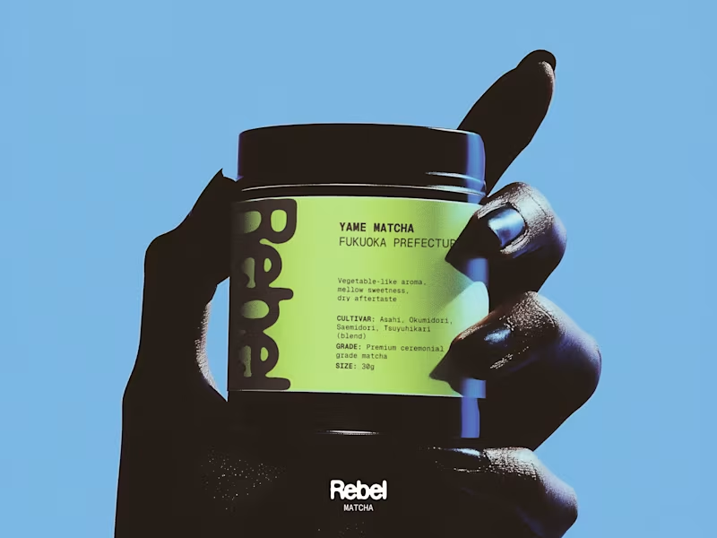
Rebel Matcha, Brand Identity + Packaging
1
4
1
Modern Brand Identity for Axe.Software
1
5
Adobe Photoshop
(3)
Follow
Message
Trina Bloemen
Edmonton, Canada
Visual Designer 🎨💻 | Storytelling for trusted brands
2x
Hired
5.0
Rating
3
Followers
Follow
Message
Visual Designer 🎨💻 | Storytelling for trusted brands
0
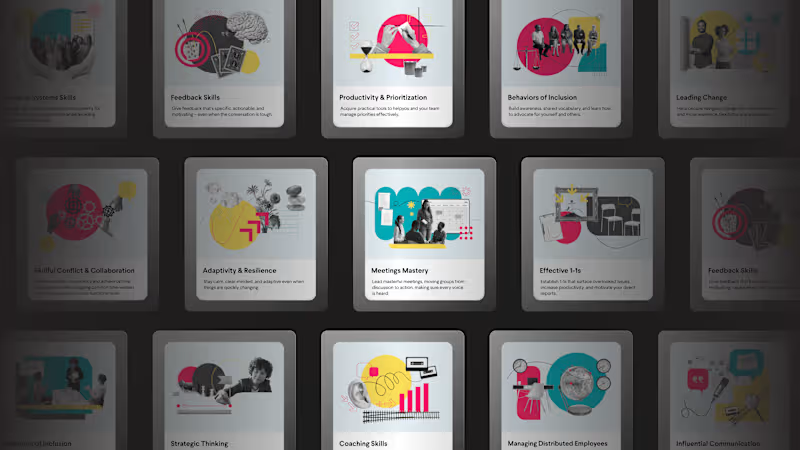
Branded Marketing Collateral for LifeLabs Learning
0
12
0
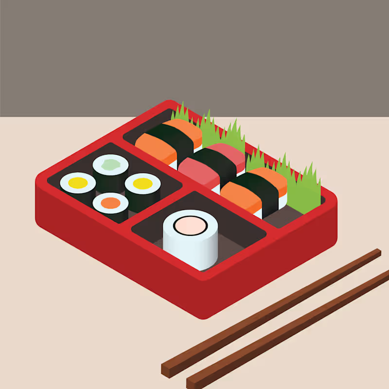
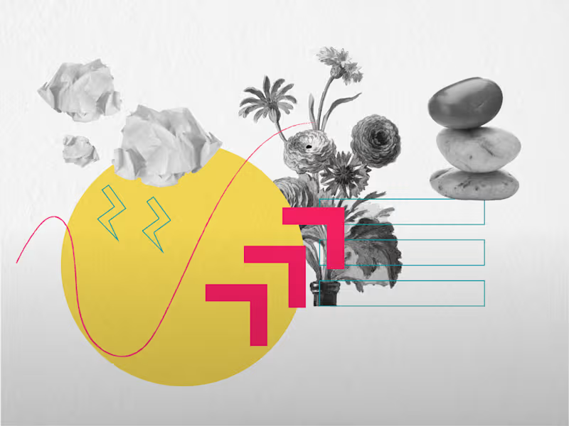
Custom Illustration for eLearning Workshop Catalogue
0
10
0
Digital Illustration
0
5
0
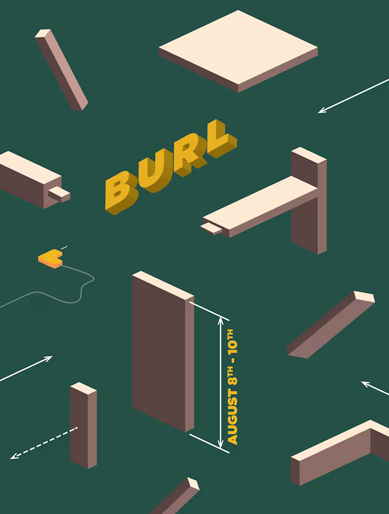
BURL: A Women's Woodworking Festival Branding
0
25
Adobe Photoshop
(5)
Follow
Message
Vladlena Pavlenko
Calgary, Canada
Create brand identity with meaning
Follow
Message
Create brand identity with meaning
0
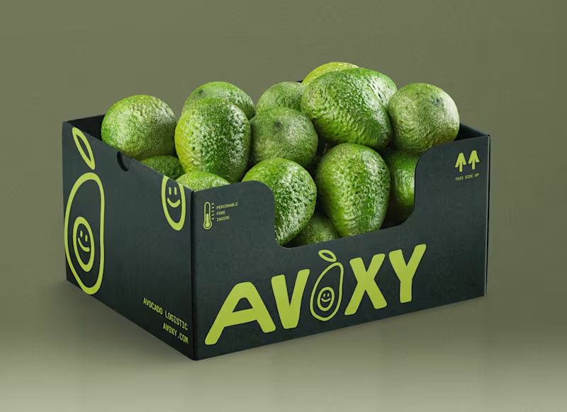
Identity design for Avoxy
0
105
0
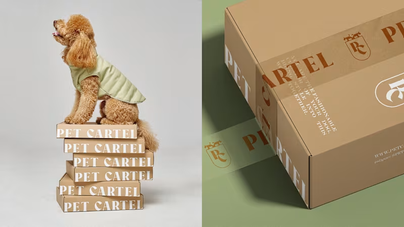
Identity design for dog's clothes brand
0
88
0
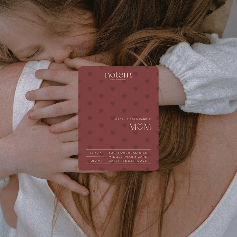
nōtem / brand design and packaging
0
42
0
NOTERA - tube design
0
34
Adobe Photoshop
(3)
Follow
Message
Chris Ryan
Calgary, Canada
Hardworking Developer: iOS, Web, Graphic Design
Follow
Message
Hardworking Developer: iOS, Web, Graphic Design
0
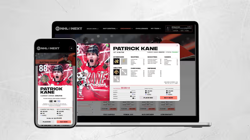
NHL Next (Concept)
0
8
0
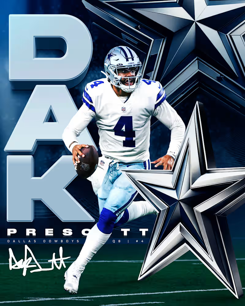
Personal Design Work
0
2
0
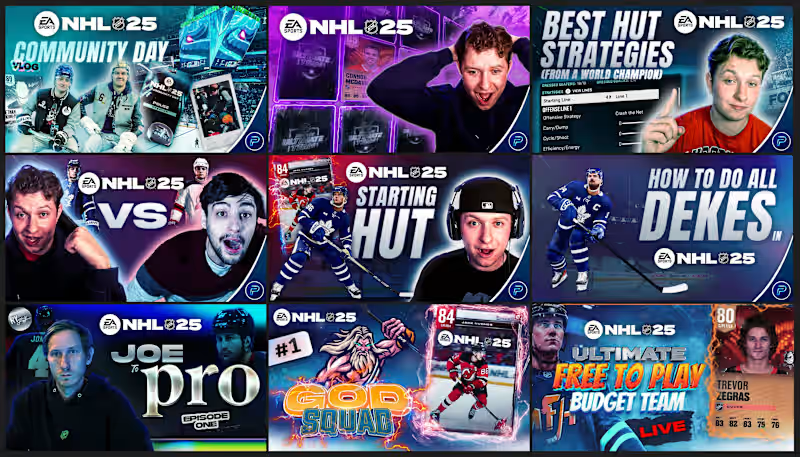
YouTube Thumbnail Work
0
8
0
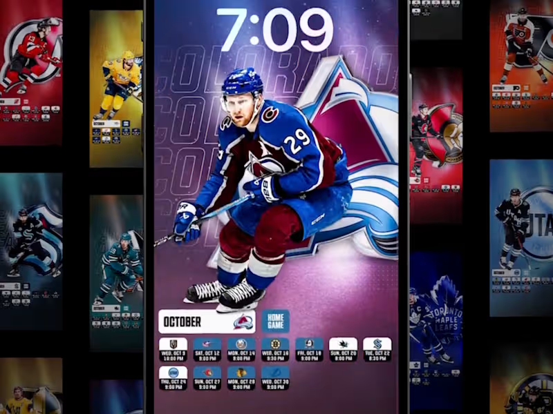
Mobile NHL Wallpaper Schedules
0
5
Adobe Photoshop
(4)
Follow
Message
Brooklyn Long
Calgary, Canada
Graphic Designer ▹ Branding, Marketing, Packaging & More
Follow
Message
Graphic Designer ▹ Branding, Marketing, Packaging & More
1
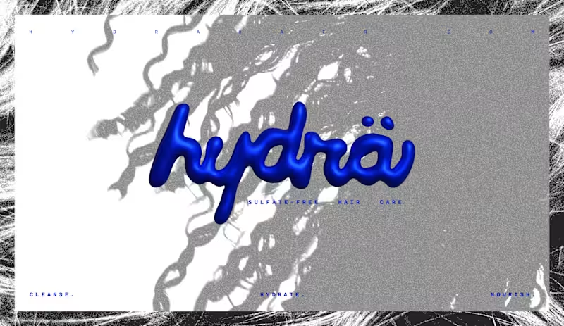
Hydrä Hair Care
1
13
0
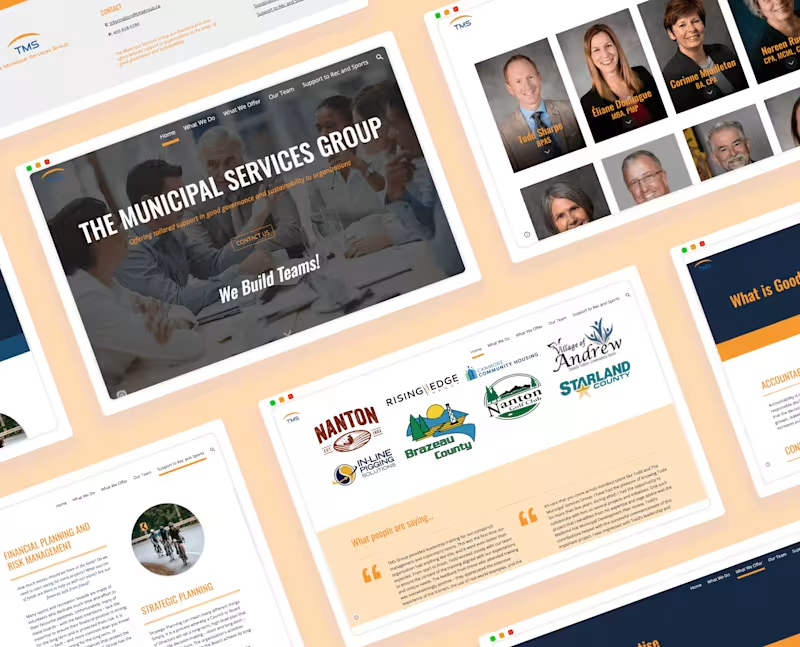
The Municipal Services Group | Web Redesign
0
25
0
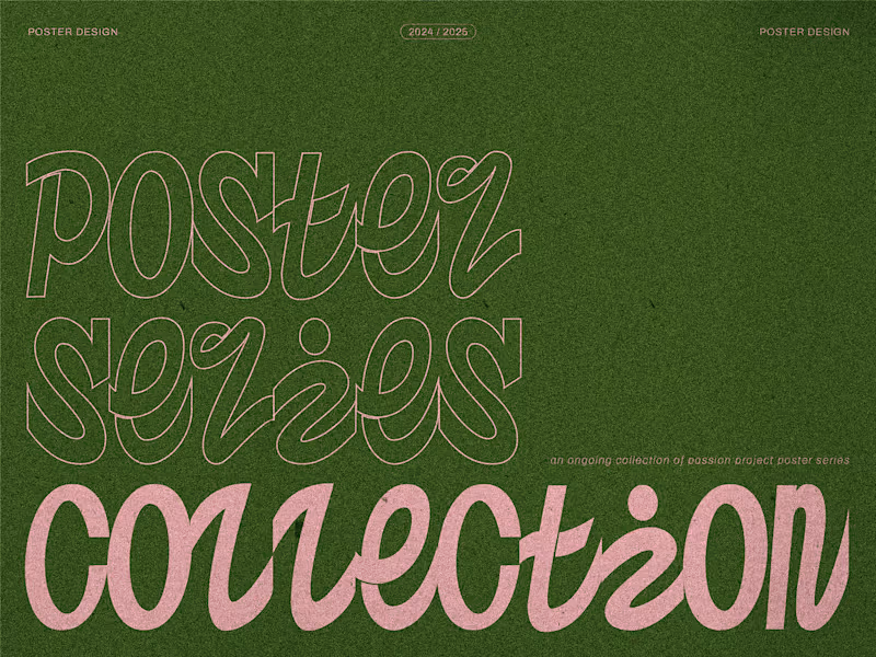
Poster Series Collection
0
29
0
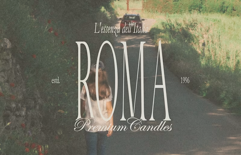
Roma Premium Candles
0
24
Adobe Photoshop
(5)
Follow
Message
Amar Elkaz
Red Deer, Canada
Brand designer helping founders build identities that scale.
New to Contra
Follow
Message
Brand designer helping founders build identities that scale.
0
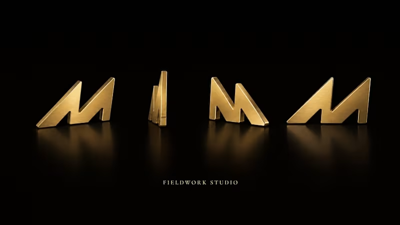
A self-initiated identity system built around a single hypothesis: in luxury B2C, restraint is the differentiator, not the constraint. Fieldwork Studio is a fictional boutique architecture and interior design practice for urban professionals who value atmosphere, materiality, and restraint. The brand was developed to read closer to a private design house than a service business, closer to a monograph than a website. The system is anchored by a single architectural mark: three descending peaks drawn in negative space, reading as a roofline, a threshold, or a hand-drawn signature depending on context. Every decision after that — the six-variant logo system, the warm-toned palette led by Midnight Black and Gold Foil, the pairing of Cormorant Garamond with Geist, the material library of black marble, smoked oak, and brushed bronze — was tuned to hold the same register. Areas explored: Positioning a Creator/Sage archetype that reads as cultured without tipping into cold or pretentious Building a logo system that survives foil, deboss, embroidery, and 16px favicons without losing identity Treating materials as a second brand language, codified alongside type and color with their own ratios and specifications Writing a voice guide that bans the words most luxury brands lean on ("premium," "stunning," "elevate your lifestyle") in favor of specific, material-led language The output is a 12-section identity book covering positioning, mark construction, lockups, color ratios, typographic pairings, voice, photography direction, material library, and applications across stationery, packaging, signage, social, and web.
0
26
0
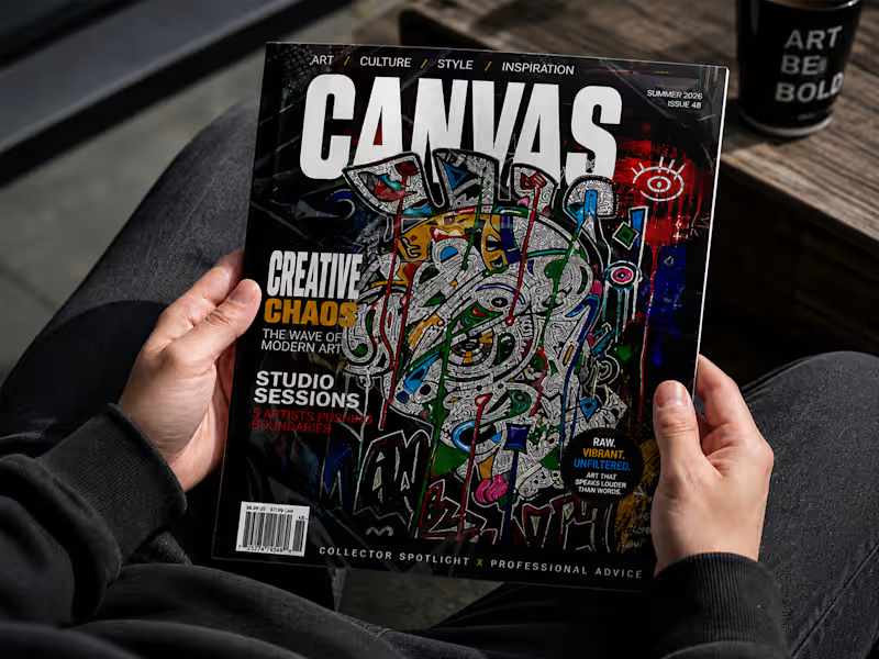
Print is not dead. It's just raising the bar. Canvas Magazine (Summer 2026, Issue AB) is an independent editorial publication built around art, culture, style, and inspiration. The brief was clear: design a print magazine that could hold its own on a shelf next to Kinfolk and Architectural Digest — while speaking to a completely different audience. The design direction leans into controlled chaos. Raw, expressive artwork by Art by Bart anchors the visual identity, with a high-contrast black editorial system built around it. Rather than competing with the cover art, the typography works with it — oversized masthead, bold section headers, and a tight three-color palette (white, gold, red) that gives structure without softening the energy. Key design decisions: Cover system: Full-bleed artwork with a layered typographic hierarchy — masthead, feature callouts, and badges coexist without crowding Interior spreads: "Beyond the Lines" feature uses an asymmetric layout to mirror the editorial content — breaking the grid where the story calls for it Newsstand positioning: Designed to command attention in-context, not just in isolation. The cover reads at distance and up close The result is a magazine identity that looks like it belongs in culture, not just on a shelf.
0
51
3
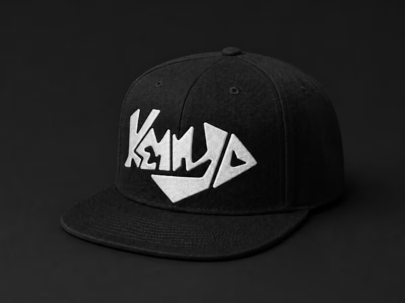
Custom lettering mark for Kenny D, an electronic music artist rooted in high energy and urban culture. The Brief Kenny D needed a mark that could hold its own across stages, merchandise, and digital — something instantly recognizable without relying on color or complexity. The Approach The wordmark is built entirely from custom letterforms, engineered so the negative space collapses into a single unified shape — a diamond silhouette with directional tension. Every cut and angle references the sharp, kinetic energy of electronic music. Nothing is borrowed from existing typefaces. The system scales across three expressions: Wordmark — full name lockup for primary use Emblem — wordmark contained within the diamond form, optimized for embroidery and print Icon — reduced mark for app icons, stickers, and small-format applications The Result A brand mark that works as hard as the music behind it — built for merch drops, festival visuals, and everything in between.
3
75
0
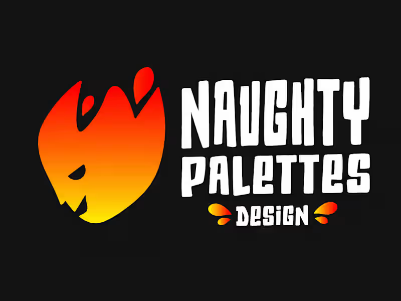
Naughty Palettes Design needed a brand identity that matched its energy — bold, expressive, and impossible to ignore. The mark is built around a flame character: a mischievous face embedded within fire, communicating passion, creativity, and a design sensibility that doesn't play it safe. The gradient moves from deep red (#FF1E00) through orange (#FF7A00) to yellow (#FFE600) — a deliberate progression that mirrors the intensity of the creative process from ignition to output. Typography reinforces the brand personality. The custom-style wordmark is chunky, confident, and carries a streetwear-adjacent edge — sitting in contrast to the "Design" sub-brand treatment, which grounds the playfulness with something more structured. The identity system scales cleanly across touchpoints. Business cards use the flame curve as a layout device, dividing the card into a branded front and clean reverse. Applied to merchandise — a black cap — the icon holds its own without the wordmark, proving the mark has the strength to function as a standalone asset. Three words. One direction: Creative. Bold. Impactful.
0
103
Adobe Photoshop
(6)
Follow
Message
Patricia Veldstra
Edmonton, Canada
Print and Digital Book Designer
Follow
Message
Print and Digital Book Designer
0
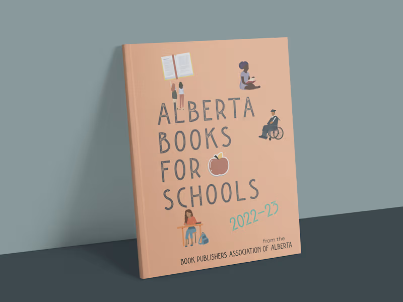
Alberta Books for Schools
0
36
0
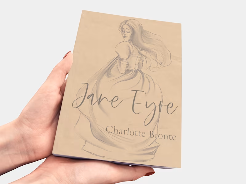
Jane Eyre Book Design
0
28
0
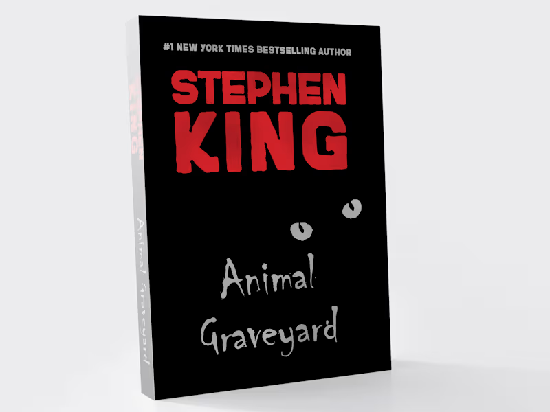
Pet Sematary Jacket Redesign
0
58
0
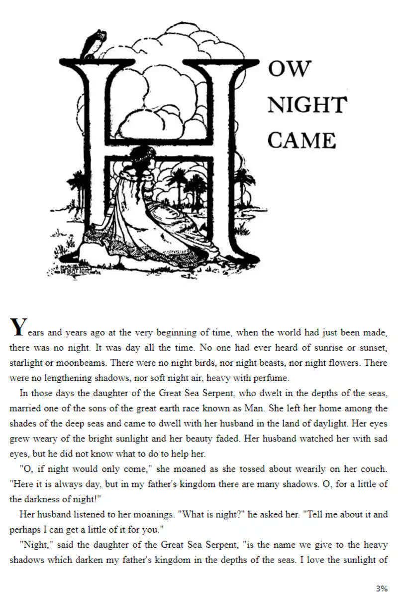
Fairy Tales From Brazil
0
15
Adobe Photoshop
(3)
Follow
Message
Mariia Reshetova
Calgary, Canada
Graphic Designer
Follow
Message
Graphic Designer
0
Lazy Fox | Cafe Identity | Cafe Branding | Cafe Logo
0
7
7
Cozy | Brand Identity
7
54
0
Echo Trip | App Branding | App Logo
0
5
2
Rollin | Bakery Branding | Bakery identity
2
17
Adobe Photoshop
(4)
Follow
Message
Explore people