Contra - A professional network for the jobs and skills of the future
Discover
Sign Up
Post a job
Sign Up
Log In
Filters
Projects
People
Filters
Featured
Web developers
Content creators
Graphic designers
Product designers
AI developers
Motion designers
Social media marketers
Animators
Video editors
Projects we love
Projects we love
Standout projects making waves around the web
View more
Message
5
Maia Anderson Rembert
pro
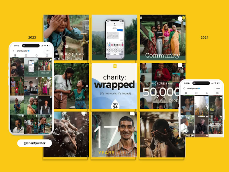
charity: water EOYG Organic Campaign Social Strategy
5
107
Message
16
Oleksandra Marchenko
pro
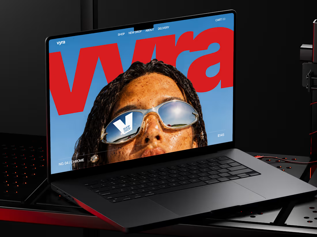
🕶️ Web design for eyewear e-commerce website | Hyperactive
16
186
Message
8
Val Guerra
pro
Explainer video for Paper
1
8
129
Message
10
Robin Holesinsky
pro
Atom.money: Brand Identity for a Regulated Fintech Platform
10
67
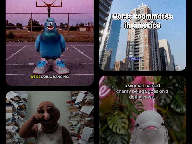
Join the $50k Cantina Challenge
Share your Cantina creation for a chance to win!
Learn more.
Enter the challenge
Enter the challenge
Enter the challenge
Enter the challenge
Web design projects using Framer
Framer
The best modern websites built on the leading web design tool, Framer
View more
Message
5
Studio Ilker
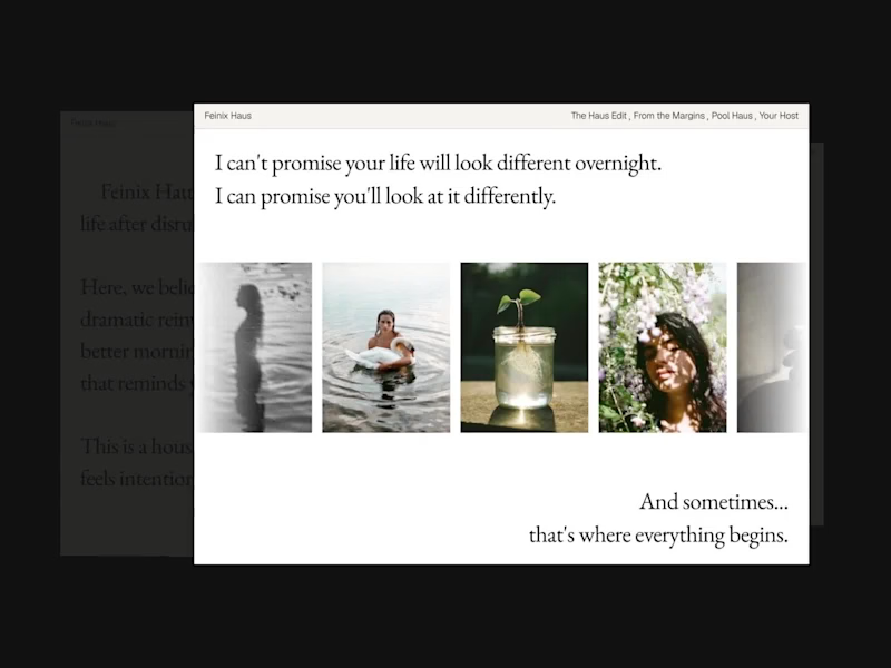
Feinix Haus Website
5
46
Framer is the leading tool for building websites, fast
Hire experts
Message
5
Creative Capital
pro
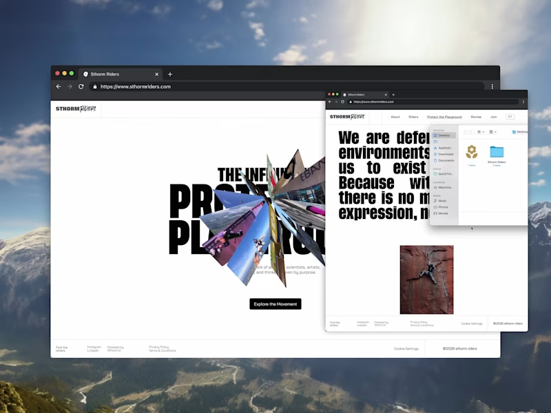
Sthorm Riders Framer Website Design
3
5
41
Message
9
Diego Colino - Vítrea Studio
max
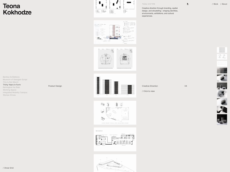
Teona Kokhodze — Framer Website Creative Director Portfolio
9
66
AI projects
AI
New projects from the best AI creators
View more
Message
12
Filip Panov
max
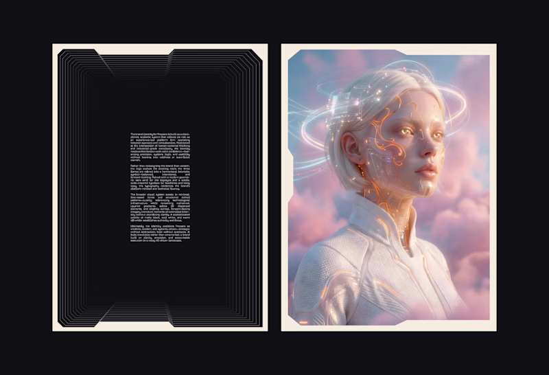
Brand Identity for Propane
12
105
Message
16
Anna asol_design
pro
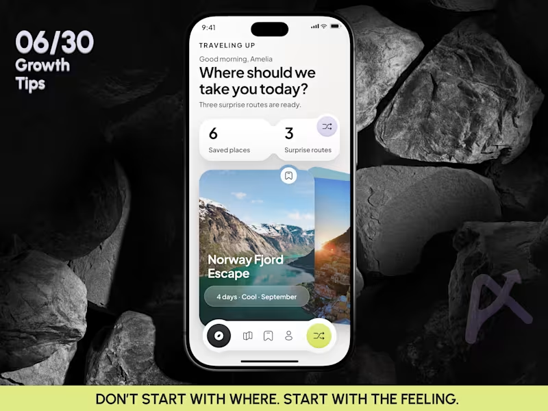
Mobile App Design | AI Trip Randomizer Planner Mobile IOS App
16
38
Message
5
Darya Batyr ✦
max
From AI-Generated to Premium: Spartan SEM Brand Identity
5
35
Message
9
Razvan Badea
pro
Alkera - Logo Design & Brand Identity
1
9
175
Brand design projects
Brand design
Bold visual identities and branding systems created by top independent designers

View more
Message
5
Virginia Roson
pro
Maneup Labs Brand Identity and Packaging Design
5
59
Message
4
Révolté
pro
Vetti Brand Identity Design
4
40
Message
5
Mateus Scopel
pro
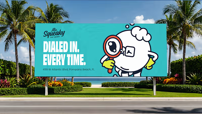
Mr. Squeaky | Brand Design
5
27
Message
4
Flávia Jackeline
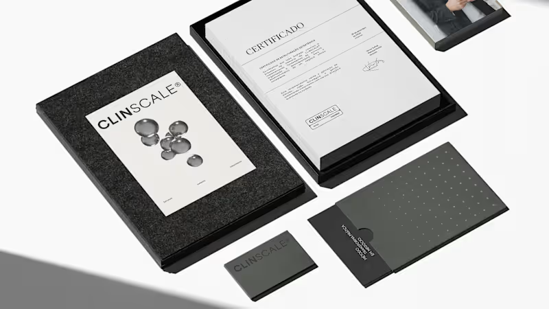
ClinScale — Brand Identity & Logo Design for Clinical Research
1
4
37
Video editor projects
Video editing
Creative video edits made using today’s best editing tools
View more
Message
3
Kayla Elorza
pro
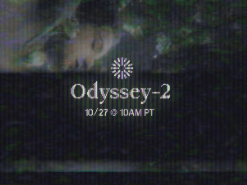
Odyssey-2 Launch Video Teasers
3
86
Message
6
Alejandra Tello
max
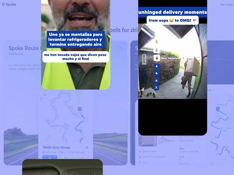
Meme-Driven Video Editing for a Delivery Driver App
1
6
132
Message
1
George Alexander-Pike
pro
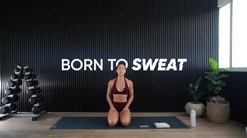
Born To Sweat Video Editing/Motion Graphics
1
1
47
Message
6
Jesse Calis
pro
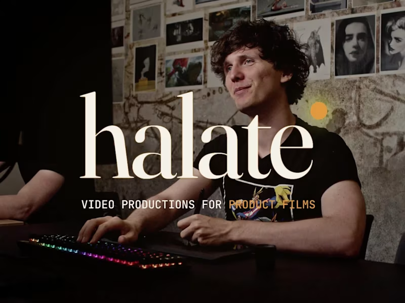
Halate Showreel
1
6
52
Standout projects
Standout projects
More projects we love that are making waves across the web
Message
9
Yonatan Efrem
pro
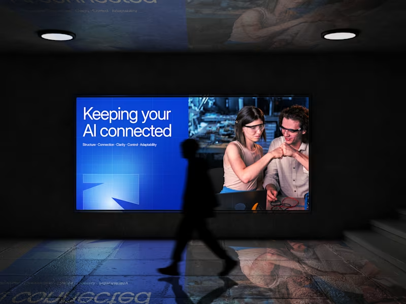
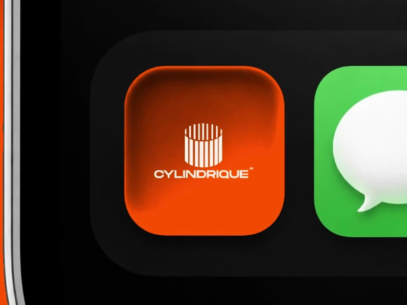
Not every project ends with a launch. Sometimes, the work is good. The direction is clear. The conversation is productive. And then the timeline doesn't quite line up. That was the case with Cylindrique. The project ended before we could take this concept all the way through, largely because we couldn't find alignment on the timeline. That's part of working in design. A good creative process still needs a practical agreement around time, feedback, and decision making. But I didn't want the concept to disappear with the project. The idea started with something deliberately simple: a cylinder. From there, I explored how that form could become a modern industrial mark for an AI company, using geometry, segmentation, negative space, and perspective to create a sense of structure and depth. No generic AI symbols. No unnecessary complexity. Just a system built from one strong form. I would have liked to see where the identity could have gone with the full process. Still, some concepts are worth showing even when they don't become the final answer. Not every design has to become a brand to be worth making. #Cylindrique #LogoDesign #BrandIdentity #AI #TechBranding #IndustrialDesign #LogoConcept #DesignProcess
2
9
297
Message
11
Bori Odekunle
I spent about 24 hours from yesterday to today developing the branding for Trellis, a fictional AI gateway for B2B SaaS teams. I started by sketching out the logo shapes I had in my head and honestly, the first few were pretty bad. But after a while I had a rough idea that actually felt worth pushing, so I moved into Figma. Hallelujah. From there, I started testing the colours I had in mind, playing with the proportions, and checking how the logo worked at different scales. That was probably the point where I started thinking, okay... this might actually work. Once the base felt right, I started properly detailing and texturing everything. I went through a lot of iterations, and at one point I had to go back to the brief because I felt like something was still missing. Funny enough, that gave me the last bit of direction I needed. I finished by trying the identity across a few designs and mockups until I was finally convinced by the direction. Really enjoyed working through this one. Website is next, and I honestly can’t wait to see how the brand starts stretching into a full experience.
3
11
185
Message
12
Vanshika Bansal
New work! Here’s a launch video we recently wrapped up for Outship - a technical hiring platform. 🌟 Client: Outship Production: Cloudwalk Studio
4
12
310
Message
19
Vanshika Bansal
A short motion spec ad for Muji (personal project). Design, animation and sound design by me :) Inspired by: Kinisi, Sebastien Camden
6
19
480
Message
14
Yonatan Efrem
pro
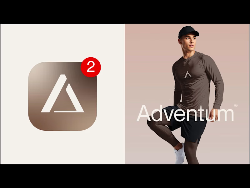
Brand identity design for Adventum Fitness, a fitness and personal development brand built around physical performance, mental fitness, and personal growth. The challenge was to create a visual identity that could bring strength, movement, discipline, and personal development together without falling into the usual fitness branding clichés. The identity was developed as a cohesive visual system across logo design, typography, color, graphic elements, and supporting brand assets, giving Adventum a distinctive and consistent presence across digital and marketing applications. Full case study available on my Contra profile. #BrandIdentity #BrandDesign #FitnessBranding #VisualIdentity #LogoDesign #BrandStrategy #GraphicDesign #BrandDesigner #FitnessBrand #PersonalDevelopment
5
14
789
Message
3
Jovanka Dorovic
Designers, a client is buying into your taste, not just your ability to execute. This project was about extending an existing brand into a new tech product, without losing the visual DNA that already made it distinctive. The moodboard became part of the sell: proof that I understood the brand, but also that my own aesthetic judgment was refined enough to carry that legacy forward. I can’t share the full moodboard yet as the project is not public, but this part of the process reflected an important part of my design philosophy. And I wanted to share it with you. Because, that’s what I believe moodboards really do in design bussiness. They make taste visible, and show what to preserve, what to evolve, and how far to push. As execution becomes faster, taste and creative judgment only become more valuable. #BrandDesign #CreativeDirection #VisualIdentity #BrandStrategy #ArtDirection
1
3
33
Message
13
Arron Watson
pro
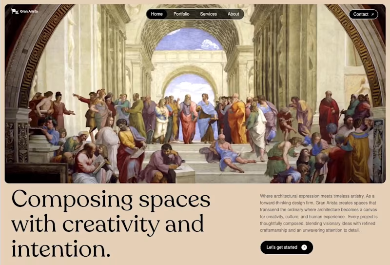
Header section for a design studio. Renaissance art is always in style.
11
13
1.4K
Message
21
Jahid Hasan Raju
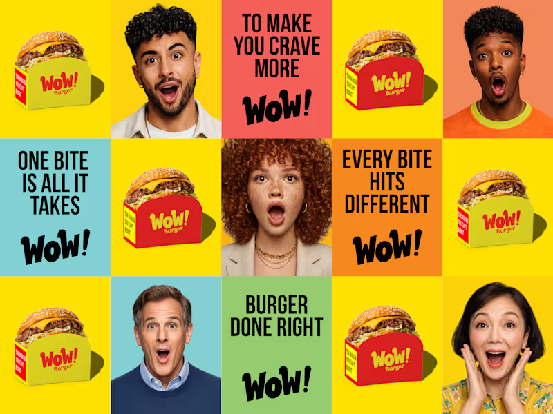
Wow Burger Branding😊
12
21
795
Message
3
Saimun Jubayer Shoyeb
NexMeet — AI Meeting Assistant Workflow
2
3
115
Message
18
Yonatan Efrem
pro
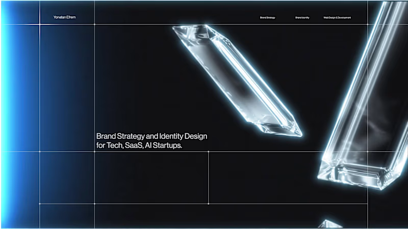
A little motion for my Contra cover. This is a small piece from a website I’m currently building. The full thing is coming soon. I specialize in branding for tech companies, SaaS, AI startups, and founders who need their brand to look as serious as the product they’re building. No fireworks. No unnecessary gradients. Just a brand system doing its job. More soon. #TechBranding #BrandIdentity #TechDesign #SaaSBranding #AIStartup #BrandStrategy #VisualIdentity #MotionDesign #Contra #BrandDesigner
1
18
1.2K
Message
11
Marco Ponce de León
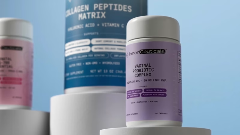
Creative Direction for Innerceuticals
9
11
169
Message
11
Lorenzo Rocco
pro
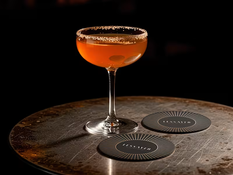
Lessayer Where Belle Époque elegance meets contemporary minimalism. The identity started with a simple challenge: how can a luxury pastry brand feel refined and timeless without relying on predictable visual codes? The answer became a single geometric symbol combining three ideas a crown, a sliced cake, and a subtle reference to the New Zealand sun. One mark. Three meanings. One distinctive identity. Here’s a first look at the logo construction and stationery system. Full case study coming tomorrow.
12
11
154
Message
23
SUBHAN DESIGNS • Identity & Packaging
pro
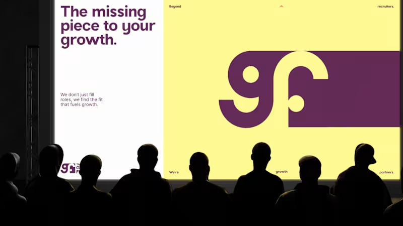
“We started with just a name and some vague ideas. They left us with a brand.” That’s how our client described their experience working with us on The Growth Fit. There was no existing identity to refine. Our job was to take an early-stage idea, understand what the brand needed to stand for, and turn it into a visual system with enough clarity and character to grow with the business. That meant exploring, challenging our own decisions, and going back to the drawing board when something wasn’t landing well. The result was a system built around one central idea: the right fit, carried consistently through the identity, motion and brand touchpoints. The complete project is live. If you’d like to see how the idea developed into the full identity system, you can explore the case study here: The Growth Fit (https://www.behance.net/gallery/254221567/TGF-Identity-Collaterals-Talent-Hiring-Global)
9
23
372
Message
4
ab studio
pro
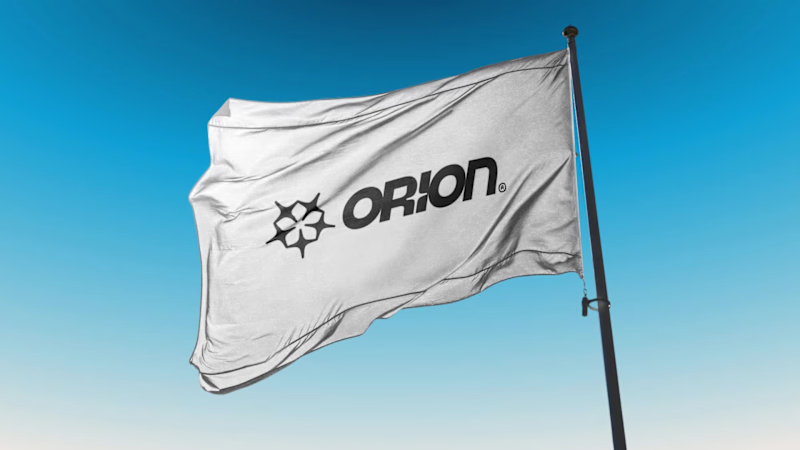
A quick look at the brand identity we developed for Orion Athletics.
2
4
74
Message
7
Marta Koziarz
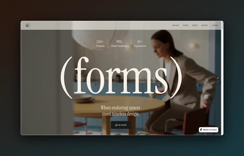
Forms is live — and it’s free. An editorial Framer template I designed for interior designers, interior architects & creative studios. Bold typography, immersive project pages, CMS-powered works + journal, and plenty of space for the work to speak for itself. Built in Framer. Free to remix. ✦ https://framer.link/MG0s5kl Oh, and if you need a hand personalising it, just reach out — I’m only a message away :)
4
7
167
Message
7
James Shih-Gillen
pro
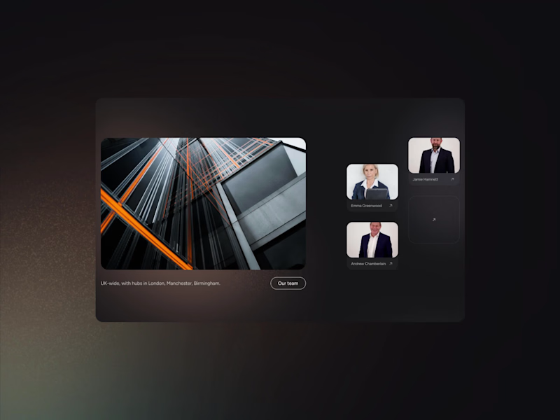
Been a white guys, I've been busy. 🚀 A little look at a recent web project for a law firm where we wanted something that felt premium, distinctive, and clear. Dark UI layered with soft light leaks and subtle noise, the coloured accents pair with the photography and stop the dark from feeling too cold or corporate. We used candid, documentary style shots to bring a real sense of authenticity. Typography is key here too, a restrained, modernist system that establishes tight hierarchy and guides the user through the site.
4
7
126
Explore projects