

Audience Monetization Strategist for Top Creators and Brands


Audience Monetization Strategist for Top Creators and Brands


Nonprofit(1)

Creative Systems Designer | Brand, Digital & Interactive
- $5k+
- Earned
- 1x
- Hired
- 13
- Followers
Creative Systems Designer | Brand, Digital & Interactive
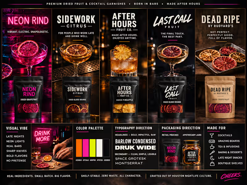
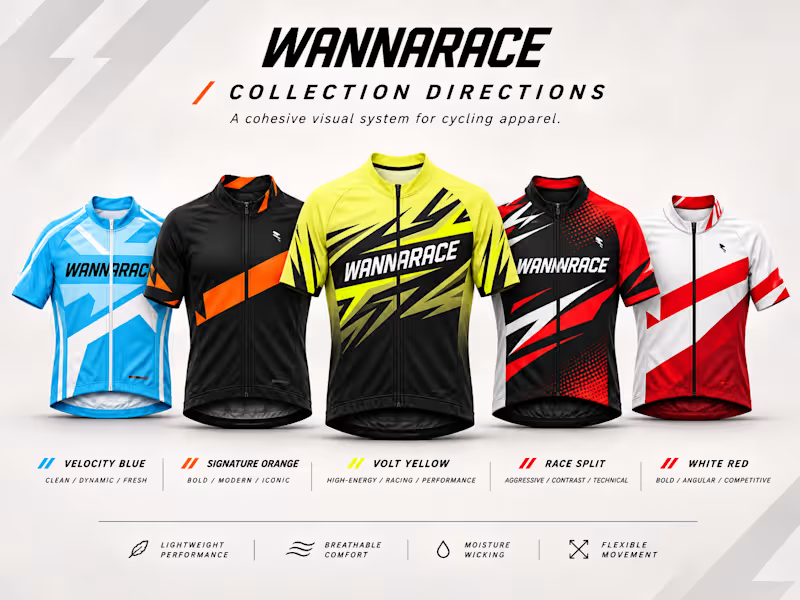
Five jerseys. One unmistakable identity.
Exploring how to build a recognizable cycling apparel brand without making every jersey look the same.
Five distinct directions, connected through movement, aggressive geometry, confident typography, and a cohesive visual language.
Because a strong brand isn't one design repeated. It's a system that makes every variation recognizable.
Independent creative concept exploration.
#CyclingApparelDesign #BrandIdentity #SportswearDesign
0
41
Nonprofit(1)

Multidisciplinary end-to-end product designer
Multidisciplinary end-to-end product designer


A modular illustration system designed for a tech agency focused on accessibility and responsible product development.
The visuals communicate complex UX concepts—like performance, accessibility, and system design—through simple, approachable metaphors. Each illustration balances clarity and personality to support storytelling across marketing, product, and educational contexts.
0
161


Nonprofit(1)

Helping busy CEOs scale software operations.


Nonprofit(1)

Custom websites, stunning illustrations & animations
Custom websites, stunning illustrations & animations


AffirmHealth Telemedicine is a private practice run by Dr. Kazia Parsons that provides gender affirming healthcare and primary care to the LGBTQ+ community.
Dr. Parsons had a WordPress site that looked dated and was difficult to manage. It had been built by a one-off freelancer, leaving her without support when updates inevitably went wrong. After attempting to make changes herself, sections like testimonials broke entirely, and adding basic content became a challenge. The site's design also lacked accessibility and didn't reflect the quality of her brand.
We rebuilt the site from the ground up with a modern, colorful design that reflected her brand's approachable and creative energy. The new layout brought focus to her core services and guided visitors more naturally toward her booking link. To make ongoing updates effortless, we implemented a custom CMS, giving her full control over page content, images, and testimonials without worrying about breaking the site.
2
127


Nonprofit(1)

Brand Guardian & Creative Generalist


Nonprofit(1)

Multidisciplinary Creative Professional
Multidisciplinary Creative Professional


Nonprofit(1)