INNcontrol Coils Brand Identity Development

View completed workwww.inncontrolcoils.com
INNcontrol Coils
Making the Invisible Impossible to Ignore
Brand Identity · Visual Strategy · Creative Direction · Design Systems
The Challenge: Selling What Nobody Sees
Hotels sell comfort. Guests notice the temperature, the cleanliness, the feeling of a room that simply works. They rarely think about the machinery responsible for any of it.
INNcontrol Coils operates in that invisible space, restoring and maintaining the systems that make hospitality possible.
The challenge wasn't to make an industrial service look glamorous. It was to communicate the value of highly technical work in a way that felt immediate, credible, and unmistakable.
How do you build a compelling visual identity around something designed to go unnoticed?
The Insight: Two Temperatures, One Identity
The answer was already embedded in the brand's existing symbol.
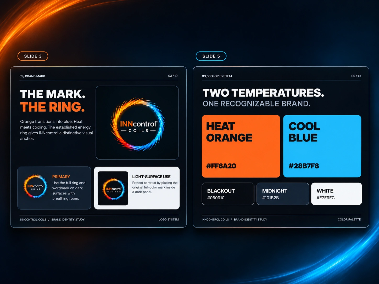
INNcontrol's circular mark moves from fiery orange into electric blue. Two opposing temperatures contained within one continuous movement.
That contrast became the foundation of the identity direction.
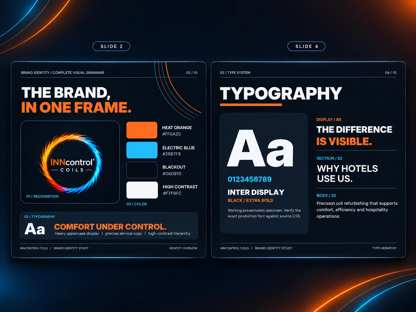
Orange represents action, energy, intervention, and transformation. Blue introduces cooling, precision, stability, and control. Against an almost-black foundation, the two colors create a visual tension that communicates the brand's purpose before a single word is read.
Rather than replace an established identity, I explored how to turn its strongest recognizable element into a complete visual language.
The Direction: Industrial Precision Meets Hospitality
The visual system needed to speak to two environments simultaneously: the technical world of equipment restoration and the elevated expectations of hospitality.
I developed a direction built around three principles:
01. Make performance visible.
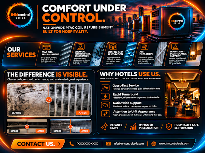
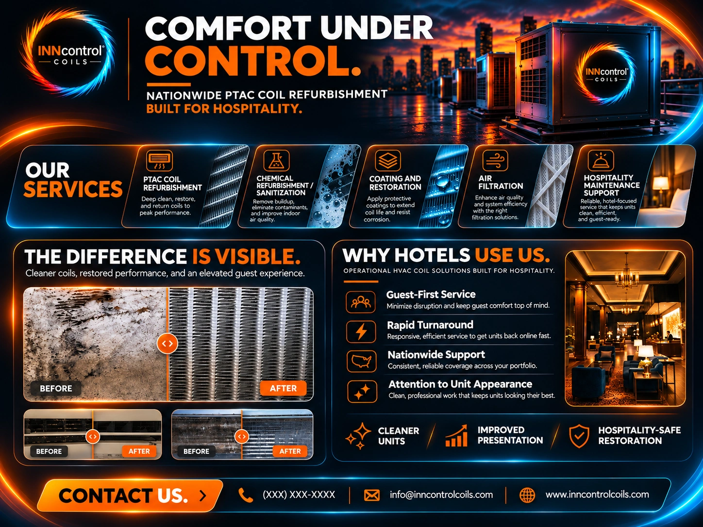
Before-and-after imagery became central to the visual storytelling. Where most industrial brands rely on descriptions of technical capability, INNcontrol has an opportunity to show the physical evidence of its work.
02. Turn contrast into recognition.
A near-black canvas gives vivid orange and electric blue room to work. Bold typography establishes authority, while disciplined supporting text makes technical information accessible. Light, movement, and temperature become recurring visual devices rather than decorative effects.
03. Create a system, not a collection of graphics.
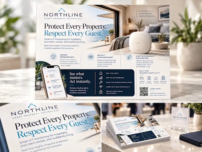
The identity was explored across varied compositions, including cinematic hero imagery, modular service presentations, editorial layouts, comparison galleries, and brand guidelines.
Each application has its own visual rhythm while remaining connected through typography, color, contrast, and the existing brand mark.
The Design Language
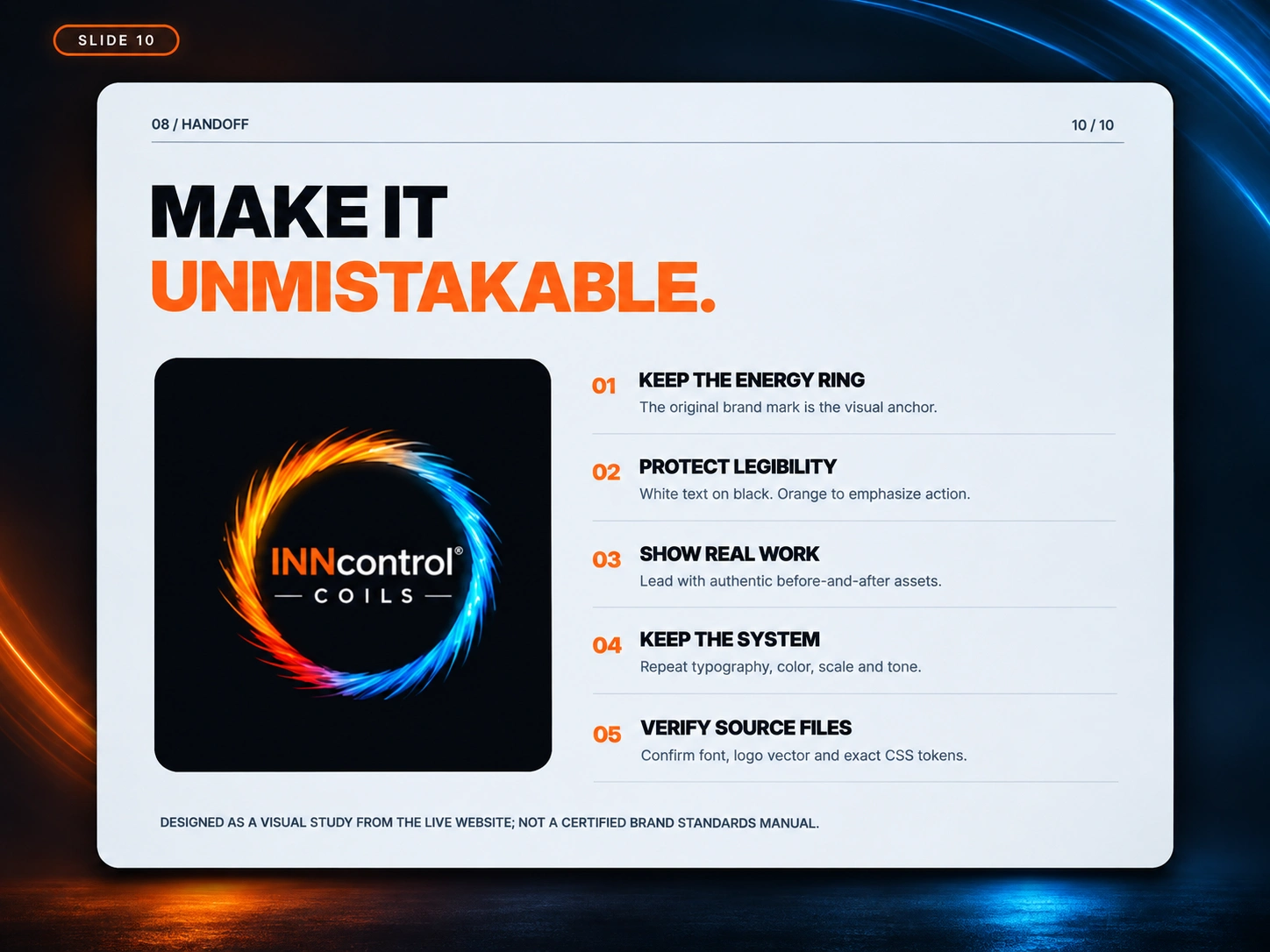
The resulting direction combines cinematic industrial photography, high-contrast typography, precise information hierarchy, and energetic color transitions.
Oversized headlines communicate confidence. Electric-blue technical accents establish structure. Orange directs attention toward action and transformation.
The circular mark anchors the system, providing continuity across layouts without requiring every composition to look the same.
The objective was deliberate: consistency without repetition.
The Outcome: A Brand Built Around Its Own Evidence
This identity exploration produced a ten-page visual brand study examining the logo, color relationships, typography, visual hierarchy, presentation design, and practical applications.
More importantly, it established a cohesive direction for communicating INNcontrol's value beyond the equipment itself.
Because the company isn't simply working on coils.
It's protecting the comfort that hotels promise and guests expect.
The work may happen out of sight. The value shouldn't.
Project note: Independent visual identity and creative-direction study informed by INNcontrol Coils' existing branding. The established logo was retained as a reference, with typography and color specifications explored as proposed design-system standards rather than verified official guidelines.
0 likes · 3 views · Nov 2, 2026
Developed a visual identity that makes INNcontrol's invisible work compelling.