Freelancers in Perry Hall
Sign Up
Post a job
Sign Up
Log In
Filters
1
Projects
People
Zach Edmunds
Severn, USA
Crafting bold brands and seamless web experiences
$5k+
Earned
3x
Hired
7
Followers
Follow
Message
Crafting bold brands and seamless web experiences
0
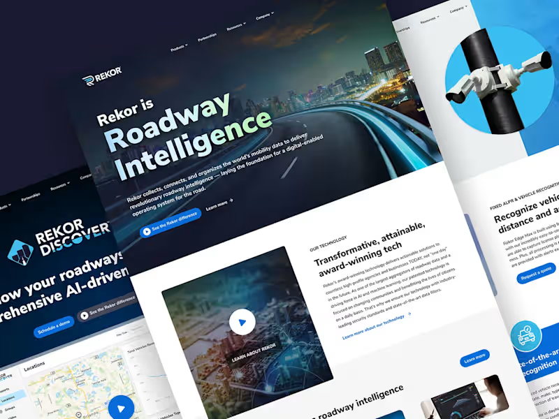
Designing Rekor's Cutting-Edge Website
0
10
0
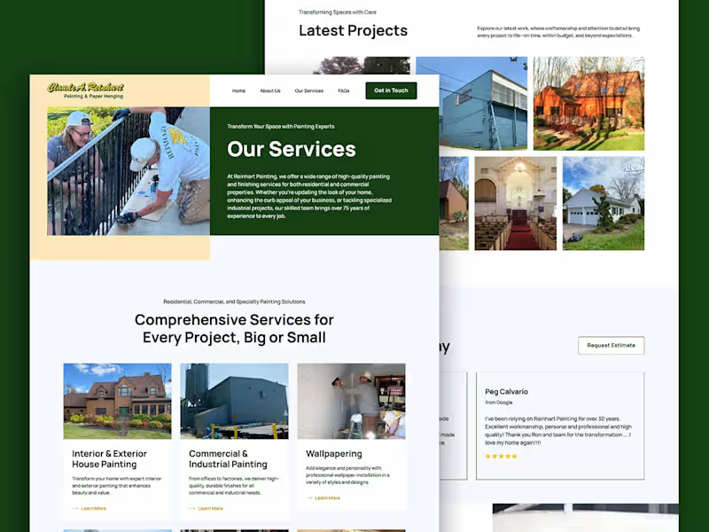
Modernizing Web Presence for Reinhart Painting
0
8
0
Unleashing Clarity Through Dynamic Product Naming
0
17
0
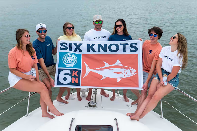
Crafting a New Lifestyle Apparel Brand in Six Knots
0
12
Follow
Message
Victoria Schultz
pro
Severn, USA
Creative problem solver, crafting brand stories
5.0
Rating
1
Followers
Follow
Message
Creative problem solver, crafting brand stories
0
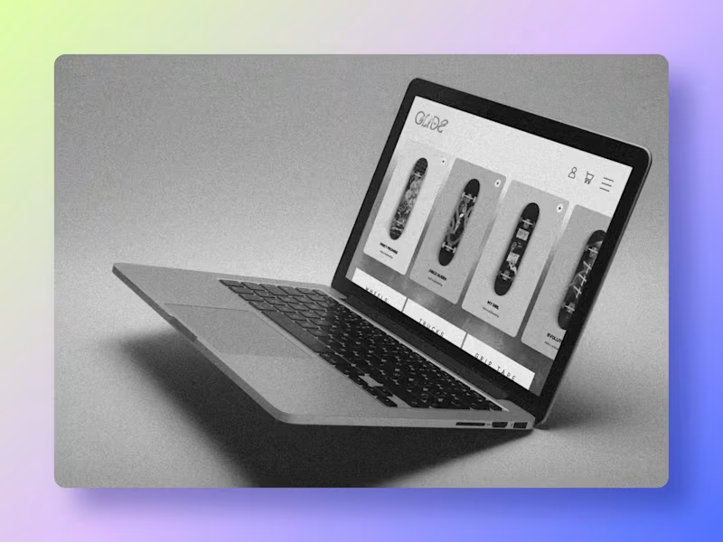
Glide 🛹 Brand Ideation + Design
0
36
0
Pitt Friends 🐾 Brand Refresh
0
34
0
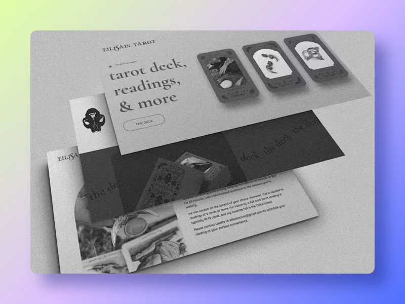
Eilisain Tarot 🔮 Brand Ideation + Design
0
47
0
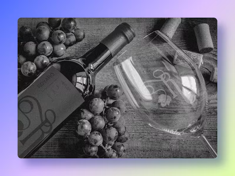
Royaro Wine 🍷 Brand Ideation + Design
0
14
Follow
Message
Robbie Ierubino
Baltimore, USA
Artistic Flair: Design & Music Production Expert
19
Followers
Follow
Message
Artistic Flair: Design & Music Production Expert

0
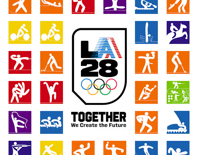
LA28 Brand Extension Concept
0
25
1
Kinetic Typography Study
1
10
1
Personality Idents
1
6
1
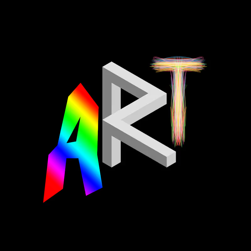
My Art World
1
10
Follow
Message
Shakya Vaughn
pro
Baltimore, USA
Strategic Branding & Packaging Design for CPG Founders
35
Followers
Follow
Message
Strategic Branding & Packaging Design for CPG Founders
1
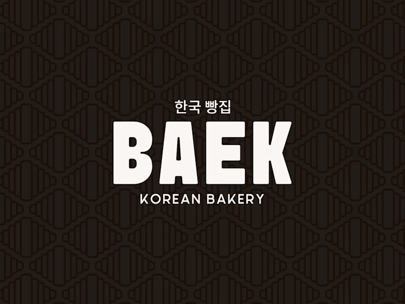
MEET BAEK 🥐🖤 A modern Korean Bakery + Cafe where heritage gets a bold, contemporary identity. The vision: clean yin-yang aesthetic, loud personality. The croissant’s natural pattern became the foundation woven into the logo mark, echoed in the brand pattern, and carried all the way through to the menu card and loyalty stamp shape. Every touchpoint designed with intention. This is what it looks like when a bakery brand has strategy behind the designs. Scope of work: ✨Brand Strategy & Identity ✨Menu Card Design ✨Pattern Design ✨Social Media Revamp
1
32
0
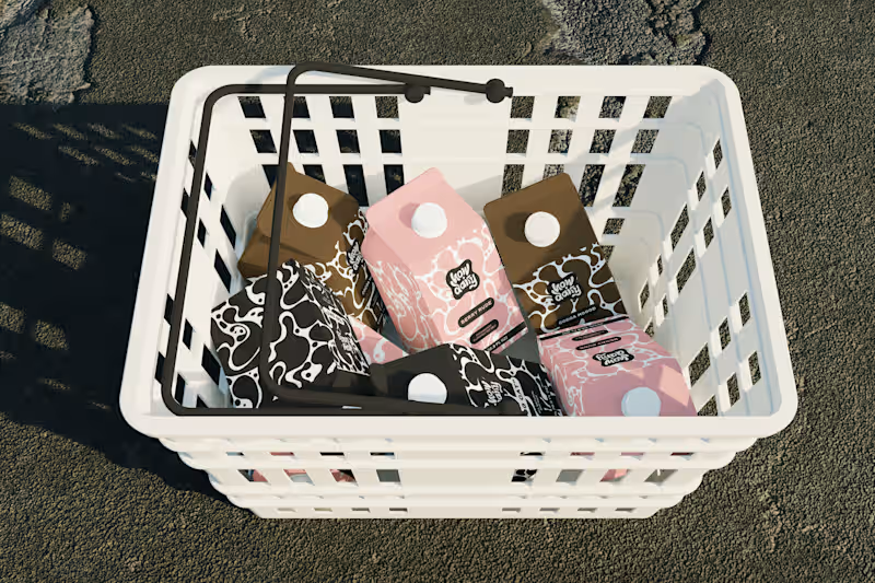
Every milk brand wants to be "bold." However, most of them just slap a cow on the carton and call it a day. How Dairy needed to actually feel bold. Not "we added a sans-serif" bold. Bold as in: you see it from 10 feet away and you already know it's not the same organic plain thing you've seen 50 times. I built the brand identity and packaging system from scratch. The name does the heavy lifting tonally (playful, modern, irreverent), so I let the visual system match that energy: high-contrast colors, type hierarchy, and zero overused dairy imagery. The carton design reads more like a streetwear drop than a dairy aisle staple. The goal: make someone grab it because it looks like it has personality and speaks to their values, not just protein content. If your product is blending into the shelf, let's talk → contra.com/shakya_vaughn (https://contra.com/shakya_vaughn) #PackagingDesign #CPG #BrandIdentity #FoodAndBeverage
0
50
2
Here's my first post for the #stealmyprompt sprint! First, this prompt was created in Chatgpt ✨ Then used in Sora to create this base mockup image for Tropina✨ Left: Before Right: After Prompt: "A woman in a muted pink swimsuit lounging on her back on a sandy tropical beach, one arm resting over her head holding a wide-brimmed straw hat that partially covers her face. Her skin is sun-kissed and she’s relaxed beside the shoreline. Next to her in the sand is a small plain white rectangular beverage bottle with a brown cap, similar to a coconut water carton, The bottle is covered in light condensation, glistening slightly in the sun to emphasize its refreshingly cold temperature. The background includes turquoise water and a softly sunlit sky, capturing a luxurious, serene summer vibe"
2
2
110
16
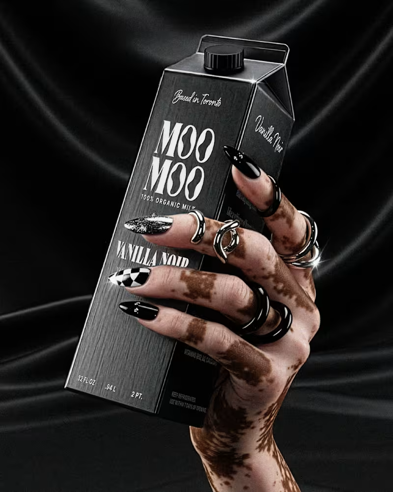
Modern organic milk, but make it luxury. 🥛 I recently wrapped the brand identity and packaging design for Moo Moo, a modern high-end milk brand based in Toronto. Packaging mockup was made with AI and I added my final design and edits in Photoshop. This project was a great reminder of why cohesive brand systems matter so much: -Custom wordmark with “O” counters inspired by cow spots + the flow of milk -Pattern system built from those same organic shapes -Collateral (cartons, billboards, thank-you cards) When every touchpoint is aligned, a brand stops feeling generic and starts feeling instantly recognizable. Whether it's on the shelf, a billboard, or in a customer’s hands. 👉 If you’re building a beverage brand and want your visual identity, packaging, and collateral to work together (not against each other), let’s connect.
6
16
188
Follow
Message
Kalpesh Mistry
Ellicott City, USA
AI Agents & Automations | 7 Shipped | Ex-FDA PM
Follow
Message
AI Agents & Automations | 7 Shipped | Ex-FDA PM
0
AI Chrome Extension That Auto-Organizes Browser Tabs by Topic
0
14
0
4 AI Agents Running Daily: Research, Drafting, Content & Inbox
0
18
0
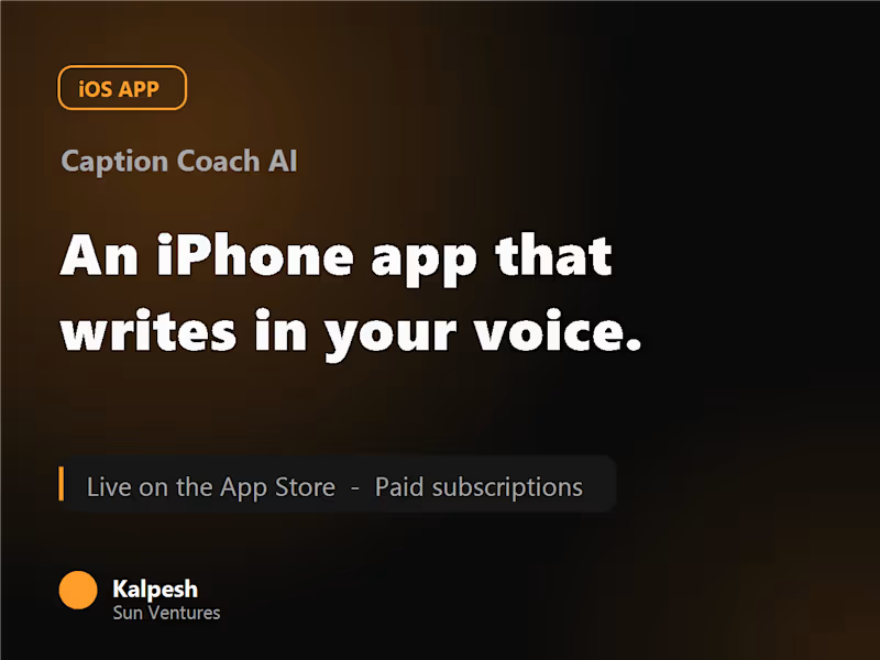
AI iPhone App That Learns Your Writing Voice, Live on the App Store
0
21
0
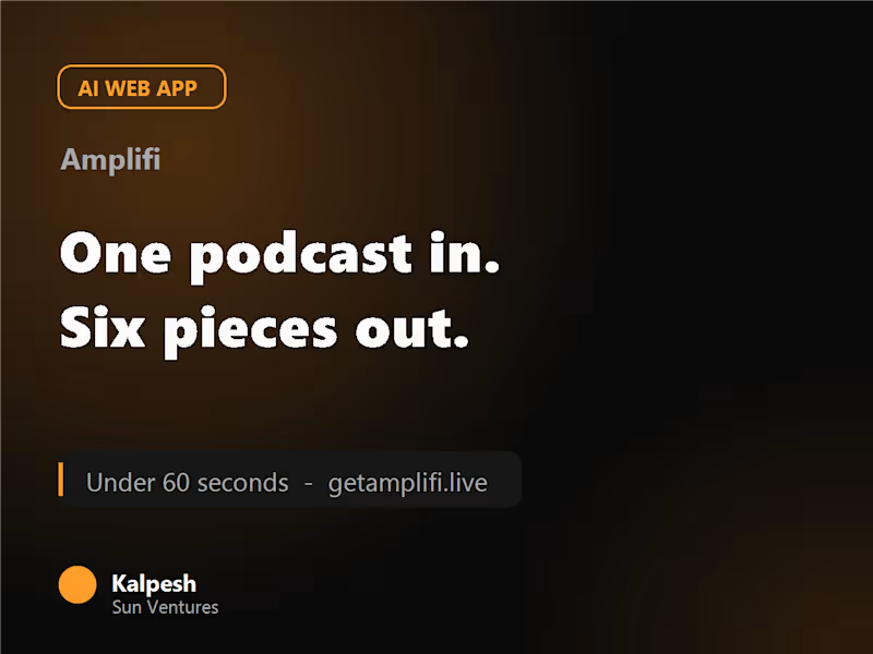
AI Content App: 1 Podcast into 6 Content Pieces in Under 60 Seconds
0
21
Follow
Message
Emerson Maggi
Baltimore, USA
Driving results through passion, and innovation!
5.0
Rating
1
Followers
Follow
Message
Driving results through passion, and innovation!
0
Content Manager: RoundSquared
0
19
0
Digital Marketing Manager: Mama's Restaurant Group
0
51
0
Let's Tap In
0
65
0
Lytos
0
46
Follow
Message
Robert Jett
Baltimore, USA
Exceeding expectations is my baseline.
Follow
Message
Exceeding expectations is my baseline.
0
Dataiku (Blog)
0
22
0
New World Person
0
36
0
Memberstack (Blog)
0
21
0
New World Studios
0
28
Follow
Message
Blue Meridian Studio
Columbia, USA
Helping brands move from confusion to clarity.
14
Followers
Follow
Message
Helping brands move from confusion to clarity.
13
OK...how come NO ONE expressed how straightforward and awesome jitter is!? We just started playing around with it, and it's a game changer
1
13
159
2
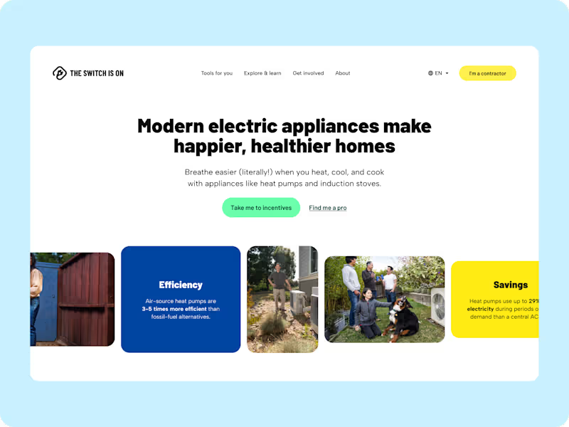
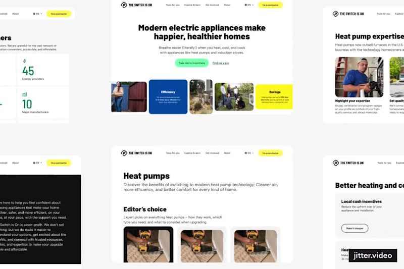
We’ve been quietly refreshing The Switch Is On: evolving how the brand looks, feels, and speaks. The updated system introduces a more grounded tone of voice, cleaner visuals, and a refreshed logo family designed to carry across programs, states, and partners. It’s still the same mission, helping people make the switch to clean, electric living: just with a sharper identity to match where the movement is headed. ⚡ New tone. New visuals. Same purpose.
2
2
109
33
Almost ready to launch the refreshed brand for the Switch Is On: very excited with the output
33
247
0
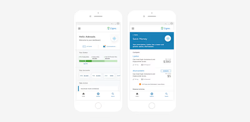
Back in December 2017, we had the opportunity to collaborate with EY and Cigna Health to redesign the Cigna Health OneGuide: a digital healthcare experience focused on improving how patients track and manage chronic back pain. Our work included designing the system architecture, over 60 healthcare sensing scenarios, and a full set of mobile app interfaces to make the experience more human, responsive, and intuitive. We also assisted in three rounds of patient testing and refinement with over 40 participants, ensuring the new experience was as empathetic as it was effective.
0
89
Follow
Message
Explore people
;